To help passengers find lost items as soon as possible, KLM launches a dedicated Lost & Found team at Amsterdam Airport Schiphol. To illustrate how the team goes above and beyond, KLM creates a marketing stunt built around a search dog.
Sherlock as the “speed of service” metaphor
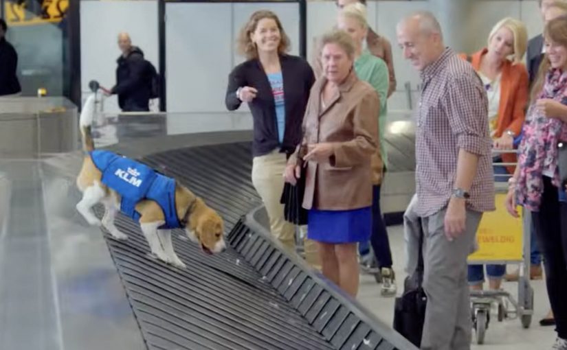
At the airport, a beagle named Sherlock is shown locating the owners of lost items, from a teddy bear found by cabin crew to a laptop left in the lounge. The reactions are captured in a short, punchy video designed to travel on its own.
How the stunt communicates the promise
Mechanically, the story is simple: an item is found, the search starts immediately, and the owner is located before they disappear into the airport flow. The dog makes that promise instantly legible. Fast. Active. A little magical. The real question is whether you can turn a back-office process into a visible, human moment without drowning it in policy.
In European full-service airlines, lost-property recovery is a service moment that shapes trust far more than most advertising claims.
Why it lands as viral, not as “brand content”
Here, “brand content” means long-form storytelling that asks for attention without proving the customer outcome. The video works because it is not about policy. It is about human relief. People love the “I thought I lost it” moment, and they love the surprise of a friendly messenger delivering it back. The dog is the emotional accelerant, but the underlying message is operational: KLM is trying to return things quickly, ideally before you even realise they are gone. This is the right way to market a service: show the outcome first, then let the symbol do the explaining. By compressing the find-and-return loop into seconds, it makes the promise feel operational, not aspirational.
Extractable takeaway: If you want a service promise to travel, dramatize the customer payoff with one repeatable loop that proves speed without explaining process.
Service marketing moves to copy
- Promote a real service outcome, not a vague value. “We find your item fast” is clearer than “we care”.
- Use one strong symbol. A single character can carry the entire promise if the behavior is unmistakable.
- Show the moment of relief. Reactions are the proof that the service matters.
- Keep it short and repeatable. One item, one search, one reunion. Then repeat with a different item.
A few fast answers before you act
What is the KLM Lost & Found stunt in one sentence?
A service story promoted via a short video where “Sherlock” helps reunite passengers with lost items at Schiphol, signalling speed and care.
What is the core mechanism the video demonstrates?
Immediate recovery plus active tracking of the owner inside the airport, aiming to return items before passengers leave the terminal.
Why use a dog in a service message?
Because it makes the promise emotional and instantly understandable, without needing explanations of process or policy.
What is the transferable lesson for other brands?
If you have a real operational capability, dramatize it through one memorable symbol and show the customer payoff in seconds.
What should you avoid when copying this pattern?
Do not outsource credibility to the symbol. If the underlying service is slow or inconsistent, the stunt backfires. Make the operational loop real, then film it simply.