Billboard Brasil: On Hold Jam Session

You call a magazine subscription line and get put on hold. Instead of elevator music, you get a prompt that turns your phone keypad into an instrument, so you can jam along while you wait.

Turning hold time into play time

Billboard Magazine features the best of pop music and entertainment in Brazil and, as they frame it, waiting on hold is one of the most boring music moments ever. So their ad agency AlmapBBDO creates the “On Hold Jam Session”, which makes the moment into a fun interactive experience and reflects the magazine’s concept of music and entertainment.

To make the magazine subscribers aware of this new on-hold feature, they send direct mail explaining how one could jam along with their phone buttons when they are put on hold at Billboard Magazine.

Why the mechanic is so effective

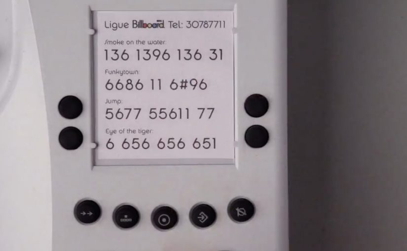
The mechanism is simple. Use the tones behind the phone keypad to trigger musical parts, so every button press feels like progress. It replaces passive waiting with viewer control, meaning the caller can shape what they hear in real time. That changes the emotional quality of the same time slice.

Extractable takeaway: If you cannot remove a wait, give people one simple action that produces immediate feedback, so the time feels shorter and more personal.

Definition-tightening: this works because phone buttons generate distinct audio tones that can be mapped to beats, riffs, or samples. The caller does not need instructions beyond “press keys to play”.

In subscription media and entertainment brands, turning unavoidable waiting into a participatory moment is a direct way to make the brand feel lived, not just consumed.

What Billboard is really buying

This is not a content campaign in the usual sense. It is a brand behavior demonstration. If Billboard is about music culture, the brand should show up even in the most unmusical moment, customer service hold time. The real question is whether your brand shows up when the customer is stuck, not only when the customer is browsing.

It also reframes a service weakness into a memorable touchpoint. The caller is more likely to tolerate the wait, and more likely to talk about the experience afterward.

Patterns for turning dead time into play

  • Target dead time. Waiting, queuing, loading, and holding are underused attention windows.
  • Make the first interaction obvious. One prompt, one action, instant feedback.
  • Turn friction into a feature. If the wait cannot be removed, redesign what the wait feels like.
  • Promote it with a physical cue. Direct mail works here because it sets expectation before the call happens.

A few fast answers before you act

What is the “On Hold Jam Session” idea?

It turns phone hold time into a playable music moment by letting callers create beats or melodies using their keypad while they wait.

Why does interactivity matter when someone is on hold?

Because it converts passive waiting into active participation, which reduces boredom and makes the time feel shorter.

How do phone buttons become a music controller?

Each keypad press produces a distinct tone that can be mapped to sounds. The system listens for the tones and triggers matching audio parts.

What is the business benefit beyond “fun”?

A better service experience, higher memorability, and a stronger brand association, plus increased word of mouth because the moment is easy to describe.

What is the main execution risk?

If the audio feedback is delayed or confusing, callers will abandon the interaction and it becomes just another frustrating hold.

Bradesco Seguros: The Fake iPad Ad

A fake ad that behaves like a real crash

Bradesco Seguros created a cheeky ad in the iPad version of Quatro Rodas, a Brazilian car magazine. When readers swipe the “page,” the car in the ad follows the direction of the gesture and crashes into the side of the screen, unveiling the message: “Unexpected events happen without warning. Make an insurance plan.”

The mechanic: one native gesture, one irreversible consequence

The entire idea is built on the most common tablet behavior: swiping to move on. Instead of letting the user escape the ad, the ad “obeys” the swipe and turns it into the cause of an accident. The crash is the reveal. It is also the proof that the format is touch-native, not a print layout copied onto glass. Here, touch-native means the idea only works because the swipe directly causes the outcome on the screen.

In touch-first publishing, a single gesture-driven interaction can turn an ad into a micro-experience that earns attention the way content does.

Why it lands

It creates a moment of surprise without requiring explanation. The user thinks they are performing a routine action, then the ad responds in a way that feels physical and slightly alarming. Because the message is revealed by the crash itself, the brand does not need to overclaim. The interaction makes the point. The real question is whether the gesture itself makes the risk message feel immediate, inevitable, and brand-relevant. This is a strong use of tablet media because the interaction and the message are inseparable.

Extractable takeaway: If your message is about risk or unpredictability, make the audience cause a small, safe “unexpected event” through a familiar action, then reveal the message as the consequence.

What touch-first ad teams should steal

  • Exploit a default gesture. Build on what people already do, not what you wish they would do.
  • Make the payoff immediate. The interaction must resolve within a second or two, or it feels like a gimmick.
  • Let the mechanic carry the copy. If the interaction proves the point, the line can stay simple and memorable.
  • Keep it brand-safe. Use surprise, not fear. The crash is symbolic, not distressing.

A few fast answers before you act

What is Bradesco Seguros’ “Fake Ad” in Quatro Rodas?

It is an interactive iPad magazine ad where a swiping gesture makes the car in the ad move and crash into the screen, revealing the insurance message about unexpected events.

What is the core creative mechanic?

Gesture mirroring. The ad responds to the swipe like content would, then turns that response into a surprising consequence that delivers the message.

Why is this better than a standard banner or full-page ad?

It uses the tablet’s native behavior, so the attention is earned through interaction, not demanded through interruption.

What is the key lesson for touch-first advertising?

Design around one familiar gesture and make the output feel inevitable and meaningful, not decorative.

What is the most common way this approach fails?

When the interaction is slow, unclear, or unrelated to the message. The mechanic must be the argument.

GOL: Valentine’s Flight Seat Challenge

Brazilian airline GOL ran a Facebook activation designed to grow its online community and raise brand awareness in a highly competitive airline market. The insight behind it was simple. A trip can be one of the most romantic Valentine’s gifts to receive.

Over the Valentine’s weekend, GOL posted a series of images featuring empty airplane seats on its Facebook wall, without warning. The first people to see each image and comment the correct seat numbers won a pair of return tickets to any of GOL’s destinations.

The campaign was reported to have grown GOL’s Facebook community from 12,000 to over 200,000 in three days, making it number one in its category for the period.

A giveaway that rewards attention, not effort

The mechanism is a speed game disguised as a romantic prize. You do not fill out a form or write a story. You notice a post. You read a seat layout. You comment a number faster than everyone else.

In mass-market consumer categories, lightweight “attention rewards”, small prizes for noticing and reacting in the feed, can outperform complex promotions because they fit how people already behave in social feeds.

Why it lands

The execution stacks three accelerators. Surprise timing. A simple visual puzzle. A high-value reward that feels emotionally relevant to the weekend. That combination converts scrolling into urgency, and urgency fuels sharing and repeat checking, even among people who never win. The real question is whether your winner logic is instantly believable at feed speed.

Extractable takeaway: If you want rapid community growth, design a loop where the behaviour is already native to the platform, and the winner selection is instantly credible. Speed plus clarity beats creativity-plus-forms.

What the brand is really buying

Beyond awareness, this format buys habit. People learn that the page can drop value without notice, so they follow, refresh, and invite friends to watch too. The prize is the hook. The real outcome is an audience that has trained itself to pay attention at the brand’s tempo.

Steal this: Surprise-seat giveaway loop

  • Use a recognisable visual trigger. A seat map is instantly readable, even at feed speed.
  • Keep participation to one action. Commenting is frictionless. That matters more than polish.
  • Make the rules self-verifying. Everyone can see the seat numbers and understand who was first.
  • Lean on surprise scheduling. Unannounced drops drive repeat checking far better than a fixed timetable.
  • Match prize to context. A Valentine’s weekend mechanic wants a prize that feels like a shared experience.

A few fast answers before you act

What is the Valentine’s Flight Seat Challenge in one sentence?

It is a Facebook giveaway where GOL posted surprise images with empty seat layouts, and the first users to comment the correct seat numbers won return tickets.

Why does “first to comment” work so well on Facebook?

Because it rewards attention and speed, which are native behaviours in a feed. It also creates a visible, easy-to-trust winner logic.

What makes the seat map a strong creative device?

It is instantly legible, visually distinctive in the feed, and turns the brand’s core product into a simple game mechanic.

What is the biggest risk with this format?

Perceived fairness. If timing, moderation, or winner confirmation is unclear, the campaign can trigger backlash rather than growth.

What should you measure beyond follower count?

New follower retention after the weekend, engagement rate on subsequent posts, repeat participation behaviour, and whether awareness lift correlates with search and booking intent.