Kia Lie Detector

Most people in Belgium know that Kia gives a 7-year warranty on all its models. That is a good thing. But a lot of them also think 7 years sounds too good to be true, and that there must be a catch. That is a problem. If people do not believe your advertising message, regular advertising is insufficient.

So LDV United built a campaign designed to prove one simple point. Although it sounds unbelievable, the 7-year warranty is described as 100% true, with no catch.

Proof beats repetition

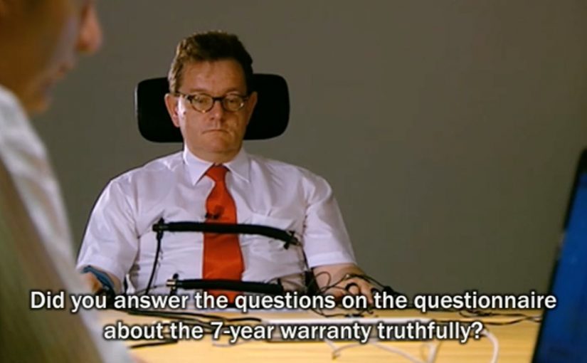
To prove the warranty was genuine, the campaign used a lie detector. Legal Connections, described as an official lie detector company, hooked up the CEO of Kia Motors to a polygraph. Consumers then asked him questions about the 7-year warranty during a live online session.

In European automotive markets, long warranties are a major purchase heuristic, and credibility becomes the real bottleneck when the claim feels “too good”.

The real question is whether the proof feels harder to fake than the doubt it is meant to kill.

Why the proof lands and spreads

The lie detector was not the whole campaign. It was the anchor. The stunt was communicated through newspaper ads, banners and a press release announcing that an actual CEO would undergo a live lie detector test. That structure is what turns a proof moment into earned media and word of mouth, meaning peer-to-peer sharing both online and offline. Because a polygraph is a culturally understood symbol of truth-testing, it reframed the warranty from “marketing claim” into “something we are willing to be challenged on, live”.

Extractable takeaway: When your promise is extraordinary, use a proof ritual. A proof ritual is a public, simple demonstration that invites challenge and feels hard to fake.

Recognition and reported impact

The work later picked up Cannes Lions recognition, listed as a Direct Bronze Lion for “Lie Detector”.

The campaign’s impact was reported via independent media company Scripta as:

  • Brand recognition: 42% (instead of 32% sector average)
  • Attribution: 73% (instead of 62% sector average)
  • Resulting in an Effectiveness Rating of 31% (instead of 20% sector average)
  • And last but not least: An impressive credibility of 80%

Steal this proof pattern for credibility gaps

A credibility gap claim is a promise people want to believe but suspect has a catch.

  • Identify the credibility gap early. If the promise sounds implausible, spend on proof, not frequency.
  • Choose a proof mechanic people already understand. Polygraph. Lab test. Public demo. Anything that signals “hard to fake”.
  • Make the proof interactive. Live questions beat scripted endorsements when trust is the objective.
  • Package the moment for pickup. Announce it like an event, so press and blogs have a clean story to carry.

A few fast answers before you act

What problem does the Kia lie detector idea solve?

It solves a credibility problem. When a benefit sounds too good to be true, people assume a hidden condition. The campaign is designed to remove that doubt by staging proof in public.

Why use a lie detector in advertising?

A polygraph is a widely understood truth ritual. Even if people do not treat it as perfect science, it signals confidence and willingness to be challenged in front of an audience.

What makes this more than a stunt?

The stunt is structured as a live, interactive Q&A, and it is distributed through paid announcements and PR. That combination turns a single moment into a story that can travel.

When should brands avoid “proof theatre” like this?

Proof theatre is staged proof that looks convincing but does not materially verify the claim. If the claim cannot withstand scrutiny, or if the proof method is likely to be seen as misleading or unsafe, the stunt will backfire. Proof mechanics only work when the underlying promise is clean.

What are better success metrics than views for credibility campaigns?

Measure belief and consideration shifts. Brand trust, message credibility, attribution to the correct benefit, and downstream intent signals are usually more meaningful than raw reach.

IKKI.be: The Crying Invoice

USG People, one of the world’s biggest outsourcing companies, launched ikki.be. A portal for freelancers in search of new projects. The mission was to build awareness among freelancers and get them to sign up.

What they learned is simple. One of a freelancer’s biggest concerns is getting paid on time. Which they usually do not. So instead of another feature-led pitch, they created a physical reminder that lets freelancers “recall” the accounts department of late payment, with a little smile. Here, “recall” means prompting the payer to act by making the delay impossible to ignore.

An invoice that complains for you

The execution is the product truth turned into a prop. A mailed invoice that starts to cry when the envelope is opened. Case write-ups describe the trigger as a simple sensor reacting when the invoice is exposed, so the sound becomes unavoidable in the moment the payment decision is made. That matters because the trigger turns a forgettable invoice into an unavoidable emotional cue at the exact moment payment is being processed.

In European B2B lead generation for freelance marketplaces, the fastest attention often comes from solving a cash-flow anxiety rather than talking about platform features.

Why it lands

It lands because it reframes a painful, familiar workflow into a moment of social pressure that feels playful rather than aggressive. The invoice does the awkward part, and the person opening it becomes the one who has to explain why it is “crying”. That flips the emotional burden away from the freelancer chasing and onto the payer delaying.

Extractable takeaway: If your audience shares a recurring frustration, build a small object or mechanic that creates a socially visible cue at the exact decision point, then let that cue do the persuasion instead of your copy.

What the business intent really is

This is awareness built on relevance. It ties ikki.be to a pain point that every freelancer recognizes immediately, and it makes the brand memorable through a single, repeatable story people will retell. This is the right kind of B2B awareness work because it earns memorability by dramatizing a real freelancer pain instead of dressing up a feature list. The real question is how to make your brand useful at the moment the pain is felt, not just visible before it happens.

What to borrow from this payment-pressure idea

  • Start from a shared anxiety. Build the message around what keeps your audience up, not what your roadmap shipped.
  • Move the moment to where decisions happen. Here, the reminder appears at envelope-open time, not in a banner.
  • Use humor as a pressure valve. Playful discomfort can be more effective than aggressive escalation.
  • Make it explainable in one line. “It cries when you open it” is instant word of mouth.

A few fast answers before you act

What is “The Crying Invoice”?

A physical invoice that audibly cries when opened, designed to nudge late payers and spark conversation around paying freelancers on time.

Why does this work better than a standard awareness ad?

Because it appears inside a real payment workflow and turns a private delay into a socially noticeable moment, without needing confrontation.

What problem is the campaign solving for ikki.be?

It makes the portal relevant by anchoring it to the most common freelancer concern. Getting paid on time.

What is the main risk with this approach?

If the gimmick feels mean-spirited or humiliating rather than playful, it can trigger backlash and reduce goodwill.

How can another B2B platform copy the pattern?

Identify the shared operational pain, then create a lightweight intervention that shows up at the decision point and makes the issue easy to talk about.

AXA: iPhone App for Car Accidents

AXA is Belgium’s first insurance company to launch an iPhone app. Their free application helps and guides you through some basic steps when you have a car accident.

To launch this new app Duval Guillaume Antwerp / Modem from Belgium created an innovative print ad that required your iPhone to complete the message.

Why the print idea is a smart match

The product promise is practical. Help me when I am stressed and do not know what to do next. The launch mirrors that by making the iPhone essential to “finishing” the ad, so the viewer experiences the role of the phone immediately. Because the viewer has to use their own device to complete the message, the concept is remembered as help in the moment, not a feature claim. In European insurance marketing, the first interaction needs to make crisis guidance feel tangible.

Extractable takeaway: If your product is built for high-stress moments, design the launch so people experience the first step, not a promise about steps.

  • Device as the missing piece. The iPhone is not just where the app lives. It is how the message becomes complete.
  • Low barrier to understanding. You do one simple action and the concept clicks.
  • Print-to-mobile bridge. The campaign uses print to trigger a mobile behavior, instead of treating print as a dead end.

What to reuse from this approach

The real question is whether your launch makes someone feel guided before they have to believe you.

If the utility of your app is “guidance in a critical moment”, your launch should demonstrate guidance, not describe it. By “guidance”, I mean a few clear, step-by-step prompts that reduce decision load when people are stressed. A small, tangible interaction can do that faster than any list of features.

  • Start with one action. Give people a single, low-friction step that mirrors the moment your app is built for.
  • Make the device essential. Let the phone complete the story so the product role is experienced, not inferred.
  • Bridge media into behavior. Use the channel to trigger the next step, not just to carry copy.

A few fast answers before you act

What does the AXA Belgium iPhone app do?

It helps guide drivers through basic steps after a car accident, providing practical assistance when they need it most.

Who created the print launch ad?

Duval Guillaume Antwerp / Modem (Belgium) created the print execution to launch the app.

What made the print launch ad innovative?

The print execution required the viewer’s iPhone to complete the message, turning the phone into an active part of the ad rather than a separate channel.

Why is this a strong launch mechanic for an insurance app?

It demonstrates the phone’s role as a helper in-the-moment, which aligns directly with the app’s accident-assistance promise.

What is the transferable pattern?

Design a simple physical or media trigger that forces a first interaction with the device. Then let that interaction explain the product in seconds.