The Nissan Virtual Showroom

There was a time when people would go to the dealership to research cars. But now most research (70%) is done online, with 50% of buyers stating that online information was the most influential part of their research.

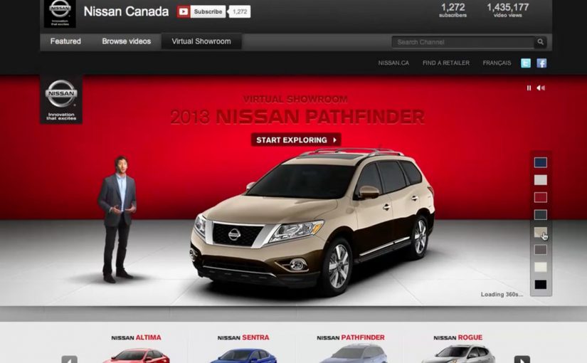
So Nissan decided to bring their dealership to the online audience through a custom YouTube Channel experience.

And for people on the go using smartphones for research, they also created a first of its kind custom mobile YouTube Channel, where they replicated the desktop experience for smaller screens.

As a result Nissan is said to have received an extremely positive response, along with a significant increase in people looking for their dealership after researching.

When a channel becomes product UI

What makes this interesting is not that Nissan published more videos. It is that the channel itself is treated like product UI. Here, “product UI” means the navigation and information scent that helps shoppers self-direct to the next best video step. Instead of forcing viewers to hunt through a generic grid, the experience is designed to guide shopper intent from model discovery to feature deep-dives, then onward to the next step in the buying journey.

A “virtual showroom” in this sense is a structured video experience that lets a buyer explore models, features, and trims in a self-directed way, without sales pressure, and without leaving the environment where they are already doing research.

In automotive marketing, the research screen becomes the showroom. So the channel needs to behave like a product experience, not a playlist.

In platform-led categories, the “research screen becomes the showroom” dynamic shows up anywhere buyers start their learning inside someone else’s interface.

The real question is whether you are designing the research journey, or just uploading assets into a grid.

Why it lands with real car-shopping behavior

The psychology is simple. When someone is researching a car, they want control. They want to compare, replay, and go deep only on the features they care about. A channel-built showroom supports that viewer control, and it keeps momentum high because the buyer never has to “leave to learn” and then try to find their way back.

Extractable takeaway: If your customer’s moment of curiosity happens on mobile, mirror the same structured pathways on the small screen so intent is not lost to a new search.

Business intent: turn video curiosity into dealer intent

Nissan is said to have received an extremely positive response, along with a significant increase in people looking for their dealership after researching. Brands should treat high-intent platform surfaces like product UI when the buyer journey starts there. The strategic bet is clear. If you can keep the research experience coherent and confidence-building, you increase the odds that the next action is dealership search, a test drive, or a shortlist decision, rather than another brand’s video.

Stealable patterns for your next “research-first” launch

  • Design the navigation, not just the content. The way viewers move matters as much as the videos themselves.
  • Map content to buyer questions. Make it easy to jump from overview to the exact feature proof someone is hunting for.
  • Keep parity across devices. If your audience researches on mobile, do not treat mobile as a scaled-down afterthought.
  • Build a clean handoff to the next step. The experience should naturally lead into dealer discovery, test drive intent, or model comparison.

A few fast answers before you act

What is a “virtual showroom” on a brand channel?

A virtual showroom is a structured video experience that helps shoppers explore products like they would in-store, with clear pathways from model overview to feature details, without relying on a salesperson or a separate site.

Why build the showroom inside a video platform experience?

Because that is where research attention already lives. Keeping the experience native reduces friction, preserves intent, and lets buyers move from curiosity to confidence without context-switching.

What makes a mobile virtual showroom different from “mobile video”?

It is not just playback on a phone. It is an interface designed for mobile decision-making, where browsing, comparing, and drilling into details still feels coherent on a smaller screen.

How does this drive dealership outcomes without being pushy?

By making the buyer feel informed and in control. When research is easy and confidence increases, dealer search and test drive intent tend to follow naturally as the next step.

What content do you need for this to work?

You need a library that covers the full set of buyer questions. Walk-throughs, feature explainers, comparisons, and proof points that can be consumed in any order depending on what the shopper cares about.

How do you measure whether it worked?

Track signals that reflect progression in the funnel, such as deeper feature engagement, repeat visits, branded search lift, and increases in dealer-locator usage or dealership queries following content exposure.

Canadian Tire: Christmas Spirit Tree

Canadian Tire wanted to re-energize Christmas spirit and reinforce its position as Canada’s leading Christmas store. So they built a public symbol of the season that behaves like a live dashboard for holiday cheer.

The result was a 30-foot Christmas tree wrapped with 3,000 individually programmed LED lights, powered by the nation’s collective online Christmas spirit. Social monitoring tools scanned blogs, forums, social networks, and news sites for Christmas keywords, then software translated that data into real-time light patterns on the tree.

Turning sentiment into a light show

The mechanic is a clean loop. Capture real-world language at scale. Reduce it to signals a system can interpret. Visualize those signals instantly as a physical experience people can gather around. That translation layer is the whole idea, because it makes something intangible, “spirit”, visible and shared. Here, the translation layer is the software bridge that converts online holiday language into visible light behavior.

In large-scale retail brands, public installations like this can turn social chatter into a measurable, collective ritual that reinforces seasonal ownership.

Why it lands

It gives people a role that feels meaningful without feeling like work. You do not have to download an app or learn a new behavior. You just post a message the way you already would, and the tree responds. That cause-and-effect is what makes the story travel, because the installation feels like it is listening, not just broadcasting.

Extractable takeaway: If you want “community” to feel real, build a visible feedback loop where everyday audience behavior directly changes a shared public object. Then make the transformation obvious enough that people can connect their action to the outcome.

What the campaign is really optimizing for

The objective is not only brand warmth. It is reclaiming seasonal leadership by creating a national-scale proof point that Canadian Tire can own, film, and redistribute. The real question is how to make seasonal sentiment visible in a way only Canadian Tire can own. The tree becomes a repeatable centerpiece for earned media, social sharing, and store association without having to lead with price.

What to steal for your own seasonal playbook

  • Make the idea self-explanatory. “Messages make lights” is a one-sentence mechanic people can repeat.
  • Turn digital into physical. Physical experiences feel more “real” than dashboards or microsites, even when the inputs are purely online.
  • Design for spectators and participants. The best public work rewards both the person who posts and the person who just watches.
  • Build a content engine. If the installation produces fresh patterns continuously, you get ongoing footage and reasons to talk about it.

A few fast answers before you act

What is the core idea of the Christmas Spirit Tree?

A large LED Christmas tree that lights up in response to holiday messages detected online, turning seasonal sentiment into a live public experience.

Why use social monitoring as the “power source”?

Because it makes the audience feel like the energy behind the display. The installation becomes a collective mirror, not a one-way broadcast.

What makes this more effective than a standard Christmas film?

The live feedback loop. People can influence the outcome, and that influence creates participation, talk value, and repeat attention.

Why does the physical tree matter more than a digital counter?

Because a public object turns online sentiment into something people can gather around, film, and talk about. The physical response makes the mechanism feel shared rather than abstract.

What is the biggest execution risk?

If the response feels delayed, random, or unconnected to real posts, the magic breaks. The system must feel immediate and believable.

MCSC: World’s Most Valuable Social Network

When a child goes missing, the first hours matter. The problem is that the people who could help are often nearby, busy, and scrolling.

The Missing Children Society of Canada, with Grey Canada, asks people to “donate” their Facebook and Twitter news feeds. By opting in, a person allows missing-child alerts to be posted directly into their feed, turning everyday social reach into a public-safety broadcast layer.

The distribution logic is local. Alerts are geographically coded, so someone in Toronto sees posts about missing children in their area, not a national firehose.

Turning social feeds into an emergency surface

The mechanism is permissioned publishing. Here, “permissioned” means people explicitly opt in to let the program post on their behalf. Instead of asking people to remember to share posters or retweet at the right moment, the campaign uses opt-in account access to place alerts where attention already lives. Because the alert is published automatically into feeds people already check, it moves faster than a request that depends on manual sharing.

In Canadian public-safety communications, speed and local relevance determine whether a message gets acted on or ignored.

Why this lands better than a generic awareness push

Most “support the cause” messaging competes with everything else in the feed. This flips the frame. The feed itself becomes the tool, and the content is time-sensitive and action-oriented. This is a stronger model than a generic awareness push because it routes attention into action without extra steps.

Extractable takeaway: If the mission depends on time, do not optimize for “awareness.” Optimize for distribution mechanics that reduce steps at the moment of need, and constrain the message to the people who can realistically act.

Geo-coding is the quiet hero here. Locality reduces fatigue, increases perceived responsibility, and makes the alert feel like a neighborhood problem, not distant tragedy content.

What the campaign is really building

Beyond any single case, this creates a repeatable digital volunteer layer. Every donated feed is a standing commitment, and every local alert becomes a test of whether the network can mobilize attention fast enough to matter.

The real question is whether you can convert passive sympathy into permissioned, local distribution during the first hours.

Design moves worth borrowing

  • Make opt-in feel like “donation.” People understand giving reach the way they understand giving money.
  • Automate the share. Remove the “I should post this” friction.
  • Localize by default. Relevance is the difference between help and noise.
  • Keep the message actionable. Clear identifiers and a next step beat emotional copy in urgent scenarios.

A few fast answers before you act

What does it mean to “donate” your social media feed in this campaign?

You opt in so missing-child alerts can be posted directly to your Facebook or Twitter feed, using your reach to distribute time-sensitive information.

Why use geo-coded alerts?

It keeps the feed relevant and increases the chance someone nearby recognizes the child or has useful information, while avoiding national alert fatigue.

What problem is this solving compared to posters or standard PSAs?

Speed and placement. It puts alerts into a high-attention channel immediately, without relying on people to take an extra step to share.

What should a program like this measure?

Opt-in volume, local reach per alert, time-to-first-distribution, engagement actions that indicate reading, and downstream reporting behavior where available.

What’s the smallest version you can pilot?

Start with a single opt-in flow, a clear local targeting rule, an approval workflow for posting, and one simple call to action that tells people exactly what to do if they have information.