TD Canada Trust: Automated Thanking Machine

TD Canada Trust: Automated Thanking Machine

Start with the smile. Then design backwards

Start with the smile of your audience, then work back from there. That is the key to many of the marketing campaigns people actually share. Coca-Cola has done a great job with their various happiness campaigns, followed by WestJet’s Christmas campaign where they surprised passengers with gifts.

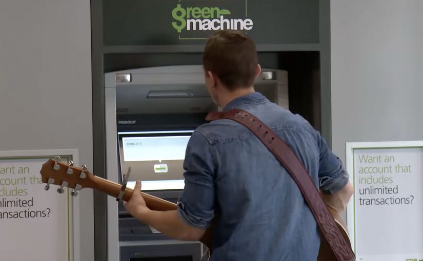
When an ATM stops being a machine

TD Canada Trust, for its “TD Thanks You” campaign, converts select ATM machines in Toronto, Montreal, Calgary and Vancouver into special Automated Thanking Machines. Twenty hand-picked customers are invited to test them.

The twist is that the ATM behaves like a person. It knows their name, talks back, and responds in ways a standard ATM never would. Then it escalates into the payoff: unexpected, genuinely personal gifts that feel tailored to the customer, not to the bank.

In retail banking and other trust-based categories, surprise-and-delight, meaning an unexpected human response inside a standard service moment, works best when it turns a routine transaction into personal recognition that feels operationally real.

The video is the distribution layer

The reactions are the asset. This is less about the ATM technology than about capturing the moment people realize a faceless institution is paying attention. The real question is how a trust-heavy brand makes gratitude feel personal without making it feel fake. As reported, the video has racked up millions of views in days because the story is instantly legible: a familiar interface becomes human, and the customer response does the persuasion.

Why it lands

Banks are trained to look serious, consistent, and slightly distant. This flips that expectation without abandoning credibility, because the setting stays “bank-real” and the interaction starts from a normal ATM flow. The experience also scales conceptually. Any service brand with a repetitive touchpoint can imagine doing a version of this.

Extractable takeaway: If your category is low-emotion or low-trust, pick a familiar moment, introduce one human signal that feels impossible in that context, then let the customer reaction carry the message.

What to steal from an ATM that says “thanks”

  • Use a familiar interface as the stage. The more ordinary the starting point, the bigger the perceived magic when it shifts.
  • Personalization beats scale. One moment that feels truly “for me” outperforms ten generic giveaways.
  • Escalate in steps. Name recognition. Conversation. Then reward. The ramp makes the payoff believable.
  • Design the filming around authenticity. A hidden-camera feel is part of the proof, even when the experience is planned.

A few fast answers before you act

What is TD’s “Automated Thanking Machine”?

It is a TD ATM adapted to greet and interact with select customers, then deliver surprise gifts as part of the “TD Thanks You” campaign.

Why does the ATM format work so well?

An ATM is the definition of impersonal service. Making it behave personally creates instant contrast and instant story value.

What’s the real mechanism behind the idea?

Not the screen. The mechanism is staged personalization at a routine touchpoint, captured on video, where real customer reactions become the proof.

What makes this shareable beyond banking customers?

The narrative is universal: a machine becomes human, then gratitude becomes tangible. You do not need product context to feel it.

How can another brand apply this without copying it?

Pick one repetitive customer moment, add one unexpected human signal, then reward the customer in a way that is clearly based on who they are, not who you want them to be.

Amazon Dash: When Commerce Becomes a Button

Amazon Dash: When Commerce Becomes a Button

A tiny button that quietly changes how buying works

When Amazon introduces Dash, it does not look like a revolution. No screens. No interfaces. No checkout flow.

Just a small physical button. One press. Reorder complete.

At first glance, Amazon Dash can feel like a gimmick. But in practice, it signals something more fundamental. A deliberate attempt to remove shopping itself from the act of buying.

What Amazon Dash does in the home

Amazon Dash, often described as the “Dash Button”, is a physical, Wi-Fi-connected button linked to a specific household product. Detergent. Coffee. Pet food. Batteries.

You place it where the need happens. On the washing machine. Inside a cupboard. Near the dog food bowl.

When you run out, you press the button. Amazon handles the rest.

No browsing. No comparison. No cart. No second thought.

Intent compression is the point, not the plastic

The button is not the story.

The real shift is intent compression. By intent compression, I mean collapsing need recognition, product choice, payment, and fulfillment into one trigger that requires almost no thought.

The real question is what happens to brand choice when reordering stops being a decision and becomes a reflex.

Dash is not a gimmick. It is a blueprint for default-setting commerce.

In replenishment categories like household essentials and other repeat-purchase goods, the winner is the brand or platform that becomes the default reorder, not the one that wins the next search.

Why “no interface” feels so good

Dash works because it removes cognitive load at the exact moment people are most willing to simplify. When a household runs out, the goal is not discovery. It is restoration. A one-press action fits the habit loop. Trigger, action, relief.

Extractable takeaway: If you can remove steps at the moment of need, you do not just improve conversion. You reshape behavior, because people repeat what feels effortless and reliable.

That same mechanism explains why Dash can feel uncomfortable. Accidental orders. Reduced price transparency. Loss of conscious choice. The discomfort is the point, because it reveals the boundary of how much control people will trade for frictionless convenience.

What Amazon is really buying with Dash

Dash compresses multiple steps. Need recognition. Product selection. Payment. Fulfillment. Into a single physical action.

Seen from that angle, Dash is less about buttons and more about locking demand upstream, before competitors even enter the consideration set.

Dash is also a learning system. It teaches Amazon about behavior, habit formation, replenishment cadence, and reorder economics, because the “moment of truth” becomes measurable and repeatable.

A signal to brands, not just consumers

For brands, Amazon Dash carries a subtle but powerful message.

If you win the button, you win the household. If you lose it, you disappear from the moment of need.

Traditional branding competes on shelves and screens. Dash shifts the battlefield into kitchens and cupboards. Physical presence becomes digital dominance.

Distribution is no longer only about visibility. It is about defaultness. Defaultness here means being the preselected choice a household reorders without revisiting the decision.

What to steal if you are not Amazon

The logic behind Dash is bigger than the hardware. Commerce keeps moving toward fewer decisions, fewer interfaces, more automation, and stronger platform pull.

  • Design for replenishment moments. Identify “run out” triggers and reduce the steps required to restore.
  • Compete for the default. Build experiences that make the second purchase easier than the first.
  • Make the trade-off explicit. Add lightweight safeguards (clear confirmations, simple cancellations, price-change visibility) so convenience does not feel like a trap.
  • Instrument the habit loop. Measure time-to-reorder, reorder frequency, and churn as first-class signals, not just conversion.
  • Protect trust. If the experience becomes invisible, reliability becomes the brand.

Sometimes, the future of shopping is just a button on a wall. The bigger story is what happens when buying becomes infrastructure.


A few fast answers before you act

Is Amazon Dash “just a button”?

No. It is a button plus an operating model that turns reordering into a near-automatic behavior.

What does “intent compression” mean in this context?

It means collapsing multiple steps. Recognize need, choose product, pay, and fulfill. Into one trigger with minimal deliberation.

Why does Dash matter even before voice becomes mainstream?

It proves the “no interface” ambition using a simple physical shortcut. It removes friction without needing new user behavior like talking to a device.

What is the strategic advantage for Amazon?

Dash moves competition upstream by capturing repeat demand before a shopper compares alternatives. That makes loyalty structural, not persuasive.

What is the core risk for brands?

If replenishment becomes default-driven, brands that are not the default become invisible at the moment of need, even if awareness is high.

What is the consumer downside, and what mitigates it?

The downside is reduced price awareness and accidental orders. Mitigations are clear confirmations, transparent price-change cues, and easy reversibility.

Zappos Thanksgiving Baggage Claim

Zappos Thanksgiving Baggage Claim

Thanksgiving Eve is one of the most stressful days to travel. So Zappos shows up in a place most people associate with impatience. The baggage claim carousel.

At Houston’s George Bush Intercontinental Airport, Zappos turns sections of a baggage carousel into a roulette-style game. Parts of the moving belt are marked with prizes and slogans. When your suitcase arrives and lands on a prize square, you win what it lands on. That can be a product prize or a gift card. Suddenly, the worst part of the journey becomes the most watchable part.

Why the idea works

The real question is how you turn captive waiting into a brand moment without adding any extra steps. The activation flips the emotional context. Baggage claim is pure friction. Zappos turns it into anticipation. Here, “activation” means a brand experience that reworks an existing touchpoint rather than creating a new destination. People are already looking at the carousel. They are already waiting. By making the outcome visible and immediate, the same waiting behavior becomes suspense. This is smart experience design because it changes the feeling of the wait without adding friction.

Extractable takeaway: When attention is guaranteed, you do not need more messaging. You need a simple mechanic that changes what the same behavior feels like.

The CX mechanics are simple by design

  • No app. No instructions. You just wait as usual.
  • Instant feedback. Your bag lands. You know if you win.
  • Social energy. People around you start watching your outcome too, because it is a shared moment.

In enterprise retail and travel environments, the biggest CX wins often come from redesigning unavoidable waiting, not adding steps.

Design moves worth copying

  • Pick a real pain point where attention is already guaranteed, then redesign the emotion of that moment.
  • Make participation automatic. If people must opt in, you lose most of the crowd.
  • Use a reward that is immediate and credible, so the surprise feels real, not promotional.

A few fast answers before you act

What is the Zappos Thanksgiving baggage claim activation?

A roulette-style baggage carousel game at an airport on Thanksgiving Eve where travelers win prizes based on where their luggage lands.

Why is baggage claim such a strong place for this?

It is a high-friction moment with captive attention. Everyone is already watching the belt and waiting.

What is the core experience design principle?

Reduce friction by changing the emotion of the same behaviour. Waiting stays the same, but it becomes suspense and delight instead of irritation.

How does it work without an app or instructions?

Participation is automatic. You wait for your bag as usual, and the belt markings tell you instantly whether you won.

What is the minimum you need to replicate the pattern?

A captive-wait moment, a visible game mechanic, instant feedback, and an immediate, credible reward.