Volkswagen #Polowers: Tweet-Powered Race

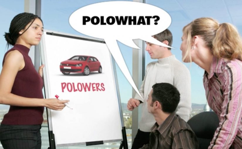
Volkswagen Polo is one of the most desired cars amongst the youth of Spain. To make a big entry DDB Spain created a Tweet based race that would make VW Polo the most trending topic on Twitter for that day.

A special hashtag #Polowers was created in order to give a name to the VW Polo Followers. Then to generate conversation amongst the Polowers a race was setup where each tweet took the follower to the first position. In this context, a tweet-based race means every tweet with the #Polowers hashtag updates a live leaderboard.

The real question is: how do you turn a low-effort social action into sustained participation during a short launch window?

This is a smart mechanic because it turns public rank into the content people return to influence.

When the Polo stopped at one of the 5 designated stops, the follower in the first position at that time would win a prize, iPad, Denon Ceol music system, Leica D-Lux 5 camera, VW Bike and eventually the grand prize VW Polo itself.

In terms of results, the campaign generated more than 150,000 tweets in 8 hours after launching, at a rate of 5 tweets per second and reached more than 10% of Twitter’s total audience in Spain. It also became the leading Top 10 trending topic and generated a record breaking amount of traffic to Polo’s product section on Volkswagen.es.

Last year Mercedes-Benz had created a tweet based race that had real life cars fueled by tweets. Check out that campaign here.

Why this mechanic works

This is a clean real-time loop. Tweeting is the action. Rank is the feedback. Prizes are the incentive. The “race” gives people a reason to keep going, because every new tweet can change the leader. Because rank shifts are immediate and visible, people keep tweeting to defend or steal the top spot.

Extractable takeaway: If you make the user action measurable and publicly visible in real time, participation grows because people can see their impact instantly.

  • Identity creates belonging. #Polowers turns followers into a named group.
  • Progress is instant. One tweet changes position immediately.
  • Time pressure drives volume. Five stops create multiple “now” moments.
  • Reward cadence sustains momentum. Smaller prizes build toward the grand prize.

In European launch campaigns that need fast, time-boxed social momentum, a live leaderboard loop like this helps convert attention into repeat action inside a single mechanic.

What to take from this if you run social campaigns

  1. Design a loop that explains itself. If the rule fits in one sentence, participation scales.
  2. Make the scoreboard the content. Rankings create a story people want to influence.
  3. Use milestones. Stops and deadlines create peaks instead of a flat timeline.
  4. Measure beyond buzz. Here the campaign also drove traffic to the Polo product section, not just tweets.

A few fast answers before you act

What was Volkswagen #Polowers?

It was a tweet-based race in Spain where participants used the #Polowers hashtag, and tweeting moved them into first position in a live competition for prizes and a chance to win a VW Polo.

How did the prize mechanic work?

When the Polo stopped at one of five designated stops, the follower in first position at that moment won a prize. The grand prize was a VW Polo.

What were the reported results?

More than 150,000 tweets in 8 hours, around 5 tweets per second, reaching more than 10% of Twitter’s total audience in Spain, plus Top 10 trending status and record traffic to Volkswagen.es Polo pages.

Why did the hashtag matter?

#Polowers gave the community a name and made participation visible, searchable, and easy to join.

What is the transferable lesson?

If you turn a simple action into a live competition with clear milestones and meaningful rewards, social participation can compound quickly.

Philips Russia: The Art of Ironing

Earlier this year I had covered a couple of novel approaches to art. Joining that collection is this film from Philips Russia, where the performance of its irons and steamer products is demonstrated by recreating famous Dutch paintings on a plain piece of white cloth.

It is a simple setup with a surprising payoff. A sheet. A tool you already understand. Then, with pressure, heat, and steam, the fabric starts behaving like a canvas.

When fabric becomes a canvas

The craft trick is that wrinkles and flattened areas act like light and shadow. Steam relaxes fibres, pressure fixes the fold, and controlled temperature makes the result repeatable. In other words, the “brushstroke” is not pigment. It is texture, created and locked in by the iron.

In global consumer electronics and home appliance marketing, the hardest job is to make small performance differences feel tangible in seconds.

Why it lands

This works because it makes an invisible promise visible. Most iron claims are abstract. More steam. Better glide. Fewer wrinkles. Here, the demonstration turns those claims into a proof you can read from across the room. That is why the idea persuades so quickly: the same steam, pressure, and temperature control needed to shape fabric into a portrait also signals control over everyday wrinkles. If an iron can reliably “draw” with fabric, it can reliably handle a shirt collar.

Extractable takeaway: When your product benefit is hard to evaluate (speed, precision, consistency), design a demo where the benefit becomes a visible artefact. The artefact should be legible instantly and hard to fake without the real capability.

What Philips is really selling

The paintings are the hook, but the real message is controllability. Consistent steam output. Predictable temperature. Even pressure. The art is not the point. It is the credibility vehicle that lets viewers infer performance without needing specs.

The real question is how to make product control visible before a viewer has to trust the spec sheet.

The spot is credited to DDB Moscow, which fits the overall approach. Make the proof the story, not the claim.

What to steal for your next product demo

  • Pick a “hero capability” and exaggerate it safely. If precision matters, show precision at a level nobody expects in the category.
  • Use a familiar reference. Famous paintings function as a built-in quality benchmark. Viewers know what “good” looks like.
  • Make the proof readable without explanation. If the demo needs narration to work, it is probably not a demo yet.
  • Engineer for repeatability. The best demos look like magic, but behave like a process.

A few fast answers before you act

What is “The Art of Ironing”?

It is a Philips Russia film that demonstrates iron and steamer performance by recreating classic Dutch paintings using wrinkles and flattened texture on white cloth.

What product point does the demo prove?

Control and consistency. Steam output, temperature stability, and pressure control are implied by the ability to create repeatable, detailed fabric texture.

Who is credited for the campaign?

The campaign is credited to DDB Moscow.

Why use famous paintings instead of an original design?

Recognition compresses understanding. Viewers instantly know the reference, so they can judge the fidelity without being taught the criteria.

How can another brand use this approach without copying it?

Translate the principle, not the prop. Choose a culturally familiar benchmark in your category, then create a visible artefact that only your real capability can produce.

McDonalds Hamburger Timetable

You wait for a train at Warsaw’s Central Station and check the departure board. Everything looks normal at first. Destination, track number, platform. Then you notice the twist. The wait time is not shown in minutes. It is shown in hamburgers, cokes and fries.

The idea. Make waiting feel shorter by making it measurable

McDonalds in Poland finds a creative way to make waiting for the train less agonizing for passengers and more profitable for its trainside location. The board translates delay time into a simple, food-based unit people instantly understand.

How it works at the station

In cooperation with PKP (Polish State Railways), McDonalds installs a special timetable about 50 meters from the main hub of Warsaw’s Central Train Station. It displays departure time, destination, track number, and platform information as usual. The difference is the wait and delay time, which appears as burgers, cokes and fries.

In transit retail, waiting time is one of the few moments when attention and immediate purchase intent sit in the same place.

Why this lands as a smart retail nudge

Here, a retail nudge means a light prompt that changes the next action without forcing it. The mechanic does not interrupt. It reframes the moment. The real question is how to turn dead waiting time into a branded action without making the brand feel intrusive. Because the board converts minutes into food units, grabbing food becomes the obvious way to spend the time. McDonalds is right to keep this utility first, brand second, because that is what makes the prompt feel clever rather than pushy.

Extractable takeaway: When a brand translates spare time into a simple unit tied to an immediate action, the message feels useful first and persuasive second.

What the result signals

While making the train station a more enjoyable place for waiting passengers, McDonalds sees an increase of 4,500 customers in the first month itself. The business intent is clear: convert idle station time into store traffic at the moment of highest relevance.

What to steal for retail nudges in waiting moments

  • Translate time into a brand-shaped unit. When minutes become “one burger”, the next action becomes self-evident.
  • Place the nudge exactly at the decision point. The board sits in the flow of passengers, not in a separate ad zone.
  • Keep the mechanic utility-first. It still behaves like a timetable, so people accept it instead of resisting it.
  • Make the conversion instantly readable. If it takes explanation, the moment is already gone.

A few fast answers before you act

What is the McDonalds Hamburger Timetable?

It is a train timetable that displays delay and waiting time as McDonalds menu items, like burgers, fries and Coke, instead of minutes.

Why does converting minutes into food items influence behaviour?

Because it makes the wait feel like “time you can spend” rather than “time you lose”. It also provides a natural suggestion for what to do next without using a hard call-to-action.

What makes this feel helpful instead of salesy?

It behaves like a real timetable first and a brand cue second. That utility lowers resistance because the brand message is embedded in something people already need to read.

What is the core design lesson?

Translate a boring metric into a simple, brand-linked unit that is immediately understood, and place it exactly where the decision happens.

Where else can this pattern work?

Any waiting context with nearby commerce. Transit hubs, queues, ticketing areas, and event entry points all benefit when “time to kill” becomes “time to enjoy”.