Apotek Hjärtat: Blowing in the Wind

Apotek Hjärtat: Blowing in the Wind

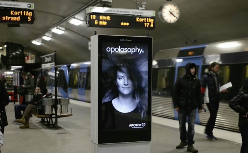
A subway platform in Stockholm. A digital screen. A model with a lush mane. Then the train arrives and her hair starts to whip around, perfectly timed to the rush of air you can feel on the platform.

To introduce a new line of hair products, Swedish pharmacy Apotek Hjärtat worked with Åkestam Holst to fit the platform screens with ultrasonic sensors. When those sensors detect an incoming train, the film switches into a “blowing in the wind” sequence, creating the illusion that the turbulence from the train is affecting the model on the screen.

The trick behind the timing

This is reactive outdoor done with restraint. Here, reactive outdoor means the screen responds to a real environmental trigger instead of running the same sequence on a fixed loop. There is no complex interface and no extra instruction for commuters. The environment provides the trigger, the sensor provides the cue, and the creative provides the payoff. The moment is over in seconds, which is exactly how long you get on a platform before attention snaps back to schedules and crowds.

In high-traffic transit environments where attention is scarce, reactive outdoor works best when it synchronizes with a real-world moment everyone already notices.

Why commuters stop

The effect feels “impossible” because it is contextual and precise. People experience the wind and see the wind at the same time. That sensory alignment is what makes it memorable, and it makes the product claim feel physical instead of cosmetic.

Extractable takeaway: If you want outdoor to earn attention, link the creative to a shared environmental trigger, and make the response immediate enough that viewers can connect cause and effect without being told.

What the brand is signaling

The story is not really about sensors. It is about vitality. The real question is whether the public moment makes the product promise feel physically true before the commuter moves on. The ad implies the product brings hair to life, then proves that idea through a living, timed reaction in a public space. You remember the feeling first, then the brand name attached to it.

What to steal for reactive outdoor

  • Pick a trigger that already exists. Trains arriving, doors opening, crowds gathering.
  • Make the payoff instantly legible. One glance should be enough to get it.
  • Use craft to hide the tech. The illusion matters more than the explanation.
  • Design for repeat viewing. Platforms are perfect for loops, because people wait.

A few fast answers before you act

What is “Blowing in the Wind”?

A reactive DOOH installation for Apotek Hjärtat where ultrasonic sensors detect an approaching subway train and trigger a film effect that makes the model’s hair appear to blow in the train’s turbulence.

What is the core mechanism?

Sensor detects train arrival. Creative switches at the same moment the real airflow hits the platform. The viewer experiences both together, which sells the illusion.

Why does it feel more persuasive than a normal screen ad?

Because it is synchronized with the physical environment. That alignment makes the message feel like something happening, not something being played at you.

What is the most common mistake when copying this pattern?

Overbuilding the interaction. If viewers need instructions, or if the trigger is unreliable, the magic disappears and the screen becomes just another screen.

Why does the product claim feel more real than in a standard beauty ad?

Because the demonstration is tied to a real physical cue on the platform. That makes the benefit feel observed in the moment, not merely claimed in the creative.

Polar Beer: Cell Phone Nullifier

Polar Beer: Cell Phone Nullifier

There is a specific kind of modern annoyance. You go out with friends, and ten minutes later the table is lit by phone screens instead of conversation.

Polar, a regional Brazilian beer brand, decides to treat that as a solvable problem. If phones steal the night, then the beer should give it back.

A beer cooler that changes the rules of the table

The mechanism is a physical prop with a blunt promise. A special Polar cooler is described as blocking 3G, 4G, Wi Fi, and GSM signals for devices within roughly a five-foot radius. Order Polar. Get served in the cooler. Watch the room look up.

In bar and nightlife settings, the strongest behavior-change ideas work when they attach to an existing ritual and alter it with minimal effort from the audience.

Because the cooler makes the phone temporarily useless at the table, conversation becomes the path of least resistance.

Why it lands, even if people hate it for a minute

This plays with a familiar tension. Everyone complains about “phubbing,” the habit of snubbing people in front of you by focusing on your phone, but nobody wants to be the first person to say “can we put phones away.” The cooler does the awkward social work on behalf of the group.

Extractable takeaway: If a social norm is breaking down, redesign the environment so the better behavior becomes the default. Remove the need for a lecture, and replace it with a small constraint that everyone experiences equally.

The brand benefit is also clean. Polar is not asking for attention. It is buying it back for you, then sitting at the center of the moment it created.

What the stunt is really selling

On the surface it is a gadget. Underneath it is a positioning move. Polar equates itself with real-world connection and the kind of night people say they want, even when their hands keep reaching for the screen.

The real question is whether you can earn attention by subtracting distraction, not by adding more stimulation.

This is a smart positioning move because it delivers the promise through the ritual, not through a slogan.

It is also a reminder that “anti-tech” can be a tech story. The cooler is not anti phone as an identity. It is pro conversation as an outcome.

Steal this for phone-free nights

  • Target the moment, not the attitude. Fix the table behavior, not the entire relationship with smartphones.
  • Use a prop that belongs in the setting. A cooler at a bar feels natural. A lecture does not.
  • Make it equal. The constraint applies to everyone in range, so it feels like a shared game, not a personal attack.
  • Build a story people retell in one sentence. “The beer that makes your phone stop” spreads fast.

A few fast answers before you act

What is Polar’s “Cell Phone Nullifier”?

It is a branded beer cooler concept described as cutting off nearby phone connectivity, so people ordering Polar are nudged into talking to each other instead of scrolling.

Why does blocking the signal work as a behavior-change tactic?

It removes the temptation rather than arguing with it. By changing the environment, it turns “I should put my phone away” into “my phone is not part of the table right now.”

What is the core creative mechanism here?

A familiar bar object is redesigned to enforce a social norm. The product ritual, ordering beer and receiving it in a cooler, becomes the delivery system for the idea.

How can brands adapt this without feeling preachy?

Focus on shared benefits and shared participation. Make the intervention playful and collective, and keep the user action simple and voluntary.

What is the biggest risk if you copy this idea?

If the constraint feels forced or punitive, it becomes the story instead of the conversation it was meant to protect. Keep it lightweight, contextual, and easy to opt into.

Coca-Cola Turkey: Invisible Vending Machine

Coca-Cola Turkey: Invisible Vending Machine

Since the time I started writing this blog, I have come across many innovative vending machines. Some I featured right here on Ramble.

Now to add to this collection, here is an invisible vending machine from Coca-Cola Turkey that becomes visible only when couples walk by. The machine was created specially for Valentine’s Day (last week) and was installed in Istanbul to spread happiness Coca-Cola style.

A vending machine you cannot see until the right moment

The trick is the reveal. What looks like a normal stretch of wall becomes a vending interface only when two people approach together. That instant transformation creates a micro-scene, and the micro-scene pulls in everyone nearby.

In consumer brand activations, public installations work best when the interaction is obvious, fast, and shareable without instruction.

How the interaction is described to play out

  • Invisible by default. The unit blends into the wall and does not present itself as a machine.
  • Couples trigger the reveal. When two people pass together, the interface lights up and becomes visible.
  • Personal moment, not just a dispense. In coverage at the time, the machine asks for names and then produces two personalised cans.

Why it lands

This is not “another vending machine story”. It is a street-level surprise that creates a small, romantic spotlight for a couple, and a quick bit of theatre for everyone else. The invisibility is not a gimmick. It is a pacing device that makes the reveal feel like a reward. The real question is whether the experience creates a transformation that bystanders can explain in one sentence.

Extractable takeaway: If you want people to stop, watch, and retell an activation, build a visible transformation into the experience. A before-and-after moment is easier to share than a static stunt.

What Coca-Cola gets out of the Valentine framing

Valentine’s Day provides the social permission for public sweetness, names, and sentiment. For the brand, it is a clean link back to togetherness and “sharing happiness”, while turning a sample into a story people can repeat without being prompted.

Retail theatre patterns worth borrowing

By “retail theatre” I mean designing a retail moment as a small piece of live, shareable experience, not just a dispense or transaction.

  • Hide the interface until it matters. Visibility can be part of the reward, not just a prerequisite.
  • Keep the trigger legible. People should understand why it happened in one glance, or they will not mimic it.
  • Design for bystanders. The couple is the participant. The crowd is the media channel.
  • Personalise lightly. Names, messages, or small custom outputs feel intimate without needing heavy data.

A few fast answers before you act

What is the “invisible vending machine” concept?

A vending machine that stays hidden until a couple approaches, then reveals itself and delivers a Valentine-themed Coca-Cola moment.

Why make the machine “invisible” at all?

It creates a sharp reveal, and that reveal is the shareable payload. People remember transformations more than static installations.

What is the simplest way to replicate the effect?

Use a clear proximity trigger plus lighting and screen content that turns on instantly, and ensure the “why it appeared” is immediately understandable.

What is the biggest execution risk?

If the trigger is inconsistent or unclear, people will not repeat the behaviour and the crowd will not form. Reliability matters more than complexity.

What should you measure beyond views?

Dwell time, participation rate per hour, bystander clustering, social mentions generated on site, and any lift in nearby sales during the activation window.