Mercedes-Benz: Flying Car

Mercedes-Benz: Flying Car

Mercedes-Benz, with the help of Ponto de Criacao from Brazil, executed a highly segmented vertical action to increase visibility for the brand among top executives and business people. Here, “vertical action” means a narrowly targeted activation placed in a single corridor that concentrates the exact audience you want.

Flying Car by Mercedes Benz

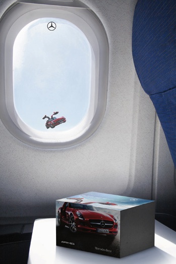
As a courtesy, passengers also received a miniature car.

Flying Car by Mercedes Benz

In one month, 100% of the target audience was reached, nearly 400 executives.

In premium automotive marketing aimed at senior business travelers, attention is scarce and context is often the only reliable way to earn it.

When the audience is this narrow and valuable, precision distribution can outperform broad reach because the placement becomes the idea.

Why this placement is so effective

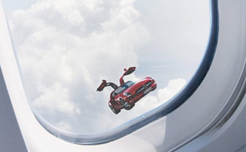
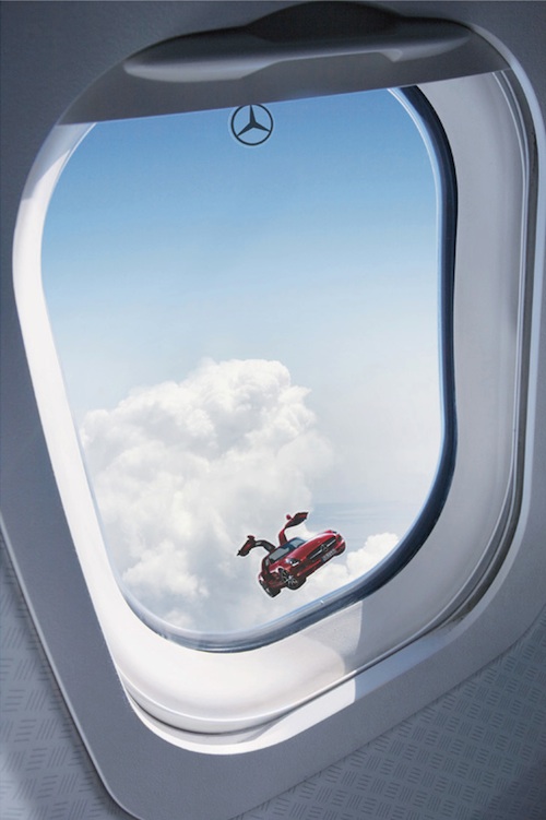
The mechanism is simple and the payoff is immediate. By turning the aircraft window into the “media unit,” the mind completes the illusion, which makes the moment feel native, surprising, and worth retelling.

Extractable takeaway: When your audience is concentrated in a repeatable corridor, design a message that only works in that context so the situation does the persuasion for you.

  • Context does the work. The illusion only makes sense in-flight, which turns a standard window view into a brand moment.
  • Precision beats scale. Shuttle flights concentrate the exact audience Mercedes-Benz wanted, without wasting impressions.
  • Low friction, high memorability. A simple sticker creates an instant “did you see that?” effect, then the miniature car extends the memory.

What to take from it

The real question is which high-value corridor your audience repeats, where attention is naturally high, and where your message can feel native instead of intrusive.

When the audience is narrow and valuable, distribution can be the idea. This activation did not rely on complex tech. It relied on selecting the right corridor, placing the message where attention is naturally high, and creating a visual that feels native to the moment.

  • Start with the corridor. Identify the repeatable moment where your audience is already together and already looking.
  • Make the context do the explaining. Build the visual so it only makes sense there, so the placement becomes the punchline.
  • Extend the memory. Add a small, simple takeaway that keeps the moment alive after the corridor ends.

A few fast answers before you act

What was “Flying Car” by Mercedes-Benz?

It was a targeted activation that placed SLS AMG window stickers on shuttle flights, creating the illusion of the car “flying” outside the aircraft window for executive travelers.

Why use shuttle flights for this?

Because those routes clustered top executives and business travelers, delivering near-perfect audience fit with minimal wasted reach.

What role did the miniature car play?

It extended the experience beyond the flight as a physical takeaway, reinforcing recall after the moment passed.

What is the transferable pattern?

Pick a narrow, high-value corridor, design a context-native visual that only works there, then add a small extension to carry the memory forward.

How do you apply this pattern without access to flights?

Find any repeatable corridor that concentrates your audience, then design a context-native cue that only works in that moment and can be carried forward with a simple takeaway.

McDonald’s: Adult Playland in Sydney

McDonald’s: Adult Playland in Sydney

A Playland built for adults, not kids

In order to awaken the inner child in McDonald’s adult consumers, McDonald’s and DDB Sydney built an adult sized Playland in the middle of Sydney.

Supersizing the familiar to make it feel new again

The mechanism is physical and immediate. Take an icon people associate with childhood, then rebuild it at adult scale and put it directly in the path of commuters. It is not a message about fun. It is fun, placed in public, with no explanation required.

In Australian CBD (central business district) commuter culture, a surprising public installation can interrupt routine and create instant permission to behave differently for a moment.

The real question is whether you can give adults permission to participate without making them feel childish.

Why it lands: it removes the awkwardness of “acting like a kid”

Adults do not need to be convinced that play is enjoyable. They need permission. By making the Playland explicitly adult-sized and placing it in the city centre, the brand turns nostalgia into a socially acceptable break from routine.

Extractable takeaway: When adults hesitate, design the environment so participation feels socially legitimate, not self-conscious.

The business intent: rebuild emotional closeness through participation

This is a reconnection play, meaning it is designed to rebuild emotional closeness through participation rather than persuasion. This is the better move than a nostalgia message when you need adults to act in public. Instead of asking adults to remember McDonald’s, it gives them a shared experience they can literally step into, then ties that memory back to the brand.

Since the time of the launch in March, McDonald’s reported that more than 300 people have taken advantage of this playground on a daily basis and engaged with McDonald’s in a way they had not for years.

Design moves that get adults to play in public

  • Use a recognisable icon. Familiarity lowers the barrier to participation.
  • Change scale to change behaviour. Adult-sizing makes the experience feel legitimate, not childish.
  • Place it where routine is strongest. The contrast is what creates attention and talk value.
  • Make the experience the proof. Participation creates memory faster than any claim can.

A few fast answers before you act

What did McDonald’s build here?

An adult-sized Playland installation in central Sydney, designed to let adults play in a familiar McDonald’s-style playground environment.

What is the core mechanism?

Rebuild a childhood icon at adult scale and place it directly in the path of commuters. The experience is the message, with no explanation required.

Why does it work psychologically?

Adults do not need to be convinced that play is fun. They need permission. Adult-sizing plus public placement makes participation socially acceptable.

What business intent does it serve?

Rebuild emotional closeness through participation. A shared, physical experience creates memory and talk value that a standard campaign claim cannot.

What is the most transferable takeaway?

If you want real engagement, put a recognisable, low-friction action in a high-routine place, and let participation do the persuasion.

KLM: Suitcase Art Project

KLM: Suitcase Art Project

How do you communicate attractive prices when people are bored of tactical campaigns and ignore yet another “deal” message? KLM answers that by making the price story behave like culture instead of advertising.

Turning fares into a city-wide art moment

KLM and Leo Burnett Budapest invite Hungary’s most talented young artists to create artworks inspired by KLM destinations, then place those works around the city so the environment itself becomes an urban gallery. The result is described as a tactical campaign that people treat like an event.

The mechanism: destination inspiration, public display, social talk value

Mechanically, the work shifts “price communication” into a set of visual anchors that are easier to notice, photograph, and discuss than conventional fare banners. Instead of asking audiences to care about numbers first, it earns attention through craft, then lets the brand and destinations ride that attention. Because the visual anchors are built to be noticed and shared, the offer benefits from social talk value instead of competing for banner attention.

In European travel marketing, reframing a tactical offer as a public experience can restore attention without changing the offer itself.

Why it breaks through when tactical work gets ignored

Most price-led creative competes in the same visual language: small type, disclaimers, urgency cues. Art flips the hierarchy. It gives people a reason to stop that is not the price, then makes the price message feel like a discovery rather than an interruption. This is a stronger play than trying to out-urgency every other fare banner.

Extractable takeaway: When your message is tactical by nature, earn the first second with something people would choose to notice, then let the offer land as the payoff.

What KLM is really buying

The business intent is not only incremental ticket consideration. It is mental availability. By mental availability, I mean being the brand that comes to mind in a destination or booking moment without needing a hard sell. KLM shows up as a brand that puts something into the city, not just a brand that takes attention out of it. That association can make the next tactical message feel less disposable.

The real question is whether your next “deal” message can earn attention before it asks for action.

Steal this when deal messages get ignored

  • Wrap the tactical truth in a non-tactical container. Put the deal inside a format people would choose to engage with.
  • Design for public visibility. If it looks good in the street, it travels further online with less paid support.
  • Use craft to earn the first second. Attention is the gate. Price can come second.
  • Make the brand additive. The activation should feel like it contributes to the audience’s day, not like it interrupts it.

A few fast answers before you act

What is the Suitcase Art Project in one line?

A fare communication idea that uses destination-inspired artworks displayed across the city, turning a tactical message into a cultural moment people want to notice and share.

What problem is it solving for KLM?

Banner blindness and fatigue around price-led messaging. It creates attention through art first, then lets the offer benefit from that attention.

Why does “art in public space” help price communication?

Because it changes the viewer’s mindset from “being sold to” into “discovering something”. That shift makes the message more memorable and less ignorable.

What is the most transferable principle?

If your message is inherently tactical, change the format and context so people approach it with curiosity instead of resistance.

What can you do if you cannot run a city-wide activation?

Use the same pattern at a smaller scale. Create one distinctive artifact people would still choose to photograph or share, then let the offer ride the attention that artifact earns.