Mikado Resistance Test

Mikado Resistance Test

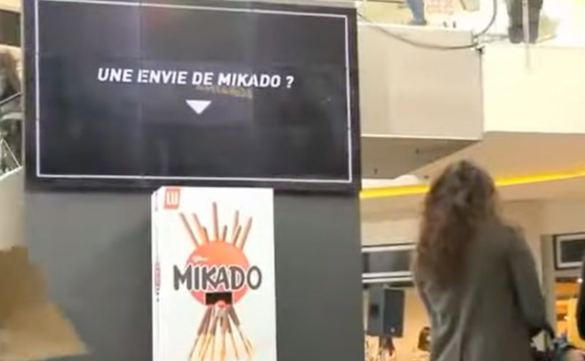
You are doing your shopping in a mall, and you spot a giant Mikado dispenser. Above it, a message scrolls: “Une envie de Mikado ? Vous ne devriez pas…”. A free box is right there. The temptation is immediate. People hesitate for half a second, then they reach for it anyway.

The moment the “victim” takes the Mikado, reality shifts. In a beat, they “fall” into an absurd, high-stakes scene. A nightmare wedding. A robbery. A knife-throwing scenario. Six variations. Each one staged to make a single point feel physical: Mikado is hard to resist, even when you are warned not to.

The core move

Turn “irresistible” from a claim into a public dilemma. Then prove it by watching people choose temptation in front of everyone.

The real question is whether you can make your product truth show up as a choice people make, not a line you repeat.

What Buzzman builds for Mikado

This is a deliberately simple setup with a brutal logic loop:

Step 1. Offer the product for free, but add a warning

The dispenser invites you, then immediately tells you not to do it. That contradiction creates tension and curiosity in the exact moment of decision.

Step 2. Make the consequence entertaining, not moralizing

When the actor takes the box, they “drop” into a surreal scenario. The audience in the mall watches the fall. Then they watch the scene unfold. The humor is the proof mechanic.

By “proof mechanic,” I mean the device that makes the claim felt, not merely stated.

Step 3. Extend it into a digital series with repeat value

The campaign runs as a set of videos with multiple protagonists and outcomes. The variety matters because it turns one stunt into a format.

By “format,” I mean a repeatable structure that can produce multiple episodes without changing the premise.

Step 4. Make the viewer complicit

At the end of the video experience, you can choose who becomes the next “victim.” That viewer control is not a gimmick. It reinforces the theme: you are part of the temptation chain.

In European FMCG brand marketing, this kind of public temptation test turns an “irresistible” claim into observable behavior people can share.

Why it works

It works because the proof is a public choice. The audience watches someone decide, then watches the staged consequence play out.

Extractable takeaway: When the attribute you want to land is emotional, design a temptation moment where people demonstrate it through behavior, not explanation.

It turns a brand truth into a behavioral test

The campaign does not explain why Mikado is irresistible. It sets up a moment where resisting is the story.

The warning is the creative fuel

“You shouldn’t” is what makes people want to do it. The copy creates the tension. The action resolves it.

The audience reaction is the distribution engine

People do not only watch the “victim.” They watch the crowd. The social proof is built into the scene itself.

The deeper point

For emotional product truths, experiential proof is usually more persuasive than descriptive messaging.

If you want a product attribute to stick, stop describing it. Build a situation where people demonstrate it for you. Especially when the attribute is emotional (irresistible, addictive, impossible to ignore), the most persuasive proof is behavior under temptation.

How to steal the pattern

  • Stage a contradiction at the point of action. Offer the thing, then tell people they should not take it.
  • Make the “consequence” playful, not punitive. The reveal should entertain the crowd, not shame the participant.
  • Design for repeatability. Build variations so one stunt becomes a series, not a one-off.
  • Capture the crowd, not just the protagonist. Reaction shots are built-in social proof and share fuel.
  • Add viewer control only if it reinforces the theme. Let the audience pick the next participant to keep the temptation chain going.

A few fast answers before you act

What is the core mechanic?

A public dispenser offers free Mikado while warning you not to take it. When someone does, the stunt flips into a staged “consequence” scenario that proves irresistibility.

Why multiple scenarios?

Because a single stunt becomes a repeatable content format. Six outcomes keep it watchable and shareable.

What is the role of interactivity?

Viewers can choose the next “victim” at the end of the video experience, extending participation beyond the mall moment.

What is the transferable pattern?

Design a public “temptation test” where the desired product truth is demonstrated through behavior, not explained through messaging.

What is the biggest risk?

If the consequence feels mean-spirited or unsafe, the tension flips from funny to uncomfortable. The stunt has to stay playful.

Le Trèfle: Emma

Le Trèfle: Emma

Here is a TV ad from Le Trèfle, a premium toilet paper brand in France. It plays on a very current household dynamic. The person who wants to replace everything with a tablet meets the one thing a screen cannot substitute when you are behind a closed door.

A modern life joke with a very old punchline

The mechanism is classic comedy timing. A husband repeatedly patronises Emma for using “paper” instead of his beloved tablet. Then the film corners him in the one place where being digital-first does not help. Here, digital-first means treating the tablet as the default answer to everyday tasks. The solution arrives under the door, framed like a tech assist, but it is really a reminder that toilet paper remains non-negotiable.

In European FMCG advertising, bathroom and hygiene categories often rely on humour to make low-involvement products feel culturally present rather than purely functional.

Why it lands

The spot works because it does not argue about softness or absorbency. It argues about relevance. It turns a generic category into a shared, domestic truth, and it does it without cruelty. Emma is not a punchline. She is the steady adult in the room, and the brand becomes her quiet win. The real question is whether a low-interest household product can prove its necessity in a culture that keeps mistaking newer for better. This is stronger brand work than a feature-led hygiene ad because it makes that necessity visible in one clean scene.

Extractable takeaway: If your product is a “must-have” with little perceived differentiation, stop over-explaining features. Build a single scene that proves the product’s place in modern life, and let the audience supply the conclusion.

What the craft communicates

The execution stays restrained. One recurring behavior. One reversal. One prop that everyone understands. That reversal works because viewers see the product’s necessity before the brand makes a claim. That discipline is the point. When the joke is this clean, the brand does not need to shout. The ending locks the memory, and the category gets a fresh reason to be talked about.

What to borrow from Emma

  • Use a repeatable behavior, then reverse it. Repetition builds expectation. Reversal creates the laugh and the brand point.
  • Let the product appear as a solution, not a claim. When viewers see the need, they accept the brand’s role instantly.
  • Write for one scene people retell. If the story can be summarised in one sentence, it travels further.
  • Keep the tone kind. The best category humour makes viewers feel seen, not judged.

A few fast answers before you act

What is Le Trèfle’s “Emma” ad about?

A tablet-obsessed husband mocks Emma’s habit of using paper, until he needs toilet paper and the “paper is obsolete” argument collapses instantly.

What is the main message?

Some products are not optional, even in a digital-first household. Toilet paper remains essential.

Why choose humour for toilet paper?

Because functional claims converge. Humour creates distinctiveness and makes the brand memorable without relying on product lectures.

What is the core creative structure?

Repetition plus reversal. A repeated behavior is set up, then the same behavior is flipped at the most inconvenient moment.

How can another brand apply this pattern?

Find a modern-life tension your audience recognises, then write one scene where your product resolves it cleanly and visibly.

Orange: Instagallery

Orange: Instagallery

An Instagrammer posts a photo and suddenly sees it displayed as “art” in a gallery setting, complete with strangers commenting on it in real time. That is the hook behind Orange France’s Instagallery. A campaign built to make network speed feel like instant cultural presence.

A gallery built from other people’s feeds

To promote a new high-speed network, Orange works with Cake Paris to target influential Instagram users by pulling their photos into a staged photo exhibition in Los Angeles. The exhibition becomes a physical set for a second move. Capturing the reactions.

The mechanism: personal proof sent back to the source

Orange films people walking through the gallery and making awkward, unfiltered comments on the displayed photos. Those short films are then sent directly to the original Instagrammers, who share the clips with followers. The sharing loop creates buzz for Orange France without buying classic reach in the same way a traditional launch campaign would.

In European telecom marketing, speed messaging becomes more believable when it is demonstrated as immediacy inside a social platform people already use daily.

Why this lands

It works because it is personal before it is promotional. The influencer is not asked to “post an ad”. They receive a surprising artifact starring their own content, with a built-in narrative their audience wants to watch. The physical gallery in Los Angeles adds a scale cue, and the awkward commentary makes the clip feel real rather than polished brand content.

Extractable takeaway: If you need influencers to spread the message, give them a shareable object that is already about them, and let the brand benefit ride inside the story instead of sitting on top of it.

What Orange is really buying

The real question is how to make a technical speed claim travel through social sharing without feeling like a telecom ad.

This is less an Instagram stunt and more a distribution design. By distribution design, this means structuring the idea so the creator’s reason to share also becomes the brand’s route to reach. Orange turns “network speed” into a reason for participation, then uses personalization to lower friction. The brand benefit is present, but it is not the main character. The creator is.

What to borrow from Instagallery

  • Start with the creator’s ego, not your slogan. Make the shareable asset feel like a reward for them.
  • Move digital into a physical set. A real-world installation creates legitimacy and better footage.
  • Build a loop, not a one-off post. Content goes from user, to brand, back to user, then out to audience.
  • Make the reveal fast. The audience should understand “why this exists” in the first seconds.

A few fast answers before you act

What is Orange’s Instagallery?

It’s a campaign that turns selected Instagram photos into a staged gallery exhibition, then sends creators short reaction films they can share to drive buzz for Orange France.

Why build a gallery in Los Angeles for a French telecom brand?

A distant, recognisable cultural setting amplifies perceived scale and surprise. It makes the creator’s photo feel like it “travels” instantly and matters beyond their feed.

How does the influencer loop work here?

Creators post normally, the brand repackages their content into an event and a film, and the creator then shares the film because it features them, not because they were handed a script.

What are the main risks with this pattern?

Rights and permissions for using user photos, avoiding a “creepy” feeling, and ensuring the brand role stays clear enough that the message does not get lost behind the stunt.

How can a non-telecom brand adapt this?

Create a “real-world upgrade” of customer-created content, capture authentic reactions, and return a ready-to-share edit to the creator so distribution feels like self-expression.