
A New Kind of Catalog 2: IKEA’s AR catalog

Last year Ikea re-imagined their catalog via a visual recognition app that brought its pages to life through inspirational videos, designer stories, “x-ray” views that peek inside furniture, and more.

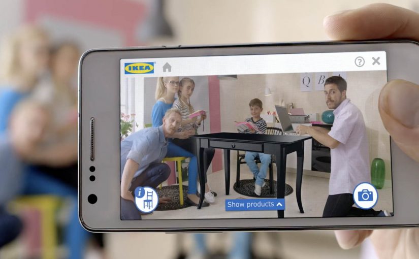
Now, for the 2014 IKEA catalogue, they push that idea into something far more useful: you can place virtual furniture directly into your home by putting the printed IKEA catalogue where you want the furniture to appear, then viewing the result through your phone or tablet using augmented reality (AR), meaning digital objects layered onto a live camera view of your real space.

The simple mechanic that makes a paper catalogue feel like a showroom

The experience design is almost disarmingly straightforward. The catalogue is not just media. It becomes the physical reference point that tells the app where “here” is, and roughly how big “life-size” should be. Because that reference point anchors position and scale, the placement feels believable enough to support a buying decision.

  • Open the IKEA catalogue app on a phone or tablet.
  • Scan a supported product page.
  • Close the catalogue and place it on the floor (or surface) where you want the item to “live.”
  • Watch the furniture appear in-context, then explore alternatives by browsing within the app.

In global retail and consumer brands, this kind of print-to-mobile AR, where the printed catalogue acts as the marker for the AR view, works because it turns “can you picture it?” into “can you see it here?” at the exact moment people are deciding.

Why it lands: utility beats novelty

AR marketing often dies as a gimmick because the “reveal” is entertaining but irrelevant. Here, the reveal is practical: scale, placement, and fit are exactly what shoppers worry about most.

Extractable takeaway: If emerging tech does not reduce a real decision friction, treat it as a distraction, not a strategy.

Even when the rendering is not perfect, the direction is clear. Reduce uncertainty. Help people make a confident choice. And if it cuts down on “it looked smaller online” returns, that utility is measurable, not just shareable.

What IKEA is really doing with this catalogue

This is a classic “bridge” play, a deliberate handoff between inspiration and purchase. IKEA keeps the reach and habit of a paper catalogue, then uses mobile interactivity to remove friction at the decision stage.

The real question is whether it removes enough doubt to change a purchase decision, not whether the AR looks impressive.

AR is worth investing in when it behaves like decision support, not when it just decorates a story.

It also quietly reinforces a brand position: IKEA is not only about affordable design. It is also about smart, accessible tools that help you plan and live better at home.

How to design an AR catalog people reuse

  • Make the printed piece part of the interface. Treat paper as a trigger, a marker, a controller. Not a dead-end.
  • Reward the scan with decision support. The “wow” should reduce doubt: sizing, configuration, compatibility, placement, or proof.
  • Design for fast repetition. The real value comes when people try multiple options in minutes, not once for curiosity.
  • Keep the action close to purchase. The best AR demos shorten the path from consideration to “yes” without feeling like a hard sell.

A few fast answers before you act

What is IKEA doing differently with the 2014 catalogue?

They extend the catalogue beyond scan-to-watch content by letting people place virtual furniture into their real home environment using AR.

How does the AR placement work in simple terms?

You scan a supported page, place the physical catalogue where you want the item to appear, and the app overlays a furniture model into the live camera view.

Why is a printed catalogue useful in an AR flow?

The catalogue becomes a physical reference point for position and approximate scale, making placement feel more believable than a free-floating 3D object.

What business problem does this help solve?

It reduces purchase hesitation by letting people judge fit and placement earlier, and it can help lower the risk of dissatisfaction and returns.

What’s the key lesson for marketers using emerging tech?

Build the experience around utility that supports a decision. Novelty may earn a try. Utility earns repeat use and moves people toward purchase.
Adshels with Difference: IKEA LEDshel and ANAR

Here are two adshel innovations currently doing rounds online. An adshel is a street shelter advertising unit, typically at a bus stop. Both use the media surface itself as the message, not just a place to hang a poster.

Ikea LEDshel

IKEA swapped the regular neon tubes found in adshels around Vienna with its LED range. The product becomes the medium, and the demonstration happens at full scale in the street. Credited to DDB Tribal Vienna, the move turns “better light” into something you can experience, not just read about.

Only for children

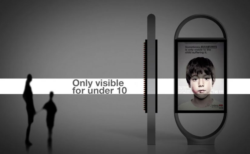
In an effort to give abused children a safer way to reach out for help, the Spanish organization Fundación ANAR created an ad that displays a different message to adults and children at the same time.

The poster uses a lenticular top layer to show different images at varying angles and heights. An adult sees the image of a sad child with the line: “sometimes, child abuse is only visible to the child suffering it.” A child sees bruises and a direct help message with a phone number. This work is widely credited to Grey Group España.

What makes these “adshels with difference”

The shared mechanism is simple: upgrade the shelter from a passive frame into an active communicator. One example changes the hardware so the ad site demonstrates the product. The other changes the optical layer so the message adapts to who is looking.

Because the shelter itself performs the claim, the viewer can grasp the argument in seconds, which is why these ideas travel in public space.

In European city out-of-home media, small physical changes to the site often persuade more powerfully than a clever headline alone.

The real question is whether your out-of-home idea still works when the media unit itself has to do the explaining.

These are the out-of-home ideas worth borrowing because the medium carries the proof, not just the copy.

Why it lands

It makes the proof unavoidable. IKEA does not claim “LED looks better.” It lets the street lighting show it. ANAR does not claim “victims can’t speak safely.” It builds a channel that protects the child in plain sight.

It respects context. Adshels sit in public space where attention is brief. Both ideas communicate at a glance, because the medium itself is doing part of the explanation.

It uses targeting without data. The lenticular execution “targets” by viewpoint and height, not cookies. It is a physical interface decision, not a digital one.

Extractable takeaway: Out-of-home innovations travel when the site behavior carries the argument. If the medium demonstrates the product, or adapts the message to the viewer’s vantage point, the campaign becomes self-explanatory and hard to ignore.

Borrowable adshel moves

  • Turn the placement into the demo. If the product has a sensory benefit, make the environment show it.
  • Use physical segmentation. Angle, distance, height, light, and motion can personalize a message without any personal data.
  • Design for public constraints. Fast comprehension wins. The structure should communicate before the copy finishes.
  • Let the medium do the persuasion. When the execution is the proof, the message needs fewer claims.

A few fast answers before you act

What is an “adshel” in this context?

A street shelter advertising unit, typically at bus stops, that combines a poster frame with lighting and protective glass.

What is the IKEA LEDshel idea actually demonstrating?

LED lighting quality in real conditions. The shelter itself becomes a live showroom for the light range.

How does the ANAR poster show two messages at once?

Through a lenticular layer that changes what is visible based on viewing angle and height, so adults and children see different visuals and text.

Why is this more effective than a standard awareness poster?

Because it delivers a help message to the child without alerting the accompanying adult, which is the real constraint in the situation.

What is the reusable principle across both examples?

Make the media unit behave like the idea. When the medium demonstrates, adapts, or protects, the campaign does not need heavy explanation.

IKEA Klippbok

IKEA Australia wanted to create a utility that IKEA customers could regularly use to help inspire them in their home. So they created an iPad app called Klippbok (Swedish for “scrapbook”) that gave users access to IKEA products all year round. With easy-to-use design functionality, users were able to mix and match IKEA products and create collages, swatchbooks (material and color sample sets), roomsets (simple room mockups) and more.

Making inspiration feel hands-on, not aspirational

The mechanism is straightforward. You drag IKEA products into a blank canvas, experiment with combinations, and build a visual “plan” you can refine over time. It takes the part people enjoy most in-store, imagining how it could look at home, and makes it repeatable on a device. Because the output is something you can revisit and refine, the interaction is more likely to earn repeat use.

In retail marketing, the strongest “always-on” utilities are the ones that turn browsing into making.

By “always-on utility”, I mean a tool customers can use between campaigns, not a one-off catalogue drop.

Why the scrapbook metaphor is the right UX

Calling it a scrapbook is not just a name. It sets expectations. This is playful, remixable, and personal. That framing lowers the pressure of “designing a room” and replaces it with “trying ideas”, which is a much easier behavior to sustain. This framing choice is the right move when the goal is repeatable inspiration, not a single perfect plan.

Extractable takeaway: If your tool makes “show someone” the natural next step, build sharing into the flow, because that social loop turns a private utility into a brand platform.

Business intent: stay present between store visits

Klippbok’s real job is frequency. Instead of only showing up when a catalogue drops or when someone is already planning a store run, the app gives IKEA a year-round touchpoint that keeps products in consideration while customers are still forming preferences.

The real question is whether your utility gives customers a reason to return when they are not yet in buy mode.

Reported outcomes and craft credits

The app was created by The Monkeys and built by Nomad. In industry reporting around the work, Klippbok is credited with roughly 53,000 downloads across 100+ countries and reaching number two in the Australian iTunes Lifestyle category.

What to steal if you want customers to return regularly

  • Turn your range into a creative system. Let people assemble, not just browse.
  • Design for quick wins. Fast collages beat perfect room planners for repeat usage.
  • Make sharing a native next step. If “show someone” is easy, your users do your distribution.
  • Build for year-round relevance. Inspiration tools age better than campaign landing pages.

A few fast answers before you act

What is Klippbok, in plain terms?

Klippbok is an IKEA iPad app that lets people create mood boards, collages, swatchbooks, and roomsets using IKEA products, so they can plan and experiment with home ideas.

Why does an inspiration app matter for a retailer like IKEA?

Because the purchase journey is rarely one session. If you can keep customers playing with ideas between store visits, you stay in the consideration set longer and influence what ends up on the shopping list.

What is the key mechanism that drives engagement?

Drag-and-drop creation. The user is making something of their own, not consuming content, which increases time spent and makes sharing more likely.

What is the biggest mistake with “catalogue as app” launches?

Copying print into a screen. The app has to behave like a tool, not a PDF, or it will not earn repeat use.

How do you measure whether an inspiration app is working?

Return frequency, creation rate, share rate, and the percentage of users who save or revisit projects. If you can connect it, track downstream indicators like store visits or product adds-to-list after app sessions.