Today’s kids are growing up with smartphones and tablets as everyday objects, so for the 30th anniversary of the Happy Meal in Sweden, McDonald’s decides to move with the times without making radical changes.
With a bit of ripping, folding, and sliding, the Happy Meal box becomes Happy Goggles. A simple VR viewer made from the box itself, designed to work with a smartphone.
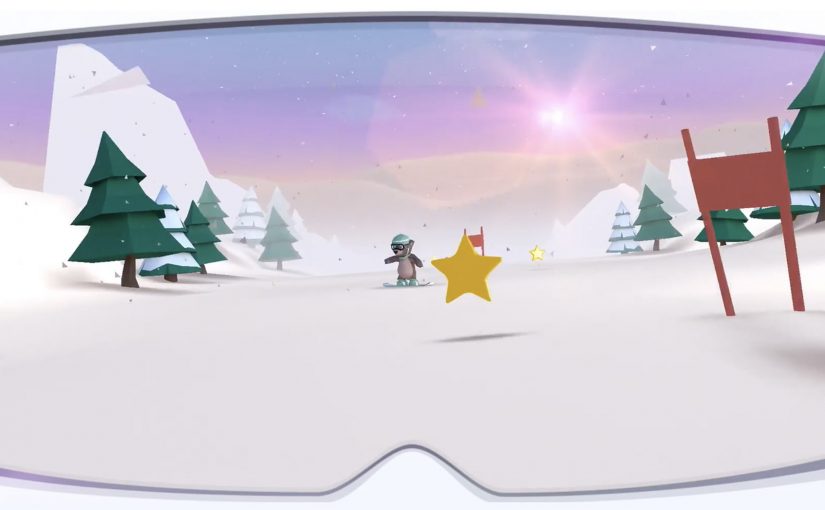
The limited edition Happy Goggles are available from March 5th along with a virtual reality skiing game called “Slope Stars.” The game is positioned as a 360° ski experience that aims to blend fantasy and fun with basic slope-safety learning.
A physical build step that makes the tech feel like play
The mechanism is the point. Kids do not just receive a headset. They assemble it from something familiar, which turns the product into an activity and makes the “VR moment” feel earned rather than handed out.
In family-focused quick-service restaurants, packaging is one of the few branded touchpoints kids hold long enough to become a lasting brand memory.
The real question is whether a kids-facing tech idea can feel like play for children while still feeling bounded and acceptable for parents.
Why it lands with parents as well as kids
The idea works because it keeps the novelty lightweight and frames it as a bounded experience. A simple viewer, a themed game, and a message that leans toward safe behaviour on ski slopes rather than pure screen time. This is a smart family-facing tech layer because it adds interactivity without asking parents to accept an open-ended new device ritual.
Extractable takeaway: If you want families to accept a new tech layer inside a kids product, make the first interaction tactile and time-boxed, then tie the content to a clear parent-friendly benefit.
What the brand is really doing here
This is packaging as media, and packaging as product. By “packaging as media,” I mean the box itself becomes the channel that carries the experience. McDonald’s turns the most iconic part of the Happy Meal into the delivery vehicle for a digital experience, while keeping the core ritual intact.
What to borrow from Happy Goggles
- Make the build part of the value: A small assembly step turns the moment into an activity, not just a handoff.
- Use an owned touchpoint as the “device”: When the packaging is already in-hand, it can do distribution and storytelling at the same time.
- Time-box the novelty with a parent-friendly frame: Keep the experience simple, themed, and clearly bounded so it feels acceptable, not addictive.
A few fast answers before you act
What are Happy Goggles?
Happy Goggles are a VR viewer made by folding the Happy Meal box into a headset-style form, designed to hold a smartphone for a simple virtual reality experience.
What is Slope Stars?
Slope Stars is a ski-themed VR game released alongside Happy Goggles, positioned as a 360° experience that mixes play with basic slope-safety messaging.
Why make the viewer out of the box instead of adding a toy?
Using the box removes distribution friction because every Happy Meal already includes it. Turning the box into the device also makes the experience feel like a clever transformation rather than an extra plastic object.
What makes this kind of packaging innovation shareable?
Happy Goggles are instantly legible because the build step and the reveal are the story. The transformation can be demonstrated in a single photo or short clip.
What is the transferable principle behind this idea?
The transferable principle is to make the first interaction tactile and contained, so the digital layer feels earned. A simple physical step can convert “new tech” into “play,” while a clear boundary makes it easier for parents to accept.