Coca-Cola Second Screen Reinvented

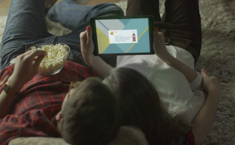
You are watching a Coca-Cola TV spot in Israel. Your phone lights up. A “Gett Coca-Cola” prompt appears. You tap once. Five minutes later, a special Coca-Cola package shows up at your door: a branded cooler, two Coke bottles, and a bottle opener.

From TV spot to one-tap delivery

Turn a TV ad into a one-tap order, and make “second screen” mean immediate delivery, not just engagement. Here, “second screen” means the phone acting as the immediate action surface while the TV spot supplies the trigger.

What is actually happening on the second screen

The TV spot carries an audio trigger that a smartphone can recognize. The moment the ad plays, phones with the Gett app installed receive a push notification. The viewer swipes or taps, and the order is placed in one click.

In practice, this behaves like Shazam for commerce. Except the payoff is not identification. It is fulfillment.

Why the Gett partnership is the real unlock

The ad is only half the experience. The other half is logistics.

To make the “five minutes later” promise credible, Coca-Cola partners with Gett, a local taxi app, and during the promotion Gett dispatches thousands of vehicles packed with branded coolers across Israel, ready to deliver on demand.

In FMCG and retail campaigns, the strategic value is not the novelty of a second screen, but the ability to compress media, commerce, and fulfillment into one immediate behavior.

The real question is whether the brand can remove enough friction that attention turns into action before intent cools.

Why this feels like a reinvention of TV, not a gimmick

This is not a gimmick. It is a tighter piece of commercial design because the creative, transaction, and fulfillment layers are built to work as one system.

Extractable takeaway: When a campaign links attention, transaction, and delivery inside one continuous action, the medium stops acting like awareness-only media and starts behaving like a service.

It collapses the funnel

There is no gap between awareness and action. The moment of attention is the moment of purchase.

It turns “sampling” into a media format

The campaign is a TV impression plus product trial, delivered instantly.

It makes the second screen earn its place

Second screen ideas often stop at polls and hashtags. Here, the phone is not a companion. It is the checkout button.

The deeper point

This is what “buyable advertising” looks like when it is engineered end to end. By “buyable advertising,” this means media that lets a viewer move from exposure to transaction without leaving the moment.

The business intent is simple: remove the lag between media spend and product trial by turning broadcast attention into immediate, measurable fulfillment.

Media triggers action. Action triggers logistics. Logistics completes the brand promise while attention is still warm.

What to steal from this buyable-media model

  • Collapse the funnel deliberately: If you can connect attention to action in one gesture, the “ad” becomes the first step of the purchase flow.
  • Make the trigger earn its existence: Second screen only matters when it changes the outcome, not when it adds commentary.
  • Engineer fulfillment as part of the creative: The logistics promise is the product. Treat it like core campaign craft, not an ops afterthought.
  • Turn sampling into a format: Delivering the kit is the media unit. That is why this reads as more than a shoppable banner.
  • Protect trust explicitly: Any “listening” mechanic needs clear permissioning and transparency, or the whole experience flips from magic to creepy.

A few fast answers before you act

What does the TV ad do that is different?

It uses an audio trigger so phones can recognize the ad and prompt a “Gett Coca-Cola” order on the second screen.

Do viewers need anything installed for this to work?

Yes. The flow depends on the Gett app, since the notification and one-tap order happens inside Gett.

How does it deliver so fast?

Gett uses its taxi network as a delivery fleet, with cars preloaded with the cooler kits during the promotion.

Why is this more powerful than a “second screen” hashtag?

Because the second screen is not commentary. It is conversion plus fulfillment.

What is the main risk brands must manage?

User trust. Any experience that “listens” for triggers must be transparent and permissioned, or it will feel creepy, even if the mechanics work.

EmotiCoke: Coca-Cola Emoji Web Addresses

Coca-Cola, through its campaign in Puerto Rico, tries to make the internet a happier place by turning emojis into a mobile call-to-action. The brand is described as registering web addresses for the emojis that convey happiness, then using huge outdoor ads to push people to try them on their phones.

EmotiCoke Outdoor Ad

Those emoji web addresses route visitors to a landing page, www.EmotiCoke.com, where people could sign up for a chance to win the emoji web addresses for themselves.

The mechanic: emoji addresses that redirect to one place

The execution hinges on a simple redirect loop. Type a “happy” emoji as the web address (with a supported suffix), land on the same destination, then convert curiosity into sign-up. Under the hood, these are internationalized domain names (IDNs) represented in a DNS-safe format, even if the user experience is “just type the emoji.” This works because every emoji address resolves to one destination, so the user does not have to learn multiple URLs to get the payoff.

In mobile-first out-of-home campaigns, the simplest call-to-action wins because the billboard has only seconds to convert attention into a tap.

Why it lands

It takes a behavior people already practice, using emojis to express mood, and repurposes it as navigation. That small twist is the hook. It is instantly legible from a distance, it is fun to try, and it creates a low-friction bridge from street-level attention to a trackable digital interaction. The real question is whether your call-to-action can be copied from a distance and tried instantly on a phone.

Extractable takeaway: When you need mass participation from a passive channel like OOH (out-of-home), make the call-to-action both copyable and inherently playful. “Try this now” works best when the first step feels like a game, not a form.

Why .ws shows up in the story

For anyone wondering why .ws shows up, it is the country-code suffix for Samoa. The campaign is described as choosing .ws because emoji characters were not accepted on common top-level domains like .com, .net, and .org at the time. The additional brand rationale mentioned in coverage is that “.ws” could be read as “We smile,” which fits the happiness positioning.

Steal this pattern: emoji URLs as a CTA

  • Optimize for retyping, not explaining. If someone cannot replicate it from memory, you lose the moment.
  • Use one destination. Let novelty drive entry, then keep the conversion path clean and consistent.
  • Make the first interaction instant. If the page loads slowly or the redirect breaks, the idea collapses.
  • Plan for platform variance. Emoji rendering differs by OS and font. Keep the creative readable even when the glyph changes.

A few fast answers before you act

What is EmotiCoke in one sentence?

It is a Coca-Cola Puerto Rico activation that uses emoji-based web addresses on billboards to drive mobile users to EmotiCoke.com to sign up for a chance to claim those emoji URLs.

How do “emoji URLs” work in practice?

They rely on internationalized domain name support. The emoji the user sees is encoded into a DNS-compatible form, then redirected to a standard landing page.

Why did the campaign use the .ws suffix?

Because the campaign is described as needing a suffix that accepted emoji characters, and .ws was positioned as a workable option. Coverage also cites the “We smile” wordplay as a fit for Coca-Cola’s happiness theme.

Are emoji web addresses reliable everywhere?

No. Support varies across browsers, keyboards, registrars, and operating systems. Emoji appearance also changes by platform, which can affect recognition and retyping accuracy.

What are the biggest execution risks?

Broken redirects, slow mobile load times, unclear typing instructions, and inconsistent emoji rendering across devices. Any of these adds friction and kills the novelty fast.

Absolut: Unique Access via WhatsApp

In October, Klik (a chocolate snack) was billed here as the first brand to use WhatsApp to increase brand engagement amongst its teen audience.

Now a month later, ABSOLUT Vodka in Argentina uses WhatsApp as well, this time to invite people to an exclusive launch party. To build awareness and engagement in Buenos Aires, Absolut creates “Sven the doorman”. Interested people have to contact Sven via WhatsApp and convince him to grant access. Since he is not easy to convince, people get creative fast.

Sven is the mechanic

The mechanism is conversational gating. Conversational gating means access is unlocked only through a back-and-forth chat, not a form or link. A single contact on WhatsApp becomes a bouncer, and the brand turns the usual “enter to win” pattern into a negotiation. You are not filling a form. You are performing for a personality, in the channel where you already talk to friends.

In mobile-first urban markets, messaging apps like WhatsApp are a natural place for brands to run direct, high-attention interactions without building a separate destination.

Why this format spreads

It packages exclusivity into a simple game loop. The real question is whether you want people to feel like they earned access, or like they completed a funnel step. Ask. Get rejected. Try again. Escalate creativity. That loop is inherently shareable because it produces artifacts people can screenshot, forward, and remix. This format is a better bet when you want depth of participation and talk value, not maximum reach. Reported campaign write-ups describe hundreds of participants and a flood of user-made messages, which is exactly what you want when the goal is buzz rather than reach alone.

Extractable takeaway: If you want engagement that feels earned, design a human-scale gate with a clear personality and a strict rule. Then let people “pay” with creativity, not clicks.

What to steal for your own messaging plays

  • Make scarcity real. The smaller the prize pool, the more believable the doorman becomes.
  • Turn the brand into a character. Sven is not a hotline. He is a role people can play against.
  • Reward effort, not volume. You want fewer, better attempts, not spammy persistence.
  • Design the rejection lines. The “no” is half the entertainment. Script it so it invites a better next try.
  • Build for screenshots. Assume the conversation will leave WhatsApp. Make it legible outside the app.

A few fast answers before you act

What is the core idea behind “Sven the doorman”?

A brand persona acts as a gatekeeper on WhatsApp. People must persuade him to unlock access to an exclusive event, which converts invitations into a creative challenge.

Why use WhatsApp instead of a landing page?

Because it removes friction. The interaction starts inside an everyday messaging habit, and the conversational format makes participation feel personal rather than transactional.

What makes this approach risky?

It can backfire if the “doorman” feels unfair, creepy, or inconsistent. The rules must be clear, and the tone must fit the audience.

What is the simplest version a brand can run today?

Use one WhatsApp contact, one character, and one strict rule to unlock a limited reward. Keep the conversation short, and make the “no” entertaining enough that people want to try again.

How do you keep the “doorman” from becoming spammy or exhausting?

Set a tight interaction window, cap repeated attempts, and use rejection lines that steer people toward better next tries instead of inviting endless back-and-forth.