Peugeot 408: Print ad with a real airbag

Peugeot 408: Print ad with a real airbag

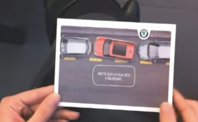
To advertise the safety benefits of the Peugeot 408, Brazilian agency Loducca put a mini airbag inside a print ad. Readers were invited to hit a marked spot on the page and see what happened. On impact, the tiny bag inflated, demonstrating in miniature what an airbag would do.

The ad appeared in Brazil’s business magazine Exame and was reportedly distributed with protective packaging so the airbag would not trigger by accident.

A magazine page you have to hit

The mechanism is brilliantly blunt. You do not watch a crash test. You perform a micro impact, a small, deliberate tap that simulates impact, with your hand, and the medium responds. That action turns a passive read into an experience, and it makes the “airbag” benefit impossible to ignore. Brands should treat safety claims as proof problems and design demonstrations the viewer can personally trigger.

In automotive safety marketing, the highest-performing proof is the kind you can physically trigger yourself.

The real question is whether your proof of safety can be triggered by the audience, not merely asserted by the brand.

Why print becomes more credible when it behaves like a product

Print normally communicates through trust in words and images. This ad adds a different kind of credibility, mechanical proof. Because it inflates on cue, the viewer’s brain files the message as something closer to engineering than persuasion. That matters because “safety” is a hard attribute to sell with rhetoric alone. People want reassurance, not adjectives.

Extractable takeaway: When a product claim is about protection, the strongest creative move is to make the audience feel a cause-and-effect demonstration, not just read about it.

The packaging is part of the idea

The special packaging is not just logistics. It signals intent. This is a controlled, designed interaction. It is also a reminder that experiential print has operational realities. Here, “experiential print” means print that behaves like a product interaction, with a designed trigger and response. If you build an ad that can go off in someone’s bag, you must engineer the distribution like you would engineer a product.

How to design triggerable safety proof

  • Make the claim triggerable. If the benefit is physical, design a physical proof moment.
  • Keep the interaction single-step. One obvious action, one immediate response, no instructions needed.
  • Let the medium do the explaining. The inflation is the headline. Copy becomes supporting detail.
  • Design the supply chain, not just the concept. Packaging, safety, and consistency are part of creative effectiveness.
  • Use spectacle sparingly. The wow moment is strongest when it directly maps to the product truth.

A few fast answers before you act

What is the Peugeot 408 “airbag in a print ad” idea?

A magazine ad with a real mini airbag insert that inflates when the reader hits a marked spot, mimicking an airbag deploying during impact.

Why does this work better than a normal safety print ad?

Because it converts a claim into a physical demonstration. The reader triggers the proof, which feels more credible than copy alone.

What makes interactive print feel premium instead of gimmicky?

When the interaction is directly tied to the product benefit and works reliably. The mechanism should be the message, not a disconnected trick.

What’s the biggest risk with mechanical inserts in magazines?

Execution risk. Misfires, non-fires, and distribution issues can overwhelm the idea. The production and packaging have to be engineered as carefully as the concept.

How can a brand replicate this approach on a smaller budget?

Design a tactile proof moment using simple materials and one clear action. The key is immediate cause-and-effect that maps cleanly to the claim.

Renault Espace: iPad 360° View

Renault Espace: iPad 360° View

The Renault Espace is a large MPV from French car-maker Renault. With a new iPad app, Renault gives users an onboard view of the Espace like never before.

The application is a 360 degree interactive video. All you need to do is tilt your iPad and explore different angles as if you were right there.

A virtual showroom that behaves like your head

The mechanism is refreshingly direct. The app uses the iPad’s motion sensors to map physical movement to viewpoint changes inside the car. Instead of tapping through static photos, you “look around” by moving the device. It is a smart use of motion sensing because it keeps the interface invisible and the focus on the cabin.

In automotive consideration journeys, anything that increases spatial understanding of the interior helps bridge the gap between online browsing and a test drive.

Why it lands

Interior experience is one of the hardest things to communicate in standard car marketing. This solves that by letting the user control perspective. It also creates a calmer kind of interactivity. No menus, no instructions, no friction. Just tilt and explore.

Extractable takeaway: When your product has a strong spatial component, give people viewer control over perspective. It builds confidence faster than adding more copy.

What Renault is really trying to achieve

The real question is whether this kind of “tilt to explore” experience reduces uncertainty enough to make a showroom visit feel worth it.

This is a digital test-sit, a lightweight simulation of sitting in the cabin so you can judge layout and comfort before a showroom visit. It is designed to make the Espace feel accessible before a showroom visit, and to reduce uncertainty about cabin layout, visibility, and perceived comfort. Done well, it also keeps attention longer than a typical brochure flow.

Steal this for spatial product demos

  • Use motion as navigation. If the device supports it, motion control can feel more natural than UI controls.
  • Keep the interaction single-mode. One behaviour. Tilt to look. That simplicity is the feature.
  • Prioritise the interior. For family vehicles, cabin experience often sells more than exterior styling.
  • Let curiosity drive. Give users freedom to explore, rather than forcing a predetermined tour.
  • Make it fast to load. Interactive video dies when buffering becomes the dominant experience.

A few fast answers before you act

What is this Renault Espace iPad app in one sentence?

It is an iPad experience that uses a 360 degree interactive onboard video so users can tilt the device to explore the Espace interior from different angles.

Why use 360 video instead of a standard photo gallery?

Because it communicates space and layout more effectively. Users can look where they want, which reduces uncertainty faster than scrolling images.

What makes “tilt to explore” feel intuitive?

It mirrors how people look around in real life. Physical movement maps directly to viewpoint changes, so interaction feels natural.

What is the main execution risk?

Performance. If motion tracking feels laggy, or the video quality is poor, users will abandon quickly and the experience will feel like a gimmick.

What should you measure if you ship this type of experience?

Time spent, percentage of users who explore multiple viewpoints, completion rate, repeat sessions, and whether it correlates with test-drive requests or dealer inquiries.

Skoda Yeti: Park Assist in Your Pocket

Skoda Yeti: Park Assist in Your Pocket

The new Skoda Yeti comes with Park Assist, a driver-assistance feature designed to help the vehicle steer into a parking space. Cayenne Milan came up with a simple idea to show the benefit in a way you can understand instantly. A card that demonstrates “parking without the driver.” The card in the video is described as being distributed at the Bologna Motor Show.

A postcard that explains the feature in seconds

The brilliance is that it does not try to teach the technology. It teaches the outcome. You interact with a physical object and immediately get the promise: the car can handle the parking maneuver for you.

In European auto shows and showroom marketing, tactile direct marketing often outperforms brochures because it delivers the feature benefit in the hand, not as a paragraph of explanation.

The real question is whether your feature can be understood through a one-step interaction before anyone explains it.

A strong feature demo does two jobs at once. It reduces cognitive load to one obvious takeaway, and it gives the audience a story they can retell without technical vocabulary. Outcome-first demos should be the default when the audience has seconds, not minutes.

Why this lands at an auto show

Auto shows are crowded with claims. Faster. safer. smarter. Most of them blur together. A direct mail object creates a private moment in the middle of a public environment, and that moment makes the feature memorable.

Extractable takeaway: If your feature benefit cannot be demonstrated as a simple interaction that survives a noisy environment, it will get flattened into “just another claim.”

  • It is self-explanatory. No staff pitch required.
  • It is portable. The idea travels with the visitor after they leave the booth.
  • It is repeatable. People can show it to someone else and replay the explanation.

And here is the video showing how the Skoda Yeti can actually park itself

The second film shifts from metaphor to proof. It shows the Park Assist function as a real maneuver, reinforcing that the postcard is not just a clever visual. It is pointing at a real capability.

Outcome-first moves for feature launches

  • Demo the outcome, not the mechanism. People buy benefits. Engineers buy systems.
  • Use a physical prop to earn attention. Something you can hold cuts through show-floor noise.
  • Pair metaphor with proof. One piece that makes it simple, one piece that makes it believable.
  • Design for pass-along. If visitors can show it to friends, your booth message keeps working off-site.

A few fast answers before you act

What is Park Assist in this context?

A driver-assistance feature designed to help the vehicle steer into a parking space, reducing the manual effort and stress of parking.

Why use a postcard instead of a normal leaflet?

Because interaction teaches faster than reading. A simple physical demo makes the benefit obvious in seconds.

Why include a second video after the postcard film?

The postcard creates understanding. The feature demonstration creates belief. Together they cover both comprehension and credibility.

What kind of features benefit most from this approach?

Features with a clear, visible outcome. Parking. safety assists. convenience automation. Anything a person can recognize immediately when shown.

What is the biggest risk with “clever prop” marketing?

If the prop is memorable but the feature link is weak, people remember the gimmick and forget the product. The prop must map cleanly to the benefit.