NikeID Loop: Sneaker Customization Concept

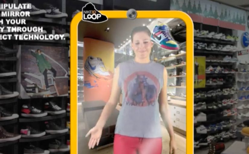
Here is another interesting concept coming out of Miami Ad School, this time for Nike.

Since Nike has a huge range of sneakers, it’s next to impossible to try each one of them at the store. In fact, it’s not even possible to find them all at the store.

So a unique interactive mirror using Microsoft’s Kinect technology was created to customize the sneakers on the user’s feet. This way, one could try on every pair of Nike sneakers ever made in record time.

The core problem this concept tackles

Retail has a physical constraint. Shelf space. Inventory. Time. Nike’s catalog depth makes “try everything” impossible, even in flagship stores.

This concept flips the constraint by moving variety from physical inventory into a digital layer, while keeping the try-on moment anchored in the body. By “digital layer” here, I mean a live overlay that swaps variants in the mirror without needing physical stock. Your feet. Your stance. Your movement.

The real question is how you let shoppers explore more options without turning the store into a warehouse or the decision into homework.

Why the mirror mechanic is powerful

Because the mirror tracks movement and renders variants instantly, it keeps the try-on believable in motion, which is what makes fast switching persuasive instead of gimmicky.

Extractable takeaway: When you can add choice in software while preserving an embodied try-on moment, you reduce assortment friction without reducing confidence.

  • It keeps context real. You see the shoe on you, not on a product page.
  • It compresses decision time. Rapid switching creates a new kind of “browsing”.
  • It turns discovery into play. The experience is inherently interactive, which increases dwell time.
  • It reduces inventory friction. The store can showcase breadth without stocking breadth.

In retail environments where shoppers want high-confidence fit and style decisions in minutes, embodied digital try-on can expand perceived assortment without expanding stock.

What this implies for customization and personalization

NikeID is already about making a product feel personal. A Kinect-style mirror extends that by making customization immediate and visual, which can increase confidence before purchase.

This kind of embodied customization is worth betting on, because it makes breadth feel real without demanding more shelf space.

The concept also suggests a future where “catalog” becomes a service layer. The physical store is the stage for decision-making, not a warehouse for options.

What to take from this if you run retail CX

  1. Start with the constraint. Space and assortment are physical limits. Digital can expand them.
  2. Keep the experience embodied. Seeing a product on yourself is stronger than seeing it on a screen.
  3. Design for speed. Rapid iteration can become a feature, not a compromise.
  4. Make the output actionable. The experience should flow naturally into saving, sharing, or ordering.

A few fast answers before you act

What is the NikeID Loop concept?

It is a Miami Ad School concept for Nike that uses an interactive mirror and Microsoft Kinect technology to let users customize and “try” different Nike sneakers on their feet digitally.

What problem does it solve in stores?

It addresses the fact that Nike’s full range of sneakers cannot be stocked or tried in one location, by shifting variety into a digital interface.

Why use Kinect or motion tracking?

Motion tracking lets the system align the visual shoe to the user’s feet in real time, keeping the experience believable as people move.

Is this a product or a concept?

In this case, it is presented as a concept coming out of Miami Ad School, showing a possible direction for interactive retail.

What is the transferable lesson?

If you can remove physical constraints through an embodied digital layer, you can increase choice, speed, and confidence without expanding inventory.

Homeplus Subway Virtual Store: Mobile Aisle

A retail store that lives on a subway wall

Homeplus turns a familiar commuter moment into a shopping moment.

Instead of asking people to visit a store, Homeplus brings the store to where people already wait. In the subway.

The virtual store appears as a life-size shelf display on station walls. Products are shown like a real aisle, complete with packaging visuals and clear selection cues.

The value is not novelty. It is time leverage. Shopping happens in minutes that normally get wasted.

How it works

The experience is deliberately simple.

A commuter scans product codes with a smartphone, adds items to a basket, and completes the order digitally. Delivery then happens to the home address.

Because the scan-to-basket flow is short, the order can be finished within a single wait for the next train.

That flow changes the meaning of convenience. The store is no longer a destination. It becomes an interface layer that can be placed anywhere footfall exists.

In high-density urban retail, the strongest convenience plays capture existing dwell time instead of trying to create new store visits.

Why this idea matters more than the technology

It is tempting to frame this as a QR-code story. That misses the point. This is the kind of retail innovation worth copying, because it turns context into conversion rather than chasing novelty.

Extractable takeaway: Treat customer dwell time as inventory. Put the simplest possible scan, pay, deliver flow inside a routine people already repeat.

The strategic innovation is contextual retail design. That means placing a purchase interface inside an existing routine, so the context provides the motivation.

Homeplus places the catalog where time is available, reduces friction to scan, pay, and deliver, and treats the physical environment as media and distribution at once.

The subway becomes a high-intent moment. People have time, they are idle, and they are already in a routine. Retail becomes a habit stitched into commuting.

What this signals for retail experience design

This concept highlights a shift that becomes increasingly important.

The real question is where your customers already have predictable micro-windows of time, and whether you can make buying fit cleanly inside them.

Retail experiences are not confined to stores or screens. They can be embedded into everyday environments where attention is naturally available.

For leaders, the question becomes where the best micro-windows of time exist in customers’ lives, and what a purchase flow looks like when it fits perfectly into those windows.

The real lesson. The aisle is a format, not a place

Homeplus shows that an aisle is a navigational model. It does not have to live inside a store.

Once that is accepted, the design space expands. Aisles can be printed. Aisles can be projected. Aisles can appear in transit, at events, or in high-dwell environments.

The pattern is consistent. Retail becomes more modular. Distribution becomes more creative. Convenience becomes a design discipline.

  • Design for dwell time. Choose environments where waiting is predictable and attention is naturally available.
  • Keep the interaction atomic. Scan, confirm, pay. Let fulfillment do the heavy lifting after the scan.
  • Make fulfillment boringly reliable. If delivery fails, the experience collapses because the shopper has no store fallback.

A few fast answers before you act

What is the Homeplus subway virtual store?

It is a life-size “aisle” display in a transit environment where commuters scan products with a phone and order delivery to home.

What is the core mechanic that makes it work?

A fast scan-to-basket flow that turns waiting time into a purchase moment, with fulfillment doing the heavy lifting after the scan.

What is the main prerequisite for repeating this model?

Operational reliability in fulfillment. If delivery fails, the experience collapses because the shopper has no store fallback.

Why is this more than a QR-code story?

The strategic innovation is placing a commerce interface inside a high-dwell routine, using the physical environment as both media and distribution.

What is the simplest way to judge if the concept is working?

If people can complete an order during a normal wait, and fulfillment consistently arrives as promised, the model earns repeat behavior.

Tissot Augmented Reality Product Experience

You hold your wrist up to a webcam and a Tissot watch appears on your arm in real time. You switch models instantly, compare styles, and explore the range without touching a physical display.

The idea. Try before you buy, without inventory

Tissot uses augmented reality to remove friction from product exploration. Here, augmented reality means a live webcam feed with a watch overlay that tracks your wrist as you move. The experience delivers the “try-on” moment digitally, so the brand can show more models than a physical counter typically allows.

The real question is whether your customer needs to see the product on themselves, and whether you can make that comparison instant.

For products where “look on me” drives choice, a fast try-on loop is worth building.

How it works. Wrist tracking plus real-time overlays

  • The user places their wrist in front of a webcam.
  • The system tracks position and angle so the overlay stays aligned.
  • Different watch models can be selected and applied instantly.
  • The experience helps users compare look and fit before committing.

In consumer retail and ecommerce, webcam-based virtual try-on is a practical way to expand assortment and comparison without stocking every variant.

Why it works. The product benefit is visual

Watches are bought with the eye as much as with the spec sheet. Because the overlay stays aligned as the wrist moves and switching is instant, the user can judge look and fit in seconds. Augmented reality makes the key decision input. How it looks on me. Available immediately, with minimal effort.

Extractable takeaway: When the decision hinges on “how it looks on me,” prioritize instant, body-anchored comparison over more static content.

What to take from it. Make comparison effortless

  • Anchor the experience to the body. It turns browsing into ownership imagination.
  • Optimize for fast switching. Comparison drives choice.
  • Keep the setup simple. A clear “put your wrist here” moment lowers drop-off.
  • Scale the catalog digitally. Show the full range without needing the full range in-store.

A few fast answers before you act

What is the Tissot augmented reality product experience?

A virtual try-on experience that overlays Tissot watches onto a user’s wrist via a webcam in real time.

What does the user do?

Hold their wrist in front of the camera and switch between watch models to compare styles.

Why is AR a good fit for watches?

Because the decision depends heavily on how the watch looks on the wrist, not only on specifications.

What is the main business benefit?

It enables broad product exploration and comparison without requiring physical inventory or a large display.

What is the transferable pattern?

If “fit and look” drives conversion, build a fast, body-anchored try-on loop that makes comparison frictionless.