
smart: The Dancing Traffic Light

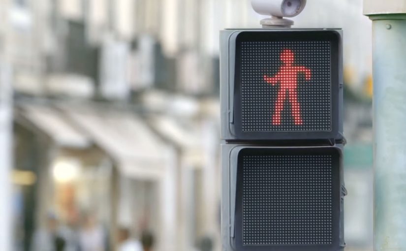
Traffic lights can be dangerous for pedestrians, especially for those who do not like to wait for the light to change. So the Smart team from Mercedes-Benz created “The Dancing Traffic Light”, where a person’s dance moves were brought to a traffic light in real time. As a result, 81% more people stopped at that red light.

A red light that earns attention

The mechanism is simple. Put a person’s live dance into the “don’t walk” figure so waiting becomes entertainment rather than dead time. The red signal stays red, but the moment changes from friction to curiosity.

In busy cities, pedestrian safety interventions work best when they change what people do in the waiting moment, not when they rely on warnings people already ignore.

Why it lands

This works because it does not moralize. It redirects impatience. By turning the red figure into live motion, it converts passive waiting into anticipation, which is why people keep their attention on the signal instead of acting on impulse. People stop because they want to see what happens next, and because the signal feels like it is doing something for them instead of only restricting them.

Extractable takeaway: If your goal is compliance in a repeated micro-moment, do not just increase instruction. Add a small, repeatable reward that makes the safer choice feel like the more interesting choice.

What the brand is really demonstrating

The real question is how to make waiting at the curb feel better without weakening the rule itself.

The installation is framed as a safety idea, but it also functions as a brand proof point. “Smart” city thinking is expressed as an everyday behavior fix, not a futuristic gadget.

The stronger idea is not the choreography. It is the use of delight as a safety mechanism.

What to steal from this crossing

  • Design for boredom. Most unsafe shortcuts happen when people are impatient. Solve the impatience.
  • Keep the rule intact. The light still means stop. Only the experience changes.
  • Use real-time participation. Live input creates social magnetism and makes the system feel alive.
  • Measure behavior, not buzz. The strongest metric here is stopping behavior at the crossing, not views.

A few fast answers before you act

What is “The Dancing Traffic Light”?

It is an interactive pedestrian signal concept where a red “don’t walk” figure mirrors a nearby person’s dance moves in real time to make people more willing to wait.

What problem does it solve?

It reduces risky crossing behavior driven by impatience, by making the waiting phase more engaging.

Why does real-time motion matter?

Because it creates unpredictability and social attention. People watch longer when the content is live and human.

What kind of metric should you track for ideas like this?

Behavior change at the location, such as stopping and waiting rates, plus any reduction in unsafe crossing incidents.

How can another brand adapt this pattern?

Find a repeated safety or compliance moment, keep the rule unchanged, and add a small live reward that makes the safe choice feel like the better choice.
AXA: Crazy Driver

A market-day shock that makes the point instantly

The fastest way to explain risk is to make people feel the cost of it. AXA’s stunt is a clean example of that principle.

To raise people’s awareness and make them realize that nobody wants to pay for bad drivers, AXA decided to play a trick on people with the help of a little old lady.

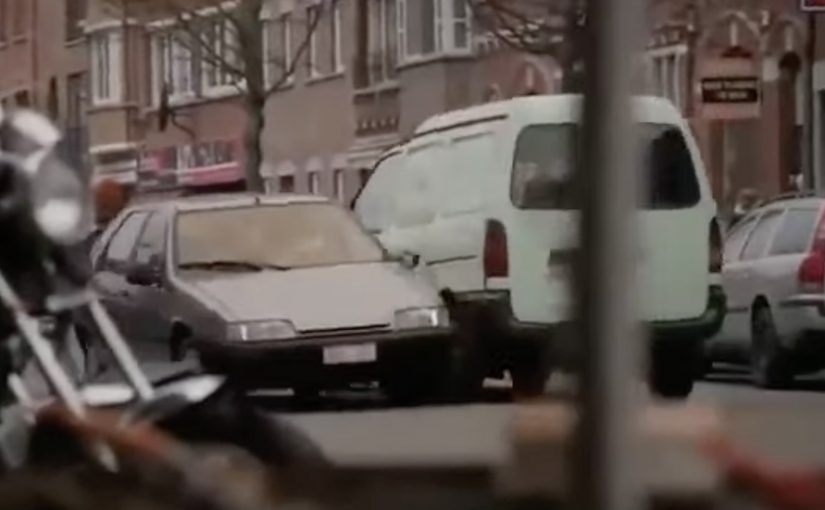
On an ordinary market day in a small, tranquil French town, an old lady was seen getting out of her parking space. In the process she knocked almost everything in her way before crashing into a line of market stalls. With the reveal being that it was staged to make the point.

How the “bad driver” setup delivers the message

The mechanism is staged reality in a real environment. By staged reality, AXA controls the trigger and the reveal, while the setting and bystander reactions stay real.

AXA uses a familiar public setting and a believable trigger. A driver leaving a parking space. Then it escalates into visible damage that bystanders can immediately judge as “this is what we do not want on the road.” The trick creates attention first, then makes space for the reveal and the point. Because the incident unfolds in public, the fairness judgment forms before anyone asks for an explanation.

In European insurance categories, public-safety messages land faster when consequences are visible and socially agreed, not only described.

Why it lands in the moment

It works because it activates two instincts at once. Concern and fairness. Nobody wants to see people hurt or property damaged, and once people witness reckless behavior, the idea of everyone else paying for it feels wrong.

Extractable takeaway: If you can make the cost of a behavior feel public and unfair in under ten seconds, you do not need to over-explain the risk.

The business intent behind the stunt

The intent is to turn an abstract insurance argument into a shared social judgment.

The real question is whether your message can become a shared verdict before people have time to tune out.

Bad driving creates costs. The campaign pushes viewers and bystanders toward the same conclusion. Pricing and consequences should reflect behavior. By making that conclusion feel obvious, AXA strengthens its positioning around responsibility and risk.

Steal this structure for risk awareness activations

  • Start with a situation everyone understands. A simple parking maneuver needs no context.
  • Make the consequence visible. People react to outcomes they can see, not statistics they cannot.
  • Use escalation to earn attention. Build from normal to shocking so the message arrives when focus is highest.
  • Let the audience reach the conclusion. The most persuasive line is the one people say to themselves first.

A few fast answers before you act

What was AXA’s “Crazy Driver” trying to change?

It aims to reduce risky driving by confronting people with an exaggerated version of everyday bad driving, making “normal” shortcuts feel unacceptable in the moment.

What is the core mechanic?

Stage a believable incident in a real public setting, then escalate visible consequences fast so bystanders form an immediate social judgment before the reveal.

What is the emotional sequence the stunt triggers?

Concern first, then fairness. Once people witness reckless behavior, the idea that everyone else pays for it starts to feel wrong, which makes the message stick.

What business intent does this serve for an insurer?

It turns an insurance argument into a shared conclusion. Risky behavior creates costs, and consequences should reflect behavior. The stunt makes that conclusion feel obvious.

What should brands steal from this approach?

Make the behavior the content. Start with a situation everyone understands, show consequences people can see, and let the audience reach the conclusion themselves.

What is the key risk with prank-style public activations?

If it feels unsafe, humiliating, or too punitive, attention can flip into distrust. The line is whether the reveal resolves tension quickly and respectfully.

TAC: How to Plan a Funeral

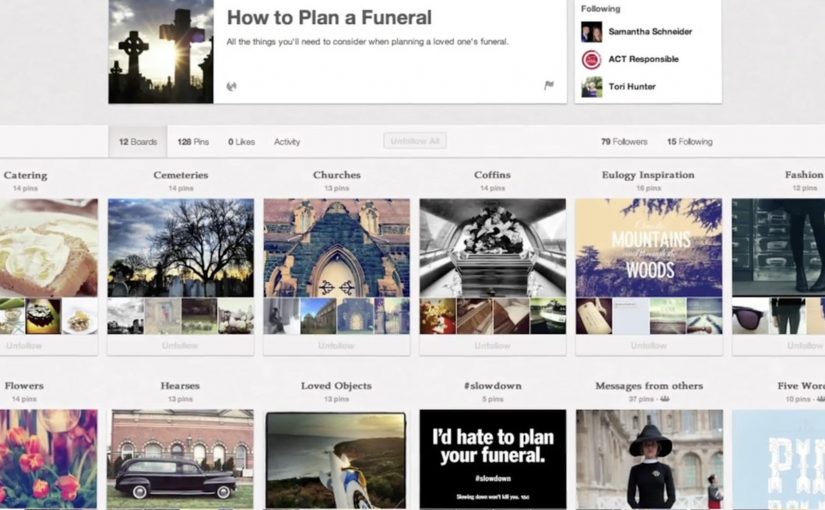
In September 2012, the Transport Accident Commission (TAC) in Australia runs a Pinterest campaign with a line that lands like a punch: How to plan a funeral.

The idea is aimed at girlfriends and mothers of young men. The case frames the problem bluntly. Young men are far more likely to die in a crash than young women, and speeding is positioned as a primary contributor to those fatalities.

How Pinterest becomes a road-safety channel

The mechanism uses Pinterest boards that look like practical inspiration for funerals. Images and pins map to real funeral-planning themes, then steer toward the campaign’s message: “I’d hate to plan your funeral. Slowing down won’t kill you.” That works because the planning format lowers resistance before the safety message lands.

In road-safety behavior change, the most effective interventions often come from trusted relationships rather than institutional authority.

Why it lands

It shifts the emotional weight. Instead of telling a driver what TAC wants, it lets a partner or parent express what they fear. Pinterest is a deliberate platform choice because the boards feel like a real place someone would browse for “ideas”, which makes the moment of recognition more personal and more unsettling.

Extractable takeaway: If you need behavior change, route the message through the person with social permission to say it, meaning someone whose concern will be heard as care rather than control. Then build the media experience so it feels like everyday browsing, not an “ad break”.

What the campaign is really optimizing for

This is not trying to win an argument about enforcement. It is trying to trigger a conversation at home. The work uses a shareable, repeatable line that people can copy in their own words, because a close person saying it carries more force than a government body broadcasting it.

The real question is how to make the warning come from someone the driver will actually hear before the risky behavior happens.

The stronger strategic move here is to design for the relationship, not for the institution.

What to steal for your own safety or health campaign

  • Design for the messenger. Decide who the audience will actually listen to, then craft the creative for that relationship.
  • Choose a platform that matches the behavior. If the message is “planning” and “ideas”, a board format can feel native.
  • Use one line people can borrow. If supporters cannot repeat it verbatim or paraphrase it easily, it will not travel.
  • Make the consequence concrete. “Funeral planning” is an action. It forces imagination to do the work.

A few fast answers before you act

What is the core idea of How to Plan a Funeral?

A TAC Pinterest presence that looks like funeral-planning inspiration, designed to help girlfriends and mothers deliver a more impactful “slow down” message to young men.

Why use Pinterest instead of a typical road-safety ad format?

Because the browsing context feels personal and practical. That makes the emotional message land as something a loved one would stumble into and share, not something an authority announces.

What is the key insight behind the campaign line?

A close relationship can say what an institution cannot. “I’d hate to plan your funeral” is a social message first, and a safety message second.

Who is the message really meant to activate?

Girlfriends and mothers of young men. The campaign is built for the people whose concern is more likely to be heard as care than control.

What is the biggest risk in copying this approach?

If the platform context feels forced or exploitative, people disengage. The creative must feel native to the behavior on that platform, and the tone must stay respectful.