FOREO: MODA Digital Makeup Artist

Never got the hang of applying makeup with your own hands? MODA from FOREO is billed as a digital makeup artist that takes the “tutorial” culture online and turns it into an automated, 30-second application moment.

From a chosen look to a mapped face

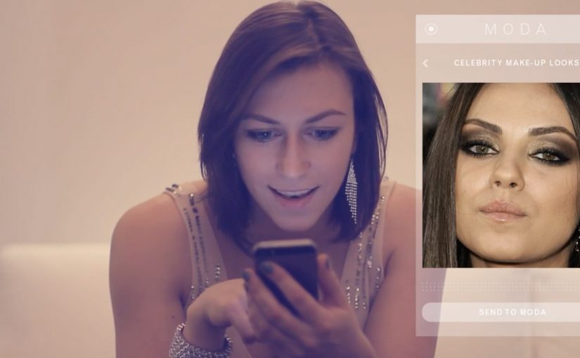
The flow starts in an app: you select a style to emulate. That style can come from MODA’s image library, a celebrity photo, or a picture of a fashionable friend. MODA then scans facial features to align the look. In other words, it maps facial landmarks so placement follows the wearer’s features. MODA then adapts colors and shapes to suit the wearer’s skin tone and face shape.

How the device applies the look

Once the selection is set, the user places their face into the device and MODA “paints” the chosen look directly onto the face, described as using makeup ink that is FDA-approved. Here, “ink” refers to the makeup medium the device dispenses onto the skin. The proposition is speed and repeatability: copy a look, personalize it, apply it, done.

In consumer beauty tech, shifting makeup from manual skill to an automated service experience changes the value from “how well you apply” to “how fast you can experiment”.

Why this idea has an audience

Online videos teaching people to copy celebrity styles are already a mass behavior. MODA’s bet is that many people do not want more instruction. They want a shortcut. Because the device applies the look for you after scanning and personalization, “trying a look” can become as easy as choosing one. The real question is whether the applied result looks credible enough that people will trust it without extra tutorial time. This framing is compelling because it shifts beauty from a practiced skill to a repeatable service moment.

Extractable takeaway: When a category is stuck on “learn the skill,” the highest-leverage innovation is often a service layer that turns inspiration into a fast, repeatable outcome, not another tutorial.

What MODA teaches about beauty UX

  • Collapse inspiration to action. Let people pick a reference look and get to an applied result quickly.
  • Personalize by default. Use scanning and simple adjustments so the outcome fits the individual, not just the template.
  • Design for repeatability. Make it easy to re-run a look, tweak it, and compare outcomes without starting from scratch.

A few fast answers before you act

What is MODA in one line?

A device billed as a “digital makeup artist” that uses an app selection plus facial scanning to apply a chosen makeup look in about 30 seconds.

What makes this different from AR try-on?

AR try-on is an on-screen overlay that previews a look digitally. MODA’s promise is physical application on the face after scanning and customization.

How does a user choose a look?

Through an integrated smartphone app, choosing from a library or supplying a reference image such as a celebrity photo or a friend’s picture.

How does MODA personalize a look to your face?

It’s described as scanning facial features and then adapting the chosen reference look by adjusting placement, shapes, and color choices to better fit the wearer’s face shape and skin tone before applying it.

Who is MODA pitched for?

People who want to experiment with different looks quickly, especially those who do not enjoy the learning curve of manual application and tutorials.

Foxtel: The Alert Shirt

In September 2012, London fashion house CuteCircuit launched a wearable, sharable, programmable tshirt. Then in 2013, Durex Australia unveiled their wearable electronic underwear that allowed touch to be transferred over the internet. Now joining this growing trend of wearable electronic clothing is the Alert Shirt from Australian telecommunications company Foxtel.

Loyal Foxtel customers can use this special shirt to experience in real time some of the physical sensations their favorite players have on the field, including:

  • Pressure: A thumping heartbeat
  • Impact: The shock of a big hit
  • Adrenalin: An intense rush of blood
  • Exhaustion: Lungs burning with effort
  • Despair: A sudden sinking feeling

The data is transmitted via Bluetooth from smartphone app, and the shirt is powered by a lithium polymer cell battery.

From second-screen to second-skin

The mechanism is a clean translation layer. Live game moments are captured as data, the app receives them, and the shirt turns those signals into physical feedback. The experience is not about watching harder. It is about feeling the sport in parallel with the broadcast.

In subscription sports media, the strategic job is retention. The best fan experiences make the service feel like access to something you cannot get anywhere else.

Why it lands

This idea works because it turns fandom into a bodily cue, not just a viewing habit. It also frames “technology” as something you wear once, then forget. When it is working, the interface disappears and the sensation becomes the message.

Extractable takeaway: If you want to deepen engagement, do not add more features to the screen. Translate key moments into a new sensory channel that runs alongside the core experience, and make activation as close to effortless as possible.

What Foxtel is really testing

Beyond the spectacle, this is a trial of emotional stickiness. By emotional stickiness, the point is simple: give fans a stronger felt reason to come back for the live broadcast. The real question is whether that added intensity is strong enough to make Foxtel feel like the only place to experience the match properly. If the shirt can make a live match feel more intense at home, it creates a reason to watch live, to watch longer, and to choose the broadcast that supports the experience.

What sports broadcasters can steal from this

  • Design the sensation vocabulary. Map data to feelings in a way users can understand instantly.
  • Make the phone a bridge, not the destination. Use the app to pair and translate, then let the wearable carry the moment.
  • Keep the promise specific. Heartbeat, hit, exhaustion. Concrete signals beat vague “immersive” claims.
  • Build for live viewing. The value rises when timing is tight and the feedback feels synchronous.

A few fast answers before you act

What is the Foxtel Alert Shirt?

It is a connected shirt that receives live match signals via a Bluetooth smartphone app and converts them into physical sensations so fans can feel key moments in real time.

What problem does it solve for a broadcaster?

It makes the broadcast feel exclusive and more emotionally intense, which can support loyalty and repeat live viewing.

Why use physical sensations instead of more on-screen stats?

Because sensations do not compete with the main viewing experience. They add a parallel layer without asking the fan to look away.

What makes this kind of wearable feel credible?

Clear mappings between events and sensations, low setup friction, and tight timing so feedback feels connected to the moment.

How can another brand apply the pattern?

Choose a live experience with high emotion, capture a small set of meaningful signals, then translate them into a simple, repeatable sensory vocabulary.

Zonacitas.com: Singles Finder App

“Love is out there. If we get organized, there’s plenty for all.” That is the simple provocation behind the Singles Finder App built for Zonacitas.com, a major Argentinian dating portal.

Buenos Aires is often described as a nightlife-heavy city with thousands of bars, discos, and pubs. That abundance creates a practical problem for singles. Where do you go tonight if your goal is to actually meet someone?

Singles Finder reframes the decision as information. It is described as a free iPhone app that shows the number of single prospects in each location, so users can choose where to go before they go.

Turning nightlife into a searchable index

The mechanism is straightforward. The app surfaces venue-level counts of single men and women, letting users compare options and pick the spot with the best odds for their intent, rather than relying on guesswork or luck.

In big-city nightlife ecosystems, the winning consumer experience is often the one that reduces uncertainty about where to invest your next two hours.

Why it lands

This works because it respects the real barrier. The hardest part is not downloading a dating app. It is deciding where to show up in the physical world. The real question is where you can increase the odds before you leave home.

Extractable takeaway: When your category depends on offline outcomes, shift the product value from “matching” to “decision support,” meaning a clear, comparable signal that helps people pick where to go before they leave. Help people choose where to go, not just who to message.

What Zonacitas.com is really buying

As positioning, it moves the brand from “dating portal” toward “nightlife utility.” As behavior, it encourages planning and repeat usage. As marketing, it turns a crowded, emotional category into a rational promise you can explain in one sentence. This is a stronger bet than competing on endless profiles and messaging alone.

Takeaways for location-driven products

  • Make the choice easier, not louder. Reduce the decision space with a simple comparison signal.
  • Shift value upstream. Solve the problem before the user commits time and money to a night out.
  • Design for “before I leave home.” The best moment is pre-decision, not mid-venue.
  • Keep the promise legible. A count is clearer than a vibe.

A few fast answers before you act

What is the Singles Finder App?

It is a Zonacitas.com mobile app concept that shows how many single prospects are in each nightlife location, helping users decide where to go before they head out.

Why is the “count per venue” mechanic persuasive?

It turns an emotional, uncertain choice into a comparable signal. Users can pick a venue based on odds rather than guesswork, which feels immediately useful.

What problem does this solve that typical dating portals do not?

It addresses the offline planning step. Instead of focusing only on profiles and messaging, it supports the real-world decision of where to show up tonight.

Who is this best for?

It is best for people facing many similar nightlife options and a time-bound goal. The value is reducing randomness in the “where do we go” decision.

How should the promise be explained in one line?

Explain it as “help me choose where to go tonight.” The clearer the decision it supports, the faster users understand why it is useful.

What should a brand measure for an activation like this?

App opens during peak nightlife hours, venue search and comparison behavior, downstream check-ins or venue visits where available, and retention driven by repeat planning on future nights.