Technology in 2014

A 2014 screen daydream from The Astonishing Tribe

This is essentially an experience video by Swedish interface gurus The Astonishing Tribe, envisioning the future of screen technology with stretchable screens, transparent screens and e-ink displays, to name a few. An experience video is a short concept film that prototypes interface behavior and user flows before the underlying hardware is ready for the market. E-ink is a reflective display technology designed for readability and low power use.

How the film turns “new screens” into real interactions

Instead of listing specs, the video uses everyday moments to make the screen itself feel like a material you can bend, place, and share. The point is not the exact device. The point is the interaction model that becomes possible when the display is flexible, see-through, or paper-like. That works because a familiar human moment makes an unfamiliar screen feel usable, not speculative.

In consumer electronics and enterprise device ecosystems, display form factors shape interaction patterns, content formats, and the business models built on top of them.

The real question is which interaction model you want your screens to enable before you commit to devices, layouts, and content formats.

Concept experience videos are still one of the fastest ways to align teams on interaction shifts before the hardware is ready.

Why “stretchable, transparent, e-ink” is a strong provocation

Stretchable screens challenge the idea that UI must live inside rigid rectangles. Transparent screens challenge the idea that a screen must block the physical world. E-ink displays challenge the assumption that every screen is emissive, high-refresh, and power-hungry.

Extractable takeaway: Pick one screen assumption to break (rigid, opaque, emissive) and demonstrate the behaviors that follow.

Steal these moves for your next interface pitch

  • Show behaviors, not features. Demonstrate how people move, share, and switch context when the screen stops behaving like a slab.
  • Prototype the handoffs. The “wow” is usually in the transitions, not the destination screen.
  • Use one material shift as the story engine. Flexible, transparent, or reflective. Pick one and build a coherent set of moments around it.
  • Make it boring on purpose. Ground the future in ordinary work, home, and commuting situations so the audience focuses on usability.

A few fast answers before you act

What is “Technology in 2014” about?

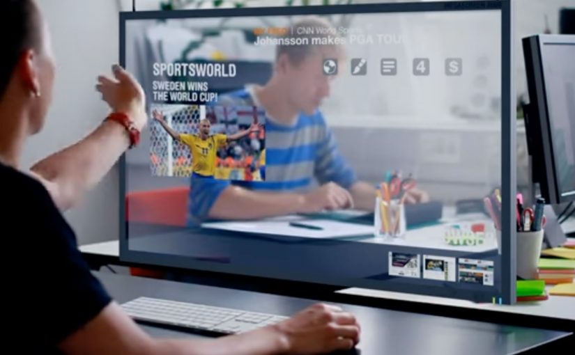
It is a concept experience video that imagines how screens could evolve by the year 2014. The focus is on new display form factors and the interactions they enable.

Which display ideas does it highlight?

The video spotlights stretchable screens, transparent screens, and e-ink displays. Those three examples are used to suggest different ways UI could live in the physical world.

What should marketers or product teams take from it?

Use concept films to communicate interaction shifts early, when prototypes are still rough. Anchor the story in everyday scenarios so the intended behavior is unmistakable.

How do you apply the idea without future hardware?

Focus on the interaction principles: continuity across surfaces, simple sharing moments, and readable, low-friction information layers. You can prototype those behaviors with today’s devices and materials.

What’s the biggest pitfall when making this kind of video?

Over-indexing on visual spectacle and under-explaining the user flow. If viewers cannot repeat the “how it works” in one sentence, the concept will not travel inside an organization.

A Non Smoking Generation: Ugly Models

A teenage girl applies to a glamorous new modelling agency called “U-Models”. She fills in her age, height, and other details, uploads a photo, and waits for the call-back.

Then the twist lands. “U-Models” is revealed as “Ugly Models”, and the campaign’s message is blunt: smoking doesn’t just damage you in the long run. It shows up on your face, sooner than you think.

A fake model search that weaponises the application form

The execution is built like a real talent hunt. Recruitment happens online, and the “application” is the product. Applicants are asked for basics like age and an uploaded photo. Smoking status is part of the form, too.

After the sign-ups, the campaign responds at scale. Applicants are told they are “too cute” for this agency because it is looking for “ugly models”. They are then shown a retouched version of their own photo that visualises how they might look after years of smoking.

How it turns a health warning into personal evidence

Most anti-smoking messages rely on abstract futures: disease, risk, statistics. This one drags the consequence into a mirror. It converts “smoking is harmful” into “this is what it can do to you”, using the viewer’s own face as proof, and using the modelling world as the attention hook.

In Scandinavian youth health communication, campaigns often have to compete with fashion and celebrity culture for attention.

The real question is how you make a long-term health risk feel socially immediate to a teenager.

Why it lands with the target group

The psychological move is simple: it swaps distant health outcomes for immediate social stakes. For teenagers, “identity now” usually beats “health later”. The campaign borrows the exact mechanics young audiences already understand. Casting calls, celebrity endorsement, online applications. Then it flips those mechanics into an uncomfortable reveal that is hard to unsee. That works because a personalised image collapses an abstract warning into an immediate identity threat.

Extractable takeaway: If your audience discounts long-term risk, translate the consequence into a near-term identity signal, and make the “proof” feel personally addressed rather than generally broadcast.

The intent, and the ethical edge you can’t ignore

This is a deliberately provocative form of social marketing. It uses deception, and it leans on appearance anxiety to get attention. That friction is part of the spread. People talk about it because it feels shocking, and because it breaks the usual public-service tone.

The pattern is effective, but it should only be used where the public-good case is strong and the safeguards are explicit. If you borrow the pattern, borrow it with care. The line between “wake-up call” and “harmful shaming” is thin, especially when the audience is young. The execution works because it is sharp, but it also raises real questions about consent, data handling, and emotional impact.

What to steal for your next behavior-change idea

  • Use a familiar cultural container. Here it is modelling and celebrity culture. Pick a container your audience already pays attention to.
  • Make the interaction do the persuasion. The form, the upload, and the response are the message. Not the headline.
  • Deliver a personalised “receipt”. The retouched photo turns a general warning into concrete evidence.
  • Design the reveal as the share trigger. The moment of “wait, this isn’t what I thought” is the social fuel.

A few fast answers before you act

What is “Ugly Models” in this context?

It is an anti-smoking campaign framed as a modelling recruitment drive called “U-Models”, later revealed as “Ugly Models”, designed to warn teenagers about the visible impact smoking can have on appearance.

How does the campaign mechanism work?

Teenagers apply online to a supposed model agency and upload a photo. The campaign then responds with a reveal message and a retouched version of the applicant’s own photo that visualises the effects of smoking over time.

Why is the personalised photo so powerful?

Because it turns a general warning into something that feels directly attached to the viewer’s own identity. The consequence stops being abstract and starts feeling immediate, visible, and personal.

Why focus on appearance instead of health consequences?

The idea is that long-term health warnings are often ignored by teenagers, while near-term identity and appearance cues are harder to dismiss. The campaign makes the risk feel immediate and personal.

What’s the main risk in copying this approach?

The tactic uses deception and can slide into shaming. If the audience is young, you need extra care around consent, safeguarding, and avoiding harm while still delivering a clear public-good message.

Nokia: The World’s Biggest Signpost

When navigation stops being private

Making navigation social is the new big idea by Swedish agency FarFar for Nokia.

What the “big signpost” actually does

The idea is simple at street level. Put a colossal digital signpost in a place with constant foot traffic, then let the public control it. People submit a location from their phone or via the web, and the sign turns to point toward that place while displaying the direction and distance.

Instead of selling navigation as a spec on a phone, the campaign turns it into a shared public utility and a social recommendation engine. Your place becomes part of the experience, and everyone nearby gets a live demonstration of what the service can do.

In global consumer tech marketing, “useful features” often stay invisible until you give them a public stage and a participatory hook.

Why it lands

It takes something normally solitary, finding your way, and makes it performative. Watching the sign react in real time creates instant credibility, and seeing other people’s “good things” transforms navigation from point-to-point directions into discovery. The spectacle draws a crowd, but the viewer control keeps the crowd engaged because the output is never the same twice.

Extractable takeaway: If you are marketing a capability people underestimate, externalize it in a physical demonstration, then let the audience drive the input so the proof feels self-generated.

What Nokia is really buying with this stunt

The visible job is attention. The deeper job is adoption.

The real question is whether a public demonstration can turn navigation from a private utility into a behavior people want to repeat and share.

This is a stronger way to sell navigation than listing features in isolation because the product benefit becomes visible, social, and easy to try.

Done well, the “map of good things” becomes more than a campaign artifact. Here, “map of good things” means a navigation layer shaped by public recommendations, not just static directions. It becomes a product behavior.

What brands can steal from the signpost

  • Turn an invisible feature into a visible ritual. Make the value legible in under five seconds, even with no sound.
  • Design for participation, not just impressions. Let people submit inputs, then reward them with a public output.
  • Make the crowd the content engine. Recommendations from real people do the persuasion work for you.
  • Build a clean bridge to “try it now.” If the demo is the billboard, the next step must be immediate on the device in someone’s pocket.

A few fast answers before you act

What is “The World’s Biggest Signpost” for Nokia?

It is a large interactive signpost installation that lets the public submit locations and then shows the direction and distance to those places, used to promote Nokia’s navigation services as social and shareable.

How does the experience make navigation “social”?

It shifts navigation from personal utility to public discovery by letting anyone contribute places and letting everyone nearby see the recommendations and results live.

What is the core mechanic that makes it work?

Real-time viewer control. People submit a destination and immediately see the sign respond with a physical, public proof of the service.

Why use a large physical installation instead of a regular ad?

A physical demo creates instant trust. It shows the capability in the real world, not as a claim, and it attracts attention through spectacle while keeping engagement through interaction.

What’s the key transferable lesson for brands?

If you want people to value a capability, stage it as a shared experience where the audience supplies the inputs and the product supplies undeniable outputs.