Air China “Facebook Check Ins”

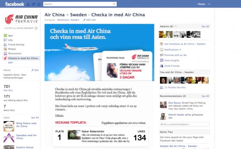
You visit a popular Asian restaurant in Sweden, check in with Air China on Facebook, and instantly become part of a live leaderboard. The more you check in, the higher you climb. Each week, the top check-in users earn two complimentary tickets to Asia.

Air China flies not only to China but also throughout Asia. The challenge is how Air China raises Swedish consumers’ awareness about this fact. In response, their ad agency Rodolfo creates a Facebook check-ins campaign.

How the campaign works in the real world

A select number of popular Asian restaurants in Sweden are transformed into ambassadors for Air China. At the restaurants, guests are encouraged to check in with Air China on Facebook.

What makes it competitive and shareable

The check-ins are aggregated on the Air China Facebook page, and a complete leader board of the highest number of check-ins and the most popular restaurants is displayed. Each week, the users with the highest number of check-ins are awarded two complimentary tickets to Asia.

In market categories where route awareness is broader than one destination, brands need a way to move from static claims to lived proof in everyday settings.

Why this format fits airline awareness

The activation connects everyday behaviour to a clear brand message. Because the action happens in Asian restaurants and the leaderboard makes repeat visits visible, the idea of “Asia access”, meaning one airline that can take you to multiple destinations across Asia, feels immediate, social, and measurable without needing a hard sell in the moment.

Extractable takeaway: When a brand promise is broader than what people currently remember, attach it to a repeatable action in a context that already signals the message.

The real question is whether the brand can turn ordinary social behaviour into repeated proof of a broader route network. The business intent is to expand Air China’s mental availability beyond China and into Asia as a travel network. This is a smart awareness play because the reward, venue, and social mechanic all reinforce the same message.

What to steal from this airline check-in mechanic

  • Use context as your media: Turn partner venues into “brand ambassadors” when the venue naturally signals your message, here Asian restaurants reinforcing broader Asia access.
  • Design for 10-second participation: Use a repeatable, low-friction action, check-in, that people can do in seconds, in a context where sharing already feels normal.
  • Add a progress mechanic: Include a visible scoreboard, leaderboard, so the behaviour has a reason to repeat, not just a reason to start.
  • Run on a clear cadence: Weekly winners keep urgency high and create multiple chances to participate without complexity.
  • Make the reward reinforce the promise: Align incentives tightly to the brand claim, tickets to Asia, so every mention strengthens recall.

A few fast answers before you act

What is the core idea of this campaign?

Turn physical venues into social triggers. Restaurants prompt people to check in with Air China, and the accumulated check-ins become the campaign scoreboard.

Why use restaurants as campaign ambassadors?

They are culturally relevant touchpoints for Asia in Sweden, with built-in footfall and a natural reason for people to share where they are.

What role does the leaderboard play?

It creates a simple competition loop. People see progress, compare against others, and repeat the behaviour to climb. That repetition drives reach and recall.

What is the incentive design lesson here?

Make the reward perfectly aligned with the promise. Tickets to Asia are a direct reinforcement of Air China’s broader Asian network, not a generic prize.

What should a brand copy first from this format?

Start with the triad, not the platform: a relevant venue, a low-friction repeat action, and a reward that proves the brand promise. That is the reusable structure.

Slide to Unlock: Audi and Amnesty iAds

Audi “Slide to Unlock”

AlmapBBDO Brazil developed a distinctive iAd for the Brazilian Audi Magazine iPad app. Here, “iAd” refers to an interactive in-app ad unit built for iPad publications. The ad appeared in iPad publications and played with Apple’s familiar “Slide to Unlock” gesture to pull people into the experience.

Users instantly recognised the swipe interaction used to unlock Apple devices. After racing their finger around the track, they were rewarded with a free download of the first Audi Magazine issue from the App Store.

Amnesty International “Slide to Unlock the Truth”

Amnesty International ran an iAd in one of Sweden’s largest newspapers, DN, presenting readers with an image of a prison cell and a prisoner inside. The same “Slide to Unlock” gesture opened the cell and revealed a strong invitation to join Amnesty International as an activist.

Mechanic: borrow muscle memory, then repay it with value

Both executions use the same trick. They take an interaction people already know, then remap it to a brand action. In Audi’s case, the swipe becomes a playful mini-game. In Amnesty’s case, the swipe becomes a literal unlock that reveals a call to action.

In iPad-era rich media placements, the fastest engagement comes from interactions that feel native to the device instead of invented for the ad.

The real question is whether the gesture is already learned, so the first second goes to the message instead of the UI.

This approach is worth using when you can deliver a clear payoff within one gesture and one reveal.

Why it lands

The shared win is immediacy. There is no learning curve. The interface is already familiar, so attention goes straight to the message. Audi uses that familiarity to reduce friction on a content reward. Amnesty uses it to make the metaphor physical and emotionally legible.

Extractable takeaway: If you want interaction inside an ad to feel effortless, borrow a gesture people already trust, then make the outcome either instantly rewarding or instantly meaningful.

What to steal from gesture-first iAds

  • Start with a native gesture. Familiar interaction reduces drop-off in the first seconds.
  • Make the mapping obvious. Swipe-to-race and swipe-to-open both explain themselves.
  • Reward immediately. Audi pays the user back with a free issue. Amnesty pays back with a clear reveal and a direct next step.
  • Keep the loop short. One gesture, one transformation, one outcome.
  • Let metaphor do the work. Amnesty’s “unlock” is not decoration. It is the message.

A few fast answers before you act

What is the core idea behind “Slide to Unlock” iAds?

They repurpose a familiar device gesture to trigger a brand action, reducing friction and making interaction feel instinctive.

Why does borrowing a system gesture increase engagement?

Because users already know what to do. That removes instruction time and makes the first interaction feel safe and predictable.

What is the key difference between the Audi and Amnesty uses of the gesture?

Audi uses it for playful interactivity and a content reward. Amnesty uses it as a literal metaphor that reveals a persuasive call to action.

What is the biggest risk when using familiar UI patterns in ads?

If the gesture mapping feels unclear or gimmicky, people feel tricked. The interaction must lead to a payoff that justifies the borrowed familiarity.

What should you measure if you run an interaction-led ad?

Interaction start rate, completion rate, time-to-first-payoff, post-interaction clicks, and whether the interaction improves recall of the message.

SAS TimeKiller App: for delayed flights

For the last two years in a row, SAS (Scandinavian Airlines) wins recognition as Europe’s most punctual airline. With their ad agency SWE Advertising Stockholm, they create a small time-wasting utility app that is not actually made for loyal SAS customers, but for customers of competitor airlines. Here, a “utility app” means a tiny set of simple time-wasters meant to fill airport waiting time, not a booking tool.

The idea is to poke fun at SAS’ rivals by suggesting their passengers will need this app from SAS because chances are their flight will be delayed and they will need something to kill time with.

Punctuality is a service promise that is easier to demonstrate through playful proof than to claim in a static ad.

Why the joke works as a positioning tool

The app is framed as “help” for the wrong audience. That reversal does two things at once. It flatters SAS’ own performance, and it gives people a sharable punchline that does not require you to know anything about the airline’s route map or pricing.

Extractable takeaway: If you have a provable operational edge, package it as “help” for the people who do not have it. The inversion makes the proof memorable and easy to retell.

What the utility format adds

A utility app earns attention differently than a film. People understand the use case immediately, and the brand is present during the exact moment when “punctuality” becomes emotionally relevant, which is waiting around with nothing to do. Because the brand shows up inside that boredom, the punctuality claim feels like lived experience rather than marketing.

In European travel markets where delays are a shared irritation, proof-based humor like this can travel faster than polished slogans.

The real question is whether your brand can turn a performance claim into something people choose to share.

Competitor teasing like this is worth doing only when your punctuality claim can withstand scrutiny.

Steal the move: playful proof of punctuality

  • Target the competitor’s pain point. The message lands because it attaches to a real frustration, delays.
  • Make the idea explainable in one line. “An app for when your airline is late” is instantly clear.
  • Let the brand voice do the selling. The confidence in the joke is the differentiator.
  • Choose a format that matches the claim. If the promise is saving time, build something that lives inside wasted time.

A few fast answers before you act

What is the SAS TimeKiller App?

It is a light utility app positioned as a set of simple time-wasters for passengers who end up waiting because their flight is delayed.

Who is the app really aimed at?

Competitor airline customers. The concept uses them as the audience so SAS can underline its punctuality by contrast.

What is the core message SAS communicates?

If you fly SAS, you should not need a time-killing app at the airport. If you fly someone else, you might.

Why is an app a smart channel for this idea?

Because it places the brand in the exact moment of frustration and boredom, which makes the message feel relevant rather than abstract.

What is the main risk with this kind of competitor jab?

If your own operational performance slips, the joke can backfire. This format works best when your proof point is consistently strong.