Nissan Micra: Savvy With Space Banner

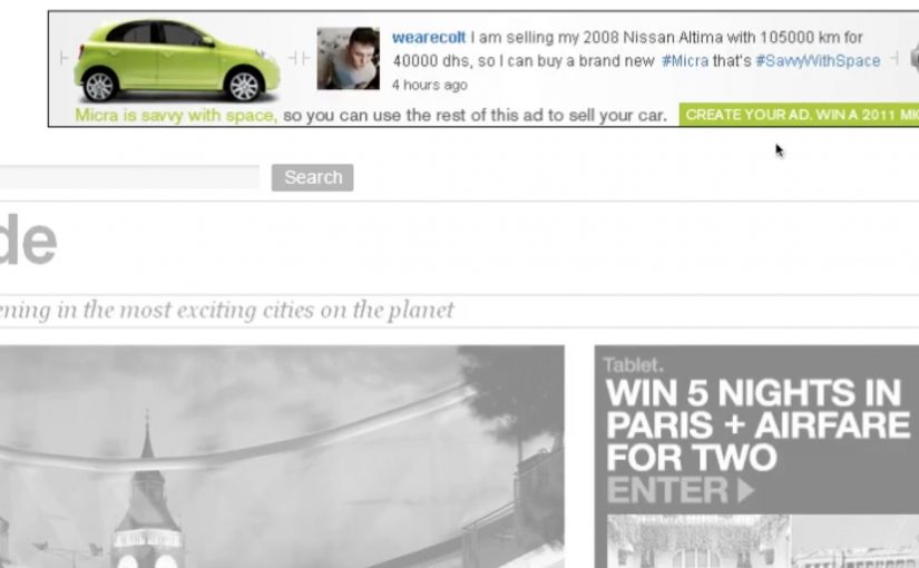
From an under-the-seat shoe drawer to an extra-large glovebox, the 2011 Nissan Micra makes the most out of what it has. Here, “space-savvy” means fitting more useful function into a small footprint without making the car feel cramped. To reach drivers who value space-savvy functionality, TBWA\RAAD Dubai takes the same idea into media and builds a banner ad that “packs in” more utility than you would expect.

The punchline is simple. The banner is so clever with space that you can even use the ad itself to help sell your car.

When the format becomes the message

Instead of talking about storage compartments and smart design in a conventional way, the campaign uses the banner’s own layout as the demonstration. The ad behaves like the Micra. Compact, efficient, and surprisingly capable inside a tight footprint.

In automotive marketing, proving practical value often works best when the proof is baked into the experience format, not layered on as copy.

Why this lands

This works because it turns “space-savvy” from a feature claim into something you can feel. The audience is not asked to believe a list of compartments. They experience a compact unit that still does more than expected, which mirrors the product promise in a way that reads instantly.

Extractable takeaway: If your product advantage is “smart use of limited resources,” make the media unit demonstrate that constraint directly, so the format itself becomes the proof.

What the campaign is really optimizing for

The real question is whether the media can make clever functionality feel obvious before the audience has to read a feature list.

This is a strong fit for the Micra because the format does the selling work before the copy has to. The target is not everyone who wants a car. It is drivers who prioritise clever functionality and everyday usefulness. The banner’s “utility-first” design signals that the Micra is designed for people who like practical wins, not flashy theatre.

What functional brands can borrow

  • Let the container prove the claim. Build the story into the experience mechanics.
  • Design for instant comprehension. The idea should land before someone reads supporting text.
  • Match the medium to the benefit. Functional products benefit from functional media behaviors.
  • Keep it user-relevant. If the execution helps someone do something, attention comes easier.

A few fast answers before you act

What is “Savvy With Space” in this Nissan Micra campaign?

It’s a banner-led idea that uses the ad unit’s compact, space-efficient design to mirror the 2011 Nissan Micra’s “smart storage and functionality” positioning.

What makes this different from a normal feature ad?

The format demonstrates the benefit. Instead of only describing clever storage, the banner’s behavior and layout are designed to feel space-smart.

Who is the campaign aimed at?

Drivers who value practical, space-savvy functionality and small design decisions that make daily use easier.

What’s the reusable pattern here?

Make the medium behave like the product benefit, so the audience experiences the claim rather than just reading it.

What could go wrong if you copy this approach?

If the “cleverness” is not immediately obvious, it can look like gimmickry. The functional proof has to be legible fast.

Nissan: Create Your Terrain

You hold your hands up to the webcam, and the landscape changes. Peaks rise, valleys drop, and a Nissan SUV gets challenged to drive across whatever terrain you just “sculpted” in mid-air. It takes an off-roading mindset and translates it into a simple piece of viewer control. Here, viewer control means your gestures directly shape the terrain in real time. Build a route. See if the car can handle it.

That is the core idea behind Nissan’s “Create Your Terrain,” built by TBWA\RAAD to help launch Nissan’s SUV family in the Middle East. Instead of showing capability with another glossy montage, it invites off-roaders to invent the terrain first, then watch the vehicle conquer it.

Create Your Terrain uses webcam detection as the input method. In plain terms, the camera reads your gestures and turns them into a terrain editor, so you can shape dunes and obstacles without a mouse or controller.

In automotive marketing, the strongest digital launches turn enthusiast culture into an interaction loop, not a viewing moment.

The microsite (www.createyourterrain.com) was reported to have attracted thousands of user-made terrains, adding up to more than 80,000 square kilometres of created landscape. The build is also credited with recognition at Dubai Lynx 2011 (Bronze, Microsites & Websites) and a GEMAS Effies 2011 finalist placement (Automotive), which fits the ambition. Make the product story feel earned through play, not told through claims.

Why this mechanic fits off-roading

Off-roading is personal. Everyone has their own “perfect line,” their own idea of what counts as a challenge, and their own pride in tackling terrain others avoid. This activation borrows that psychology. The viewer creates the course, so the payoff feels like their test. Nissan just shows up to pass it.

Extractable takeaway: When you let enthusiasts define the test, the brand’s proof point feels like a response to their standards, not a claim the brand asks them to accept.

What Nissan is really buying with “Create Your Terrain”

This is not only a tech demo. The real question is whether your mechanic makes the capability story feel earned, not asserted. It is a positioning move. The message is that Nissan’s SUVs can handle anything, including terrain you have never seen before. And because the experience is interactive, it naturally increases dwell time, encourages sharing, and gives people a reason to return and try a “harder” build.

What to borrow for your own interactive launch

  • Let the audience create the challenge. Self-made tests feel more authentic than brand-made obstacles.
  • Use input that matches the story. Gestures and a webcam make “hands-on terrain” feel physical, not like another web game.
  • Keep the loop tight. Create. Challenge. Watch. Repeat. The shortest loop is the one people replay.
  • Design for bragging rights. The shareable unit is not the ad. It is “my terrain” and “my result.”

A few fast answers before you act

What is “Create Your Terrain” in one sentence?

It is an interactive Nissan microsite where webcam-based gestures let viewers build a digital off-road landscape and then challenge a Nissan SUV to drive across it.

Why does viewer-created terrain matter?

Because it flips the usual launch pattern. Instead of the brand defining the challenge, the audience defines it. That increases personal investment and makes the capability story feel more credible.

What does “webcam detection” mean here?

It means the experience uses the camera feed to interpret basic gestures as inputs, turning the viewer’s hands into a simple controller for shaping the terrain.

What is the key takeaway for digital campaign design?

Build an interaction loop that mirrors real-world behaviour. When the mechanic matches the passion, like building and conquering terrain here, people stay longer, replay more, and share more naturally.

What is a common failure mode for experiences like this?

Overcomplicating the first minute. If setup is fiddly, calibration is fragile, or the payoff is slow, people bounce before the “magic” lands.

Levi’s: Soundwash

You pick a Levi’s Square Cut style, choose a music genre, then “Soundwash” the jeans, meaning you pair the selected cut with a music mix through a washing-machine-style interface. The idea gives young audiences a new way to express themselves by turning denim selection into a brand and music experience, not just a purchase.

TBWA\TEQUILA Hong Kong and Levi’s Hong Kong developed Soundwash for the Square Cut collection featuring five new styles of jeans. Soundwash runs as a multi-dimensional interactive experience that lets the audience choose their favourite jeans style and then “Soundwash” the jeans to their favourite style of music, including rock, hip hop and Cantopop, across multiple platforms.

Creatively, Soundwash rediscovers the authenticity of the classic American laundry and collides it with cutting-edge music styles to create a distinct brand experience using a Soundwash “machine”. The concept is supported by limited edition packaging and gift accessories, a Soundwash Laundry pop-up store in high traffic Tsim Sha Tsui, a branded iPhone game app, a website, and an online viral video featuring local music band Mr.

A laundromat you can control with music

The mechanism is a tight participation loop. Start with a product choice, then translate that choice into sound. Shoppers select a Square Cut style, then pick a music mix to “Soundwash” it, using the Soundwash “machine” as the interface that makes the metaphor feel physical and real.

In youth fashion markets where denim is a social signal and music is identity language, interactivity works best when it lets people express taste choices in public, not just consume a message in private.

Why it lands

This works because it turns a collection launch into something you can play with. The laundry metaphor makes the experience instantly legible, and the music layer makes it personal. You are not only choosing jeans, you are choosing a vibe, then “performing” that choice through the machine, the pop-up, and the shareable formats.

Extractable takeaway: If you want a product line to feel like culture, build one repeatable interaction that lets people express taste, then extend it across retail, packaging and mobile so the same idea shows up wherever the audience moves.

How the app makes it competitive

The Soundwash iPhone app includes a game where friends can compete to see who can Soundwash the most jeans in 30 seconds. The top scorer of each week receives a pair of Levi’s Square Cut jeans, which turns the app from a novelty into a reason to return and to challenge others.

The real question is whether the campaign can turn one moment of playful customization into a repeatable social behavior that keeps the collection in circulation.

Levi’s makes the right call by using the app to extend the same interaction rather than treating mobile as a separate stunt.

Steal the denim-and-music playbook

  • Turn selection into performance. Make the act of choosing feel like self-expression, not decision fatigue.
  • Use one clear metaphor. “Laundry” is a simple frame that supports multiple touchpoints without explanation.
  • Build a retail anchor. A pop-up makes the digital idea feel tangible and photogenic.
  • Add a competitive loop. Time-boxed play plus weekly rewards creates repeat usage and social pull.

A few fast answers before you act

What is Levi’s Soundwash?

A Levi’s Hong Kong Square Cut activation that combines denim and music. People choose a style, then “Soundwash” it to a music mix via an interactive machine and supporting digital experiences.

What is the core mechanism?

Product choice plus music choice, expressed through a “Soundwash machine” interaction, then extended into a pop-up, packaging, app, website, and a viral video featuring local music band Mr.

Why use a laundromat metaphor?

Because it is instantly understood and visually rich. It makes the experience feel physical, and it gives the campaign a consistent world across touchpoints.

What role does the iPhone app play?

It adds competition and repeat engagement through a 30-second game format, plus weekly rewards that encourage people to come back and challenge friends.

What is the most reusable lesson here?

When you are selling self-expression, design one simple interaction that makes taste visible, then let that interaction travel across retail, digital, and social formats.