SNCF: Take a look at Brussels

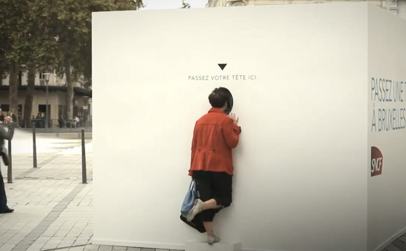
France’s national state-owned railway SNCF is back with another live event. This time, with ad agency TBWA\Paris, they set out to promote the launch of their new direct Lyon (FR) to Brussels (BE) train route.

A 3 meter high cube is placed in Place de la République, Lyon with the message “Take a look at Brussels”. Passers-by who peek into the hole are transported to Brussels and greeted live by a Belgian music band.

A cube that makes “direct” feel real

The idea does not try to explain the route. It stages it. The cube behaves like a physical portal that turns “Lyon to Brussels is direct” into something you can experience in a few seconds, without a brochure, timetable, or sales pitch. For route launches, staging the benefit beats explaining it.

How the peephole reveal is engineered

The public-facing mechanic is simple. Here, “mechanic” means the visible action a passer-by is asked to take. Look inside, see Brussels. Underneath, it is a live link that creates the feeling of distance collapsing, with the band providing a human welcome that reads as hospitality rather than tech demo. Because the link is live and the welcome is human, the portal feels credible, which is why the message sticks.

In European transport marketing, live street experiences work best when they compress a service promise into one instantly understood moment.

Why this feels like travel, not advertising

Most transport marketing shows trains and destinations. This one gives you a destination moment first, then lets your brain do the rest. Curiosity pulls people in. The live greeting rewards them immediately. And the “I just saw Brussels from Lyon” story is easy to retell.

Extractable takeaway: If your promise is immediacy, make it visible as a live reveal, so people feel it before you explain it.

The real question is whether your launch makes the benefit felt before it is explained.

What SNCF is really buying with the activation

  • Instant comprehension. “Direct link” becomes experiential, not informational.
  • Earned attention. The cube is a public object that draws a crowd and creates spectators.
  • Shareable proof. The experience is built to be filmed, reported, and repeated as a simple narrative.

Steal this for your next route or service launch

  • Turn the benefit into a moment. Do not describe “direct”. Demonstrate it.
  • Make the invitation frictionless. A peephole beats an app download when you need street volume.
  • Add a human layer. A live welcome lands faster than a purely technical reveal.
  • Design for bystanders. If the crowd understands it instantly, the activation markets itself.

A few fast answers before you act

What is “Take a look at Brussels” by SNCF?

It is a street activation in Lyon where a large cube invites people to look into a peephole and see a live scene from Brussels, promoting a new direct train route.

Why use a cube and a peephole instead of posters?

Because the action is self-explanatory and physical. People understand what to do in seconds, and the reveal delivers the message more memorably than a static claim.

What is the key idea being communicated?

Directness. The campaign makes the Lyon to Brussels link feel immediate by turning it into a live “window” experience.

What makes this effective as live communication?

Curiosity drives participation, the live greeting rewards it, and the outcome becomes a simple story people share: “I saw Brussels from Lyon.”

What should a transport brand measure for activations like this?

Footfall, participation rate, dwell time, earned media pickup, and any measurable lift in route awareness or intent in the regions reached.

Kenco: Kenneth the Talking Vending Machine

Kenco Millicano’s whole bean instant coffee is positioned as the closest thing to a proper coffee from a vending machine. However, people often have negative perceptions about drinking instant coffee from a machine. So, to engage and excite people enough to consider swapping their coffee shop routine for a vending option, Kenco Millicano worked with its agency team on a talking vending machine. The voice for the machine was provided by comedian and voice actor Mark Oxtoby, who spent a whole day in Soho Square interacting with passers-by.

Similarly in Hong Kong, Levi’s worked with TBWA on a talking phone booth dubbed the “Levi’s Summer Hotline”. Inside the booth, two popular local radio hosts connected via video and challenged visitors to answer questions or do stunts. The crazier the stunt, the bigger the prize. The prize printed out in the booth like a receipt, and could be redeemed at nearby Levi’s stores. The activation was reported to have drawn more than half a million interactions over three days and to have driven a 30% sales uplift.

Two executions. One shared trick

Both ideas take a familiar street object. A vending machine. A phone booth. Then they add something people do not expect from an object like that. A voice, a challenge, a human response, and a reward that arrives immediately.

How the “talking interface” mechanic works

A “talking interface” is a familiar street object that responds with voice, turning a simple transaction into a short ask, response, reward loop.

  • Interrupt the script. People approach expecting a predictable transaction, then the unit talks back.
  • Create a small social contract. You do something simple or slightly brave, and the unit rewards you.
  • Turn participation into theatre. Bystanders can understand what is happening fast, and the crowd recruits the crowd.

In busy public places where attention is scarce, interactive installations win when the first five seconds are obvious and the payoff is immediate.

The real question is whether you can make a vending moment feel like a social interaction, not a compromise.

Why it lands

The “talking” element is not a gimmick. It flips an inanimate object into a social moment, which makes the interaction feel personal even when it is happening in public. That shift changes the emotional framing from “machine coffee” to “a quick story I was part of”. For brands, that is how you replace a negative perception without arguing about it.

Extractable takeaway: If you want people to try something they think they dislike, do not debate the product. Change the moment around the product so the first experience feels human, surprising, and worth retelling.

What these activations are really doing for the brands

Kenco’s machine makes “vending” feel warmer, and it makes the product choice feel less like compromise. Levi’s booth turns brand interaction into a game with a tangible receipt-style reward that pushes people towards a nearby store. Both installations are a conversion point and a content engine at the same time.

Steal this loop for street activations

  • Use a familiar object. Familiarity reduces explanation time and increases participation.
  • Make the first step low-risk. A small action opens the door to a bigger payoff.
  • Keep the loop short. Ask. Respond. Reward. Long flows die in public space.
  • Design for onlookers. The audience around the participant is the multiplier.
  • Make redemption effortless. If the reward requires extra effort later, participation drops.

Vending machines are one of my favourite formats for street-level innovation. I have featured plenty of them on Ramble. If you want to go deeper, browse the vending-machine archive.


A few fast answers before you act

What is a “talking vending machine” in marketing terms?

It is an interactive out-of-home installation where a vending unit uses live or scripted voice interaction to trigger participation, then delivers an immediate reward to reframe the product experience.

Why does “talking back” increase participation?

Because it breaks the expected script of a transaction. That surprise creates curiosity, and curiosity pulls people closer long enough for the reward loop to start.

What makes these ideas work in high-footfall locations?

They are instantly legible, fast to complete, and entertaining for bystanders. The environment supplies the amplification through crowd behaviour.

What is the biggest execution risk?

Throughput and reliability. If interactions slow down, misfire, or confuse people, the installation becomes friction, not fun.

How do you measure success beyond views?

Participation rate per hour, completion rate, average dwell time, sentiment, and whether the activation produces measurable trial or store redemption lift.

MINI: Fan the Flame

MINI, together with TBWA\Agency.com, creates a social spectacle to grow the fan base for its newly launched Facebook page in Belgium and Luxembourg.

The setup is as physical as it gets. A MINI Countryman is attached to a thick rope in the parking lot of the Brussels Motor Show, with a burner placed beneath the rope. Facebook fans are encouraged to remotely trigger the burner and shoot flames at the rope. A webcam broadcasts the scene 24×7, and the fan whose flame ultimately breaks the rope wins the MINI Countryman.

Why this is a “like” campaign people actually talk about

Most fan-growth ideas are transactional: click like, get content. This one makes the click feel consequential. Each interaction is a tiny act of sabotage against a real-world object, with a visible scoreboard outcome. The page is not just where the brand posts. It is the control panel for the event. This is the better pattern when you need fast fan growth without training people to expect freebies.

Extractable takeaway: If you want people to talk, make the social action change a visible system, then let the audience verify progress live.

The mechanism: remote control plus live proof

Mechanically, the campaign combines three ingredients: a simple trigger (fan action), a physical system (rope and flame), and continuous proof (the live webcam). The webcam is crucial because it converts a remote interaction into trust. People can see that something is actually happening, continuously, with no editing.

In European automotive social campaigns, linking digital participation to a live physical outcome is one of the fastest ways to create earned attention, meaning people talk and share without paid amplification, beyond the fan base itself.

What the prize is really doing

The real question is whether your social channel is just a feed, or a place where the audience can change something that matters in real time.

The MINI Countryman is not only incentive. It is also the symbol. The closer the rope gets to breaking, the more the prize feels “reachable”, which keeps people checking back and telling friends to join. The prize turns time into tension.

What to copy for your next live activation

  • Make the interaction visible. Live video proof makes remote participation feel real.
  • Use a simple mechanic with cumulative progress. People return when they believe their action contributes to a final outcome.
  • Put the brand in the role of facilitator. The page becomes the place where something is happening, not just the place where posts appear.
  • Design for suspense. A slow-burn system creates anticipation and repeat visits.

A few fast answers before you act

What is “MINI Fan the Flame” in one line?

A live contest where Facebook fans remotely trigger flames to burn through a rope holding a MINI Countryman, with the fan who breaks it winning the car.

Why does the webcam matter?

It provides continuous proof that the event is real and progressing, which sustains trust and repeat engagement.

What behavior is this campaign optimizing for?

Fan acquisition plus repeat visits. The tension mechanic encourages people to return and recruit others.

What is the transferable lesson for other brands?

If you want scale, connect digital actions to a visible physical outcome and design the system so progress builds suspense over time.

What is the minimum viable version of this mechanic?

Combine one clear trigger, one physical system that visibly changes, and one always-on proof stream so participants can verify progress without edits.