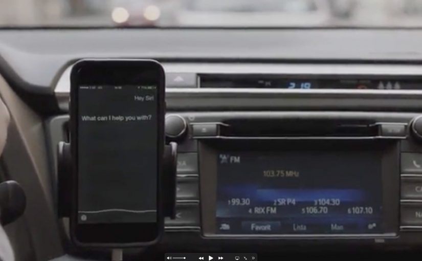
By hijacking Siri, Toyota in Sweden has found a new way to get people to turn off their phones in the car and stop texting.
With the help of Saatchi & Saatchi they created a radio ad that interacts with the phone without human intervention. It relies on the iPhone being plugged in and charging, and on the “Hey Siri” wake phrase being enabled, so even if the driver is not paying attention, their phone is.
Click here to watch the video on AdsSpot website.
Two separate ads ran during rush hour. One was designed for Apple’s Siri, and the other for Android with the “OK Google” wake phrase.
How the hijack works
The mechanism is voice-command interception. The ad speaks the wake phrase and a follow-up instruction that prompts the assistant to switch the device into airplane mode, provided the phone is in a state where it will listen hands-free. The trick is that radio is ambient, so the command can be delivered even when the driver is not actively using the phone.
In passenger vehicles where phones are commonly used for navigation and messaging, road-safety campaigns win when they reduce distraction without adding driver effort.
Why it lands
This works because it demonstrates the problem and the solution in the same breath. The message is not only “do not text”. It is “your phone can be compelled to stop being a temptation”. The moment your device responds makes the risk feel real, and it makes the remedy feel immediate.
Extractable takeaway: If you can make the safety behavior happen automatically at the moment of risk, you remove reliance on willpower. That shift from intention to automation is what makes behavior change scalable.
What the campaign is really saying about attention
The real question is how to remove temptation at the exact moment distraction becomes possible.
The deeper point is that distraction is not a moral failure. It is a design failure. If the environment keeps inviting you to look, eventually you will. Toyota reframes the ask from “be better” to “build a system that makes the right thing easier”.
What safety campaigns can steal from this
- Use the medium’s superpower: radio is always-on and hands-free, so it can reach people at the exact time the habit happens.
- Make the behavior visible: when the phone reacts, the lesson becomes undeniable.
- Design for constraints: define the exact conditions required for the mechanic to work, then build the idea around them.
- Offer an immediate fix: a safety message lands harder when it includes a concrete action, not only a warning.
- Keep the premise singular: one problem, one intervention, one clear outcome.
A few fast answers before you act
What is “A Siri-ous Safety Message”?
It is a Toyota Sweden road-safety campaign built around radio ads that trigger voice assistants to switch a phone into airplane mode, aiming to reduce distracted driving.
How can a radio ad control a phone?
By speaking the wake phrase and a follow-up command that the assistant will interpret, if the device is plugged in and hands-free voice activation is enabled.
Why run two versions of the ad?
Because “Hey Siri” and “OK Google” are different triggers. Separate edits let the concept work across major phone ecosystems.
Is the main value the tech trick or the message?
The trick earns attention. The value is the behavior change prompt. It turns “turn off your phone” from advice into a demonstrated, immediate action.
What could make this backfire?
If people feel the intervention is intrusive, or if it interferes with legitimate in-car use like navigation. The campaign needs the safety intent to be unmistakable and the boundaries to be clear.


