VW GTI Banner Race: Chase a Car Across the Web

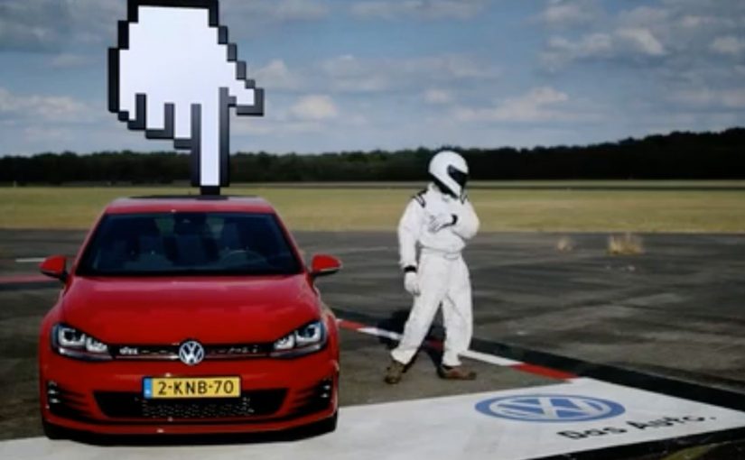
Volkswagen Netherlands set out to launch the new GTI in a way that feels fast before anyone even touches the accelerator. The result is an online race staged inside banner advertising, but mapped onto the physical logic of the real world.

Four popular Dutch websites are painted as the runway of an airport, each banner space measuring 20 metres wide and 25 metres long. On race day, 13th September, participants chase the GTI as it speeds through the banner spaces of each site. The person fast enough to catch the new GTI wins the car in real life.

When banners stop being static and start behaving like space

The mechanism is a reframing of banner advertising. Instead of isolated rectangles, the banners become connected terrain. Each site represents a segment of runway. Movement between banners creates the illusion of distance, speed, and progression.

The GTI does not just appear. It moves. And because it moves, the user has a reason to stay alert, react quickly, and treat the banner as something to engage with rather than ignore.

In digital launch campaigns, turning passive media into an environment with rules is often the fastest way to earn attention without buying more impressions.

Why speed and scarcity do the heavy lifting

This works because it borrows from racing psychology. There is a single target. There is a clear win condition. And there is scarcity. Only one person catches the GTI. That tension transforms passive browsing into a moment of competition.

The prize is not symbolic. Winning the actual car anchors the experience in reality, which prevents the activation from feeling like a disposable digital trick.

The intent: make the GTI feel alive online

The business intent is to translate the GTI’s performance DNA into a digital format. Speed, responsiveness, and thrill are not explained. They are simulated. The banner becomes a proxy for the car’s character.

At the same time, Volkswagen demonstrates that standard media formats can still surprise when they are treated as systems instead of slots.

How it was built behind the scenes

The making-of video shows how the different banner environments were aligned, timed, and stitched together to behave like a single runway across multiple sites.

What to steal from the GTI banner race

  • Rethink familiar formats. Banners can be environments, not just placements.
  • Design for motion. Movement creates attention where static assets fail.
  • Use a real reward. Tangible stakes raise commitment instantly.
  • Connect experiences. Linking multiple sites turns reach into narrative space.
  • Encode the product DNA. Let the interaction mirror what the product stands for.

A few fast answers before you act

What makes this GTI launch different from a normal banner campaign?

The banners are connected into a continuous race environment, turning advertising space into gameplay instead of static exposure.

Why use an online race to launch a car?

Because racing instantly communicates speed and performance, which are core to the GTI identity.

Does this work without the prize car?

The experience would still be novel, but the real-world reward dramatically increases urgency and participation.

What role do partner websites play?

They become part of the environment. Each site is a segment of the runway rather than just a host for an ad.

What is the main takeaway for digital launches?

When you turn media formats into systems with rules and progression, people stop skipping and start playing.

Video Campaigns: When the Player Is Message

Two videos that did not just play, they proved the point

In digital marketing, video innovation rarely comes from “better footage”. It comes from changing how the viewer experiences the message. These two campaigns are clean examples of that approach.

In the last week or so I came across two campaigns that used video to innovatively deliver their message.

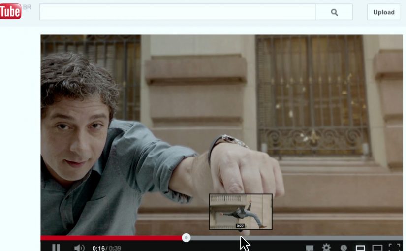
Volkswagen Hidden Frame – using the YouTube play bar as the story

The Volkswagen Side Assist feature helps drivers avoid accidents by showing other vehicles when they are in the side mirror’s blind spot.

To drive home the message, AlmapBBDO developed a film that used YouTube’s play bar to show the difference the VW Side Assist made in people’s lives.

No Means No – a player that interrupts denial

Amnesty Norway, in an attempt to change the Norwegian law on sexual assault and rape, developed a film that used a custom video player to pop up the key message.

The campaign was a success and the law was about to change as a direct consequence of the campaign.

Why interface-led video lands harder

Both ideas shift the viewer from passive watching to active noticing.

Volkswagen used a familiar interface to make a safety benefit visible in the moment. Amnesty used an interface interruption to force the key message to be seen, not skipped. In both cases, the “player” stopped being furniture and became the persuasion device.

In digital storytelling, interface design becomes a competitive advantage when it shapes what the viewer notices and cannot easily skip.

What these campaigns were really trying to achieve

The business intent was not “engagement” as a vanity metric. It was message delivery with minimal loss.

Volkswagen aimed to make an invisible feature feel tangible and memorable. Amnesty aimed to change perception and behavior at the cultural level, and the player design reinforced that urgency by refusing to be background noise.

What to steal from player-hacking storytelling

  • Use the interface as evidence. When the message is hard to show, let the UI demonstrate it.
  • Design for the skip reflex. If your message is often ignored, build an experience that makes ignoring harder.
  • Keep viewer control intentional. Interactivity works when it serves comprehension, not novelty.
  • Make the “point” happen inside the viewing moment. Do not rely on a voiceover claim when the experience can prove it.

A few fast answers before you act

What is an “interface-led” video campaign?

A campaign where the video player experience. The progress bar, overlays, or controls. Is part of the storytelling, not just the container.

How did Volkswagen Hidden Frame use YouTube differently?

It used YouTube’s play bar as a narrative device to demonstrate the value of Side Assist, making the benefit feel visible rather than described.

What did Amnesty Norway’s No Means No change about the player?

It used a custom video player that surfaced the key message via a popup, ensuring the point was encountered during playback.

Why do these ideas work better than a standard film in some cases?

Because they reduce message loss. The viewer is guided to notice the point through the viewing mechanics, not just the content.

What is the practical takeaway for brands?

If your message is often missed, redesign the viewing experience so the message is structurally harder to ignore and easier to understand.

Volkswagen Beetle: Slowmercial

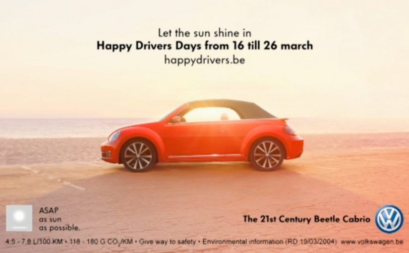
A lot of people fast-forward TV commercials when watching time-shifted shows. So Volkswagen took the opposite approach and made a TV commercial that is deliberately slow and almost static, so it still communicates even at high-speed playback.

The idea is simple. When the spot is fast-forwarded on a TV recorder, it collapses into something that feels like a print ad. A single, readable message. A clear product reveal. No complicated storyline to miss.

A tv spot designed for 8x speed

This is not “slow motion” for cinematic drama. It is time engineered as a media format. The frames are composed to hold meaning when they blur together, and the copy and visuals are built to survive the exact behavior viewers use to avoid ads.

In DVR-heavy TV markets, the remote control is the real media buyer.

Why it lands

It respects the viewer’s habit without pretending it will change. Instead of trying to stop skipping, it designs for skipping. That creates a rare feeling of cleverness, because the ad meets you where you are, and still gives you a complete message.

The deeper lesson is that “attention” is not binary. If you can make your message legible in partial attention, you can still win.

Business intent: keep the message intact

The intent is straightforward. Protect the core benefit and the product impression in a world where traditional 30-second storytelling gets shredded by fast-forward. The slowmercial approach makes sure the Beetle remains visible and understandable, even when the viewer refuses to watch properly.

What to steal

  • Design for the behavior, not the ideal. If people skip, build a format that works while skipping.
  • Make one message unmissable. One benefit. One visual proof. One clean takeaway.
  • Borrow from print discipline. Composition, hierarchy, and legibility beat complexity.
  • Assume partial attention as default. Build creative that degrades gracefully instead of collapsing.

A few fast answers before you act

What is a slowmercial?

A slowmercial is a TV ad designed to work even when viewers fast-forward. It uses ultra-slow pacing and print-like composition so the message remains readable at high playback speeds.

Why does fast-forward turn this into a print ad experience?

Because fast-forward compresses time and removes nuance. If the creative is built around stable frames, clear typography, and a single message, the compressed playback still delivers a coherent visual and idea.

When should a brand use this approach?

When you know a meaningful portion of viewing happens time-shifted, and when the ad’s job is to deliver one clean message rather than tell a complex story.

What is the biggest creative mistake with “anti-skipping” ideas?

Over-engineering. If the concept requires explanation, it fails. The viewer must understand the message instantly, even in partial attention.

What metrics matter for this kind of creative?

Ad recall under time-shifted viewing, brand linkage, and message takeout. If you can test it, compare recall for normal-speed versus fast-forward exposure.