VW GTI Banner Race: Chase a Car Across the Web

VW GTI Banner Race: Chase a Car Across the Web

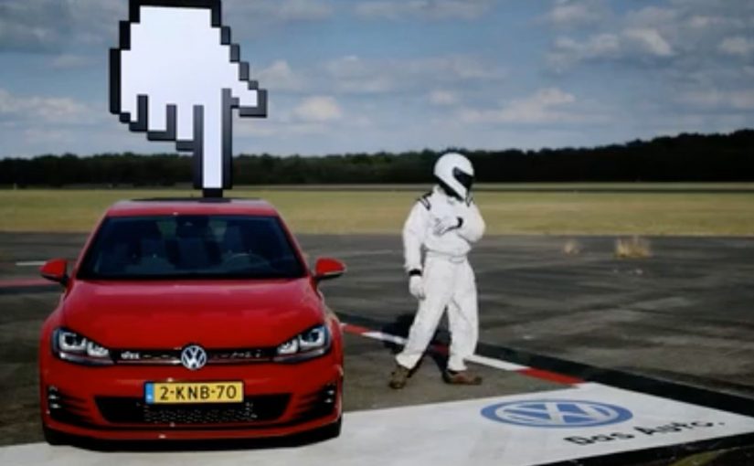
Volkswagen Netherlands set out to launch the new GTI in a way that feels fast before anyone even touches the accelerator. The result is an online race staged inside banner advertising, but mapped onto the physical logic of the real world.

Four popular Dutch websites are painted as the runway of an airport, each banner space measuring 20 metres wide and 25 metres long. On race day, 13th September, participants chase the GTI as it speeds through the banner spaces of each site. The person fast enough to catch the new GTI wins the car in real life.

When banners stop being static and start behaving like space

The mechanism is a reframing of banner advertising. Instead of isolated rectangles, the banners become connected terrain. Each site represents a segment of runway. Movement between banners creates the illusion of distance, speed, and progression.

The GTI does not just appear. It moves. And because it moves, the user has a reason to stay alert, react quickly, and treat the banner as something to engage with rather than ignore.

In European automotive launches, turning passive media into an environment with rules is often the fastest way to earn attention without buying more impressions.

Why speed and scarcity do the heavy lifting

This works because it borrows from racing psychology. There is a single target. There is a clear win condition. And there is scarcity. Only one person catches the GTI. That tension transforms passive browsing into a moment of competition.

Extractable takeaway: When you can make a product trait playable, set one clear target, one win condition, and one scarce outcome so attention becomes a self-sustaining loop.

The prize is not symbolic. Winning the actual car anchors the experience in reality, which prevents the activation from feeling like a disposable digital trick.

The intent: make the GTI feel alive online

The business intent is to translate the GTI’s performance DNA into a digital format. Speed, responsiveness, and thrill are not explained. They are simulated. The banner becomes a proxy for the car’s character. By “performance DNA” here, I mean the cues of speed, responsiveness, and thrill that people associate with a GTI.

The real question is whether your launch media can make the product trait felt in the first five seconds, not just described.

This is a better pattern than static launch assets when the brand promise is motion, because the interaction does the persuasion.

At the same time, Volkswagen demonstrates that standard media formats can still surprise when they are treated as systems instead of slots.

Patterns to borrow from the GTI banner race

  • Rethink familiar formats. Banners can be environments, not just placements.
  • Design for motion. Movement creates attention where static assets fail.
  • Use a real reward. Tangible stakes raise commitment instantly.
  • Connect experiences. Linking multiple sites turns reach into narrative space.
  • Encode the product DNA. Let the interaction mirror what the product stands for.

A few fast answers before you act

What makes this GTI launch different from a normal banner campaign?

The banners are connected into a continuous race environment, turning advertising space into gameplay instead of static exposure.

Why use an online race to launch a car?

Because racing instantly communicates speed and performance, which are core to the GTI identity.

Does this work without the prize car?

The experience would still be novel, but the real-world reward dramatically increases urgency and participation.

What role do partner websites play?

They become part of the environment. Each site is a segment of the runway rather than just a host for an ad.

What is the main takeaway for digital launches?

When you turn media formats into systems with rules and progression, people stop skipping and start playing.

Coca-Cola: Personal Road

Coca-Cola: Personal Road

Coca-Cola has an ongoing global campaign that allows consumers to personalise bottles and cans…

The real question is how you extend a personalization promise beyond the package without turning it into a gimmick.

Enjoy a Coke with Sunil

Building on the success of this campaign Coca-Cola Israel decided to take the idea further with personalised billboards.

A mobile app was developed where consumers could enter their name. Then using geo-fence technology, the Coca-Cola billboard displayed the name when it was approached. Geofencing here means the app detects when you enter a defined area around the billboard. The same trigger also sends a phone message, which is what makes the public moment feel personal and easy to share.

In global consumer brands running mass-personalization campaigns, this kind of simple, location-triggered reveal is a clean way to turn a name into a real-world moment.

Since its launch the app has reached 100,000 downloads and is currently ranked #1 in Israel’s app store.

Why this extension makes sense

It keeps the original “Share a Coke” promise intact, then amplifies it with one visible surprise that is immediately confirmed on the device you are already holding.

Extractable takeaway: If you want personalization to stick, pair one unmistakably personal output people can see with one immediate confirmation they can keep.

  • It keeps the personalization promise. The name is not only on the package. It shows up in the world around you.
  • Location makes it feel “for me”. The moment you approach the billboard, the experience becomes uniquely yours.
  • Mobile closes the loop. The phone notification confirms the moment and turns it into something you can share.

The reusable pattern

Start with a personalization mechanic people already understand. Then add a single “surprise and confirm” moment in the real world, powered by location and a simple mobile action.

  • Keep the input tiny. Ask for one thing, like a name, and make it obvious what happens next.
  • Make the output public and specific. Put the person’s name somewhere they cannot miss in the real world.
  • Confirm on mobile. Send a message at the same moment so the experience is memorable and shareable.

A few fast answers before you act

What is Coca-Cola “Personal Road”?

It is a Coca-Cola Israel extension of the personalised-name campaign that uses a mobile app and geofencing so a billboard displays your name as you approach, and your phone notifies you.

How does the billboard know when to show a name?

The app uses geo-fence technology to detect proximity, then triggers the personalised billboard moment when the user approaches.

Why pair the billboard moment with a smartphone message?

The message confirms what just happened and makes it easy for the consumer to capture and share the experience.

What is the key takeaway for location-based campaigns?

Make the rule simple and the payoff instant: one input from the consumer, one visible personalised output, and one mobile confirmation that seals the memory.

NIVEA: Solar Ad Charger

NIVEA: Solar Ad Charger

You are on the beach, your battery is dying, and the solution is sitting inside a magazine. NIVEA Sun and Draftfcb Brazil built a print ad insert with real solar panels and a USB port, so beachgoers could plug in and charge while staying in the sun.

The mechanism is the message. The ad is not “about” a product benefit. It behaves like one. Put it in sunlight, connect your phone, and it becomes a small piece of beach kit.

In consumer brand marketing, the most memorable activations turn a media placement into a useful object that fits a real moment of need.

The real question is whether you can make the medium do the job your copy normally tries to do.

This kind of utility-first work is worth copying because it earns attention by solving something small, fast, and real.

Everything in the context ties together cleanly. Sun. Beach. Sunscreen. Mobile phone. Solar charger. The usefulness makes the brand feel present without asking for attention, because the attention arrives naturally once the ad starts solving a problem.

When “print” becomes a product

This is a simple but important shift. The ad is no longer a container for persuasion. It is a container for utility. That makes the experience inherently shareable, because the story people retell is not “I saw an ad”. It is “I charged my phone with a magazine”.

Why this idea lands on a Brazilian beach

Beach time is long, bright, and social. It also creates a predictable friction point. Phones run out of battery, and leaving the spot to find power breaks the day. A solar-powered insert fits the environment and the behaviour, so the concept feels obvious in hindsight.

Extractable takeaway: When the environment already supplies the input, design the interaction so the payoff arrives with almost no explanation.

How to reuse the Solar Ad Charger pattern

  • Start with a real constraint. Battery anxiety is a better brief than “increase awareness”.
  • Let the medium carry the meaning. Solar charging in sunlight communicates the sun story instantly.
  • Make the interaction self-explanatory. A USB port is a universal instruction set.
  • Design for the “tellable moment”. A tellable moment is an interaction someone can retell in one sentence, without explaining the ad first.

A few fast answers before you act

What is the NIVEA Solar Ad Charger?

It is a magazine ad insert created for NIVEA Sun in Brazil that includes thin solar panels and a USB port, allowing readers to charge a phone using sunlight.

Why does this count as interactive advertising?

Because the viewer has to use it. The interaction is physical and immediate. Place it in sun, connect a cable, and the ad performs a function rather than only communicating a claim.

What makes the idea feel so “on brand”?

The utility is inseparable from the product context. Sunscreen is used in the sun. The charger also only works in the sun. The message and the mechanic are the same thing.

What is the main lesson for FMCG launches?

If you can turn a placement into a small, relevant tool, you shift from attention-seeking to value-giving. That typically increases recall, sharing, and positive brand association without needing complex explanation.

What is the most common pitfall with utility ads?

Overengineering. If it requires special setup, fragile components, or unclear instructions, people will not try it. Simple inputs and fast payoff matter more than novelty.