The world’s first emotionally powered store

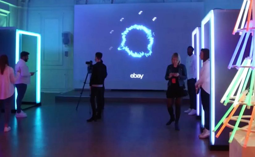
You step into a pop-up store in central London because Christmas shopping feels like a chore. You sit down, look at product ideas on a screen, and the system watches your face as you react. Not in a creepy sci-fi way, but in a deliberately framed “let’s reconnect with the emotional spirit of giving” way. Your expressions become signals. The store turns those signals into a personal report, then suggests the gift that triggers the strongest “this feels right” response.

That is the idea behind eBay’s “emotionally powered store,” created with American technology firm Lightwave. Using intelligent bio-analytic technology and facial coding, eBay records which products provoke the strongest feelings of giving. Here, “facial coding” means software that classifies facial expressions into emotion signals. Then, through personalised emotion reports, it suggests the gift that stirs the most feeling.

What eBay is actually testing here

This is not only a seasonal stunt. It is a test of whether emotion can be treated as data in a retail environment, and whether that data can be turned into a better decision loop.

Treating emotion as data is compelling when it reduces stress and strengthens intent, not when it becomes a gimmick.

The store reframes the problem:

  • the problem is not “too little choice”
  • the problem is decision fatigue, stress, and loss of motivation
  • the solution is not more filters, it is faster emotional clarity

The mechanics. Simple, but provocative

At the core is a clean input-output system:

  • Input. A sequence of gift ideas shown in a tight flow.
  • Measurement. Facial coding and bio-analytic signals that infer which moments create the strongest emotional engagement.
  • Output. A personalised emotion report that recommends the gift that creates the strongest “giving” response.

The tech is almost secondary. The real innovation is the framing. A store that does not just sell products. It guides you toward the gift that feels most meaningful.

Because the flow turns in-the-moment reaction into a clear recommendation, it aims to cut decision fatigue and restore motivation.

In consumer retail and gifting contexts, the win is turning anxious browsing into a confident choice.

Why this matters for next-generation shopping environments

A lot of “next-gen retail” bets on bigger screens, more sensors, and more automation. This one bets on something more human.

Extractable takeaway: When people feel stuck choosing, experience design should optimize for emotional clarity and confidence, not just more options.

It treats the emotional state of the shopper as a first-class design constraint:

  • reduce stress
  • re-anchor the experience in intent and empathy
  • make the decision feel more satisfying, not just more efficient

That is a powerful signal for any brand that sells gifts, experiences, or anything identity-driven. The product is rarely the only thing being purchased. The feeling of choosing it matters.

The leadership question sitting underneath the pop-up

The real question is whether you want your retail experience to optimize for emotional confidence, or pure conversion efficiency.

If you can capture emotional response at the moment of choice, you can start redesigning:

  • the sequence in which products are presented
  • the language and imagery that drives confidence
  • the point at which a recommendation should trigger
  • the moment where a shopper’s motivation drops, and how to recover it

That is where this moves from a pop-up into a capability.

What to copy from this pop-up

  • Design for intent first. Frame the experience around the feeling the shopper wants to deliver, not the catalog size.
  • Shorten the path to “this feels right”. Use tight sequencing and clear prompts that reduce choice overload.
  • Make feedback immediate. Turn reactions into a simple, understandable next step, not another dashboard.
  • Measure to support, not to impress. Keep the technology secondary to the human framing that builds confidence.

A few fast answers before you act

What is an “emotionally powered store”?

An “emotionally powered store” is a retail concept that uses facial coding and bio-analytic signals to infer emotional reactions, then recommends products based on the strongest response.

What is eBay trying to solve with this experience?

The experience targets Christmas gift-buying stress and decision fatigue. It is designed to reconnect shoppers with the emotional spirit of giving.

What role does Lightwave play?

Lightwave provides the technology support for the bio-analytic and facial coding layer used in the pop-up.

What is the output for the shopper?

The output is a personalised emotion report and a gift recommendation based on the products that provoke the strongest feelings of giving.

What is the broader takeaway for retail innovation?

The broader takeaway is that emotion becomes a measurable input for experience design, not just a brand aspiration.

Gatebox: The Virtual Home Robot

You come home after work and someone is waiting for you. Not a speaker. Not a disembodied voice. A character in a glass tube that looks up, recognizes you, and says “welcome back.” She can wake you up in the morning, remind you what you need to do today, and act as a simple control layer for your smart home.

That is the proposition behind Gatebox. It positions itself as a virtual home robot, built around a fully interactive holographic character called Azuma Hikari. Here, “virtual home robot” means a stationary device that uses a character interface to run simple routines and smart home control, rather than a mobile physical robot. The pitch is not only automation. It is companionship plus utility. Face recognition. Voice recognition. Daily routines. Home control. A “presence” that turns a smart home from commands into a relationship.

What makes Gatebox different from Alexa, Siri, and Cortana

Gatebox competes on a different axis than mainstream voice assistants.

Voice assistants typically behave like tools. You ask. They answer. You command. They execute.

Gatebox leans into a different model:

  • Character-first interface. A persistent persona you interact with, not just a voice endpoint.
  • Ambient companionship. It is designed to greet you, nudge you, and keep you company, not only respond on demand.
  • Smart home control as a baseline. Home automation is part of the offer, not the story.

The result is a product that feels less like a speaker and more like a “someone” in the room.

In consumer smart homes, the interface layer matters as much as the devices, because it shapes whether automation feels like commands or companionship.

Why the “holographic companion” framing matters

A lot of smart home innovation focuses on features. Gatebox focuses on behavior. By keeping a persistent character in your peripheral vision, it turns prompts into small social cues, which is why it can feel relational rather than transactional.

Extractable takeaway: If you want technology to be used every day, design for a lightweight loop of interaction that stays alive between commands, not just for perfect answers on demand.

It is designed around everyday moments:

  • waking you up
  • reminding you what to remember
  • welcoming you home
  • keeping a simple loop of interaction alive across the day

That is not just novelty. It is a design bet that people want technology to feel relational, not transactional.

What the product is, in practical terms

At its most basic, Gatebox:

  • controls smart home equipment
  • recognizes your face and your voice
  • runs lightweight daily-life interactions through the Azuma Hikari character

It is currently available for pre-order for Japanese-speaking customers in Japan and the USA, at around $2,600 per unit. For more details, visit gatebox.ai.

The business bet behind a companion interface

The real question is whether your home interface should be a command surface, or a companion that maintains a simple relationship across the day.

The intent is straightforward: keep the interaction loop alive so “smart home control” becomes a daily habit, not a feature you try once and forget.

Character-first companions are a stronger interaction bet than voice-only assistants when you want sustained engagement, as long as utility stays the default.

The bigger signal for interface design

Instead of:

  • screens everywhere
  • apps for everything
  • menus and settings

It bets on:

  • a single persistent companion interface
  • a character that anchors interaction
  • a device that makes “home AI” feel present, not hidden in the cloud

That is an important shift for anyone building consumer interaction models. The interface is not the UI. The interface is the relationship.

Four patterns to borrow for companion interfaces

  • Design for in-between moments. Build a lightweight loop of greetings, nudges, and routines that persists between explicit commands.
  • Make utility the baseline, not the punchline. The companion framing works only if home control and reminders stay reliable and fast.
  • Anchor interaction in one persistent “someone”. A stable persona reduces friction compared to hopping between apps, menus, and settings.
  • Use presence to change behavior. A visible, ambient interface shifts usage from “ask when needed” to “engage because it is there”.

A few fast answers before you act

What is Gatebox in one sentence?

Gatebox is a virtual home robot that combines smart home control with a holographic companion character, designed for everyday interaction.

Who is Azuma Hikari?

Azuma Hikari is Gatebox’s first character, presented as an interactive holographic girl that acts as the interface for utility and companionship.

What can it do at a basic level?

At a basic level, it can control smart home equipment, recognize face and voice, and run daily routines like wake-up, reminders, and greetings.

Why compare it to Alexa, Siri, and Cortana?

The comparison helps clarify positioning. Gatebox frames itself as more than a voice assistant, using a character-first, companion-style interface instead of a purely voice-first tool.

What is the commercial status?

It is described as available for pre-order for Japanese-speaking customers in Japan and the USA, at around $2,600 per unit.

Amazon Go was never about checkout

When Amazon Go surfaced, the headlines went straight to the obvious part. No cashiers. No checkout lines. Walk in, grab what you want, walk out.

It sounds like a stunt until you look at what it quietly challenges.

For decades, retail has been built around a fixed moment. The moment the customer stops. The moment the basket becomes a transaction. The moment the system catches up with reality.

Amazon Go takes that moment and tries to delete it. Not by making checkout faster, but by questioning whether checkout needs to exist as a separate step at all.

Position: Amazon Go is not primarily about convenience. It is about shifting the burden of “truth” from the customer’s confirmation to the system’s continuous sensing.

The real innovation is the part you don’t see

The experience is intentionally boring. That’s the point.

Nothing about the store screams “innovation” in the way tech demos usually do. There’s no “wow” screen at the end. No special ritual. No new behavior to learn. You behave like you always do. The store adapts around you.

That is the shift.

Amazon Go is less a store format and more a live system that tries to observe reality continuously. Who entered. What they picked up. What they put back. What they left with. Then reconciling all of that with identity and payment, without forcing you to participate in a checkout confirmation moment.

Retail has always relied on explicit confirmation. A barcode scan. A till. A receipt. A moment where the system can say, “Now we know.” Amazon Go is testing something different. A world where the system is confident enough, early enough, that it doesn’t need to ask.

In large omnichannel retailers, the hardest part is building operational truth without making customers do the bookkeeping.

Why this matters beyond convenience

If this works, it changes the definition of “frictionless”. Here, “frictionless” means uninterrupted flow. No queue and no explicit stop where the customer must confirm the basket.

Extractable takeaway: Removing a checkpoint beats optimizing it. But removing a checkpoint only works when you move its control logic into the system and design the exception path as carefully as the happy path.

Most retail innovation tries to shave seconds off steps. This tries to remove steps entirely. The customer doesn’t feel faster checkout. The customer feels absence. No interruption. No break in flow.

That absence is not just UX. It is a statement about operations.

When you delete a checkpoint, you do not remove work. You relocate it into sensing, reconciliation, inventory accuracy, and exception handling.

Because once you remove checkout as a formal checkpoint, the store must become more precise everywhere else. The “truth” can’t be created at the end of the journey. It has to be maintained throughout it.

And that’s why Amazon Go is interesting. Not because it eliminates a job role, but because it attempts to turn physical retail into something closer to software. A continuous system. Not a set of steps. A continuous system means a loop of sensing, reconciliation, and exception resolution, not a sequence of isolated handoffs.

What Amazon is really buying with this

Checkout-free is a design bet. You trade a visible control point for invisible control. That can reduce interruption for customers, but it also raises the bar for operational discipline behind the scenes.

The business intent is not “no lines” as a feature. The business intent is end-to-end reliability. Identity, item state, and payment have to reconcile cleanly without asking the customer to do the reconciliation work for you.

That is where the real cost sits. Sensors and models are only the beginning. The hard part is governance. How you handle misreads, disputes, refunds, edge cases, and the human operating model that keeps the system trustworthy.

Steal the pattern. Delete the checkpoint

The deeper takeaway is not “checkout-free store”. The real question is which checkpoints in your customer journey still earn their existence, and which ones only exist because your systems cannot carry the truth continuously.

  • Name your checkpoints. List the moments where the customer must stop to confirm something. Identity. Eligibility. Basket. Address. Consent. Payment.
  • Ask what the checkpoint protects. Fraud. Compliance. Inventory truth. Revenue assurance. If you cannot name it, you cannot redesign it.
  • Decide what “enough confidence” means. Define what the system must know before it stops asking the customer for confirmation.
  • Design the exception path first. The happy path is cheap. The edge cases are where trust is won or lost.
  • Measure absence, not speed. The KPI is not seconds saved. The KPI is interruptions removed without increasing disputes or operational cost.

Amazon Go is a reminder that sometimes innovation is not adding something new. It is removing something that no longer earns its existence.


A few fast answers before you act

What is Amazon Go?

Amazon Go is a retail concept that removes the traditional checkout step. Customers enter, pick up items, and leave without stopping at a register.

What is the real innovation behind Amazon Go?

The real innovation is not “no cashiers”. It is a live system that tries to observe shopping behavior continuously and reconcile what happens in the store with identity and payment without requiring a checkout confirmation moment.

Why does removing checkout matter?

Checkout is one of retail’s most fixed moments. Removing it reframes convenience from speed to absence. No queue and no interruption of flow.

What does Amazon Go suggest about customer experience design?

It suggests the biggest experience gains may come from removing steps that no longer earn their existence, rather than optimizing them. Removing a step only works when the system absorbs its control logic and handles exceptions cleanly.

What is the key takeaway from Amazon Go in 2016?

Amazon Go challenges the assumption that checkout must exist as a separate step. It tests whether retail can move from a sequence of discrete moments to a more continuous system of sensing, reconciliation, and exception handling.