
Adshels with Difference: IKEA LEDshel and ANAR

Here are two adshel innovations currently doing rounds online. An adshel is a street shelter advertising unit, typically at a bus stop. Both use the media surface itself as the message, not just a place to hang a poster.

Ikea LEDshel

IKEA swapped the regular neon tubes found in adshels around Vienna with its LED range. The product becomes the medium, and the demonstration happens at full scale in the street. Credited to DDB Tribal Vienna, the move turns “better light” into something you can experience, not just read about.

Only for children

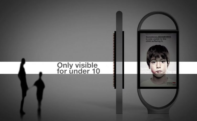
In an effort to give abused children a safer way to reach out for help, the Spanish organization Fundación ANAR created an ad that displays a different message to adults and children at the same time.

The poster uses a lenticular top layer to show different images at varying angles and heights. An adult sees the image of a sad child with the line: “sometimes, child abuse is only visible to the child suffering it.” A child sees bruises and a direct help message with a phone number. This work is widely credited to Grey Group España.

What makes these “adshels with difference”

The shared mechanism is simple: upgrade the shelter from a passive frame into an active communicator. One example changes the hardware so the ad site demonstrates the product. The other changes the optical layer so the message adapts to who is looking.

Because the shelter itself performs the claim, the viewer can grasp the argument in seconds, which is why these ideas travel in public space.

In European city out-of-home media, small physical changes to the site often persuade more powerfully than a clever headline alone.

The real question is whether your out-of-home idea still works when the media unit itself has to do the explaining.

These are the out-of-home ideas worth borrowing because the medium carries the proof, not just the copy.

Why it lands

It makes the proof unavoidable. IKEA does not claim “LED looks better.” It lets the street lighting show it. ANAR does not claim “victims can’t speak safely.” It builds a channel that protects the child in plain sight.

It respects context. Adshels sit in public space where attention is brief. Both ideas communicate at a glance, because the medium itself is doing part of the explanation.

It uses targeting without data. The lenticular execution “targets” by viewpoint and height, not cookies. It is a physical interface decision, not a digital one.

Extractable takeaway: Out-of-home innovations travel when the site behavior carries the argument. If the medium demonstrates the product, or adapts the message to the viewer’s vantage point, the campaign becomes self-explanatory and hard to ignore.

Borrowable adshel moves

  • Turn the placement into the demo. If the product has a sensory benefit, make the environment show it.
  • Use physical segmentation. Angle, distance, height, light, and motion can personalize a message without any personal data.
  • Design for public constraints. Fast comprehension wins. The structure should communicate before the copy finishes.
  • Let the medium do the persuasion. When the execution is the proof, the message needs fewer claims.

A few fast answers before you act

What is an “adshel” in this context?

A street shelter advertising unit, typically at bus stops, that combines a poster frame with lighting and protective glass.

What is the IKEA LEDshel idea actually demonstrating?

LED lighting quality in real conditions. The shelter itself becomes a live showroom for the light range.

How does the ANAR poster show two messages at once?

Through a lenticular layer that changes what is visible based on viewing angle and height, so adults and children see different visuals and text.

Why is this more effective than a standard awareness poster?

Because it delivers a help message to the child without alerting the accompanying adult, which is the real constraint in the situation.

What is the reusable principle across both examples?

Make the media unit behave like the idea. When the medium demonstrates, adapts, or protects, the campaign does not need heavy explanation.
Durex Fundawear

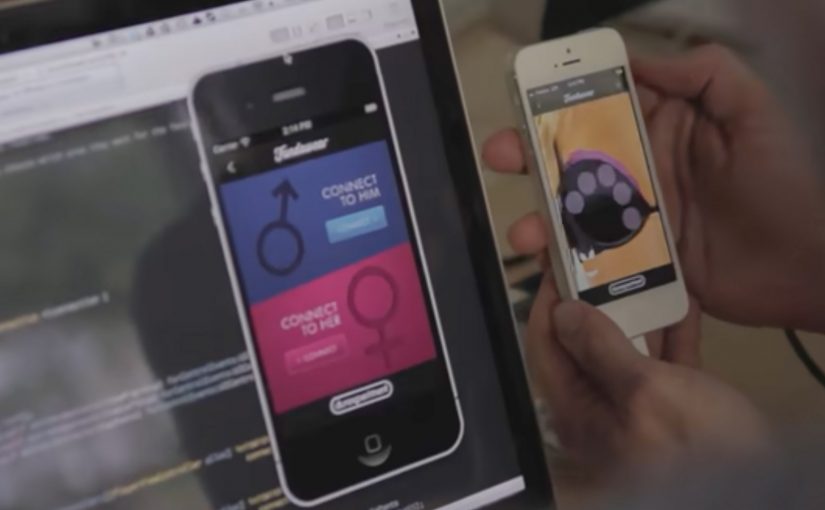
If t-shirts can be digitised, then why can’t underwear. Durex Australia has unveiled “Fundawear”, billed as a first-of-its-kind wearable electronic underwear concept that allows touch to be transferred over the internet while maintaining comfort, sexiness and flexibility. The idea is simple. People in long-distance relationships can tease, tickle and tantalise even when apart.

To replicate the nuances of touch, each garment houses touch technology that connects with a real-time server to communicate between touchscreen devices and the garments. Interaction happens through a smartphone interface, translating inputs into sensation on the connected wearable.

A prototype that behaves like a campaign

What makes this work stand out is the choice to launch as an experiment, not a finished product. Fundawear is framed as a prototype, which gives the brand permission to be bold, invite participation, and trigger debate, without pretending the tech is already mainstream.

Extractable takeaway: When a product concept is unfamiliar, framing it as a prototype lowers disbelief and lets curiosity do the distribution work.

The real question is whether people can understand the use case quickly enough to talk about it.

It also shifts the job of the communications. Instead of persuading people that “remote touch” is a good idea, it makes people imagine use cases. That imagination is the marketing engine.

How the technology story earns attention

The campaign leans on a clear mechanism. Touch input on a phone maps to specific zones, then the garment responds, creating a feedback loop, meaning the phone input and garment response feel connected in the same moment rather than as a delayed message.

When wearable technology is explained this clearly, it stops sounding like science fiction and starts sounding like an interface decision. That is when people share it.

In consumer innovation marketing, the leap from novelty to adoption happens when a physical interface makes a digital promise feel immediate, controllable, and consent-led.

Distribution strategy: invite the internet to co-author the idea

Fundawear is described as still in the experimental stage, with no confirmed release date at the time. But Durex uses that uncertainty as a hook. If you provide a creative reply to “How would you use Fundawear with your partner?” at the Durex Facebook page, you might win a free prototype.

That is a smart move. It turns the public into contributors, and it generates word of mouth that carries the concept further than a conventional product launch could.

What to steal if you are launching an unfamiliar product concept

  • Prototype publicly. Experiments can travel faster than “finished” products because people argue, imagine, and remix.
  • Explain the mechanism in one breath. If the audience cannot repeat how it works, they will not share it.
  • Design for participation. A prompt like “how would you use it?” converts curiosity into content.
  • Keep the tone playful, not clinical. For intimate categories, playfulness lowers the barrier to talk about it.

A few fast answers before you act

What is Fundawear, in plain terms?

Fundawear is an experimental wearable concept from Durex Australia. It pairs smart underwear with a smartphone interface so a partner can send touch inputs over the internet in real time.

What kind of technology does it rely on?

It relies on wearable haptics, meaning small actuators in the garment respond to signals from an app. A server connection synchronises inputs between two partners’ devices and garments.

Why launch a prototype instead of waiting for a finished product?

Because a prototype creates permission to experiment, earn press, and test cultural appetite. It also turns uncertainty into participation, which can generate more talk than a polished launch.

What is the biggest brand risk with intimate wearable tech?

Trust. The concept has to feel safe and consent-led, and the communication has to avoid any hint of surveillance or misuse. If trust breaks, the idea becomes a cautionary tale.

What is the core marketing lesson from Fundawear?

When the product is unfamiliar, the first job is not persuasion. It is making the mechanism and the imagined benefit instantly understandable, so people do the distribution for you.

Heineken Ignite

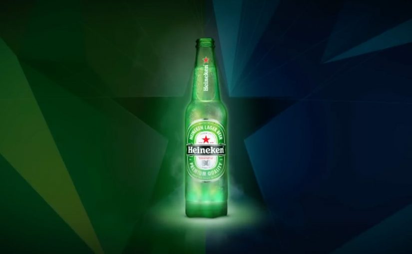
Last year I had written about StartCap, the world’s first digitally enabled bottle top. Now, Heineken has created LED based “smart bottles” that put serious tech into drinking beer.

These interactive bottles are designed to react to the gestures that already define a night out. Cheer and clink bottles together and the LEDs flash. Drink and the light pattern speeds up. Put the bottle down and it shifts into an idle “breathing” mode. Here, “breathing” means the LEDs pulse slowly when the bottle is stationary. The concept also includes software control so bottles can synchronize to music cues for a coordinated light show.

Heineken Ignite is a prototype bottle module that combines LEDs, motion sensing, and wireless synchronization so the bottle becomes part of the club experience, not just the drink in your hand.

Why it lands. When the bottle becomes the signal

What separates this from a gimmick is the engineering story. Coverage around the prototype describes an Arduino based circuit board housed in a reusable 3D printed casing that clips onto the bottom of a standard bottle. The electronics include multiple LEDs, a motion sensor to detect cheers and drinking, and wireless connectivity so the “party” effect can spread across a room. Wireless synchronization matters because it scales the effect from one person’s bottle to a room level cue that people can notice together. This is not a gimmick.

Extractable takeaway: If you want a brand experience to spread in a venue, instrument the object people already hold so natural gestures trigger visible, shared feedback.

This is also why the commercial challenge is real. In prototype form, the tech sits in an external module. To reach a mass market use case, the experience needs to be cheaper, smaller, and embedded, not attached. The real question is whether the connected layer can be made cheap and embedded enough that the bottle ships as the interface, not an accessory.

In European nightlife culture, the most effective brand innovation is the kind that turns the product itself into a social signal.

Why it was shown at Milan Design Week

The concept was unveiled during Milan Design Week as part of Heineken’s future of nightlife exploration. That matters because it frames the bottle as design plus experience, not only packaging. It is a statement about how brands might use connected objects to shape atmosphere in shared spaces.

Recognition and why it matters

Heineken later reported that its Ignite bottle earned a Silver Lion at Cannes Lions 2013 for Exhibitions or Live Events, as part of a broader set of design and innovation activations. Awards do not make a product viable, but they do validate that the idea is legible as a new format for brand experience.

Steal the pattern: product-led nightlife cues

  • Use the product as the interface. When the object in hand is the experience, you do not need to fight for attention elsewhere.
  • Design for social gestures. “Cheers” is a better trigger than any forced interaction because people already do it.
  • Make synchronization the payoff. One glowing bottle is a toy. A room that reacts together is a moment.
  • Prototype in public. Early demonstrations can generate press and learning long before the supply chain is ready.

A few fast answers before you act

What is Heineken Ignite?

Heineken Ignite is a prototype “smart bottle” concept that uses LEDs, motion sensing, and wireless synchronization so the bottle lights up in response to cheers, drinking gestures, and music cues in club environments.

How does the prototype work technically?

Reporting describes a clip-on module under the bottle that houses an Arduino based circuit board, LEDs, motion sensing, and wireless connectivity. The module detects motion patterns and can coordinate lighting across multiple bottles.

Why is syncing to music the key feature?

Because it turns individual behavior into shared atmosphere. Synchronization makes the experience visible at a crowd level, which is what creates talkability and makes the brand feel “in the room”.

What is the biggest barrier to commercializing a concept like this?

Miniaturization and cost. A clip-on prototype can prove the idea, but mass market use needs the tech to be smaller, cheaper, and more seamlessly integrated into production packaging.

What is the main marketing lesson here?

If you want to own a nightlife moment, design around existing social rituals. When the trigger is already natural, the experience feels additive instead of forced.