Nike: Jordan Melo M8 Water Projection

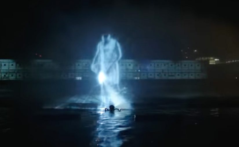
I have seen plenty of projection mapping in the last year or so, but this Nike execution for the Jordan Melo M8 takes a different route. Instead of treating a building as the canvas, it turns the Hudson River into the screen and uses a water curtain to make the visuals feel alive.

Trade coverage describes the launch as a live event at Pier 54, where a crowd gathered for performances and then got hit with a large-scale water projection moment featuring Carmelo Anthony and the Melo M8, layered with mapped effects that made the “explosive” theme feel physical.

When projection mapping stops being “mapping”

The mechanic is simple and smart. Water gives you motion for free, so the visuals do not need to do all the work. Every splash, ripple, and mist edge amplifies the animation and makes the illusion feel bigger than it would on a flat wall.

It also creates a built-in contrast. The shoe is a hard, engineered object. The canvas is fluid and unpredictable. That tension is what makes people stare.

In global sportswear launches, the fastest way to earn attention is to make the product reveal feel like a public event, not a private ad.

Why the water screen is the brand message

The most important thing this stunt communicates is not “this is a new shoe”. It is “this is an event-level product”. The audience reads production scale as product importance, especially in a category where new drops appear constantly.

Using water also supports the narrative hook that appears in reporting around the event. Melo “walks on water” as a visual flex. Whether you call it projection, illusion, or theatre, the point is the same. The launch gives people a story they can retell without describing a single feature.

Business intent

This is launch-week acceleration. Get a live crowd. Create a spectacle that looks unreal on camera. Seed the footage. Then let the audience do the distribution, because the clip is more shareable than a standard product film.

What to steal

  • Choose a canvas that adds value. Water, smoke, ice, and mirrors all contribute “movement” that visuals can ride.
  • Make the environment part of the claim. A river-scale reveal says “major” before any copy does.
  • Design for the recap video. If it does not look unbelievable on a phone screen, it will not travel.
  • Give people one sentence to repeat. “They projected Melo and the shoe onto the Hudson” is enough.

A few fast answers before you act

What is a water screen projection?

A water screen projection uses a thin curtain of mist or falling water as the surface. A projector throws imagery onto it, creating a floating effect that feels more dimensional than a wall projection.

Why does projection on water feel more “real”?

Because the surface moves. Ripples and spray add natural variation, so the visuals feel integrated with the environment rather than pasted onto it.

What makes this kind of stunt effective for a product launch?

It signals importance through scale, creates immediate talk value, and produces recap footage that performs better than a standard reveal because it looks like an event, not an ad.

What is the main operational risk?

Reliability. Water, wind, sightlines, and crowd control can all degrade the experience. If the image is not crisp and the moment does not land fast, the spectacle becomes confusion.

What metrics matter most?

Earned pickup, social share rate of the hero clip, completion rate, and correct retelling of the mechanic. If people remember “Hudson water projection” and connect it to the shoe, the stunt did its job.

Volkswagen Beetle: Juiced Up

A billboard looks normal until you point your phone at it. Then the Beetle “juices up” into a 3D scene that spills out of the frame, turning a static poster into something you can explore.

That is the twist behind Volkswagen’s Beetle “Juiced Up” launch, created with Red Urban. Traditional out-of-home placements like billboards and bus shelters double as augmented reality markers. Download the custom app, scan the printed ad, and a 3D experience unlocks on your screen.

An AR marker is a printed visual pattern that a camera can recognize. When the app detects it, it anchors digital 3D content to the real-world poster so the animation appears to sit on top of the physical ad.

In large automotive launches, the best out-of-home work turns “I noticed it” into “I did something with it”, without asking people to learn a new behaviour.

Why AR markers work so well in out-of-home

Out-of-home already has the two things AR needs. Scale and repetition. People pass the same placements multiple times, which makes it easier for curiosity to build. Once someone scans, the experience feels like a hidden layer you only get if you engage.

The other advantage is perception. A revamp is hard to communicate through copy alone. A 3D reveal makes the “newness” feel more tangible, even if the viewer only plays for a few seconds.

What this launch is really optimizing for

This is not just about feature education. It is about reframing the Beetle’s personality and making the redesign feel more assertive and contemporary. The app is a proof device. It says “this is different” by behaving differently than a normal poster campaign.

What to steal for your next OOH-led activation

  • Make the trigger obvious. A single prompt, scan here, is enough. Let the payoff do the persuasion.
  • Anchor the interaction to the medium. If it is out-of-home, the phone should feel like a lens on the poster, not a separate experience.
  • Keep the first moment fast. If the 3D reveal does not land immediately, the novelty collapses.
  • Design for “I have to show you”. The best activations create a demo impulse that spreads in person.

A few fast answers before you act

What is “Volkswagen Beetle: Juiced Up”?

It is an out-of-home launch activation where Volkswagen posters and billboards act as AR markers. A dedicated mobile app unlocks a 3D Beetle experience when viewers scan the ads.

Why use AR markers instead of a standard QR code?

Markers make the poster itself the interface. That keeps the experience visually seamless, and it helps the 3D content feel physically attached to the real ad.

What is the main benefit of this approach for a product revamp?

It makes “newness” experiential. A 3D reveal can communicate attitude and redesign energy faster than a feature list.

What is the biggest practical risk with AR OOH?

Friction. If the app install and scan flow is slow, most people will not complete it. The reward has to justify the effort quickly.

What is the simplest way to improve completion rates?

Reduce steps and increase immediate payoff. Clear instruction at the poster, fast recognition, and an instant 3D moment that feels worth showing to someone else.

Contrex: The Contrexperience

When diet culture repeats, brands look for a better hook

In European FMCG marketing, “health” messages often fail when they sound like lectures. Contrex looked for a way to make the same truth feel like an experience instead of advice.

Every year, magazines announce new fad diets. And each time, the conclusion is the same. It does not work. To lose weight effectively and permanently, one must adopt a balanced diet, drink water, and do regular exercise.

So Contrex, a mineral water brand owned since 1992 by Nestle Waters, decided to create an ambient campaign that showed how losing weight could be fun.

How the ambient idea turned effort into play

The mechanism was to move the message out of print logic and into physical behavior.

Rather than telling people to exercise, the campaign created an environment where movement was the point, and where participation delivered a visible, enjoyable payoff. The installation did what most health messaging cannot. It made action feel lighter than intention.

Why “fun” can outperform discipline

Fad diets fail for a predictable reason. They demand willpower every day, and they punish slips.

By contrast, play removes friction. When exercise feels like a game, people start without negotiating with themselves. That first step matters because health change is rarely blocked by knowledge. It is blocked by starting.

Contrex used that psychological shift to reframe weight loss from restriction to participation.

The business intent behind making weight loss entertaining

The intent was to connect Contrex with a sustainable, realistic path to wellness, not a temporary fix.

By associating the brand with water, movement, and balance, the campaign positioned Contrex as a companion to everyday healthy behavior. In a category where the product is easily interchangeable, that behavioral association is where differentiation lives.

What to steal for your next wellness campaign

  • Turn advice into action. If your message is behavioral, build an experience that makes the behavior happen.
  • Design for a low-friction start. The first minute matters more than the perfect plan.
  • Use play as a motivator. Fun can carry people further than discipline messaging.
  • Link brand value to the routine. The brand should feel like part of the habit, not a slogan around it.

A few fast answers before you act

What is Contrexperience?

An ambient campaign by Contrex designed to show that exercise and weight-loss motivation can be fun, not just disciplined.

What problem was Contrex responding to?

Recurring fad-diet cycles that promise quick fixes but do not lead to lasting results.

What was the core mechanism?

Move the health message into a physical, participatory experience that rewards movement and lowers the barrier to starting.

Why does a “fun” approach work in wellness messaging?

Because play reduces friction and gets people moving without requiring constant willpower negotiations.

What is the transferable takeaway for brands?

If your product supports healthy behavior, build experiences that make the behavior feel easy to start and satisfying to repeat.