ROM: The American Takeover wrapper switch

ROM, made by Kandia Dulce, is the traditional Romanian chocolate bar wrapped in the national flag. It has a nostalgic consumer base. But with younger Romanians it was losing ground to cooler American brands.

So McCann Erickson Bucharest launched “The American Takeover.” ROM’s familiar wrapper was replaced with an American-flag version to provoke the country’s ego and force a reaction. It is a risky deception, because the packaging is the product’s identity.

In heritage FMCG categories, packaging is not a skin. It is a symbol people feel they own.

The trick was not the wrapper, it was the public reflex

The campaign doesn’t try to persuade with copy. It creates a cultural irritant and then lets people do the storytelling for it. The outrage, debate, and defensiveness are the mechanism that “refreshes” ROM back into relevance for the people who had stopped paying attention.

The reveal is what makes the stunt more than trolling. The brand flips the wrapper back and turns the backlash into a point about identity, pride, and what it means when local icons try to imitate foreign cool.

Why it worked: it made “cool” feel like betrayal

Younger audiences often default to global brands because the signals are easy. ROM makes that default choice emotionally expensive for a moment. When you see a national icon wearing another flag, you are forced to pick a side, even if you didn’t plan to care.

Standalone takeaway: If you want to revive a heritage brand with youth, you can borrow attention from the culture war around it. But you must do it with a clear reversal and a clear message, otherwise you just burn trust.

What McCann actually engineered

  • A single visual change that could be understood instantly.
  • A provocation that invited discussion beyond advertising channels.
  • A redemption arc that lets the audience feel proud again, and lets the brand look clever rather than cynical.

What to steal if you are refreshing a legacy brand

  • Change one symbol, not everything. One sharp deviation creates clarity and talkability.
  • Build a reversible stunt. You need a planned way back to safety once the reaction peaks.
  • Let people carry the message. When the audience argues for you, the brand feels revalidated.
  • Respect the sacred bits. If the brand has a national or cultural role, treat it like identity, not aesthetics.
  • Make the reveal the moral. The stunt is the hook. The reveal is the brand meaning.

A few fast answers before you act

What is “The American Takeover” for ROM?

It is a campaign where ROM replaced its Romanian-flag wrapper with an American-flag version to provoke public backlash, then used the reaction to reassert Romanian pride and renew interest in the brand.

Why was the wrapper switch so risky?

Because ROM’s wrapper is a national symbol as much as a pack design. When you touch that symbol, people react emotionally, not rationally.

What did the campaign win?

It went on to win top honours at Cannes Lions, including the Grand Prix in Promo & Activation, and it is also credited with winning the Direct Grand Prix.

What is the core lesson for consumer brands?

If your brand is culturally owned, you can regain relevance by staging a public argument about what it stands for. But the argument must end in a respectful reaffirmation, not a cheap shock.

When should you not copy this approach?

If you cannot control the reversal, if the symbol you are provoking is too sensitive, or if your brand does not have enough goodwill to survive a week of anger.

Antarctica Breathalyzer

Drinks giant Ambev aimed to reduce high rates of drinking and driving in Brazil. So with agency Almap BBDO, they came up with a unique Antarctica beer ‘breathalyzer’ campaign. The campaign in a very unique and engaging way showed the young people of Brazil how their judgement skills got affected by alcohol.

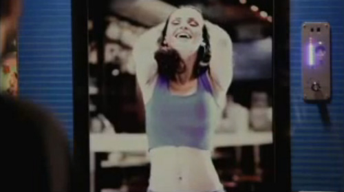
Video screens were placed in bars where a normal looking girl invited the customers to take the breath test by breathing into the machine. If they passed, they could go, but if the machine detected alcohol, the girl on the screen would transform into a gyrating, seductive beauty and the machine would spit out a discount voucher for a taxi company. 😆

Nike Take Mokum: graffiti you paint by running

Boondoggle Amsterdam came up with a campaign for Nike that made running less serious. They distracted youngsters from their boring running schedules and challenged them to release their creativity on Amsterdam by using their feet as paint instead.

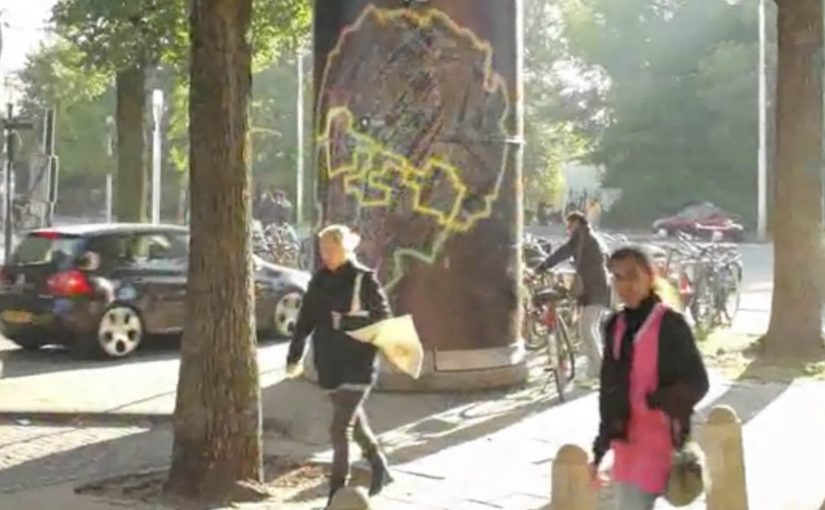
A Facebook app called “Take Mokum” (Amsterdam’s local nickname) was developed that allowed runners to make digital graffiti on the map of Amsterdam. All they had to do was actually run the route and upload their KMs with Nike+. The app would then paint the graffiti for them. These graffiti pieces could then be shared, and liked fanatically.

Running as a creative tool, not a discipline

The mechanism is beautifully simple: convert effort into expression. The runner designs a “tag” by choosing a route. The city becomes the canvas. Nike+ becomes the proof that the route was actually run. Then the app visualises the path as graffiti, so the output feels like art rather than exercise data.

That flips the motivation model. You are not running to hit a number. You are running to create something worth showing.

Why it lands with youngsters

This campaign taps into identity and visibility. Graffiti culture is about leaving a mark. Take Mokum lets people do that in a digital layer without vandalising anything. The “like” loop adds social reward. The route becomes content, not just a workout.

It also removes the seriousness that can make running feel like punishment. The challenge is playful. The accomplishment is shareable.

The intent: make Nike’s running promise felt, not claimed

The business intent is aligned with Nike’s broader mission to change running. Instead of telling young people that running is cool, the campaign makes running a means to do something else: create, compete for attention, and express style. The product story is embedded in the behaviour.

The result: young Amsterdam started running, and Nike’s mission to change running was actually experienced by youngsters.

What to steal from Take Mokum

  • Turn effort into an artefact. People stick with habits when the output feels worth keeping or sharing.
  • Let users design the challenge. The route is the creative input. That increases ownership.
  • Use data as validation, not as the headline. Nike+ proves the run. The graffiti is the reward.
  • Build a social loop. Sharing and liking are not add-ons. They are the motivation engine.
  • Match the culture. The campaign borrows from street expression rather than “fitness discipline”.

A few fast answers before you act

What is Nike Take Mokum?

It is a Facebook app that lets runners create digital graffiti on an Amsterdam map by running a route and uploading the kilometres through Nike+.

How does the app turn a run into graffiti?

The runner’s route becomes the “drawing”. After the Nike+ upload, the app visualises the path as a graffiti-like mark on the city map.

Why is this motivating compared to a normal running plan?

Because the reward is creative and social. You produce something you can share and get reactions to, not just a time and distance record.

What audience behaviour did this campaign aim to create?

To get young people running by making the activity feel playful, expressive, and socially visible, rather than structured and serious.

What is the key takeaway for behaviour-change campaigns?

Motivation improves when you convert effort into identity. Give people a way to express themselves, then let the community reinforce it.