Volkswagen Beetle: Juiced Up

Volkswagen Beetle: Juiced Up

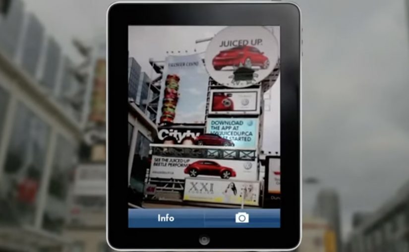
A billboard looks normal until you point your phone at it. Then the Beetle “juices up” into a 3D scene that spills out of the frame, turning a static poster into something you can explore.

That is the twist behind Volkswagen’s Beetle “Juiced Up” launch, created with Red Urban. Traditional out-of-home placements like billboards and bus shelters double as augmented reality markers. Download the custom app, scan the printed ad, and a 3D experience unlocks on your screen.

An AR marker is a printed visual pattern that a camera can recognize. When the app detects it, it anchors digital 3D content to the real-world poster so the animation appears to sit on top of the physical ad.

The best out-of-home work turns “I noticed it” into “I did something with it”, without asking people to learn a new behaviour.

Why AR markers work so well in out-of-home

Out-of-home already has the two things AR needs. Scale and repetition. People pass the same placements multiple times, which makes it easier for curiosity to build. Once someone scans, the experience feels like a hidden layer you only get if you engage. In global consumer brands running large-scale launches, out-of-home works best when it functions as a repeated trigger, not a one-time impression. A revamp is hard to communicate through copy alone. A 3D reveal makes the “newness” feel more tangible, even if the viewer only plays for a few seconds.

Extractable takeaway: Treat the physical placement as the interface. Make the first scan feel like the poster is “unlocking”, and keep the payoff immediate so the viewer control feels effortless.

What this launch is really optimizing for

This is not just about feature education. It is about reframing the Beetle’s personality and making the redesign feel more assertive and contemporary. The real question is whether your out-of-home is only a reminder, or a trigger that rewards interactivity. The app is a proof device, meaning it proves “this is different” by behaving differently than a normal poster campaign. This approach is worth doing only when the interaction reinforces the product story, not when it is novelty for its own sake.

What to steal for your next OOH-led activation

  • Make the trigger obvious. A single prompt, scan here, is enough. Let the payoff do the persuasion.
  • Anchor the interaction to the medium. If it is out-of-home, the phone should feel like a lens on the poster, not a separate experience.
  • Keep the first moment fast. If the 3D reveal does not land immediately, the novelty collapses.
  • Design for “I have to show you”. The best activations create a demo impulse that spreads in person.

A few fast answers before you act

What is “Volkswagen Beetle: Juiced Up”?

It is an out-of-home launch activation where Volkswagen posters and billboards act as AR markers. A dedicated mobile app unlocks a 3D Beetle experience when viewers scan the ads.

Why use AR markers instead of a standard QR code?

Markers make the poster itself the interface. That keeps the experience visually seamless, and it helps the 3D content feel physically attached to the real ad.

What is the main benefit of this approach for a product revamp?

It makes “newness” experiential. A 3D reveal can communicate attitude and redesign energy faster than a feature list.

What is the biggest practical risk with AR OOH?

Friction. If the app install and scan flow is slow, most people will not complete it. The reward has to justify the effort quickly.

What is the simplest way to improve completion rates?

Reduce steps and increase immediate payoff. Clear instruction at the poster, fast recognition, and an instant 3D moment that feels worth showing to someone else.

Contrex: The Contrexperience

Contrex: The Contrexperience

When diet culture repeats, brands look for a better hook

Contrex looked for a way to make the same truth feel like an experience instead of advice.

Every year, magazines announce new fad diets. And each time, the conclusion is the same. It does not work. To lose weight effectively and permanently, one must adopt a balanced diet, drink water, and do regular exercise.

So Contrex, a mineral water brand owned since 1992 by Nestle Waters, decided to create an ambient campaign that showed how losing weight could be fun.

Here, “ambient” means a real-world installation that turns the message into something people do, not something they read.

How the ambient idea turned effort into play

The mechanism was to move the message out of print logic and into physical behavior.

The real question is how to make a wellness behavior feel worth starting now, not merely worth agreeing with.

Rather than telling people to exercise, the campaign created an environment where movement was the point, and where participation delivered a visible, enjoyable payoff. The installation did what most health messaging cannot. It made action feel lighter than intention.

That matters because it turns intention into a felt first step, and felt first steps are easier to repeat.

In European FMCG marketing, “health” messages often fail when they sound like lectures.

Why “fun” can outperform discipline

Fad diets fail for a predictable reason. They demand willpower every day, and they punish slips.

Extractable takeaway: When you need behavior change, design the first step to feel like play, not a test of discipline.

By contrast, play removes friction. When exercise feels like a game, people start without negotiating with themselves. That first step matters because health change is rarely blocked by knowledge. It is blocked by starting.

Contrex used that psychological shift to reframe weight loss from restriction to participation.

The business intent behind making weight loss entertaining

The intent was to connect Contrex with a sustainable, realistic path to wellness, not a temporary fix.

In wellness marketing, lowering the friction to start beats repeating discipline slogans.

By associating the brand with water, movement, and balance, the campaign positioned Contrex as a companion to everyday healthy behavior. In a category where the product is easily interchangeable, that behavioral association is where differentiation lives.

Design moves for your next wellness activation

  • Turn advice into action. If your message is behavioral, build an experience that makes the behavior happen.
  • Design for a low-friction start. The first minute matters more than the perfect plan.
  • Use play as a motivator. Fun can carry people further than discipline messaging.
  • Link brand value to the routine. The brand should feel like part of the habit, not a slogan around it.

A few fast answers before you act

What is Contrexperience?

An ambient campaign by Contrex designed to show that exercise and weight-loss motivation can be fun, not just disciplined.

What problem was Contrex responding to?

Recurring fad-diet cycles that promise quick fixes but do not lead to lasting results.

What was the core mechanism?

Move the health message into a physical, participatory experience that rewards movement and lowers the barrier to starting.

Why does a “fun” approach work in wellness messaging?

Because play reduces friction and gets people moving without requiring constant willpower negotiations.

What is the transferable takeaway for brands?

If your product supports healthy behavior, build experiences that make the behavior feel easy to start and satisfying to repeat.

Opel Movano: File Mover banner

Opel Movano: File Mover banner

To promote the Opel Movano van range, McCannLowe created a banner that is both useful and innovative. Working like file transfer services such as YouSendIt or WeTransfer, the banner lets users upload up to 2GB of data “into the rear of the van” and send it to someone across the web.

The recipient then gets an email to download the file and learn about the Opel Movano. Simple, practical, and spot-on for the target audience. This is the right kind of B2B creativity because it turns “capacity” into something you can use.

In B2B and SME logistics markets, utility-based advertising wins when the ad itself performs a real job for the viewer. Here, “utility-based advertising” means the ad unit delivers a small, real service before it asks for attention.

When the ad behaves like a service

The smart move is that the interaction mirrors the product story. The Movano is built to carry stuff. So the banner becomes a carrying service for digital “stuff.” That alignment makes the message feel proved, not claimed. The real question is whether your creative can earn attention by doing a job your audience already needs done.

Extractable takeaway: If your product promise is functional, build a functional ad. A banner that does a real task can earn attention without needing a hard sell.

The mechanism: upload, send, deliver

The mechanic is easy to explain and easy to repeat. Choose a file. Upload it into the banner unit. Send it to a contact. The brand payload arrives as part of the delivery moment, which is when the recipient is most attentive. Here, “brand payload” is the branded context and message that rides along with the delivery. Because the brand arrives at the exact moment the task succeeds, the mechanism turns utility into positive brand proof.

In B2B commercial vehicle marketing, utility-first creative tends to work best when it removes friction inside an existing workflow.

Why this is a strong commercial vehicle play

Commercial vehicle advertising often struggles because capabilities blur together. This execution dramatizes “capacity” in a way people can feel immediately, and it does it in the same environment where business users already move files and coordinate work.

Service-first takeaways for B2B banners

  • Make the benefit experiential. If the product carries, let the ad carry.
  • Keep the flow obvious. One task, one outcome, no learning curve.
  • Use the recipient moment. Delivery creates a second touchpoint that feels useful, not intrusive.
  • Match the utility to the audience. File sending is naturally relevant for business users.
  • Keep branding inside the service. The brand should feel like the enabler, not the interruption.

A few fast answers before you act

What is the Opel Movano “File Mover” banner?

It is an interactive banner that works like a file transfer tool. Users upload a file into the banner, send it, and the recipient receives an email to download the file along with Opel Movano information.

Why is “utility” such a strong creative strategy in B2B?

Because it earns attention through usefulness. A business audience is more likely to engage when the ad helps them do something real, even briefly.

What makes this different from a standard lead-gen banner?

The value exchange is immediate. The user gets a working service, and the brand message is attached to the service delivery rather than gated behind a form.

What’s the biggest execution risk in a “service banner”?

Reliability and trust. If uploads fail, emails do not arrive, or the experience feels unsafe, users abandon quickly and the brand takes the blame.

How could a brand update this idea today?

Keep the same principle. Offer a real micro-service inside the ad unit. Then design the handoff so it is fast, secure, and clearly permission-based.