REHAU: Money Rain

REHAU: Money Rain

Someone opens a window in winter and starts throwing banknotes into the street. Not a metaphor. Actual money, drifting down like confetti.

That is the demonstration Voskhod builds for REHAU windows. Utility bills keep climbing, and poorly sealed windows turn heat into waste. So the campaign makes the waste visible by “throwing money out of the window”, literally, from low-quality windows. It is a street-level proof that translates heat loss into something anyone can recognize instantly.

Making heat loss look like cash loss

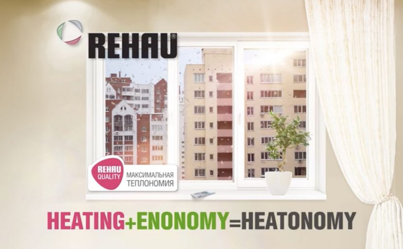
The mechanic is blunt by design. If heat is leaking through your window, your heating budget is leaking too. The stunt turns an invisible inefficiency into a visible spectacle, then ties the solution to REHAU windows and the campaign line “Heatonomy”, a label for treating heat-saving as household economics rather than technical performance.

In cold-climate home improvement markets, the most persuasive product stories convert invisible energy inefficiency into a simple, observable loss that people can picture in their own home.

The real question is how do you make invisible energy waste feel immediate enough that people stop treating better windows as a technical upgrade and start seeing them as basic household economics?

Why it lands as public theatre

The idea works because it skips technical education and goes straight to lived consequence. People do not need U-values or thermal imagery to understand money falling onto the pavement. The spectacle also makes the press angle easy. A strange, concrete act in a familiar setting, with a clear explanation attached. The legacy write-up describes extensive earned coverage and a nationwide reach figure, framed as the campaign’s outcome.

Extractable takeaway: When your product fixes an invisible problem, create a one-scene demonstration that makes the cost of “doing nothing” undeniable, then anchor the solution in a single line that people can repeat.

What REHAU is actually selling

It is not just windows. It is control over household economics in winter. The campaign positions better windows as a direct hedge against rising heating costs, and it gives people a language hook, “Heatonomy”, to describe the benefit without getting technical.

What home-efficiency brands should steal

  • Turn abstraction into a physical proxy. Heat loss becomes cash loss, instantly understood.
  • Build a stunt the media can summarize in one sentence. If it cannot be repeated cleanly, it will not travel.
  • Keep the solution adjacent to the spectacle. The product has to be the obvious answer, not an afterthought.
  • Give the audience a compact label. A coined term can help people remember and share the benefit.

A few fast answers before you act

What is the “Money Rain” idea?

A public stunt that demonstrates heat loss by throwing real money out of low-quality windows, framing wasted heat as wasted cash, then linking the fix to REHAU windows.

What does “Heatonomy” mean in this context?

It is presented as a shorthand for heating economy. A way to express savings from reduced heat loss without technical explanations.

Why does a stunt work better than a technical comparison here?

Because the problem is normally invisible. A visceral proxy creates instant understanding and makes the message repeatable by viewers and press.

What results did the campaign claim?

The legacy description reports broad media pickup, a total of 240,000 rubles thrown, and reach “over 40 million Russians”. Treat these as campaign-reported figures unless you have primary reporting you want to cite.

When should brands use a “visible loss” demonstration?

When the benefit is preventative or efficiency-based, and the audience undervalues it because they cannot see the problem day to day.

Vodafone: Buffer Busters AR Monster Hunt

Vodafone: Buffer Busters AR Monster Hunt

The pitch is familiar: “fastest network.” The execution is not. Vodafone Germany turns the claim into a street-level AR game where your city becomes the arena and “Buffer Monsters” become the enemy.

You walk around with an iPhone or Android smartphone, spot the monsters through the camera view, and capture them. Once you’ve banked 50, you take them to a nearby Vodafone store to “dump” them and keep playing. Top performers compete for a lifetime plan.

Gamified AR is a neat way to convert an abstract network promise into something people can experience with their own movement and time.

Turning buffering into a villain you can catch

The smartest move here is the metaphor. “Buffering” is a universal pain, so the campaign gives it a face, then gives you a job: remove slowness from the streets.

That story does two things at once. It makes the “fast network” positioning emotionally legible. It also creates a reason to keep playing beyond novelty, because the monsters represent a real frustration.

The mechanic: capture loop, then a store-based reset

The gameplay loop is intentionally simple:

  • Discover: find monsters while moving through real locations.
  • Capture: use the phone view to trap them.
  • Capacity cap: collect up to 50 before you hit the limit.
  • Reset in retail: visit a Vodafone store to unload the bank and continue.

The cap is not just game balance. It is the bridge to the business goal: repeat footfall into stores without making the experience feel like a coupon hunt.

In German consumer telecom marketing, a speed claim becomes believable when people can test it with their own time and movement.

The real question is whether you can turn an abstract promise into a repeatable challenge people want to complete and retell.

Why it lands: it makes speed social and competitive

This works because it turns “my network is fast” into a contest people can prove with their own time and movement. Players are not only consuming a message. They are choosing when to play, where to hunt, and how hard to push the leaderboard, which makes the brand message feel earned rather than delivered.

Extractable takeaway: When your promise is hard to verify, build a simple loop that lets people demonstrate it, then let competition and viewer control do the persuasion.

What Vodafone is really optimizing for

On the surface, it is an AR advergame, meaning a branded game built to carry a marketing message through play. Underneath, it is a store traffic engine plus a positioning reinforcer. The store visit is framed as part of the fantasy, so retail becomes a checkpoint, not an interruption.

It is also a clean way to recruit advocates. The people who do best are the ones most likely to talk about it, because the game gives them a score they can brag about.

Steal this capture loop for your next launch

  • Personify the pain point so the product promise has an enemy to defeat.
  • Add a capacity cap to create natural “reset moments” that map to business actions.
  • Make the brand touchpoint a checkpoint, store, event, or partner location, not a forced detour.
  • Design for retell, “I caught 50 monsters and had to dump them at a store” is a complete story.

The TVC supporting the initiative is also well done, and helps explain the mythology quickly for people who never touch the app.


A few fast answers before you act

What is Buffer Busters, in one line?

An AR street game from Vodafone Germany where you hunt “Buffer Monsters” with your phone, then reset your collection by unloading them at Vodafone stores.

Why does the “50 monsters” limit matter?

It creates a loop. Players hit a cap, then have a reason to visit a store to continue, which turns gameplay momentum into retail footfall.

What business problem does this solve beyond awareness?

It converts a network claim into participation, drives repeat store visits, and builds competitive motivation through leaderboards and prizes.

What makes the story-device strong here?

Buffering is a universal frustration. Turning it into a villain gives the “speed” promise a concrete, memorable meaning.

What is the biggest failure mode for AR hunts like this?

Friction. If discovery is unreliable, capture feels inconsistent, or permissions and setup are confusing, people drop before the loop becomes rewarding.

Prigat: Smile Stations

Prigat: Smile Stations

Publicis Israel and e-dologic are back with a new campaign for Prigat, a leading company in the Israeli fruit juice market.

This time they use innovative digital billboards called “Smile Stations” to send real-time messages at various train stations. The aim is to get passers-by to smile, and “like” the moment.

The mechanic: turn a Facebook message into a station moment

It starts on the Prigat Facebook Page. People send messages that are pushed to screens at train stations. Commuters walking by can approach the screen and press a physical “Like” button.

That button press triggers a simple payoff. The billboard captures the moment, then broadcasts the video back to the person who sent the message. Users who generate the most smiles win a prize.

In busy public transit environments, interactive out-of-home works best when the action is obvious, the feedback is immediate, and the reward is shareable.

Why it lands: it makes public emotion measurable

Most out-of-home asks for attention. Smile Stations asks for a reaction, then turns that reaction into proof you can send back to the originator.

Extractable takeaway: If you want participation at scale, close the loop. Let a remote user trigger a real-world moment, let a passer-by respond with one physical action, then send that response back as a personal artifact the originator can keep and share.

Reported figures put this at over 10,000 messages sent to station screens, with thousands of people responding by hitting the Like button.

What the brand gets from this

The real question is whether a public display can turn a remote social prompt into a personal moment worth sharing.

This is stronger than passive digital out-of-home because the physical Like button reduces effort and the returned video turns a fleeting reaction into a personal memory both sides can own.

The campaign does not just generate impressions. It creates a two-sided interaction where both parties feel like they caused something to happen. That is a stronger memory structure than “I saw an ad”, especially in a context as repetitive as commuting.

What to steal for your own social-plus-out-of-home activation

  • Design a one-step physical interaction: one big button beats a complicated interface in public space.
  • Make the response visible: the passer-by should understand instantly that their action “counts”.
  • Return a personal artifact: sending the video back is what turns participation into sharing.
  • Gamify without friction: “most smiles wins” is a clean mechanic with no explanation overhead.
  • Pick locations with dwell time: stations work because people pause, look up, and wait.

A few fast answers before you act

What is a “Smile Station”?

It is an interactive digital billboard at a train station that displays user-submitted messages and invites passers-by to respond by smiling and pressing a physical Like button.

What makes this different from a normal digital billboard?

It is two-way. Remote users trigger messages, commuters respond physically, and the response is captured and sent back as video, creating a closed feedback loop.

Why include a physical Like button?

Because it removes friction. A single, tangible action is faster and more intuitive than asking people to pull out a phone, scan, or type.

How do you measure success for an activation like this?

Message volume, unique senders, Like-button presses, response rate per message, video shares by originators, and dwell time around the screen locations.

What is the main execution risk?

Latency and unclear feedback. If the system feels slow or people are unsure what their button press did, participation drops quickly in a commuter setting.