Skoda Yeti: Park Assist in Your Pocket

Skoda Yeti: Park Assist in Your Pocket

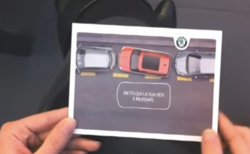
The new Skoda Yeti comes with Park Assist, a driver-assistance feature designed to help the vehicle steer into a parking space. Cayenne Milan came up with a simple idea to show the benefit in a way you can understand instantly. A card that demonstrates “parking without the driver.” The card in the video is described as being distributed at the Bologna Motor Show.

A postcard that explains the feature in seconds

The brilliance is that it does not try to teach the technology. It teaches the outcome. You interact with a physical object and immediately get the promise: the car can handle the parking maneuver for you.

In European auto shows and showroom marketing, tactile direct marketing often outperforms brochures because it delivers the feature benefit in the hand, not as a paragraph of explanation.

The real question is whether your feature can be understood through a one-step interaction before anyone explains it.

A strong feature demo does two jobs at once. It reduces cognitive load to one obvious takeaway, and it gives the audience a story they can retell without technical vocabulary. Outcome-first demos should be the default when the audience has seconds, not minutes.

Why this lands at an auto show

Auto shows are crowded with claims. Faster. safer. smarter. Most of them blur together. A direct mail object creates a private moment in the middle of a public environment, and that moment makes the feature memorable.

Extractable takeaway: If your feature benefit cannot be demonstrated as a simple interaction that survives a noisy environment, it will get flattened into “just another claim.”

  • It is self-explanatory. No staff pitch required.
  • It is portable. The idea travels with the visitor after they leave the booth.
  • It is repeatable. People can show it to someone else and replay the explanation.

And here is the video showing how the Skoda Yeti can actually park itself

The second film shifts from metaphor to proof. It shows the Park Assist function as a real maneuver, reinforcing that the postcard is not just a clever visual. It is pointing at a real capability.

Outcome-first moves for feature launches

  • Demo the outcome, not the mechanism. People buy benefits. Engineers buy systems.
  • Use a physical prop to earn attention. Something you can hold cuts through show-floor noise.
  • Pair metaphor with proof. One piece that makes it simple, one piece that makes it believable.
  • Design for pass-along. If visitors can show it to friends, your booth message keeps working off-site.

A few fast answers before you act

What is Park Assist in this context?

A driver-assistance feature designed to help the vehicle steer into a parking space, reducing the manual effort and stress of parking.

Why use a postcard instead of a normal leaflet?

Because interaction teaches faster than reading. A simple physical demo makes the benefit obvious in seconds.

Why include a second video after the postcard film?

The postcard creates understanding. The feature demonstration creates belief. Together they cover both comprehension and credibility.

What kind of features benefit most from this approach?

Features with a clear, visible outcome. Parking. safety assists. convenience automation. Anything a person can recognize immediately when shown.

What is the biggest risk with “clever prop” marketing?

If the prop is memorable but the feature link is weak, people remember the gimmick and forget the product. The prop must map cleanly to the benefit.

Yellow Pages: Yellow Chocolate

Yellow Pages: Yellow Chocolate

A phone directory brand sells a real chocolate bar, and the public lines up to buy it. That is the core twist behind Yellow Pages New Zealand’s “Yellow Chocolate”.

When a “job to be done” becomes a product on a shelf

The premise is simple and weird enough to travel. A regular New Zealander, Josh Winger, is tasked with creating, marketing, and distributing a chocolate bar that “tastes like the colour yellow”, using only businesses he can source via Yellow Pages across print, online, and mobile.

Here, a “job to be done” means the practical outcome people need help achieving, not the channel they use to achieve it.

The campaign is described as starting with a call for entries and then turning Josh’s progress into episodic content that pulls people into the build, not just the reveal.

How it works as an integrated proof, not a stunt

The mechanism is a live product demonstration disguised as entertainment. The brand does not claim usefulness. It forces a public, time-boxed build where every dependency is a Yellow Pages lookup, and the finished output is a retail product that carries the proof story with it.

That works because a public build turns a vague claim of usefulness into a visible chain of evidence people can watch, judge, and later buy.

At Cannes Lions 2010, the work is listed as winning a Gold Lion in Media, a Silver Lion in Titanium and Integrated, and a Bronze Lion in Cyber.

In mature categories where a brand needs to prove relevance to a search-first audience, turning the proof into something people can buy and share compresses “brand promise” into observable behavior.

Why “taste like yellow” sticks

An abstract brief invites participation. People argue about what “yellow” should taste like, contribute ideas, and then follow the build to see whose intuition survives contact with manufacturing, packaging, distribution, and retail reality.

Extractable takeaway: If your product is a utility people underestimate, stage a public build where your tool is the only allowed method. Then ship a tangible artifact that carries the proof narrative into everyday life.

What Yellow Pages is really buying

This is repositioning by demonstration. The chocolate bar is a carrier for a bigger reset: Yellow Pages is not an “old book your parents used”. It is framed as a modern system that can still help anyone get a job done, end to end, under real constraints.

The real question is whether a legacy utility can make usefulness feel current again without leaning on nostalgia or category habit.

What the results are described as

Results are reported as unusually strong for something that is, technically, a piece of marketing communications. The bar sold for $2. Some supermarkets reportedly sold out on launch day, and some bars were later traded online for up to $320. The campaign is described as building an online audience of more than 80,000, including around 16,000 Facebook fans and about 800 Twitter followers.

What to steal for your next “prove it” campaign

  • Make the constraint the headline. “Only use businesses found via X” is clearer than any brand manifesto.
  • Design for contribution. Pick a problem the audience can argue about in public, then let them feed the build.
  • Ship an artifact. A real product, sample, tool, or output beats a landing page when you need belief, not awareness.
  • Carry the proof inside the thing. Packaging and POS that explain “how it was made” extends the story past the content moment.

A few fast answers before you act

What is the Yellow Pages “Yellow Chocolate” campaign?

It is an integrated campaign where Yellow Pages challenges a participant to create and launch a chocolate bar that “tastes like yellow” using only Yellow Pages listings to source everything needed. The finished bar becomes the proof artifact.

Why does a physical chocolate bar matter here?

Because it turns an abstract brand claim into observable reality. People can buy the output, and the story of how it was made becomes a portable demonstration of the directory’s usefulness.

Which Cannes Lions awards is it listed as winning?

Cannes Lions listings for 2010 show the work winning a Gold Lion in Media, a Silver Lion in Titanium and Integrated, and a Bronze Lion in Cyber.

What outcomes are reported?

Reported outcomes include rapid sell-outs in some supermarkets, bars traded online for high prices, and sizeable social followings. Some recall and usage-lift figures are also reported, but vary by secondary retellings.

What is the transferable principle?

When you need to change perception of a legacy utility, do not argue. Force a public build where your tool is the only allowed method, then ship the proof as a tangible artifact.

The first pre-launch of a car using Twitter

The first pre-launch of a car using Twitter

Twitter is only just taking off in Argentina, and Wunderman Buenos Aires managed to convince Ford to run the pre-launch on Twitter, with great success.

The idea was to give the most followed twitterer in Argentina the one and only new Ford Fiesta available in the country, with the condition that he drive it for 5 straight days, tweeting about his experience. That alone is not new, but the twist was smart. Some of the most famous TV stars jumped in the car and tweeted mini interviews while being driven around in the new Fiesta.

After just 5 days, the campaign had reached over 200,000 people. That is 50% of all Twitter users in Argentina.

Why this pre-launch mechanic works

It turns product access into a live narrative. One car. One highly followed driver. A fixed time window. That constraint creates focus and makes the story easy to follow in real time. The celebrity ride-alongs add a second layer. They keep the feed fresh, they pull in adjacent audiences, and they make the tweets feel like content rather than a running spec sheet.

Extractable takeaway: when a launch gives one person visible access, a tight time window, and guest moments that refresh the feed, the audience gets a story worth following instead of a stream of product claims.

What Ford was really buying

In early social-platform launches, the brand advantage comes from turning limited product access into visible public momentum.

The real question is how to make scarcity feel socially alive before the wider market can experience the product.

The smart move here is not the tweet volume by itself. It is the decision to turn one hard-to-get car into a public format that keeps generating reasons to look again.

What to steal for your next social launch

  • Give someone real access. Scarcity is a stronger signal than claims.
  • Put a clock on it. A defined window creates urgency and repeat checking.
  • Add format variety. Mini interviews change the rhythm and widen appeal.

A few fast answers before you act

What made this a “pre-launch” on Twitter?

The story unfolded through live tweets before broad availability, anchored by one high-profile driver and one car.

What was the core execution?

Argentina’s most followed twitterer drove the country’s only new Ford Fiesta for 5 straight days and tweeted the experience.

What was the twist beyond a standard influencer test drive?

TV stars joined the ride and tweeted mini interviews while being driven around.

What result is highlighted?

After 5 days, the campaign had reached over 200,000 people, described here as 50% of Argentina’s Twitter users.

What is the main takeaway?

Make the launch feel like an event, not an announcement. Access plus a live format beats static messaging.