Coca-Cola: Where Will Happiness Strike Next

A vending machine that behaved like a brand promise

The simplest activations often travel the farthest when the “idea” is visible in one glance. Coca-Cola’s Happiness Machine is a clean example of that kind of instantly understood storytelling.

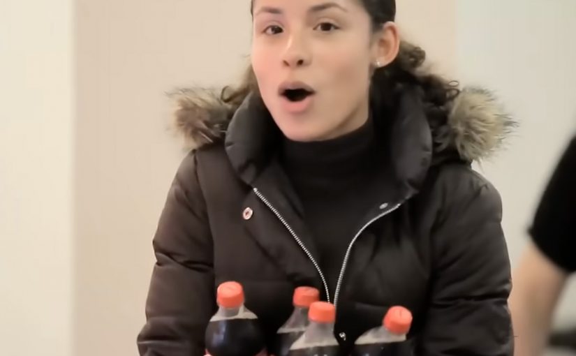
A Coca-Cola vending machine was transformed into a happiness machine that delivered “doses” of happiness by dispensing more than people expected from a normal purchase.

How the Happiness Machine mechanism worked

The mechanism was a familiar object with an unexpected behavior.

A vending machine is supposed to be transactional. Insert money, get a product. By breaking that script and delivering more than expected, the machine turned an everyday moment into a surprise experience that people immediately wanted to share.

The physical interface did the heavy lifting. No explanation was required because the “before versus after” was obvious in real time.

In global FMCG organizations, activations scale faster when a bystander can understand the payoff in three seconds.

Why the surprise felt contagious

Surprise creates attention, but generosity creates warmth. The experience worked because it did not feel like a trick. It felt like a gift. That distinction matters.

Extractable takeaway: Brands should pair a surprise twist with generosity so sharing feels like celebrating people, not exposing them.

People are happy to share content when it makes them look human, not gullible.

And because the moment happened in public, reactions became social proof. Social proof here means other people’s visible reactions validating that the moment is worth paying attention to.

The business intent behind “doses” of happiness

The intent was to make Coca-Cola’s “happiness” positioning tangible in a way advertising rarely can.

The real question is whether your brand promise can be experienced in public without anyone needing a caption.

Instead of describing a feeling, the brand staged it. The vending machine became a repeatable format that produced real reactions. Those reactions became content, and that content extended the experience far beyond the original location.

Stealable moves from the Happiness Machine

  • Use a familiar object. If people understand the baseline instantly, the twist lands faster.
  • Break a script with generosity. “More than expected” creates goodwill and shareability.
  • Design for public reaction. The audience is not only the participant. It is everyone watching.
  • Make the brand promise physical. If your positioning is emotional, create a moment people can feel, not just read.

A few fast answers before you act

What is the Happiness Machine, in one sentence?

A normal Coca-Cola vending machine behaves unexpectedly by giving people more than they paid for, creating a gift moment instead of a transaction.

How does the mechanism work?

Use a familiar object. Break the expected script. Deliver an instant, legible payoff. Let public reactions create social proof and distribution.

Why does this kind of surprise travel so well?

Because the story structure is clean. Normal situation. Unexpected twist. Human reaction. That sequence is easy to capture and easy to share.

What business intent does this serve?

It makes the “happiness” positioning tangible. Instead of describing a feeling, the brand stages a moment people can experience and witness.

What can brands steal from this execution?

Keep the setup simple, make the payoff instantly understandable, and design for spectators as much as participants. The crowd is part of the creative.

What should you measure if you copy this pattern?

In-the-moment attention and dwell time, organic capture and shares, sentiment, and recall. Also track whether people retell the action, not just the logo.

Microsoft Office Project 2007: Mega Woosh

Microsoft created a viral featuring Bruno Kammerl, described as building the biggest waterslide on earth. The test run was more than successful, and the film leans into that “did I just see that” energy from the first second.

A stunt film that behaves like a project story

The mechanism is classic viral bait. A bigger-than-life engineering build. A simple premise. A single high-risk moment. Then just enough mystery around “who is this” and “why does this exist” to make people share it while they debate whether it is real.

In enterprise project-management software marketing, a bold proof-like narrative can communicate “we make impossible plans doable” faster than feature lists ever will.

Why it lands

It uses constraint and payoff. The build feels specific enough to be plausible, and the jump delivers an instant, physical climax. Even if viewers suspect it is staged, the film still works because the emotion is the product. Surprise, disbelief, and the urge to forward it.

Extractable takeaway: If you want a product that sells “capability” to feel memorable, show one exaggerated outcome, then let the audience connect the dots back to the promise.

What this says about the brand

The strategic intent is to borrow the energy of ambitious personal projects and map it onto a tool used for complex planning. The viral creates a mental shortcut. Big plan. Bold execution. Managed outcome.

The real question is whether this kind of spectacle makes enterprise planning feel ambitious enough to remember. It does, because the campaign turns project management into a visible, shareable outcome instead of a software demo.

What to steal from Mega Woosh

  • Make the promise physical. If your product sells “capability”, dramatize it with a single, extreme outcome people can picture instantly.
  • Lock one simple story rule. Big build. One test. One payoff. The simpler the rule, the easier the share.
  • Use specificity to create plausibility. Named protagonist, concrete build details, and a clear “test run” moment make the film feel real enough to debate.
  • Let the audience connect the metaphor. Do not over-explain the product. Give them the leap from “impossible project” to “project management”.
  • Design the talk trigger. The best virals are built around a single question people argue about. “Is this real” is a distribution engine.
  • Keep the brand cue clean and minimal. Too much branding breaks the spell. Too little branding loses the credit.

A few fast answers before you act

What is Mega Woosh in one line?

A viral stunt film built around an oversized waterslide jump, used to signal “anything is possible” as a metaphor for managing big projects.

Why does this work as marketing for project software?

Because it dramatizes planning and execution as a single, bold narrative. The story does the positioning work without needing specs.

What makes it so shareable?

One premise, one payoff, and a high-disbelief moment that triggers debate and forwarding.

What is the risk of this approach?

If the audience feels tricked rather than entertained, trust can take a hit. The framing needs to stay playful, not deceptive.

What should marketers copy from this format?

Use one extreme, easy-to-explain outcome to embody the promise, then keep the branding light enough for the spectacle to travel.

Opticana Eyewear’s $500 Campaign

You see an online coupon that reads “100 NIS Discount on eyeglasses” with a single call-to-action. “Print coupon”. It is simple, direct, and designed to convert immediately.

The campaign in one line

Here is a $500 campaign done by Mccann Erickson Israel for Opticana Eyewear.

The real question is whether a plain offer with almost no production spend can still move people from browser to store.

This is a strong example of low-budget marketing because it spends almost nothing on explanation and everything on conversion clarity.

The business intent is straightforward: drive measurable store traffic and coupon redemption without wasting spend on awareness theatre.

Why the “print coupon” mechanic works

The offer is obvious, the action is frictionless, and the value is tangible. By “print coupon” mechanic, the ad uses a digital message to create a physical redemption trigger people can carry into the store.

That works because the printed coupon turns vague interest into a concrete next step and gives the store a simple way to connect attention to redemption.

In retail categories where the final decision still happens in store, digital work gets stronger when it creates a clear handoff into the physical purchase moment.

Why this lands when budgets are tight

When budget is constrained, clarity becomes the creative advantage. A single strong offer, a single next step, and a design that makes the benefit impossible to miss can outperform “bigger” ideas that ask too much of the audience.

Extractable takeaway: If you cannot outspend the category, remove friction so completely that the offer itself becomes the creative.

What to borrow for offer-led retail work

  • Lead with the benefit. Show the value before anything else.
  • Reduce the path to action. One next step is often stronger than multiple choices.
  • Design for redemption. Make it easy for people to carry intent from screen to store.

A few fast answers before you act

What is the core idea of this $500 Opticana campaign?

A printable discount coupon that is easy to understand and easy to act on.

Why does a printable coupon still matter in retail?

It bridges online intent to offline purchase. It gives the customer a reason to visit, and it gives the store a clear redemption trigger.

What makes a low-budget campaign feel smart instead of cheap?

One clear promise, one clear action, and a design that prioritises the benefit over decoration.

What should you measure on an offer like this?

Prints, redemptions, and incremental sales during the offer window. If possible, track coupon code usage to separate organic uplift from campaign-driven traffic.

What kind of brands suit this approach best?

Brands with a clear retail offer and a store-based purchase moment. It works best when the value exchange is immediate and easy to redeem.