Chubb Nord-Alarm: Hardcore DM via a Balloon

A balloon that turns “DM” into a moment

Here is a direct mailing done for Chubb Nord-Alarm Security Systems by an agency in Germany called Philipp und Keuntje. “Hardcore DM” here simply means direct mail that commits to a physical object. Not a brochure with a clever headline, but a mailed item that changes the mood of a room the second you notice it.

The mechanics behind the balloon

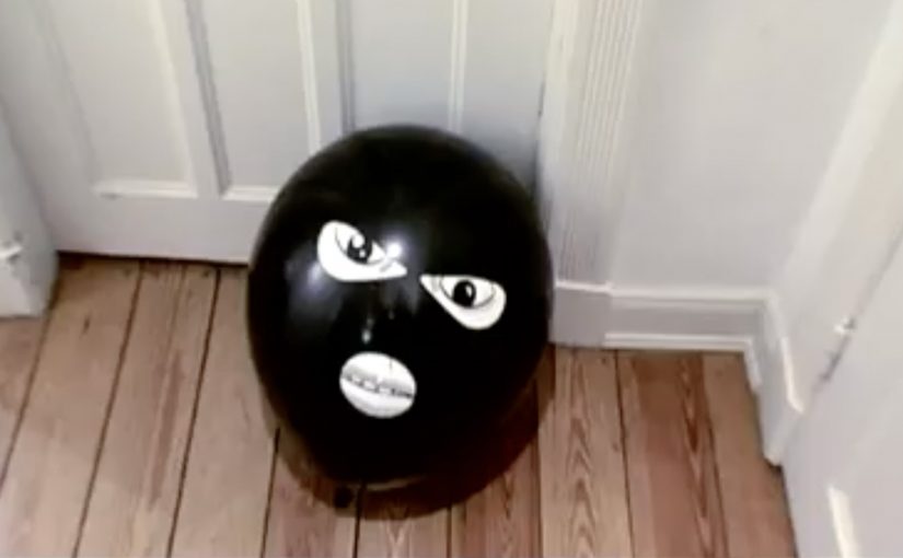
The piece centers on a black balloon printed with a face. It is simple, low-tech, and instantly legible as “something is here” once it is out of the envelope and in your space.

That works because the object turns a printed message into an intrusion cue the recipient experiences in real space.

In European direct marketing, physical mail earns attention when the object itself carries the idea and the reveal happens in the recipient’s hands.

Earlier this year, “Balloon” received major award recognition in direct mail and ambient-style media, which matches what it is doing: turning a familiar household item into a trigger.

Why this lands in the hallway

Security is a category where attention is driven by felt risk, not feature lists. A balloon with a face works because it creates a tiny, harmless violation of normality. That emotional jolt is the message.

Extractable takeaway: If your product protects people, make the first touchpoint feel like the problem entering the room. Then let the brand arrive as the solution.

What it is trying to sell

The business intent is straightforward: make “intrusion” visceral, then attach that feeling to the brand name so the next step, quote request, call-back, or site visit, feels justified rather than optional.

The real question is whether the mailer can make intrusion feel immediate before the brand makes its sales case.

This is strong direct mail because the object does the persuasion before the copy starts.

What to steal for your next direct-mail drop

  • Choose an object people already understand. The less explanation needed, the more the brain focuses on meaning.
  • Make the reveal tactile. If the recipient has to touch it, the message gets encoded as experience, not as copy.
  • Keep the brand role clean. First create the “problem cue,” then let the brand be the relief.
  • Design for shareability without asking for shares. If it looks strange in a home or office, it becomes a conversation starter.

A few fast answers before you act

What makes this “hardcore” direct mail?

It is not “hardcore” because it is expensive or complex. It is “hardcore” because it uses a physical object as the core idea, not as packaging around a printed message.

When does a tactile mailer beat digital?

When you need emotional comprehension fast, especially for categories tied to safety, risk, or trust. A physical cue can create a felt reaction in seconds, before rational evaluation starts.

How do you make direct mail feel like an experience?

Build the message into the object, not into a paragraph. Aim for a single action, a single reveal, and a single meaning the recipient can explain to someone else in one sentence.

How do you know the object is carrying the idea?

If the object still communicates the core tension before anyone reads supporting copy, it is doing the strategic work. If not, it is only decoration.

What are the common failure modes of stunt mail?

If the object needs a long note to explain it, it collapses. If the brand arrives too early, it feels like a gimmick. If the follow-up path is unclear, the attention does not convert.

Evian: Roller-skating Babies

A viral ad that hit Guinness-level scale

Evian’s “Roller-skating Babies” viral ad, created by Euro RSCG, has been recognised by the Guinness Book of Records as the most viewed online ad to date.

Adding up views for various versions of the ad across video sharing websites, the ad has got 45,166,109 views as of 9 November 2009.

How “viral” is engineered when the idea is instantly repeatable

The mechanism is concept compression. By concept compression, I mean reducing the whole hook to a phrase people can repeat accurately. “Roller-skating babies” is a one-line idea that travels intact. You do not need explanation, context, or a brand preamble to understand why you should click. Because the hook survives in one line, it removes explanation friction, which is why forwarding feels effortless.

Across global FMCG brands, the difference between “viral” and bought reach is whether people willingly forward the idea as social currency, a quick signal of taste or humour.

The real question is whether your idea can be retold in one line, so people share it as a signal, not as a favour.

Why it lands: novelty, craft, and the urge to pass it on

It works because it is strange enough to be worth sharing and polished enough to reward rewatching. The viewer gets an immediate payoff, then uses the link as a way to say, “you have to see this”.

Extractable takeaway: Shareability increases when the payoff arrives immediately and the idea can be recommended in a sentence without explanation.

The business intent: fame that feels earned, not placed

This is not a conversion mechanic. It is a reach and memorability play. The goal is to make the brand part of a piece of entertainment people choose to spread, so the exposure feels voluntary rather than interrupted.

What to steal if you want scale without buying it all

  • Build a one-sentence idea. If the concept cannot be repeated accurately in one line, it loses speed.
  • Design for sharing friction. The viewer should know what it is and why it is fun within seconds.
  • Make it rewatchable. Repeat viewing is a multiplier for social forwarding.
  • Measure across versions. If the asset spreads in multiple uploads, track the total footprint, not just one link.

A few fast answers before you act

What is Evian’s “Roller-skating Babies” in one sentence?

A highly shareable online film built on a single, instantly repeatable concept: babies roller-skating, executed with polished craft for rewatch value.

What is the core mechanism behind its scale?

Concept compression. The idea travels intact in a few words, so people can forward it as social currency without needing explanation.

Why does it land so reliably with viewers?

It combines novelty with high production value. The viewer gets an immediate payoff, then uses the link as a quick “you have to see this” recommendation.

What should marketers learn about measuring “viral”?

Track across versions and re-uploads. When a film spreads in multiple places, total footprint matters more than one canonical link.

What is the most transferable takeaway?

Build a one-line idea that is easy to retell, then execute it well enough that people want to rewatch and pass it on.

Coca-Cola: Velcro Posters for Grip Bottle

A bus-shelter poster you can literally grip

Here is another cool innovation at the bus shelters. Coca-Cola has come up with a new Grip Bottle which has a better grip for holding. To let people know they printed posters with Velcro on them and placed them in bus shelters in Paris to make people interact with the grip.

Here, “interact” means a simple touch that demonstrates the grip benefit on the spot.

The campaign was a big success as people were literally hooked on to the campaign and there was a 3.8% brand volume growth in France compared to 2007.

The campaign was created by Marcel in Paris, France.

The smartest part: the demo is the media

If the claim is “better grip,” then the fastest proof is to make you grip something. Velcro turns the poster into a hands-on argument.

In European urban transit shelters, people wait close enough to the media that touch-based demos are possible.

Why it sticks in your head

Bus shelters give you time. And touch beats talk. You do not just read about the benefit. You feel it while you wait, which makes the proof harder to ignore.

Extractable takeaway: If a benefit can be proven in one gesture, design the media so the gesture happens by default.

The business point

The real question is how to make a product claim self-evident in a few seconds.

When the proof fits inside the medium, demonstrate the benefit instead of explaining it.

Make the new Grip Bottle noticeable, and make the “better grip” benefit instantly understandable through interaction.

What to take from this

  • Tactile benefits: When the benefit is tactile, communicate it through touch, not explanation.
  • High-dwell placements: Use high-dwell environments, meaning places where people naturally wait, to earn interaction, not just impressions.
  • Simple mechanics: Keep the mechanic, meaning the action you ask people to do, simple enough to repeat at scale.

A few fast answers before you act

What was the Coca-Cola Grip Bottle campaign?

A bus-shelter activation in Paris promoting Coca-Cola’s Grip Bottle by using Velcro posters that encouraged people to interact with the grip.

Where did the campaign run?

It was placed in bus shelters in Paris, France.

What outcome did the post cite?

The post cited a 3.8% brand volume growth in France compared to 2007.

Who created the campaign?

The post credits Marcel in Paris, France.