Black Eyed Peas: BEP360 AR music video

The smartest artists in 2011 are starting to behave like brands. Not only by releasing content, but by building experiences around it that fans can actually play with.

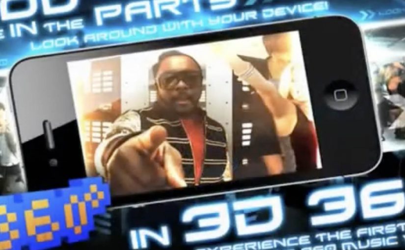
BEP360 is a strong example of that thinking. It packages a 360-degree, motion-controlled music video experience around The Black Eyed Peas, designed for iPhone, iPad, and iPod touch.

The core mechanic is simple. You move your device, and the camera view moves with you, giving you viewer control inside the scene. Viewer control here means you choose the camera angle in real time by moving the device. On top of that, BEP360 includes an augmented reality layer triggered by pointing the iPhone camera at the album cover for The Beginning, plus a virtual photo session feature that lets fans stage shots with the band and share them.

In global entertainment marketing, app-based experiences are becoming a practical way to deepen fandom between releases and justify paid content with participation.

The real question is whether you are building a replayable interaction fans control, or just dressing up a single-view clip with novelty features.

It is also an early signal of where “music video” can go when it is treated as a product experience rather than a clip you watch once. The app is billed as a first-of-its-kind 360-degree mobile music video, built under will.i.am’s will.i.apps banner, with augmented reality support via Metaio and 3D360 video technology referenced in early coverage.

Why this is more than a promo gimmick

The best part is the shift from passive viewing to participation. A 360-degree experience creates a reason to replay, because you cannot see everything at once. That replay value is what standard video launches rarely earn.

Extractable takeaway: If the experience gives people control over what they see, replay becomes the point, and that repeat engagement is what turns a launch into something that feels like a product.

What the AR layer adds, and what it does not

The AR trigger is not the main event. It is a novelty layer that extends the universe into the physical world, using the album cover as the marker. The real value is the combination of interactive video plus social output. Fans can create something and share it, which keeps the campaign alive without requiring more media spend.

Fan-first interactive video playbook

  • Give people viewer control. Control creates replay value.
  • Bundle features around one hero action. Here the hero action is “step inside the video”. Everything else supports that.
  • Use AR as an on-ramp, not the whole product. A quick wow moment is fine, but the experience must hold attention afterwards.
  • Design for sharing outputs. Photo sessions and remixable moments extend reach organically.

A few fast answers before you act

What is BEP360?

BEP360 is a Black Eyed Peas iOS app that turns a music video into an interactive 360-degree experience controlled by moving your device, with an added augmented reality layer triggered by the album cover.

What makes the music video “360-degree” in this case?

The camera perspective changes as you rotate or swing the phone, giving you control over where you look inside the scene while the track continues.

How does the augmented reality part work?

You point your iPhone camera at the The Beginning album cover, and the app overlays animated BEP characters and related content on screen.

Why does an app make sense for music marketing?

Because it can bundle interaction, social sharing, and ongoing fan content into one place. It gives people a reason to pay for the experience, not only consume a free clip.

What is the main risk with app-based fan experiences?

Friction. If downloads, device compatibility, or onboarding are annoying, the idea collapses. The experience has to deliver value within seconds.

Claro: Ringtowns

Turning coverage into something people can carry

Claro is one of the leading telecommunications companies in Guatemala and it faces a constant struggle to combat negative perceptions of their network coverage. So Ogilvy Guatemala created a campaign to counter these perceptions and communicate the wide coverage of Claro by involving consumers through their cellphones.

Imitating the sound of the traditional ringtones they communicated the names of towns and remote communities in the country. The campaign “Ringtowns” was based on local realities in Guatemala to create a strong sense of identity and pride, while communicating the wide coverage of Claro in an innovative manner. In the campaign, each “Ringtown” is a downloadable ringtone that encodes a town or community name into the audio, so the place name itself becomes the message.

The mechanic: make a town name sound like a ringtone

The product here is not a poster or a banner. It is a piece of audio people choose to install. Each ringtone is designed to sound like a familiar phone ring while “saying” a place name, so the coverage claim becomes something you hear repeatedly in daily life.

A “Ringtown” is a downloadable ringtone that encodes a specific town or community name into the audio, so the location itself becomes the message.

In telecom categories where coverage is questioned, making the proof travel through personal devices can outperform traditional persuasion because it shows up in real social moments.

In emerging-market telecom markets, coverage trust is shaped as much by social stories as by technical maps.

Why it lands: social proof disguised as personalization

The real question is whether you can make a skeptical coverage claim feel like a personal identity choice, not corporate reassurance. This works because it turns a skeptical claim, “We cover remote places,” into a personalized choice. If I download a ringtone that represents my town, then every time my phone rings in public, it signals both identity and reach. That shift turns the coverage narrative from a corporate statement into a consumer-owned artifact that other people hear.

Extractable takeaway: When an attribute is distrusted, package the proof as a personalized utility people choose, keep, and replay in public.

What Claro is really buying with this format

This is an awareness campaign that behaves like distribution. Downloads create repeat exposures. Call events create additional impressions. Sharing extends reach without extra media spend. An opt-in utility is a stronger lever than another coverage-map ad because repetition is user-chosen and public.

Most importantly, it reframes “coverage” from a technical map into a cultural map. Names and pride replace bars and statistics.

Design moves that make proof portable

  • Make the message a utility. If people can use it daily, frequency is built in.
  • Use identity as the opt-in. People adopt things that say something about where they are from.
  • Design for public replay. Ringtones happen around other people, which makes the message audible and social.
  • Keep distribution simple. Website download and text message fulfillment reduce barriers.

A few fast answers before you act

What is Claro’s Ringtowns campaign?

It is a mobile campaign that turns town and community names into ringtone-style audio. People download the ringtones, and every incoming call becomes a small, repeated reminder of Claro’s coverage.

How does it communicate network coverage without showing a map?

It uses place names as the proof. By turning remote locations into ringtones, the campaign suggests breadth of coverage through cultural recognition rather than technical claims.

Why is the ringtone format powerful for marketing?

A ringtone is repeated, public, and chosen by the user. That combination creates high frequency exposure with built-in social visibility.

What is the key participation mechanic?

Users download one of the “Ringtowns” from the Claro website or request it by text message. Installation is the commitment step that creates ongoing exposure.

What is the biggest risk if you copy this idea?

If the audio is annoying or the payoff feels unclear, people will not keep it installed. The artifact has to be genuinely usable, not just clever once.

Augmented Reality Calendar by Audi

An Audi calendar arrives and it looks almost wrong. Each month is a beautiful landscape, with a deliberate empty space and no car in sight. You open Audi’s iPhone app, point the camera at the page, and the missing piece appears. An Audi A1 fills the blank area in augmented reality, sitting inside the printed scene as if it belongs there. Here, augmented reality means the app renders a 3D car model aligned to the printed page.

The idea. A car calendar without cars

Audi takes a familiar format. The premium calendar. Then it removes the expected hero asset. The car. The calendar becomes an invitation to discover, not a static brand object.

The real question is how to make a physical brand object earn interaction without adding friction.

How it works. Print as trigger, iPhone as lens

  • The printed calendar pages feature landscapes and intentional negative space.
  • People download and open the dedicated Audi iPhone app.
  • They point the phone’s camera at the calendar page.
  • The app overlays a car into the empty area, turning the page into a live scene.

The interaction is simple, but the effect is surprising because it uses a physical artifact as the interface. The calendar is not just content. It is the marker that activates the experience. Because the page is the trigger, the reveal feels like it belongs to the object, not like a separate digital stunt.

In brand marketing, the hardest part of physical brand objects is earning a second interaction without adding friction.

Why this works. A tangible product that earns a second look

This is not augmented reality for the sake of augmented reality. It is a clean integration of print and mobile that rewards curiosity. The calendar builds anticipation with absence, and the app completes the story in the moment you engage.

Extractable takeaway: Design intentional absence in the physical layer, then use mobile to deliver one earned reveal that completes the scene with minimal effort.

Augmented reality earns its keep when it completes a physical moment, not when it competes with it.

This idea is developed by Neue Digitale / Razorfish Berlin and executed for Audi.

What to take from it. Designing the reveal

  • Use restraint to create intrigue. Removing the obvious element can be more powerful than showcasing it.
  • Make the physical object the trigger. When the real-world asset is the interface, the digital layer feels earned.
  • Keep the action obvious. Point camera. See result. Low friction beats complex onboarding.
  • Build around a single wow moment. One crisp reveal is often enough to make the experience memorable.

A few fast answers before you act

What is Audi’s augmented reality calendar?

Audi’s augmented reality calendar is a printed calendar designed to work with a dedicated iPhone app, where pointing the phone camera at a page reveals an Audi car overlaid in augmented reality.

What is the core creative twist?

The creative twist is a car calendar without cars. The car appears only when you view the page through the app.

What role does the calendar page play?

The calendar page acts as the trigger, using the printed layout and empty space as the designed area the AR overlay “completes.”

What makes it effective as a brand experience?

It turns a passive object into an interactive reveal, linking print, mobile, and product desire in one simple action.

What is the transferable pattern for other brands?

Create curiosity in a physical artifact, then use mobile to deliver a single high-impact reveal with minimal friction.