Dentsu: iButterfly Location-Based Coupons

Coupons with wings: iButterfly turns deals into a mobile hunt

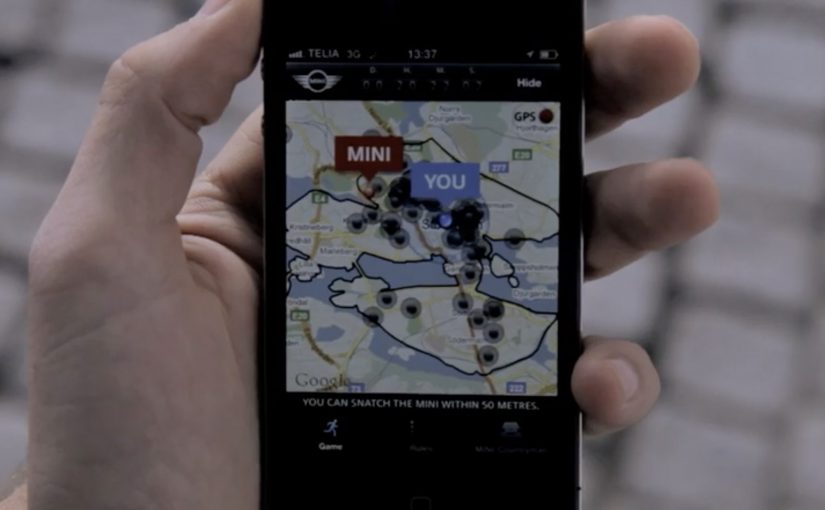
Here is a great example of Online, Mobile and Shopper Marketing converging with Augmented Reality (AR), where the phone camera view becomes the backdrop while digital objects are overlaid and tied to location signals like GPS. Integrated Marketing literally put into the hands of the people.

Japanese ad agency Dentsu has started this experimental coupon download platform called iButterfly on the iPhone. The free iPhone app transforms the habit of collecting coupons into a fun little game using AR and the device’s GPS.

The mechanic: catch a butterfly, unlock a coupon

The app tasks its users with catching virtual butterflies that are flying around, each representing one or more coupons. You can even share “butterflies” with your friends via Bluetooth.

In this context, the phone camera view becomes the backdrop, while digital objects, here butterflies, are overlaid and tied to location signals like GPS.

In retail and FMCG shopper marketing, the value of this approach is that promotions become a location-linked experience, not a passive download.

Why this format works for targeted promotions

The key shift is motivation. People are not “clipping” coupons. They are playing a simple collecting game, and the reward is a deal that feels earned. That feeling is why the offer holds attention long enough to drive action.

Extractable takeaway: When an offer is packaged as a collectible tied to place and moment, it feels context-aware rather than generic. Treat location as part of the experience, and keep the capture-to-redemption path short so the “find” turns into a real reward.

What Dentsu is really prototyping here

This is less about novelty AR and more about a new distribution behavior. Turning offers into collectible objects changes how often users open the app, how long they stay in it, and how naturally they talk about it with friends.

The real question is whether your promotion can create a repeat habit, not just a one-time redemption.

This format is worth copying when you can tie the reward to a real place and keep redemption friction near zero.

It is also a rare example where “share with a friend” is not a marketing CTA. It is a gameplay action that carries the promotion with it.

Shopper activation moves to copy from iButterfly

  • Make the reward immediate. Catch. Unlock. Redeem. Long funnels kill the game loop, the simple repeat cycle of catch, unlock, redeem.
  • Use location as a story, not a filter. Place rewards where people already go, so the map feels meaningful.
  • Let sharing be part of the mechanic. A tradable object beats a generic “share this” button.
  • Keep the collection simple. If users need a manual, they will not hunt.

A few fast answers before you act

What is iButterfly?

iButterfly is a mobile coupon platform that turns deal collection into a location-based AR game. Users catch virtual butterflies on their phone and unlock coupons as rewards.

How does the AR coupon mechanic work?

Users view the real world through the phone camera. Virtual butterflies appear and can be “caught”. Each butterfly contains one or more offers, which unlock after capture.

Why is this relevant for shopper marketing?

It shifts promotions from passive browsing to active discovery. Location and gameplay increase attention, repeat usage, and the likelihood of in-the-moment redemption.

What makes it feel targeted rather than random?

Butterflies can be tied to locations and contexts via GPS. That links the offer to where the shopper is, not just who they are.

What is the biggest execution risk?

If redemption is hard or the rewards feel weak, the novelty wears off fast. The game loop only survives when the payoff is clear and friction stays low.

MINI: Getaway Stockholm 2010

After their recent Talent Poaching via Facebook Places campaign, Jung von Matt is back with the MINI Getaway Stockholm 2010 campaign.

The premise is a reality game that challenges you to do the impossible: stay at least 50 metres away from everybody else in Stockholm city between October 31st and November 7th 2010. If you succeed, you win the new MINI Countryman.

A city-wide game disguised as a launch

This is not a typical “watch and forget” film. It is a product introduction that behaves like a week-long public challenge, using the city as the playing field and social friction as the difficulty setting. Here, “social friction” means the everyday collisions and proximity of city life that make distance hard to maintain.

The mechanic that makes it feel impossible

Mechanically, the campaign turns distance into drama: the rule is simple, but enforcing it in a dense capital city is the whole point. Every street corner becomes a decision, and every near-miss becomes part of the story players tell afterwards.

In European automotive launches, turning a product message into a participatory public challenge is a reliable way to earn attention without leaning on price or specs.

Why this breaks through

Most launches compete on features. This one competes on behavior. It gives people a clear goal, a clear constraint, and a clear reward, then lets the public generate the content through their attempts to win. Because the rule forces constant micro-decisions in public space, it creates tension that keeps spectators watching and participants talking. A constraint-led public game beats a feature-led launch when you need sustained talk value. The real question is whether your launch can earn attention by making the public do the storytelling.

Extractable takeaway: If you can express your launch as one repeatable rule plus one real-world constraint, you turn passive awareness into a week of attempts, near-misses, and shareable stories.

The business intent behind the play

The obvious headline is the prize, but the deeper intent is talk value and repeated engagement over a full week. By “talk value,” I mean the likelihood people will mention it to others and keep the story alive. A launch that unfolds day by day creates more chances for people to hear about it, join late, or simply follow along as a spectator.

Launch moves worth copying

  • Build one rule people can repeat. If the mechanic fits in a single sentence, it spreads faster.
  • Use a constraint, not just a reward. Difficulty creates stories. Stories create sharing.
  • Make the environment part of the experience. When the city is the stage, the campaign feels larger than the media.
  • Stretch the reveal over days. A week-long cadence beats a one-day spike if you want sustained attention.

A few fast answers before you act

What is MINI Getaway Stockholm 2010 in one line?

A week-long reality game in Stockholm with one simple rule and a real prize: stay 50 metres away from everyone else and win a MINI Countryman.

Why does the “50 metres” rule matter?

It turns a basic challenge into something socially and logistically hard in a busy city, which creates tension, stories, and spectator interest.

What makes this feel less like advertising?

The campaign centers on participation and behavior. People engage with the challenge first, and the brand benefits as the enabler of the experience.

What is the transferable lesson for other brands?

If you want attention without shouting, turn your launch into a simple public game with a constraint that generates stories over time.

How do you adapt this pattern without a big prize?

Keep the single repeatable rule, make the constraint genuinely hard in the real world, and use a reward that feels meaningful enough for people to attempt and for others to follow.

AXA: iPhone App for Car Accidents

AXA is Belgium’s first insurance company to launch an iPhone app. Their free application helps and guides you through some basic steps when you have a car accident.

To launch this new app Duval Guillaume Antwerp / Modem from Belgium created an innovative print ad that required your iPhone to complete the message.

Why the print idea is a smart match

The product promise is practical. Help me when I am stressed and do not know what to do next. The launch mirrors that by making the iPhone essential to “finishing” the ad, so the viewer experiences the role of the phone immediately. Because the viewer has to use their own device to complete the message, the concept is remembered as help in the moment, not a feature claim. In European insurance marketing, the first interaction needs to make crisis guidance feel tangible.

Extractable takeaway: If your product is built for high-stress moments, design the launch so people experience the first step, not a promise about steps.

  • Device as the missing piece. The iPhone is not just where the app lives. It is how the message becomes complete.
  • Low barrier to understanding. You do one simple action and the concept clicks.
  • Print-to-mobile bridge. The campaign uses print to trigger a mobile behavior, instead of treating print as a dead end.

What to reuse from this approach

The real question is whether your launch makes someone feel guided before they have to believe you.

If the utility of your app is “guidance in a critical moment”, your launch should demonstrate guidance, not describe it. By “guidance”, I mean a few clear, step-by-step prompts that reduce decision load when people are stressed. A small, tangible interaction can do that faster than any list of features.

  • Start with one action. Give people a single, low-friction step that mirrors the moment your app is built for.
  • Make the device essential. Let the phone complete the story so the product role is experienced, not inferred.
  • Bridge media into behavior. Use the channel to trigger the next step, not just to carry copy.

A few fast answers before you act

What does the AXA Belgium iPhone app do?

It helps guide drivers through basic steps after a car accident, providing practical assistance when they need it most.

Who created the print launch ad?

Duval Guillaume Antwerp / Modem (Belgium) created the print execution to launch the app.

What made the print launch ad innovative?

The print execution required the viewer’s iPhone to complete the message, turning the phone into an active part of the ad rather than a separate channel.

Why is this a strong launch mechanic for an insurance app?

It demonstrates the phone’s role as a helper in-the-moment, which aligns directly with the app’s accident-assistance promise.

What is the transferable pattern?

Design a simple physical or media trigger that forces a first interaction with the device. Then let that interaction explain the product in seconds.