AXA: Mobile Service Home i-Mercial

In 2010, AXA was the first insurance company in the market to launch an iPhone application for car insurance. In 2011, AXA took this one step further and developed an iPhone application for fire insurance.

“Mobile Service Home” is described as a first for the Belgian insurance market, so the product was launched with a method designed to feel just as inventive. AXA and ad agency Duval Guillaume Antwerp. Modem developed what they called an i-Mercial, a television spot for viewers to step into.

How the i-Mercial works

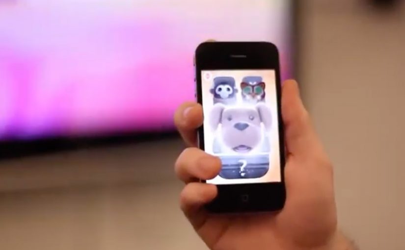
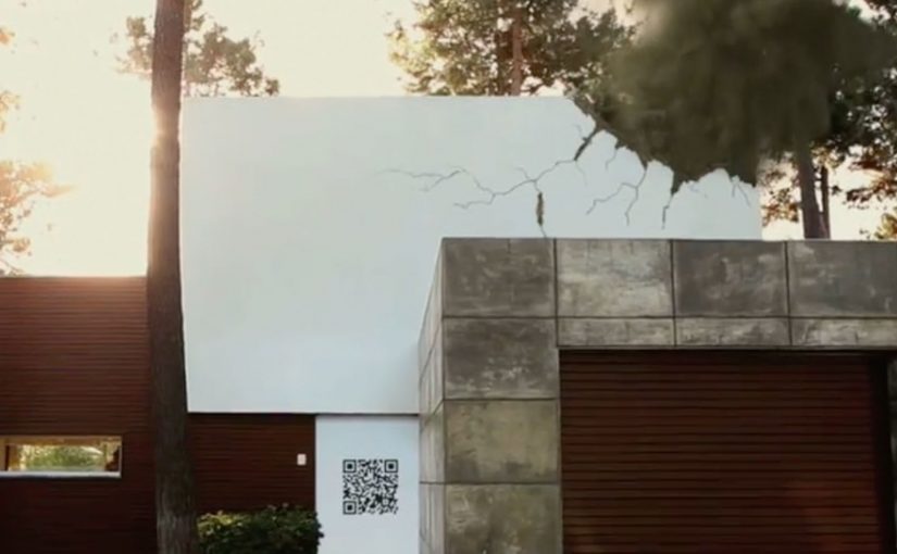
The mechanism is a second-screen bridge: the TV spot includes an on-screen code, and the viewer uses an iPhone to scan it. That scan unlocks an extended layer of the story on the phone, so you move from watching the house on TV to exploring what happened inside it on your own screen. Because the scan happens while the spot is still running, the viewer stays in the narrative and experiences the service logic instead of just hearing about it.

In European insurance markets, this kind of second-screen interactivity turns a passive TV spot into a hands-on service demonstration.

The real question is whether the second-screen bridge proves the service promise in the moment, not whether the format feels novel.

Why it lands

It makes “mobile service” tangible. If the promise is speed and guidance in stressful moments, an interactive format is a better proof than a claim.

Extractable takeaway: Interactive advertising works when the phone is used as a second screen to continue the story and demonstrate the service. The TV spot creates the prompt. The mobile interaction delivers the proof.

  • It gives the viewer control. The audience is not asked to remember a URL later. The action happens in the moment, and the phone becomes the interface for continuing the narrative.
  • It turns a CTA into an experience. Scanning is not a bolt-on gimmick. It is the creative idea, because it lets the viewer literally step into the ad.

Second-screen launch moves

  • Design the interaction to be immediate. If the action cannot happen in seconds, most viewers will drop.
  • Make the “next layer” worth it. The mobile extension should add narrative, clarity, or utility, not just extra footage.
  • Ensure the format matches the product. A mobile service is best launched through a mobile-driven interaction.

A few fast answers before you act

What is an “i-Mercial” in this case?

A TV commercial designed to continue on an iPhone, so the viewer can interact with the ad rather than only watch it.

How does the viewer “step into” the TV spot?

By scanning an on-screen code with an iPhone during the broadcast, which unlocks an extended experience on the phone.

Why is this a smart launch method for an insurance app?

Because it demonstrates mobile-guided service behavior immediately, instead of asking viewers to imagine how the app helps.

What is the main risk with this format?

Link rot. If the scan destination or app flow is no longer maintained, the core mechanic breaks and the campaign loses its point.

What is the most transferable lesson?

When you want people to believe a mobile service, make the first brand interaction mobile, interactive, and simple enough to complete in the moment.

Honda Jazz Interactive TV Ad

You watch the Honda Jazz “This Unpredictable Life” TV spot. At the same time, you open a companion iPhone app and literally “grab” what is happening in the ad. A character jumps onto your phone in the exact moment it appears on TV. Then you take that character with you and keep playing after the commercial ends.

Wieden + Kennedy London is behind this interactive TV campaign for the new Honda Jazz. The idea is simple and sharp. Use the iPhone as a second screen that syncs to the broadcast and turns a passive spot into a real-time experience. Here, “second screen” means the phone becomes the companion interface while TV stays the primary video canvas.

What the iPhone app does while the ad plays

The mechanic is “screen hopping.” The iPhone app recognises the sound from the TV ad and matches it to predefined audio fingerprints. That timing tells the app exactly which character or moment is live in the commercial, so it can surface the right interactive content on your phone in real time. Because the sync is driven by the ad’s audio, the handoff can happen on the exact beat the viewer sees on TV, which is what makes the interaction feel seamless.

In European consumer-brand marketing teams, this pattern matters most when broadcast reach and mobile engagement are owned and designed as one experience.

The real question is whether your second-screen sync can stay instant and obvious enough to feel like part of the spot, not a separate product.

What happens after you “grab” a character

Once a character lands on your iPhone, you interact with it away from the TV. You can trigger behaviours and mini-interactions, including singing into the phone to make characters react and dance. The TV spot becomes the gateway. The mobile experience becomes the engagement layer you keep.

Why this matters for interactive advertising

This is a clear step toward campaigns that treat broadcast as the launchpad and mobile as the control surface. When the second screen is tightly synchronised, you can design moments that feel native to the content people are already watching, rather than forcing a separate “go online later” call-to-action. This is worth doing when the sync is instant and the post-spot interaction is fun enough to continue without the TV.

Extractable takeaway: If you want broadcast to create action, design the mobile handoff so it happens on the same beat the viewer sees on TV, then give the phone a simple loop that keeps going after the spot ends.

This is also not the first time an iPhone engagement model starts to bridge media and action. A related example uses a similar iPhone-led interaction pattern for coupons and augmented reality: location based augmented reality coupons.

Design cues to reuse from this campaign

  • Anchor everything on a single trigger. Let the TV spot be the trigger, and let the phone pick up the same moment without delay.
  • Make the interaction obvious in one move. “Grab a character” is a clean mental model that needs almost no instructions.
  • Carry the payoff beyond the broadcast window. Treat the spot as the gateway and the phone as the layer that continues after the ad ends.
  • Keep the experience playful, not feature-heavy. Simple behaviours and reactions beat complex menus when timing is the point.

A few fast answers before you act

What is “screen hopping” in advertising?

Screen hopping is when content “jumps” from one screen to another during a live experience. Here, the TV spot triggers synchronized content on an iPhone so viewers can capture and interact with elements of the ad.

How does the Honda Jazz app sync to the TV commercial?

The app uses audio recognition. It matches the ad’s sound to predefined audio patterns so it knows what is playing at any moment and can show the right character or interaction on the phone.

What is the value of a second-screen experience like this?

It extends a short broadcast moment into a longer engagement loop. The ad becomes a gateway. The phone becomes the interactive layer that continues before, during, and after the spot.

What should a brand get right to make this work?

Timing and simplicity. The sync must feel instant, the interaction must be obvious, and the “reward” for participating must be fun enough to carry beyond the TV moment.

Toyota: A Glass of Water

A Glass of Water is a challenge created by Saatchi & Saatchi Stockholm for Toyota in Sweden. Its mission is to help drivers cut down their fuel consumption by 10% and reduce CO2 emissions, aligned with Toyota’s stated zero-emission vision.

When drivers register on the program website, they accept the challenge to place a glass of water on their dashboard or cup holder, then drive in a smooth manner that avoids spillage.

According to Toyota, the less you spill, the gentler you drive. Therefore the less fuel you consume.

A rule you can test on your next drive

The brilliance is the simplicity. No special car, no expert coaching, no complicated scorecard. Just a physical feedback loop that makes every harsh brake and every aggressive turn visible in the most basic way possible.

How the mechanism teaches eco-driving

Spilling is the metric. If you keep the water steady, you are accelerating, braking, and cornering more smoothly. That smoother style tends to reduce wasteful energy spikes, which is the same principle behind most eco-driving advice, translated into something you can feel immediately.

In European automotive marketing, behavior-change challenges work best when the rule is simple enough to try on the next drive.

Why it lands

It turns an abstract goal. “reduce fuel consumption”. into a personal game with instant feedback. The glass makes you self-correct without being told what to do, and it makes eco-driving feel like mastery rather than sacrifice. It also travels well as a story because anyone can explain it in one sentence.

Extractable takeaway: If you want people to change a daily behavior, give them a physical, low-effort indicator that converts “doing better” into a visible result they can improve on.

What Toyota is really buying

This is not just awareness. It is repeatable participation. Each drive becomes a new attempt, and each attempt reinforces the brand’s association with smarter, calmer driving rather than with lecturing about emissions.

The real question is how to make smoother driving feel self-evident and repeatable, not how to explain eco-driving more forcefully.

What to steal from the water-glass challenge

  • Use a single, legible metric. Spills are binary and instantly understood.
  • Make the feedback loop physical. Physical cues outperform abstract dashboards for habit shifts.
  • Lower the start barrier to almost zero. If people can start today, they will.
  • Turn restraint into skill. People adopt habits faster when it feels like competence.

A few fast answers before you act

What is A Glass of Water?

A driving challenge where you place a glass of water on the dashboard or cup holder and try to drive smoothly enough not to spill, as a proxy for reducing fuel consumption.

Why does “not spilling” relate to fuel savings?

Because avoiding spills requires gentler acceleration, braking, and cornering. That smoother driving style tends to reduce inefficient energy spikes.

What makes this different from typical eco-driving advice?

It replaces instructions with immediate feedback. The glass shows you how you are driving without needing an expert or a complex display.

What is the biggest risk with this kind of challenge?

If people treat it as a stunt rather than a habit tool, the effect fades quickly. The challenge needs repetition to translate into lasting driving style change.

How should a brand measure success for a behavior challenge like this?

Participation volume, repeat participation, and any measured or self-reported fuel consumption improvement among participants, not only views or clicks.