
Coca-Cola: The Future Room Exhibition

A museum-scale brand moment for a milestone anniversary

In brand experience work, the strongest anniversary executions do not look like commemorations. They look like a reason to step inside the brand world. Coca-Cola’s “Future Room” is a clean example of that approach.

For Coca-Cola’s 125th Anniversary, Istanbul’s creative agency Antilop created a “Future Room” concept, made specifically for the Turkish modern-art museum Santralistanbul. They transformed a section of the gallery into an impressive 90 square meter, 270-degree projection mapping installation.

How the Future Room worked as an immersive installation

The mechanism was spatial immersion. Here, that means using the room itself as the storytelling surface, so viewers are surrounded rather than watching a single screen.

That choice changed the viewing behavior. People did not just watch a piece of content. They entered it, and the room itself became the interface.

In global consumer brands, milestone experiences land best when the venue and the format give people a reason to physically show up.

Why it landed in a modern-art setting

In a museum context, attention is earned through presence, scale, and craft. Projection mapping fits because it turns a physical space into a living canvas.

Extractable takeaway: In cultural venues, design the environment first, then let the brand meaning ride on the craft people can feel in the room.

By committing 90 square meters of gallery to one experience, the work signaled seriousness. It also made the activation feel like an exhibit, not an ad, which is exactly the psychological shift a heritage brand wants during an anniversary moment.

The business intent behind the exhibition format

The intent was to elevate the partnership between brand and venue, and to position Coca-Cola as culturally fluent rather than purely commercial.

The real question is how you make a milestone feel current without turning it into a retrospective.

An anniversary is a credibility play, meaning a chance to reaffirm relevance in the present. The exhibition format helped translate “125 years” into something contemporary, sensory, and shareable, without relying on nostalgia alone.

Design cues for your next immersive brand experience

  • Choose a format that matches the venue. In cultural spaces, experience and craft beat messaging density.
  • Use scale as a signal. Large physical commitment communicates importance before anyone reads a word.
  • Turn the room into the medium. Immersion works when the environment does the storytelling, not just the screen.
  • Make milestones feel current. Anniversary work lands when it shows relevance, not only history.

A few fast answers before you act

What was Coca-Cola’s “Future Room”?

An immersive, exhibition-style installation that used large-scale projection mapping to wrap visitors in a future-facing brand environment.

Where did it appear?

It was created for Santralistanbul, a Turkish modern-art museum in Istanbul, as part of Coca-Cola’s 125th anniversary moment.

What was the mechanism?

The room became the medium. A wraparound projection space made the environment itself the interface.

Why does this work in a museum context?

Museums reward presence, scale, and craft. An immersive installation can read as an exhibit, not an ad, which changes how people grant attention.

Why is this effective for anniversaries?

It makes the milestone feel current. It gives people a reason to attend now, not just a reason to remember then.

What should experience teams copy from it?

Match the format to the venue, commit physically to signal seriousness, and design for movement and dwell time instead of messaging density.
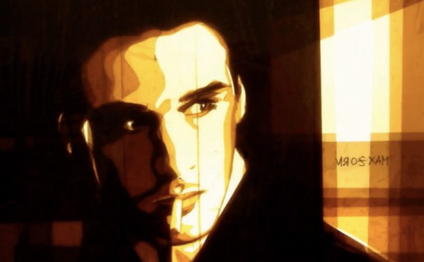
Max Zorn and Ilana Yahav: Tape and Sand Art

Here is a novel approach to two different kinds of art.

Tape Art by Max Zorn

Tape art is exactly what it sounds like: images built from cut and layered tape rather than paint. What makes this version so watchable is the reveal. The scene sharpens as light passes through the tape and the darker cuts define faces, shadows, and edges.

Sand Art by Ilana Yahav

Sand art in this form is live sand animation: a performer draws with sand on a lit surface while the camera captures the transformation in real time. The image keeps evolving. Characters become landscapes, then dissolve into the next beat of the story.

What both techniques have in common

Both styles use humble materials and a strong constraint to create drama. Tape relies on cutting, layering, and backlight. Sand relies on gesture, timing, and continuous change. In both cases, the process is not a behind-the-scenes detail. It is the point.

In brand and content environments where attention is earned through demonstration, process-first art formats, meaning the making is the narrative, work because the transformation is visible.

The real question is whether your content can make progress legible enough that people want to watch to the end.

Brands should design for the reveal, not just the final frame.

Why it lands

Both formats turn craft into suspense by letting the viewer track progress in real time and feel the constraint working.

Extractable takeaway: Highly shareable art formats make the transformation readable in motion. When the audience can follow the image changing step by step, the process becomes the hook and the result becomes the proof.

It turns craft into suspense. You are not waiting for a final reveal. You are watching the image assemble itself in front of you.

It is instantly legible. Even without context, the viewer can track progress: shapes become meaning, and meaning becomes a scene.

It makes constraint feel like a superpower. Limiting the toolset (tape or sand) increases appreciation, because the outcome feels “impossible” relative to the materials.

Borrowable moves

  • Design for a visible build. If the audience can’t track progress, you lose the “how did they do that?” effect.
  • Commit to one constraint. One material. One rule. The constraint is what gives the work its identity.
  • Use light as a storytelling tool. Backlight and contrast do more than look good. They guide attention and make detail emerge at the right time.
  • Let the medium define the pacing. These pieces work because the rhythm matches how the image is formed, not how an editor wants to cut it.

A few fast answers before you act

What is “tape art” in this context?

Artwork created by cutting and layering tape to form images. The look often depends on light, translucency, and negative space rather than brushstrokes.

What is “sand animation”?

A live performance where images are drawn with sand on a lit surface and continuously transformed, so the story emerges through motion rather than static frames.

Why do these formats work so well on video?

Because the making is the story. Viewers stay for the transformation, then share because the craft feels both simple and astonishing.

What makes the work feel “novel” even when the materials are basic?

The constraint is unusual and the reveal is staged. The audience watches ordinary materials produce an unexpectedly cinematic result.

How can a brand borrow this without copying it?

Borrow the structure: one clear constraint, a readable transformation, and a finish that feels earned by the process.

Mercedes-Benz Vans: Key to Viano

A commuter points a car key at a digital billboard and clicks the remote. The screen reacts. Suddenly, the advertising display stops behaving like outdoor media and starts behaving like interactive entertainment.

That is the core mechanic behind “Key to Viano”, an interactive outdoor event for Mercedes-Benz Vans created by Lukas Lindemann Rosinski on Wall AG’s digital out-of-home (DOOH) displays in Berlin’s U-Bahn station Friedrichstraße. Passers-by are invited to use their own remote car keys to control the content on the screens, turning a familiar everyday object into the controller.

In high-traffic urban DOOH environments, the quickest path to attention is to turn an existing habit into viewer control, with a payoff that feels immediate and public.

The experience works because the interaction is self-explanatory. Press the button you already know. Watch the screen respond. The line between ad and game collapses, and the crowd becomes part of the moment because everyone can see the “trigger” happen.

Why the car key is the perfect interface

No download. No new behaviour. No instruction manual. A car key is already a remote control in people’s hands, so the activation feels intuitive instead of “techy”. That simplicity is what makes the experience legible from a distance, and what makes bystanders stop and watch.

Extractable takeaway: If you want interaction in public space, pick an input people already carry and trust, then make the response visible to everyone around them.

What Mercedes-Benz Vans is really proving

The stunt is framed as entertainment, but it is also a product metaphor. “Key to Viano” implies access, convenience, and a premium feel. When the participant can “open” a digital experience with a key, the brand gets to borrow the emotional cues of unlocking a car, without talking about features.

The real question is whether your idea can be explained in one glance, without staff, signage, or a QR code.

Interactive DOOH should earn its place by being instantly legible, not by adding layers of “smart” complexity.

What to borrow from Key to Viano

  • Use a controller people already trust. Familiar inputs reduce friction and increase participation.
  • Make the interaction visible. If the crowd can see what caused the screen to change, attention multiplies.
  • Keep the loop fast. Trigger. Response. Reward. A slow loop loses commuters.
  • Let the location do the targeting. Stations deliver high volume and natural dwell time without extra explanation.

A few fast answers before you act

What is “Key to Viano”?

It is an interactive digital out-of-home activation where passers-by control advertising screens using their own remote car keys, under the Mercedes-Benz Vans “Key to Viano” concept.

Where did the activation run?

It ran on digital displays at Berlin’s U-Bahn station Friedrichstraße.

Why does using a car key work so well?

Because it is an input people already understand. It removes download friction and makes the interaction feel natural and premium.

What is the main benefit of interactive DOOH like this?

It converts passive exposure into participation. Participation creates longer attention, stronger memory, and visible social proof from the crowd watching.

What is the biggest risk with interactive screens in transit spaces?

Complexity. If the interaction is not instantly clear, people walk past. The mechanic must be obvious in seconds.