
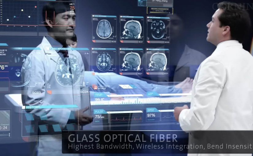
Corning: A Day Made of Glass 2

Corning is best known as a high-tech glass manufacturer. Their Gorilla Glass is used across a huge number of smartphones. In March last year they released “A day made of glass”. A futuristic look at glass technology.

Now they are back with an expanded vision for the future of glass technologies. This video continues the story of how highly engineered glass, with companion technologies, will help shape our world.

What’s new in the expanded vision

The core mechanic stays the same. Glass is no longer a cover. It becomes the interface. The expansion is about reach and density. More environments. More surfaces. More moments where information appears “in place” and responds directly to touch.

In consumer electronics, automotive interiors, and collaborative workplaces, the real shift is treating surfaces as shared touch-first interfaces rather than single-purpose screens.

The interaction pattern underneath the glass

Strip away the material science and you can see a product blueprint. Persistent identity across contexts. Content that follows the user. Direct manipulation as the default. And big surfaces that invite more than one person to participate at the same time.

In global enterprise and consumer-tech product teams, smart-surface visions only pay off when the interaction rules stay coherent across devices and contexts.

Why this vision sticks

It sells immediacy. You touch the thing you mean. You get feedback where your eyes already are. There is less “device ceremony”, meaning fewer unlocks, app switches, and mode changes, and more task flow. Because the interaction is direct and feedback stays in place, the experience feels faster and more trustworthy, which is why these concept films can persuade even before the enabling tech is fully mainstream. These concept films are worth using, but only if you translate them into interaction rules you can actually prototype. The real question is whether you can keep those rules coherent across surfaces once the demo glow fades.

Extractable takeaway: When you are designing a future-facing experience, define the interaction grammar first, meaning the repeatable set of gestures, feedback cues, and handoffs that make the experience feel consistent. If the same gestures, feedback, and handoffs work across two form factors, your concept has legs. If they don’t, the material is just a costume.

Steals from the smart-surface UX model

  • Prototype the handoffs early. Moving from phone to wall to table is where visions usually collapse. Test that seam before you polish anything else.
  • Design for two people, not one. Large surfaces create collaboration by default. Add rules for turn-taking, ownership, and conflict resolution.
  • Keep data anchored to the decision. The strongest moments are when information shows up exactly where action happens, not in a separate dashboard.
  • Make “glanceable” a first-class mode. If the surface is always there, the experience must work in 2-second looks, not only long sessions.

A few fast answers before you act

What is “A Day Made of Glass 2” actually demonstrating?

It demonstrates an interface direction. Glass surfaces behave like interactive displays, so information can appear in place and be manipulated directly by touch.

Is the value here the glass technology or the UX model?

The transferable value is the UX model. Direct manipulation, seamless handoffs, and multi-user surfaces. The materials enable it, but the interaction design makes it believable.

What is the biggest risk in “smart surfaces everywhere” thinking?

Interface overload. If every surface can talk, the environment becomes noisy. The discipline is deciding when to stay quiet and when to surface the one next action.

How do you scope a first prototype so it stays realistic?

Pick one job-to-be-done, two surfaces, and a single handoff. Then enforce a small set of interaction rules so you can observe friction before you add polish.

What is one practical next step after watching the video?

Write down the 6 to 10 interaction rules you believe the film is using. Then build a rough prototype that applies those rules in two contexts, such as phone plus kiosk, or tablet plus meeting room display.

Wimpy: Braille Burgers

Wimpy wanted to let visually impaired people know that it offered braille menus in all of its restaurants. Instead of announcing it with a poster, it turned the message into the product itself.

With the help of skilled chefs, sesame seeds were meticulously placed on burger buns so the seeds formed a braille message. The bun becomes a tactile line of communication. You do not have to ask. You can read it with your fingertips.

A message built for the audience

This is a campaign that respects the medium. If the audience reads through touch, the communication should be touchable. The craft is the point. Someone had to care enough to place every seed, because that effort signals the same care the brand claims to have for accessibility.

It is also a quiet reversal of how “accessibility features” often get communicated. Normally, the burden is on the customer to ask for the braille menu. Here, the brand leads with the fact that it is already available.

In mass-market food and retail brands, inclusive design travels fastest when people can discover it in the experience itself rather than having to request it.

The real question is whether accessibility is discoverable by default, or only available to people who already know to ask for it.

Brands should make accessibility features self-revealing inside the product experience, not tucked behind a request.

Why it lands

This works because the message arrives through touch in the moment of use, which removes the “ask” step and makes the accessibility promise instantly usable.

Extractable takeaway: Inclusion marketing lands when the communication channel matches the audience’s access mode. Here, the message is readable by touch at the exact moment of consumption, so the customer discovers the braille-menu promise without needing to ask.

It is specific, not generic. The idea is built around one concrete barrier, then removes it in a way that feels native to the category.

It creates earned attention without begging for it. The story spreads because it is surprising and easily retold. A burger bun you can read is instantly legible as a headline.

It avoids “awareness theater”. By “awareness theater,” I mean symbolic inclusion messaging without a usable change for the customer. The message is not “we support inclusion” in abstract terms. It is “here is the inclusive thing, already made real”.

How to make accessibility discoverable

  • Match the channel to the audience. If your audience cannot access the default channel, redesign the channel. Do not just add copy.
  • Let the product do the talking. The most credible claims show up as a behavior, feature, or ritual inside the experience.
  • Make the proof tactile or visible. When a customer can feel the difference, you do not need to over-explain it.
  • Use craft as a credibility signal. The effort in execution communicates intent more strongly than any tagline.

A few fast answers before you act

What was Wimpy trying to communicate?

That braille menus were available across its restaurants, and that visually impaired customers were welcome without extra friction.

How did the “braille burgers” actually work?

Sesame seeds were placed on the bun in braille patterns that could be read by touch. The braille spelled out a short message or burger description.

Why is this more effective than a standard ad?

Because the audience can directly access the message. It does not depend on sight, and it does not depend on asking staff for information.

What is the business intent behind an inclusion idea like this?

To increase awareness and usage of an accessibility feature, strengthen brand warmth, and reduce the “I did not know you had that” barrier that stops people from choosing the brand.

What is the most transferable lesson?

Build the message in the same mode your audience uses. When the communication format is accessible by design, the campaign becomes self-validating.

Turquoise Cottage: The Buddy Stamp

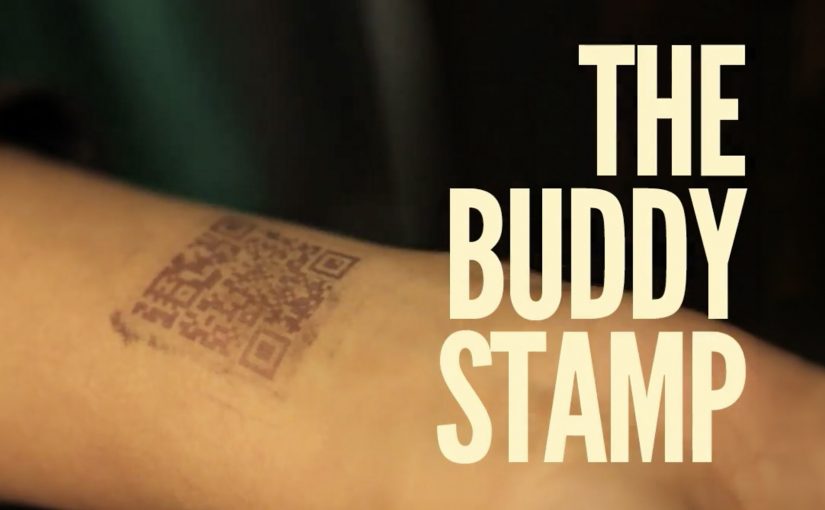
Most nightclubs in India put an admittance stamp on the wrist of their customers. Turquoise Cottage, a nightclub based in Vasant Vihar, New Delhi, was no different. However, with their digital agency, Webchutney, they created what then went on to be coined as “The Buddy Stamp”.

“The Buddy Stamp” was a unique QR code stamp which upon scanning gave customers useful and actionable information depending on the time of night.

A wrist stamp that keeps working after entry

The clever move is that the stamp is not branding. It is a tool. You already have it on you, so the lowest-effort scan becomes a doorway to whatever you need next, without searching, asking staff, or opening a menu.

How the QR code changes by time of night

The stamp routes to different content depending on when it is scanned. Early in the evening it can point to venue offers and drink specials. Later it can switch to practical “get home” help like cab options. It can even pivot the next day into recovery-style tips, which extends the brand’s care beyond the club.

In high-energy hospitality environments, time-based mobile utilities work when they reduce friction at the exact moment the customer needs help.

Why this lands

It respects how nights actually unfold. People do not want a generic microsite when they are out. They want one fast answer that fits the current hour, and they want it without social overhead.

Extractable takeaway: If you already “touch” the customer as part of entry, turn that touchpoint into a changing utility that anticipates the next decision, not just a logo.

What the club and agency are really optimizing

This is experience design disguised as a stamp. It upgrades service without adding staff steps, and it makes responsibility and convenience feel like part of the venue’s personality, not a lecture.

The real question is how a venue can turn a mandatory entry ritual into timely help people will actually use.

What venue teams can steal from this

  • Attach the utility to an unavoidable ritual. Admission is the perfect moment because everyone participates.
  • Use time as the personalization layer. You do not need profiles when the clock predicts needs well enough.
  • Design for the “next 30 minutes”. The best content is the thing people would otherwise ask a friend.
  • Extend care past the venue. Post-night help builds goodwill that outlasts the party.

A few fast answers before you act

What is The Buddy Stamp?

It is a QR code wrist stamp used as a nightclub admission stamp that links to different, practical information depending on the time of night.

What makes it different from a normal QR code poster?

The QR code lives on the customer. That makes it always available, and the time-based switching makes it feel context-aware without asking the user to do anything extra.

Why does “time of night” matter as a design input?

Because needs change predictably across an evening. Offers and discovery matter early. Getting home safely matters late. The best experiences match that rhythm.

What is the transferable pattern for other venues or brands?

Turn an existing physical touchpoint into a dynamic utility. Let one simple scan deliver the most useful next step for the customer’s current situation.

Why is the wrist stamp a better utility surface than a poster?

Because entry already puts it on every guest. That makes the utility universal, immediate, and easy to revisit without asking people to find a sign again.