
Québec City Magic Festival: The Magic Poster

To promote the Québec City Magic Festival, lg2 makes the poster behave like a trick, not a billboard.

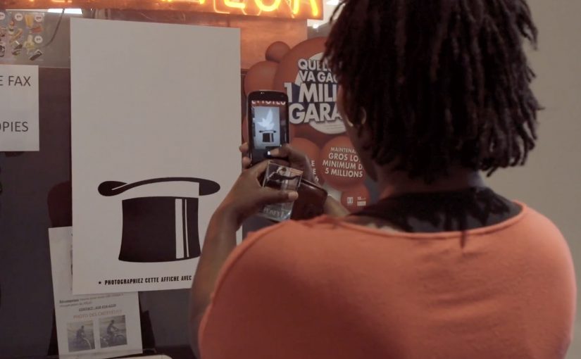
The creative is a magician’s hat poster with a message printed in invisible ink. Curious passers-by discover the mechanic by doing what people already do. They pull out a phone, take a picture, and turn the flash on. The flash reveals the hidden copy, and a lucky few are rewarded with a free ticket for the festival’s closing show.

A poster that turns curiosity into participation

The mechanism is invisible ink plus a flash-triggered reveal. Instead of asking for attention, the poster pays attention back. It gives you a reason to stop, and it gives you a satisfying “aha” the moment you do.

In high-traffic city out-of-home placements, the best interactive work rides on habits people already have, not instructions they have to learn.

In out-of-home, the strongest interactive ideas do not demand a new behavior. They attach to a behavior already in the environment and simply add a twist.

Why it lands for a magic festival

The medium is perfectly aligned with the message. The campaign does not merely advertise magic. It performs magic in the street. That alignment makes the experience feel like a preview of the festival rather than an ad for it. The real question is whether the medium can demonstrate the experience you are selling, not just describe it.

Extractable takeaway: When promoting an experience product, make the marketing behave like the product. Let the audience sample the feeling, not just read the promise.

The free-ticket twist strengthens the loop. The reveal provides instant reward. The prize provides delayed reward. Both motivate sharing, because people want friends to try it and to see if they win.

How to design a flash-reveal OOH interaction

  • Hide something worth revealing. The reveal must feel like a payoff, not a gimmick.
  • Use a native trigger. Flash photography is a default phone capability, not an app install.
  • Reward the behavior. Even a small chance of winning can meaningfully increase participation.
  • Make it repeatable. The interaction should be easy enough that people can show someone else on the spot.

A few fast answers before you act

What is “The Magic Poster” concept?

A festival poster printed with invisible ink that reveals its message when someone photographs it with a phone flash, turning a passive billboard into a small magic trick.

Why is the flash-triggered reveal effective?

It uses a built-in phone behavior, creates instant payoff, and turns the audience into the operator of the trick, which increases attention and sharing.

What makes it more than a novelty poster?

The mechanic reinforces the product truth. The campaign demonstrates magic rather than merely claiming it, making the ad itself a preview of the festival experience.

How can brands adapt this without copying the exact technique?

Design a simple reveal that matches your story, attach it to a native behavior in the environment, and ensure the revealed content is genuinely rewarding, not just hidden for hiding’s sake.

What should the hidden message say?

Keep the revealed copy short and emotionally rewarding in one glance, so the flash moment feels like a payoff and not a puzzle.
Formula E: Leap of Faith

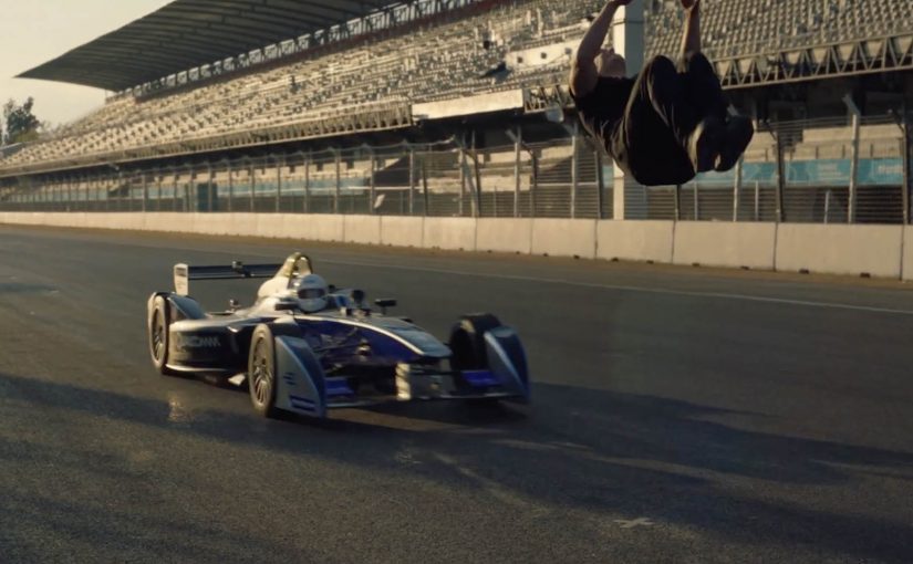
A race car comes up fast from behind. Damien Walters cannot see it. He commits anyway, throwing a backflip that clears the car at speed, landing as if it is routine.

Watch the perfectly synchronised leap below.

One trick, built on timing discipline

The mechanic is simple to describe and hard to execute. A blind backflip over a moving Formula E car. What makes it work is timing control. The driver holds a consistent approach speed, and the stunt is triggered off a repeatable timing reference so the flip happens at the exact moment the car reaches the take-off zone.

In sports branded content, the cleanest way to earn attention is to stage a single, unmissable proof where human skill and the sport’s technology meet in the same frame.

Why it lands

This is a spectacle with a clear question and a clear answer. Can he do it. Then, there it is. The real question is whether the stunt can make precision feel visible rather than merely claimed. The “blind” constraint adds tension because it removes the most obvious safety cue, and the viewer instinctively runs the risk calculation while watching. The payoff is the feeling of precision, not chaos. It reads less like danger for danger’s sake and more like controlled performance.

Extractable takeaway: If your story is “this is high-performance and precise,” build a moment where the viewer can see precision as a binary outcome, and keep the framing uncluttered enough that nobody misses the proof.

What Formula E gets out of it

The stunt borrows the language of elite motorsport. Speed, control, engineering, nerve. It also gives Formula E an easily shareable “you have to see this” asset that travels beyond core racing fans, while still feeling native to the category.

What to steal from the stunt

  • Make the promise visible. Translate “precision” into a single, legible pass or fail moment.
  • Add one constraint that increases tension. Blind, one-take, fixed distance, single attempt. Keep it understandable.
  • Keep the shot honest. The simpler the framing, the more the audience trusts what they are seeing.
  • Design for replay. If the moment is short and clean, people will rewatch and repost without needing context.

A few fast answers before you act

What is “Leap of Faith” in one sentence?

A branded stunt film where Damien Walters performs a blind backflip over a speeding Formula E car with tight timing synchronisation.

What makes the stunt feel different from a normal trick shot?

The car approaches from behind, so the timing has to be pre-controlled rather than visually adjusted, which raises tension and makes precision the headline.

Why does this format work for a sports brand?

It communicates the sport’s core attributes, speed and control, in a compact proof that is understandable even to non-fans.

What is the main creative risk?

If the production feels over-edited or overly cinematic, audiences question authenticity and the share impulse drops.

When should you use a “single proof moment” idea like this?

When your brand story is performance-based and you can express it as one unmistakable action that holds attention in the first three seconds.

WhatsApp Taxi

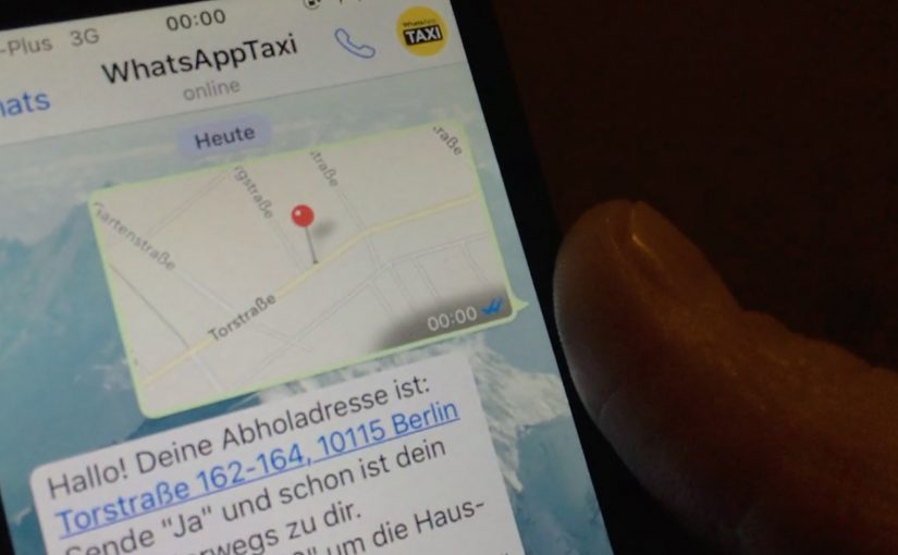
You need a taxi. Instead of calling or using a dedicated app, you open WhatsApp, share your location, and place the order by message. Taxi Deutschland positions “WhatsApp Taxi” as a simple way to request a cab in major German cities using the behavior people already know. Messaging.

Why this shows up now

After years of public sharing and transparency on social media, people gravitate toward more intimate, private, and even anonymous ways to communicate. That shift boosts the popularity of messaging apps and ephemeral messaging. Chat apps become hubs for social networks, games, e-commerce, and more.

The service. Taxi ordering by location message

Taxi Deutschland launches a new service called “WhatsApp Taxi” that allows users in major German cities to order a taxi by simply sharing their location via a WhatsApp message. The interaction is reduced to one core input. Your location.

The pattern. Messaging becomes an interface

Just last week I wrote about how KLM was starting to use Facebook Messenger for customer service related queries and tasks. WhatsApp Taxi sits in the same movement. Utility shifts into the messaging layer, which means the chat app becomes the place where the service starts, is confirmed, and is updated. The chat thread becomes the service surface.

In service categories where the audience already coordinates through chat, the smarter move is often to reduce entry friction rather than build another interface.

Why this lands for service adoption

This is a stronger service design move than another branded utility app because one familiar message and one high-confidence input make the service easier to try, which is why the interaction feels lighter and more repeatable.

Extractable takeaway: When the job to be done can be triggered with one trusted input inside a familiar chat flow, messaging can outperform a dedicated interface on adoption because it removes setup and learning cost.

The real question is whether your service needs a dedicated interface at all when messaging can already handle the request, confirmation, and follow-up. For Taxi Deutschland, the business intent is to reduce ordering friction and capture demand inside an existing behavior instead of forcing a new app habit.

What service brands can lift from WhatsApp Taxi

  • Ship in the behaviour people already have: If your audience already lives in messaging, put the service where the habit already exists.
  • Reduce the request to one high-confidence input: Location-first is a clean pattern when the service is fundamentally “come to me”.
  • Make chat the interface: Treat the thread as the order surface. Request, confirmation, updates, and support stay in one place.
  • Keep the interaction minimal: If one message can start the service, adoption is easier than “install app, register, learn UI”.
  • Design for repeat use: The same simple flow should work the second time without needing new learning or setup.

A few fast answers before you act

What is WhatsApp Taxi?

A Taxi Deutschland service that lets users order a taxi via WhatsApp by sharing their location in a message.

Where does it work?

Taxi Deutschland positions the service for use in major German cities.

What is the core user action?

Send your location via WhatsApp message to initiate the taxi order.

Why is this a marketing and product signal?

It shows how messaging apps evolve from communication tools into utility layers where services can be initiated and managed.

What is the transferable lesson for brands?

If your service can be reduced to a small set of high-confidence inputs, messaging can become a low-friction interface that people already understand.