Coca-Cola: Sharing Can That Splits in Two

When “share” is built into the can

With summer coming up and an ice cold soda in your hand, people around you are bound to hope that you will share the soda with them. The normal way of doing so would be to sip from the same opening.

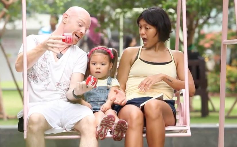
Now in an attempt to create another way of sharing happiness, Coca-Cola teamed up with Ogilvy in Singapore and France to create a shareable can of Coke that splits into two and creates two half pints. The results.

The packaging hack: one can becomes two

The can does not just contain the drink. It choreographs the moment. Split it. Hand one half over. The product becomes the gesture.

In global FMCG brands, packaging is often the fastest way to turn “share” from a line of copy into a behavior.

If the behavior matters, design it into the object. Because the can physically divides into two drinkable halves, the social negotiation disappears and the gesture becomes obvious.

Why it changes the social moment

The post nails the truth. People want a sip. This design turns that awkward micro-negotiation into a simple ritual that feels natural in the moment. Here, “ritual” means a tiny repeatable sequence anyone can copy. Split, hand one half over, drink.

Extractable takeaway: When the friction lives in a shared micro-moment, redesign the object so the desired behavior is the default, not a negotiation.

The job it solves

Create another way of sharing happiness in summer, without two people sipping from the same opening. Here, “sharing happiness” is not abstract. It is one can producing two separate openings, so two people can drink without swapping sips.

The real question is how to make sharing feel effortless and hygienic at the exact moment someone is holding the drink.

Steal the split-and-share ritual

  • Encode the behavior: If the behavior matters, build it into the object, not only the message.
  • Remove micro-friction: Design for the real scenario, then remove friction inside that moment.
  • Make the ritual portable: Create a repeatable ritual. The best ones travel without explanation.

A few fast answers before you act

What is the “sharing can” concept?

A Coke can engineered to split into two drinkable halves, creating two half pints from one can.

Who was involved?

Coca-Cola partnered with Ogilvy. The post associates the work with Singapore and France.

What moment does it target?

The everyday situation where someone has a cold drink and others around them hope they will share it.

What is the core creative move?

Turning “sharing happiness” into a physical product feature rather than a line of copy.
Gladiator: USB Can

A “USB” that is really packaging as a key

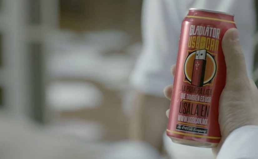
Mexican energy drink Gladiator created a “USB Can” which is not exactly a USB, but it features a packaging innovation that gives users storage when they need it.

Users who want to use the USB Can are directed to a website where they connect with Facebook and scan their can to upload files from their computer. Those uploaded files can then be unlocked on another computer by scanning the same USB Can.

The mechanic: one physical object, reused as authentication

The core move is simple. The can becomes the key. You do not carry a drive. You carry the proof that you own the can, and that proof unlocks your files. It is a packaging-as-authentication mechanic that turns a throwaway object into a repeatable login ritual.

By that, I mean the pack itself functions as the proof needed to unlock the digital benefit.

In FMCG promotions, utility mechanics work best when the physical object is the credential and the digital benefit is immediate.

The real question is whether a disposable pack can earn repeat use by acting like a credential instead of just carrying a logo.

Why it lands

It creates an easy story people can retell. “This can unlocks your files.” The idea also fits the energy drink mindset because it borrows tech culture cues without needing to become a real hardware product. You get the surprise of a “USB” promise, then the reveal that it is a smart access system rather than storage inside the can. Because the can itself becomes the credential, this is smarter than a standard promo-code promotion: it is easier to remember, explain, and reuse.

Extractable takeaway: When you want packaging to be more than a label, give it a repeatable job. Make the pack the key that unlocks a benefit people can use more than once.

What packaging-led utility brands can borrow

  • Make the object the credential. A physical key reduces friction and increases memorability.
  • Keep the ritual quick. Scan, unlock, done. If it takes too long, it stops feeling like a perk.
  • Use a benefit people can demo. “Unlock files on another computer” is easy to explain and easy to show.
  • Let the gimmick resolve into utility. The “USB” hook earns attention. The access mechanic earns credibility.

A few fast answers before you act

What is Gladiator’s “USB Can”?

It is a packaging-led activation where the can is scanned to unlock an online file upload and retrieval flow, so the can behaves like a reusable access key rather than a literal USB drive.

What is the core creative mechanic?

Packaging as authentication. The same physical can is scanned again to unlock access to the files later.

Why does this work better than a normal promo code?

Because the object is the code. It is harder to ignore, easier to remember, and it turns the pack into a functional part of the experience.

What is the transferable principle for other brands?

Give packaging an action people can repeat. If the pack becomes a key, token, or trigger, it can extend the campaign beyond first purchase.

What is the main risk of this kind of execution?

If scanning or login is unreliable, the “magic” collapses. The tech flow has to be faster than the novelty.

Billboard Fan Check Machine

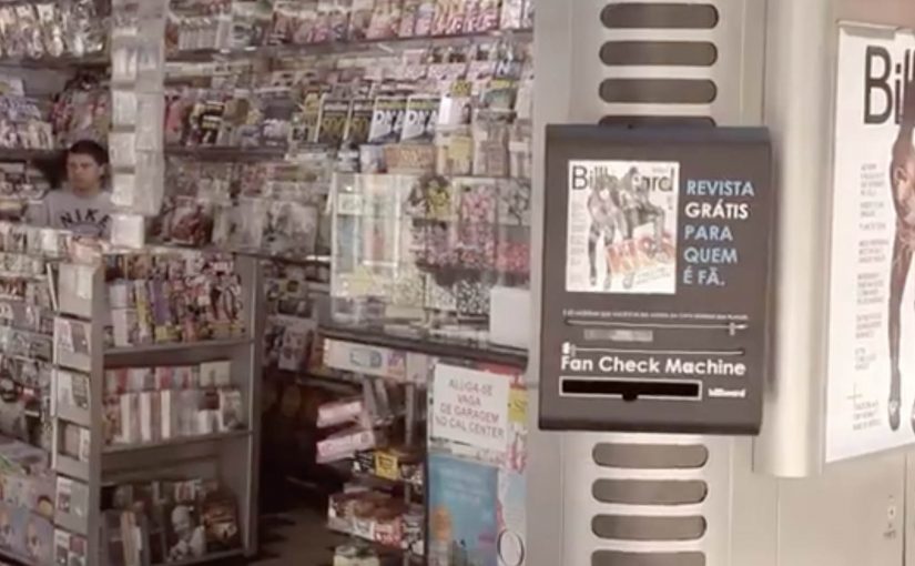
You walk up to a Billboard Magazine dispenser, plug in your iPhone, and let the machine scan your music library. If it finds more than 20 songs by the artist on the cover, it dispenses a free copy of the magazine.

How the Fan Check Machine works

Not every music fan reads Billboard Magazine, but every music fan has music on their phone. Ogilvy & Mather Brazil turns that into a simple proof-of-fandom mechanic. Here, “proof of fandom” means using your existing listening history as the credential. Because the verification happens in the moment, the reward feels earned instead of arbitrary. The real question is how you turn an existing behavior into a self-serve credential people understand instantly.

In retail and live-event environments, this kind of “prove it, then get it” interaction creates participation without staff explaining the rules.

Why this format feels fair to fans

The exchange is transparent. You do not enter a sweepstake or fill a form. You prove you are genuinely into the artist on the cover, and you get rewarded immediately. That immediacy makes the activation memorable, and the “fan verified” moment becomes the story people share.

Extractable takeaway: When access is gated by a behavior people already do, the reward feels fair, and the activation becomes easy to retell.

What this teaches about shopper activations

This is a strong pattern for retail and event environments. Use an existing behaviour as the credential, keep the threshold clear, and make the reward instant. This is a better giveaway pattern than generic sampling when you care about perceived fairness and the story people retell. When the rule is simple and the payoff is immediate, participation scales without staff explaining it over and over.

Steal this pattern for your next giveaway

  • Credential: Use an existing behavior as the proof, not a form-fill or “enter to win.”
  • Threshold: Make the requirement unmissable, with one clear pass or fail rule.
  • Payoff: Deliver the reward instantly, so the moment becomes the story.
  • Friction: Remove staff dependence so participation scales on its own.

A few fast answers before you act

What is the Billboard Fan Check Machine?

It is a magazine dispenser that gives away a free Billboard issue if you can prove you are a fan of the cover artist by plugging in your iPhone and scanning your music library.

What is the “fan” threshold in this activation?

If the machine finds more than 20 songs by the artist on the cover of Billboard Magazine, you get the magazine for free.

Why does “proof of fandom” beat generic giveaways?

Because it targets real fans and makes the reward feel earned. That increases perceived fairness, reduces waste, and creates a stronger story than a random handout.

What should you keep simple if you replicate this pattern?

The rule, the verification step, and the payoff. People should understand the requirement instantly, complete it in seconds, and receive the reward without friction.