World’s Toughest Job: The Fake Interview Reveal

A job listing almost nobody wanted

Do you have what it takes to handle the World’s Toughest Job? Mullen, an advertising agency in Boston, posted a fake “Director of Operations” job for one of their clients online and in newspapers. The paid placement reportedly generated over 2.7 million impressions, but only 24 people applied.

Those applicants were invited to a video conference where the role was explained in blunt terms: more than 135 hours per week, constant mobility, tight coordination, and nonstop communication. There are no breaks, no holidays, and no pay.

The mechanic: recruiting theatre as storytelling

The film uses a familiar structure, a job interview, then pushes the requirements until the audience’s common sense kicks in. Because the “candidate” reactions are captured live on webcam, the escalating demands feel real, not scripted, and the viewer keeps watching to resolve the tension.

At the end, the campaign reveals what this “Director of Operations” role is actually describing, and the entire job spec snaps into focus.

In mass-market brand storytelling, the faux-recruitment format is a fast way to make hidden work visible and comparable.

Why it lands

It borrows credibility from the hiring process. When you hear “job requirements,” you naturally evaluate fairness, compensation, and sustainability. By deliberately breaking those expectations, the spot forces a reassessment of what society normalizes and undervalues, then uses the reveal to turn discomfort into appreciation.

Extractable takeaway: If your message is about undervalued effort, put it into a framework people already use to judge value, then let the contrast do the persuasion instead of a lecture.

What the client is buying

This is not just a feel-good twist. It is a reframing device designed to change how people talk about a role, and to prompt a concrete action immediately after the emotional peak. The “job interview” wrapper also makes it highly shareable because viewers can describe it in one sentence without spoiling the whole experience.

What to steal

  • Start with a believable premise. Familiar formats reduce skepticism and earn attention fast.
  • Escalate with specificity. Numbers, constraints, and tradeoffs make the situation feel tangible.
  • Use real-time reactions as proof. Authentic surprise is a stronger asset than polished dialogue.
  • Time the reveal after tension peaks. The moment of resolution is where people decide to share and act.

A few fast answers before you act

What is the “World’s Toughest Job” campaign format?

A fake job listing leads to webcam interviews where the role is described as extremely demanding with no pay. The film then reveals what the role is actually referring to.

Why does the job interview structure work so well?

Viewers already know how to judge jobs. When the requirements become unreasonable, it triggers an instinctive fairness check, which makes the reveal feel earned.

What is the key mechanic in one line?

Use a credible real-world frame, escalate expectations, capture real reactions, then deliver a reveal that reframes the entire premise.

What makes this shareable beyond the initial audience?

The premise is easy to summarize, the tension holds attention, and the payoff feels emotionally decisive, which motivates sharing.

What should a brand borrow from this without copying it?

Translate an abstract truth into a familiar evaluation framework, then let the audience reach the conclusion themselves.

Amazon Dash. When Commerce Becomes a Button

A tiny button that quietly changes how buying works

When Amazon introduces Dash, it does not look like a revolution. No screens. No interfaces. No checkout flow.

Just a small physical button. One press. Reorder complete.

At first glance, Amazon Dash can feel like a gimmick. But in practice, it signals something more fundamental. A deliberate attempt to remove shopping itself from the act of buying.

What Amazon Dash does

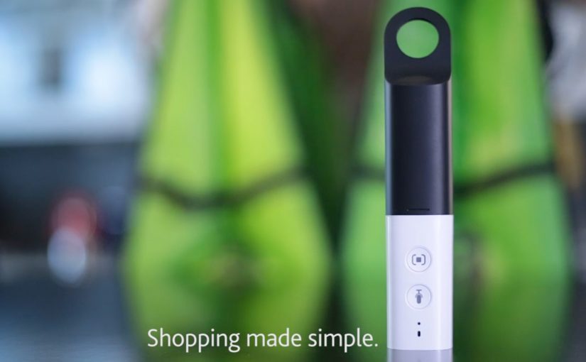
Amazon Dash is a physical, Wi-Fi-connected button linked to a specific household product. Detergent. Coffee. Pet food. Batteries.

You place it where the need happens. On the washing machine. Inside a cupboard. Near the dog food bowl.

When you run out, you press the button. Amazon handles the rest.

No browsing. No comparison. No cart. No second thought.

The real innovation is not the hardware

The button is not the story.

The real shift is intent compression.

Amazon is asking a provocative question. What if reordering does not feel like shopping at all?

Dash collapses multiple steps. Need recognition. Product selection. Payment. Fulfillment. Into a single physical action.

That move reframes commerce from a conscious decision into a habitual reflex.

Why this matters more than voice right now

Before voice assistants become mainstream, Dash pursues the same ambition through hardware.

No interface is the interface.

This is Amazon experimenting with a future where convenience beats choice. Where loyalty replaces discovery. Where the best experience is the one you barely notice.

Seen from that angle, Dash is less about buttons and more about locking demand upstream, before competitors even enter the consideration set.

A signal to brands, not just consumers

For brands, Amazon Dash carries a subtle but powerful message.

If you win the button, you win the household. If you lose it, you disappear from the moment of need.

Traditional branding competes on shelves and screens. Dash shifts the battlefield into kitchens and cupboards. Physical presence becomes digital dominance.

Distribution is no longer only about visibility. It is about defaultness.

Why Dash feels uncomfortable and that is the point

Dash also triggers unease.

Accidental orders. Reduced price transparency. Loss of conscious choice.

Those concerns are real. They highlight what Amazon is testing. How far consumers are willing to trade control for frictionless convenience.

Dash is not only designed to sell buttons. It is designed to teach Amazon something about behavior, habit, and reorder economics.

What Amazon Dash reveals about the direction of commerce

Even if Dash remains a niche device, the logic behind it is bigger than the hardware.

Commerce is moving toward:

  • Fewer decisions
  • Fewer interfaces
  • More automation
  • Stronger platform gravity

Dash is an early manifestation of a broader shift. Buying becomes less visible. Consumption becomes more continuous. Loyalty becomes infrastructural.


A few fast answers before you act

Is Amazon Dash “just a button”?
It is a button plus a new operating model for reordering.

What consumer problem does it solve?
It removes friction at the exact moment a household runs out.

Why should brands pay attention?
It changes the fight from “win the shelf” to “become the default.”

Why this story matters right now

Amazon Dash is best understood as a prototype of a mindset.

A belief that the best customer experience is the one that disappears. A conviction that convenience can become a moat. And a reminder that big shifts often arrive looking insignificant.

Sometimes, the future of shopping is just a button on a wall.

Be More Dog

O2 UK wanted to promote their brand in a new and different way. So they turned to an unlikely source i.e. dogs. With the help of VCCP and the Moving Picture Company they developed a campaign that prompted viewers to embrace their inner dog.

On visiting the campaign website – www.bemoredog.com, people were greeted by a cat that acted more like a dog. Engagement on the website was created with the help of a dual screen HTML5 Frisbee game and a bunch of customizable cat videos. Overall a great example of how TV, Mobile and Social can be seamlessly integrated. 😎