Your Music School: Voice-Navigated Website

Your Music School: Voice-Navigated Website

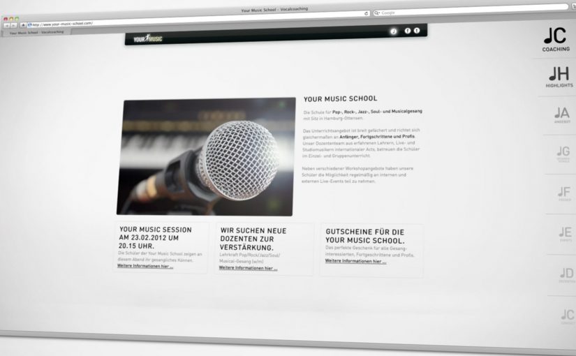
Your Music School is a school for vocal education in Hamburg. To generate more applicants for the school’s vocal coaching courses, ad agency Red Rabbit Hamburg developed a website that can be navigated by using one’s own voice.

The eight menu items on the navigation are arranged on a scale. By singing the appropriate notes, you can directly hit the desired menu item. As a result, the website increased applications to the vocal coaching courses by almost 30%.

When the interface previews the course

This is recruitment as product demonstration. Before you read about vocal coaching, you are already doing a micro-version of it. You listen, you match pitch, you get feedback, and the site responds.

The mechanic: navigation as a singing exercise

The interaction design is a single clear rule. Map menu choices to notes on a scale, then let the user’s voice act as the pointer. It removes the mouse, reduces explanation, and makes the site’s subject matter unavoidable in the best way.

In European education marketing, interactive admissions touchpoints work best when the first interaction proves the promise, and makes the applicant feel capable within seconds.

Why this lands

It turns curiosity into participation. People arrive expecting a standard brochure site, and instead get a playful challenge that feels aligned with the goal of singing better. That alignment makes the brand feel confident, and it lowers the psychological barrier to applying because the visitor has already taken a first “lesson” without committing.

Extractable takeaway: If you sell skill-building, make the first click a tiny skill moment. Let the interface demonstrate the value before the copy explains it.

What it is really optimizing for

The real question is whether the interface proves course fit before the application form appears.

The point is not novelty. The point is qualified intent. Qualified intent means interest from people already comfortable with the core behavior the course demands.

Anyone willing to test their voice to navigate is self-selecting into the right audience, which makes the application uplift more believable than a pure traffic spike.

What to steal from voice-led admissions

  • Turn a site feature into a proof of value. Navigation becomes the product, not a wrapper around it.
  • Use one rule and make it learnable fast. One mapping. Immediate feedback. No instructions-heavy onboarding.
  • Design for confidence. Small early successes are what convert interest into action.
  • Let the interaction pre-qualify. People who enjoy the mechanic are more likely to enjoy the offering.

A few fast answers before you act

What is special about the Your Music School website?

It can be navigated by voice. The main menu sits on a musical scale, and users select items by singing the corresponding notes.

Why does voice navigation make sense for a vocal coaching school?

Because the interface demonstrates the subject immediately. It converts the first visit into a small singing task, which aligns the experience with the promise of the course.

What outcome did the site drive?

The site increased applications to the vocal coaching courses by almost 30%.

Why is this more than a gimmick?

Because the interaction previews the course itself. Visitors are not just exploring the site. They are rehearsing the core behavior the school teaches, which helps qualify interest and reduce hesitation.

When should you use this pattern?

When your product is skill-based and you can translate the skill into a simple, low-friction interaction that builds confidence and qualifies interest.

Volkswagen Facebook Flipbook

Volkswagen Facebook Flipbook

You open a Facebook photo gallery called Amarok FlipDrive, click the first image, and keep the right arrow button pressed. The photos flip fast enough to feel like a running movie. A flipbook, built out of a Facebook album.

The reference point. A “commercial” powered by a Twitter feed

In April, Mercedes Smart in Argentina created the first of its kind Tweet Commercial using its Twitter stream. Here, “Tweet Commercial” means the Twitter feed is the engine behind the spot. Now Volkswagen Amarok in Turkey has created the Facebook alternative.

The idea. An all-terrain truck that can even “drive” on Facebook

The Volkswagen Amarok is positioned as an ultimate all terrain vehicle. It can go everywhere. From the city to sand to water. With some creativity from McCann Erickson Istanbul, it can even go on Facebook.

This is the kind of platform-native execution worth copying because it treats navigation as the media layer, not just a way to browse.

How it works. 201 images in sequence

201 images that follow each other in sequence are uploaded to the Amarok FlipDrive Facebook photo gallery. Opening the first photo and keeping the right arrow button pressed makes the photos flip by fast and gives the effect of a running movie.

In global brand marketing teams looking for attention inside social feeds, this is a reminder that interface behavior can be the format.

Why it lands. Viewer control becomes playback

Because the user can hold one familiar key to control speed, the sequence feels like motion without needing a video player. The real question is whether your idea can be expressed as a repeatable gesture the platform already trains people to do.

Extractable takeaway: If a platform has a predictable navigation gesture, you can sequence stills so the gesture becomes playback and the user becomes the “play button”.

The reality check. Caching changes the experience

The flipbook experience is very jerky the first time, but once all the photos are cached (loaded locally after the first pass), it plays as seen in the video below.

What to borrow from Amarok FlipDrive

  • Turn one navigation action into “play”. Upload frames in strict sequence, then let holding the right arrow key act as the playback control.
  • Design for the first-run experience. Expect jerkiness until images are cached, and make sure the idea still reads even when playback is imperfect.
  • Use native mechanics as the “player”. Streams, galleries, and navigation keys can carry a social commercial without introducing a separate media layer.

A few fast answers before you act

What is the Volkswagen Facebook Flipbook?

It is a Facebook photo gallery that behaves like a flipbook-style animation when you move quickly through sequential images by holding the right arrow key.

How many images does it use?

201 images, uploaded in sequence.

What does the user do to “play” it?

Open the first photo in the album and keep the right arrow key pressed to flip through the sequence fast enough to feel like motion.

Why is the first run jerky?

Because the images are not yet cached. Once the browser has loaded them once, playback becomes smoother.

What is the broader pattern?

Using native platform mechanics, such as streams, galleries, and navigation keys, as the media layer for a social commercial.

Magnum Pleasure Hunt: AR bonbons in Amsterdam

Magnum Pleasure Hunt: AR bonbons in Amsterdam

Earlier on in April Magnum launched the second edition of its hit online game Magnum Pleasure Hunt. To extend the campaign further, a real time mobile augmented reality game takes the hunt to the streets of Amsterdam.

The game is currently ongoing and participants between April 22nd and April 29th can use a special mobile app to hunt down 150 chocolate bonbons hidden across 9 locations in Amsterdam, described in some write-ups as centered around the city’s Nine Streets area. The one who claims the most bonbons wins a free trip to New York, while the rest are rewarded with the new Magnum Infinity ice cream.

Why this is a smart extension of a digital hit

The original online game is built for reach and replay. The Amsterdam version adds scarcity and locality: the same “collect the bonbons” mechanic, but tied to time, place, and physical movement, which makes participation feel more like an event than a link.

In European FMCG launches, location-based AR hunts work best when the rules are obvious in seconds and tiered prizes make “one more try” feel worth it.

The real question is whether your AR layer gives people a reason to move now, not just a new way to look at the same brand world.

What the AR layer adds to the experience

The AR layer keeps the mechanic simple, but changes the context by making the hunt visible in public and limited to specific dates and locations.

Extractable takeaway: When you take a proven digital mechanic into the street, pair it with a short window and clear rewards so participation feels like an event, not an app demo.

  • Instant purpose. You are not browsing a branded world. You are on a hunt with a clear target.
  • Real-world urgency. Limited dates and specific locations make the challenge feel live.
  • Social proof by default. People playing in public become the campaign’s moving media.

A quick comparison to Vodafone Buffer Busters

I find the Magnum mobile game to be a toned down version of the Vodafone Buffer Busters game that ran in Germany last September. Either way, this is the right direction. More brands should treat augmented reality as a medium of engagement, not a gimmick.

What to copy from Magnum’s Amsterdam hunt

  • Make the first action obvious. People should understand the goal and the first tap in seconds.
  • Limit the window. A short time period turns “I’ll try it later” into “I should go now.”
  • Use rewards that scale. A big winner prize plus smaller payoffs keeps both competitive and casual players engaged.

A few fast answers before you act

What is Magnum Pleasure Hunt Across Amsterdam?

It is a time-limited mobile augmented reality game that moves Magnum’s “collect the bonbons” mechanic from the web to real locations in Amsterdam.

How do players participate?

Players use a mobile app while out in the city to find and collect virtual bonbons placed at specific locations during the campaign window.

What makes it different from the online Pleasure Hunt?

The online version is a digital-only chase. The Amsterdam version adds time and place, turning the hunt into a real-world activity with location-based stakes.

Why are prizes so central to this format?

Because the effort is physical. A clear top prize plus smaller “everyone gets something” rewards keep motivation high across both competitive and casual players.

What is the key design lesson for AR brand games?

Keep onboarding friction low. If people cannot understand the goal and the first action immediately, they will not start, especially outdoors.