Airwalk: The Invisible Pop-Up Store

Airwalk: The Invisible Pop-Up Store

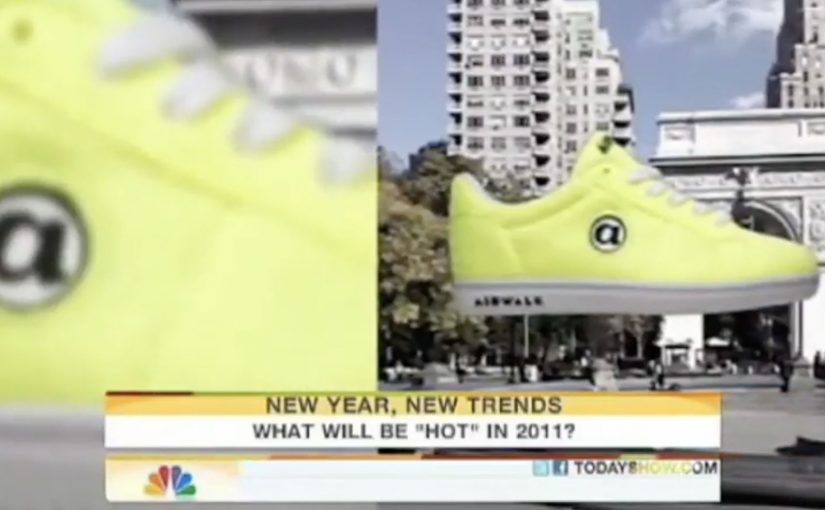
GoldRun and Young & Rubicam have created what is billed as the world’s first invisible pop-up store. Here, “invisible” means the storefront is an AR layer that only appears on a phone at specific GPS coordinates.

Sneakerheads and skaters visit the virtual store at Washington Square Park in NYC and Venice Beach in LA. You show up, look through the phone, and the drop reveals itself.

A pop-up you cannot see until you are there

The mechanism is a location-based AR layer. The product is GPS-linked to specific places, so access is earned by presence, not by refreshing a webshop.

Instead of browsing shelves, people “capture” the virtual sneaker in the app and unlock a purchase path. The retail action is still commerce, but the pre-commerce moment is play.

In youth culture launches where scarcity and scene credibility matter, location-based drops create stronger heat than broad e-commerce blasts.

Why this lands with sneaker culture

This is not just novelty AR. It taps into three instincts that already exist in sneaker communities:

Extractable takeaway: When scarcity is the story, make the constraint experiential (where, when, who) so fans can earn access and retell the effort.

  • Scarcity: limited runs feel meaningful when access is constrained.
  • Proof of effort: being there becomes part of the story and the status.
  • Social retell: the experience is easy to describe and easy to show.

The “invisible store” framing also upgrades the idea from a promo to a cultural moment. It makes the drop feel like an event that happened, not a product that launched.

The business intent under the stunt

Airwalk gets a high-impact relaunch without paying for traditional retail real estate. The brand borrows the authenticity of parks and beaches, then turns those places into distribution.

The real question is whether you can make showing up part of the product value, not just the marketing.

That matters because it makes the product and the environment inseparable. The sneaker is not simply “for” skaters and surfers. It appears where they actually are.

Launch moves from geo-locked pop-ups

  • Make access physical, even if the product is bought digitally.
  • Turn scarcity into a mechanic, not a banner headline.
  • Design a one-sentence retell, for example “the store only exists at two spots.”
  • Pick locations that already signal the brand, so the setting does some of the messaging work.

A few fast answers before you act

What is an “invisible pop-up store” in practical terms?

It is a temporary retail experience that exists only through a phone interface at specific real-world coordinates. No physical store build is required.

What is the core mechanic that drives participation?

Geo-fenced discovery. People must travel to a location to reveal the product, then complete an action in-app to unlock purchase.

Why not just sell the shoes online normally?

Because the launch is the marketing. Turning purchase access into a hunt creates earned attention, social proof, and a stronger sense of drop culture than a standard checkout flow.

What are the biggest risks with this approach?

Friction and disappointment. If the experience is hard to access, unstable on devices, or feels unfair due to distance, enthusiasm flips quickly.

What should a brand measure to know if it worked?

Location visits, completion rate from “found” to purchase, time-to-sell-out, and the volume and quality of organic sharing that shows people proving they were there.

SNS Bank: I Want Interest on My Current Account

SNS Bank: I Want Interest on My Current Account

SNS Bank promotes a simple product shift. Paying interest on a normal current account. Instead of leading with rates and fine print, the work frames it as something worth protesting for.

People “join” the protest using their Facebook or Twitter account. Their profile picture then becomes the campaign’s moving unit, connected into live rich media placements running on Dutch publisher inventory such as msn.nl and telegraaf.nl. Here, the moving unit is the participant’s profile picture reused as the visible building block of the protest crowd.

How the protest mechanic is built

The mechanism is straightforward. Sign up with a social account, capture the profile image, then re-render that image as part of a marching crowd inside dynamic banners. The same identity asset travels from social sign-up, to landing experience, to high-impact display formats, including what is described as a homepage takeover on telegraaf.nl.

In European retail banking, feature-led propositions like “interest on current accounts” often need a memorable way for customers to visibly participate to cut through price parity and low attention.

Why it lands

It takes a boring benefit and gives it a human visual. A rate becomes a crowd. That shift matters because it makes the offer feel socially validated and easy to explain. It also turns ordinary display inventory into a live proof point, because the banners visibly update with real people rather than generic stock photography. This is the right strategic move because the campaign makes participation itself the proof of relevance.

Extractable takeaway: When your proposition is a small financial feature, convert it into a visible social object. One reusable profile image can power sign-up, storytelling, and proof across every paid placement.

What SNS Bank is really trying to achieve

The business intent is to make “interest on a current account” feel like a category change, not a marginal tweak. The protest framing gives SNS Bank permission to be louder than the feature itself, and it creates a participation funnel that can be measured from social sign-up to on-site conversion.

The real question is how to make a marginal banking feature feel like a public movement rather than a line item in a comparison table.

What to steal from this protest-led banking launch

  • Turn the benefit into a visual system. If the offer is intangible, give it a repeating picture that accumulates and grows.
  • Use one identity artifact everywhere. A single profile image can unify sign-up, landing experience, and ad formats into one story.
  • Make paid media feel live. Dynamic creative that visibly changes reads as proof, not just persuasion.
  • Respect permission and platform rules. If you are pulling profile images, ensure consent is explicit and the experience stays compliant.

A few fast answers before you act

What is the core mechanic of this campaign?

People join via Facebook or Twitter, and their profile image is then reused as the creative building block inside a marching protest rendered across rich media banners.

Why use display banners for something that starts in social?

Because banners can function as visible proof at scale. The audience sees real faces moving through the ad units, which makes the proposition feel active rather than purely claimed.

What is the main advantage of the “protest” framing?

It makes a dry feature feel like a cause. That reframing increases memorability and gives people a simple story to repeat.

What is the biggest risk in copying this approach?

Using social identity assets without clear consent creates trust and compliance issues. If the sign-up step is not explicit, the same mechanic can backfire fast.

When does this kind of mechanic work best?

It works best when the product feature is real but visually weak. The participation layer gives the feature a public shape without changing the underlying offer.

Lynx Sexy Rugby Rules: Rugby 101

Lynx Sexy Rugby Rules: Rugby 101

The Rugby World Cup is currently underway in New Zealand, and there is no better time than now for Lynx to do what they do best in their advertising: push sex appeal front and center. Reportedly passing 600,000 views in its first week, it suggests plenty of people are “learning” the rules of rugby.

Mechanically, it is Rugby 101 delivered as a faux-serious, straight-faced rules explainer, with the on-field demonstrations staged for maximum attention rather than maximum clarity. Because the familiar explainer wrapper is instantly legible, viewers click quickly, and the cheeky demonstrations give them a reason to forward it.

In mass-reach men’s grooming marketing, this kind of “rules explained” format is a reliable way to ride a cultural moment and turn it into shareable entertainment.

The real question is whether you can borrow a “helpful explainer” wrapper without damaging trust when the content is really designed for provocation.

This works for Lynx because provocation is already part of its brand contract, but it is a poor fit for brands that need to be taken literally.

Why this is timed to the tournament

When a big tournament is on, casual viewers suddenly need a quick refresher. Lynx hijacks that natural demand with a piece of content that looks like a helpful explainer, but behaves like a viral film.

Why it spreads even if you already know rugby

The viewing motivation is not really education. It is surprise, cheek, and the simple social impulse to forward something that feels slightly taboo, especially when it is framed as “sport content” during a major sports moment.

Extractable takeaway: If you can wrap a bold brand move inside a familiar utility format, you lower the friction to watch, and you increase the odds that people share it as “useful” instead of “an ad.”

What Lynx is actually reinforcing

This is classic Lynx branding: confidence, flirtation, and provocation, packaged into a format that is easy to justify watching because it is “about rugby rules.” The product is not the story. The personality is the product.

What to borrow from the “rules refresher” wrapper

  • Attach to a live moment. The closer you are to the cultural peak, the less explanation you need.
  • Use a familiar wrapper. A “rules refresher” is instantly understood, so the audience knows what they are getting.
  • Design for forwarding. If the content is made to be shown to a friend, distribution becomes part of the creative.
  • Keep the premise simple. One joke, one format, one payoff. No extra plot required.

A few fast answers before you act

What is Lynx “Sexy Rugby Rules”?

It is a Rugby 101 style explainer video released during the Rugby World Cup that uses provocative on-field demonstrations to turn a rules refresher into viral entertainment.

Why launch something like this during the Rugby World Cup?

Because more people are searching for quick rules explanations during a tournament, so the format earns attention without needing heavy media spend to explain itself.

Is this meant to genuinely teach rugby?

Not primarily. The “rules” wrapper gives it a reason to exist, but the real goal is shareable entertainment that fits the Lynx brand tone.

What makes this kind of content travel?

Simple premise, instantly recognizable format, and a payoff that people feel compelled to forward as a joke or talking point.

What is the key lesson for campaign timing?

If you can piggyback on a live cultural event, you can spend less time building context and more time maximizing the share moment.