Hemoba and Vitória FC: My Blood Is Red and Black

Hemoba and Vitória FC: My Blood Is Red and Black

The state of Bahia was experiencing a shortage of blood. To raise awareness of this problem and increase the blood reserves, Hemoba Foundation (Blood Foundation) in Brazil partnered with Bahia football club Esporte Clube Vitória to run a unique blood donation drive.

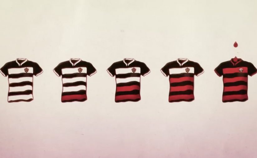
For the campaign, the football club changed the stripes of their iconic jersey from red to white. Then over the course of the season as the blood reserves rose, the team slowly changed the white stripes back to the original red.

As a result, the promotion is reported to have helped raise blood donation by 46%.

A club kit that doubles as a public scoreboard

This is a blood drive that refuses to stay in the background. Instead of asking people to donate “because it is important”, it turns the most visible symbol of the club into a live indicator of how the state is doing. This is a stronger behavior-change design than a standard awareness appeal, because the public scoreboard sits inside club identity.

How the stripe mechanic works

The mechanism is one clean promise. Remove the red from Vitória’s shirt, then bring it back only as blood reserves recover. Every step of progress becomes legible in the one place fans naturally look, the team’s colors.

In sports-led community campaigns, changing a core identity asset works because it creates a shared metric that everyone can track without explanation.

Why this lands beyond typical charity messaging

Most donation drives rely on abstract need. This one makes need visible and slightly uncomfortable, because fans are confronted with “missing red” every match week until they act. It also flips motivation from guilt to pride, because the act of donating becomes a way to restore the club’s full identity.

Extractable takeaway: If you need sustained participation, attach the cause to a symbol your audience already protects. Then turn progress into a public, binary signal that updates over time.

What the partnership is really doing

The campaign aligns incentives. The real question is how to turn a one-time act of goodwill into a shared public ritual that people keep joining. Hemoba gets reach and urgency without buying attention in the usual media sense. The club earns meaning and publicity by making its platform materially costly, because it “gives up” part of its kit until the community responds.

What to steal for your next behavior-change campaign

  • Make the metric visible. People act more when they can see progress, not just hear appeals.
  • Use a symbol with real emotional ownership. Identity assets beat posters, because people notice when they change.
  • Turn donation into restoration. “Bring something back” is often more motivating than “add something new”.
  • Design for weeks, not a day. A season-long mechanic sustains attention and creates multiple decision moments.

A few fast answers before you act

What is “My Blood Is Red and Black”?

It is a blood donation campaign in Bahia, Brazil, where Hemoba partnered with Esporte Clube Vitória and used the team jersey’s red stripes as a visible indicator tied to blood reserves.

How did changing the jersey drive donations?

By removing the red stripes and gradually restoring them as reserves improved, the campaign turned blood supply into a public signal that fans could track across the season.

Why does sports identity work for public health?

Because club colors, rituals, and match-week attention are already shared and emotionally charged. The campaign borrows that energy and redirects it into a concrete action.

Why is this stronger than a standard awareness appeal?

Because it does not ask people to care in the abstract. It makes the shortage visible through a symbol fans already watch, defend, and want restored.

What is the transferable principle here?

Make progress tangible. Link participation to restoring a valued symbol, and keep the feedback loop running long enough for people to join when they are ready.

Video Campaigns: When the Player Is Message

Video Campaigns: When the Player Is Message

Two videos that did not just play, they proved the point

Video innovation rarely comes from “better footage”. It comes from changing how the viewer experiences the message. These two campaigns are clean examples of that approach.

In the last week or so I came across two campaigns that used video to innovatively deliver their message.

Volkswagen Hidden Frame – using the YouTube play bar as the story

The Volkswagen Side Assist feature helps drivers avoid accidents by showing other vehicles when they are in the side mirror’s blind spot.

To drive home the message, AlmapBBDO developed a film that used YouTube’s play bar to show the difference the VW Side Assist made in people’s lives.

No Means No – a player that interrupts denial

Amnesty Norway, in an attempt to change the Norwegian law on sexual assault and rape, developed a film that used a custom video player to pop up the key message.

The campaign was a success and the law was about to change as a direct consequence of the campaign.

Why interface-led video lands harder

Both ideas shift the viewer from passive watching to active noticing. By “interface-led” I mean the player UI, like the progress bar, overlays, or controls, doing storytelling work, not just housing the film.

Extractable takeaway: If the interface carries part of the argument, the viewer is forced to notice the point during playback, which reduces message loss.

The real question is whether your player can carry the argument when attention collapses.

Volkswagen used a familiar interface to make a safety benefit visible in the moment. Amnesty used an interface interruption to force the key message to be seen, not skipped. In both cases, the “player” stopped being furniture and became the persuasion device.

In global consumer brands and publisher-style marketing teams, interface constraints often determine what gets noticed and what gets ignored.

What these campaigns were really trying to achieve

The business intent was not “engagement” as a vanity metric. It was message delivery with minimal loss.

Volkswagen aimed to make an invisible feature feel tangible and memorable. Amnesty aimed to change perception and behavior at the cultural level, and the player design reinforced that urgency by refusing to be background noise.

Player-hacking patterns to copy

Here, “player-hacking” means designing the video controls and UI as part of the message, not just the wrapper.

  • Use the interface as evidence. When the message is hard to show, let the UI demonstrate it.
  • Design for the skip reflex. If your message is often ignored, build an experience that makes ignoring harder.
  • Keep viewer control intentional. Interactivity works when it serves comprehension, not novelty.
  • Make the “point” happen inside the viewing moment. Do not rely on a voiceover claim when the experience can prove it.

A few fast answers before you act

What is an “interface-led” video campaign?

An interface-led video campaign is one where the player experience, like the progress bar, overlays, or controls, is part of the storytelling, not just the container.

How did Volkswagen Hidden Frame use YouTube differently?

It used YouTube’s play bar as a narrative device to demonstrate the value of Side Assist, making the benefit feel visible rather than described.

What did Amnesty Norway’s No Means No change about the player?

It used a custom video player that surfaced the key message via a popup, ensuring the point was encountered during playback.

Why do these ideas work better than a standard film in some cases?

Because they reduce message loss. The viewer is guided to notice the point through the viewing mechanics, not just the content.

What is the practical takeaway for brands?

If your message is often missed, redesign the viewing experience so the message is structurally harder to ignore and easier to understand.

Antarctica: The Beer Turnstile

Antarctica: The Beer Turnstile

Carnival in Rio de Janeiro drives alcohol consumption up, and it also drives traffic risk up with it. Traditional safety warnings are easy to ignore in the middle of a street party.

Antarctica, as an official sponsor of Carnival, decides to make the safer choice feel easier than the risky one. With AlmapBBDO, they install a “beer turnstile” at a subway station where carnival groups gather. Scan an empty Antarctica can at the gate and the turnstile opens, giving you a free ride home.

Turning an empty can into a ticket

The mechanism is a direct behavior swap. Instead of telling people not to drink and drive, the brand turns public transport into the reward for doing the right thing. The “payment” is an empty can, scanned like a transit card, then collected at the turnstile.

In big-city event environments, the most effective safety interventions reduce friction at the exact moment decisions get made, and they do it with an incentive people can use immediately.

Why it lands

This works because it replaces moralizing with utility. The act is simple, public, and repeatable, and it reframes the end of the night as a next step you can take without planning. The real question is how to make the safer ride home easier than the risky one when people are already in motion. It also keeps the brand inside the solution rather than just beside the problem, which makes the sponsorship feel like action, not signage.

Extractable takeaway: If you want behavior change at scale, stop asking for restraint. Build a one-step alternative that fits the moment, then reward the safer behavior with access people already want.

What the beer turnstile gets right

  • Reward the right behavior at the decision point. Do not place the incentive after the moment has passed.
  • Use a token people already hold. An empty can is a frictionless “ticket” during Carnival.
  • Make it visible. A physical gate turns participation into social proof.
  • Keep the story one sentence long. “Scan a can. Ride free.” travels fast.

A few fast answers before you act

What is the Beer Turnstile?

A subway gate that accepts an empty Antarctica beer can as the “fare”, unlocking free travel during Carnival to reduce drunk driving.

Why is this more effective than a standard “don’t drink and drive” message?

Because it changes the default action. It makes the safe option simpler, faster, and immediately rewarding in the same moment people need to get home.

How does the can scanning work in practice?

The can’s code is scanned at the turnstile like a transit credential, then the can is collected as part of the exchange.

What results were reported for the activation?

Campaign write-ups reported usage of around 1,000 people per hour at the special gate, cited as 86% higher than conventional turnstiles that day, and a reported drop in drunk drivers caught of 43%.

When should brands use “brand utility” mechanics like this?

When a safety or public-good goal depends on real-time choices, and the brand can provide an immediate alternative action rather than just awareness.