AXA: iPhone App for Car Accidents

AXA is Belgium’s first insurance company to launch an iPhone app. Their free application helps and guides you through some basic steps when you have a car accident.

To launch this new app Duval Guillaume Antwerp / Modem from Belgium created an innovative print ad that required your iPhone to complete the message.

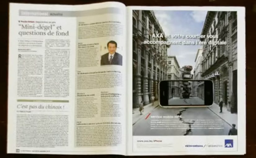
Why the print idea is a smart match

The product promise is practical. Help me when I am stressed and do not know what to do next. The launch mirrors that by making the iPhone essential to “finishing” the ad, so the viewer experiences the role of the phone immediately.

  • Device as the missing piece. The iPhone is not just where the app lives. It is how the message becomes complete.
  • Low barrier to understanding. You do one simple action and the concept clicks.
  • Print-to-mobile bridge. The campaign uses print to trigger a mobile behavior, instead of treating print as a dead end.

What to reuse from this approach

If the utility of your app is “guidance in a critical moment”, your launch should demonstrate guidance, not describe it. A small, tangible interaction can do that faster than any list of features.


A few fast answers before you act

What does the AXA Belgium iPhone app do?

It helps guide drivers through basic steps after a car accident, providing practical assistance when they need it most.

What made the print launch ad innovative?

The print execution required the viewer’s iPhone to complete the message, turning the phone into an active part of the ad rather than a separate channel.

Why is this a strong launch mechanic for an insurance app?

It demonstrates the phone’s role as a helper in-the-moment, which aligns directly with the app’s accident-assistance promise.

What is the transferable pattern?

Design a simple physical or media trigger that forces a first interaction with the device. Then let that interaction explain the product in seconds.

McDonald’s: Sleeping Baby

Exhausted new fathers count on McDonald’s and they will appreciate this nicely crafted McDonald’s spot by TBWA\Chiat\Day.

Why this spot lands

The premise is instantly recognizable, and the execution stays disciplined. It leans on a real-life tension. Keep the baby asleep. Get what you need. Do not make a sound. That restraint is exactly what makes the humor feel earned instead of forced.

  • Relatable truth first. The situation does the storytelling heavy lifting.
  • Craft over noise. The pacing and detail make the moment feel real.
  • Brand as helpful, not loud. McDonald’s shows up as the dependable solution in a small life moment.

What to take from it

If you can anchor the story in a lived-in human moment, you do not need to over-explain the product role. The viewer connects the dots, and the brand benefit feels natural rather than “sold”.


A few fast answers before you act

What is the “McDonald’s: Sleeping Baby” spot?

It is a McDonald’s commercial by TBWA\Chiat\Day built around the relatable reality of exhausted new fathers and the tension of not waking a sleeping baby.

Why is it effective advertising?

It starts from a universal situation and keeps the execution restrained, so the humor feels authentic and the brand role feels earned.

What is the transferable lesson?

Find one human truth your audience instantly recognizes, then let craft and timing deliver the payoff instead of relying on heavy messaging.

How does the brand show up without being intrusive?

By acting as the reliable enabler of a small win in the viewer’s day, rather than forcing a big claim or a loud punchline.

Yamaha: Coast

A TV spot built around one clean optical trick

A neat optical illusion by Clemenger BBDO Adelaide for the TV ad.

How it works: perception as the hook

The mechanism is simple. The viewer’s brain tries to resolve what it is seeing, then the illusion “clicks” and the ad earns a second look. That moment of resolution does the heavy lifting. It buys attention without shouting for it.

In mass-reach brand communication, perceptual puzzles can act as a fast attention magnet because they create a micro-challenge the viewer wants to complete.

Why it lands: the viewer completes the experience

Optical illusions work because they recruit the viewer’s pattern recognition. You are not just watching. You are solving. That tiny sense of participation creates a stronger memory trace than a standard montage of claims.

The business intent: make the brand feel smart and premium

Using a clean visual device signals confidence. It suggests craft, control, and intelligence. The brand benefits from the association: if the ad is clever and precise, the product inherits some of that perceived quality.

What to steal for your next “simple but sticky” creative idea

  • Use one primary device. A single clear trick beats three competing ideas.
  • Design for the “click” moment. Structure the reveal so the viewer feels the resolution, not just sees it.
  • Keep the frame uncluttered. Illusions need visual discipline to land quickly.
  • Let craft do the persuasion. A well-executed device can communicate confidence better than copy.

A few fast answers before you act

What is the core creative idea in “Yamaha: Coast”?

A TV spot built around a single optical illusion that creates an “aha” moment and earns a second look through perceptual surprise.

What is the core mechanism?

A perceptual puzzle. The viewer’s brain tries to resolve what it is seeing, and the moment the illusion “clicks” becomes the engagement engine.

Why do optical illusions increase attention?

They create a micro-challenge the viewer wants to complete. That small participation moment makes the experience more memorable than a standard claim-led montage.

What is the business intent of using a clean visual trick?

To signal craft and confidence, and transfer a sense of intelligence and premium precision from the ad to the brand.

What is the most transferable takeaway?

Use one primary device, design for a clear “click” moment, and keep the frame disciplined so the effect lands instantly.