Honda Jazz Interactive TV Ad

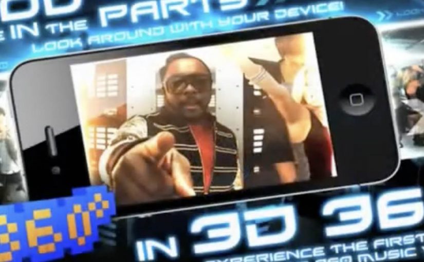
You watch the Honda Jazz “This Unpredictable Life” TV spot. At the same time, you open a companion iPhone app and literally “grab” what is happening in the ad. A character jumps onto your phone in the exact moment it appears on TV. Then you take that character with you and keep playing after the commercial ends.

Wieden + Kennedy London is behind this interactive TV campaign for the new Honda Jazz. The idea is simple and sharp. Use the iPhone as a second screen that syncs to the broadcast and turns a passive spot into a real-time experience. Here, “second screen” means the phone becomes the companion interface while TV stays the primary video canvas.

What the iPhone app does while the ad plays

The mechanic is “screen hopping.” The iPhone app recognises the sound from the TV ad and matches it to predefined audio fingerprints. That timing tells the app exactly which character or moment is live in the commercial, so it can surface the right interactive content on your phone in real time. Because the sync is driven by the ad’s audio, the handoff can happen on the exact beat the viewer sees on TV, which is what makes the interaction feel seamless.

In European consumer-brand marketing teams, this pattern matters most when broadcast reach and mobile engagement are owned and designed as one experience.

The real question is whether your second-screen sync can stay instant and obvious enough to feel like part of the spot, not a separate product.

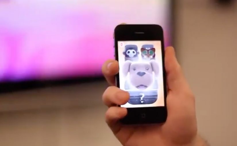
What happens after you “grab” a character

Once a character lands on your iPhone, you interact with it away from the TV. You can trigger behaviours and mini-interactions, including singing into the phone to make characters react and dance. The TV spot becomes the gateway. The mobile experience becomes the engagement layer you keep.

Why this matters for interactive advertising

This is a clear step toward campaigns that treat broadcast as the launchpad and mobile as the control surface. When the second screen is tightly synchronised, you can design moments that feel native to the content people are already watching, rather than forcing a separate “go online later” call-to-action. This is worth doing when the sync is instant and the post-spot interaction is fun enough to continue without the TV.

Extractable takeaway: If you want broadcast to create action, design the mobile handoff so it happens on the same beat the viewer sees on TV, then give the phone a simple loop that keeps going after the spot ends.

This is also not the first time an iPhone engagement model starts to bridge media and action. A related example uses a similar iPhone-led interaction pattern for coupons and augmented reality: location based augmented reality coupons.

Design cues to reuse from this campaign

  • Anchor everything on a single trigger. Let the TV spot be the trigger, and let the phone pick up the same moment without delay.
  • Make the interaction obvious in one move. “Grab a character” is a clean mental model that needs almost no instructions.
  • Carry the payoff beyond the broadcast window. Treat the spot as the gateway and the phone as the layer that continues after the ad ends.
  • Keep the experience playful, not feature-heavy. Simple behaviours and reactions beat complex menus when timing is the point.

A few fast answers before you act

What is “screen hopping” in advertising?

Screen hopping is when content “jumps” from one screen to another during a live experience. Here, the TV spot triggers synchronized content on an iPhone so viewers can capture and interact with elements of the ad.

How does the Honda Jazz app sync to the TV commercial?

The app uses audio recognition. It matches the ad’s sound to predefined audio patterns so it knows what is playing at any moment and can show the right character or interaction on the phone.

What is the value of a second-screen experience like this?

It extends a short broadcast moment into a longer engagement loop. The ad becomes a gateway. The phone becomes the interactive layer that continues before, during, and after the spot.

What should a brand get right to make this work?

Timing and simplicity. The sync must feel instant, the interaction must be obvious, and the “reward” for participating must be fun enough to carry beyond the TV moment.

Black Eyed Peas: BEP360 AR music video

The smartest artists in 2011 are starting to behave like brands. Not only by releasing content, but by building experiences around it that fans can actually play with.

BEP360 is a strong example of that thinking. It packages a 360-degree, motion-controlled music video experience around The Black Eyed Peas, designed for iPhone, iPad, and iPod touch.

The core mechanic is simple. You move your device, and the camera view moves with you, giving you viewer control inside the scene. Viewer control here means you choose the camera angle in real time by moving the device. On top of that, BEP360 includes an augmented reality layer triggered by pointing the iPhone camera at the album cover for The Beginning, plus a virtual photo session feature that lets fans stage shots with the band and share them.

In global entertainment marketing, app-based experiences are becoming a practical way to deepen fandom between releases and justify paid content with participation.

The real question is whether you are building a replayable interaction fans control, or just dressing up a single-view clip with novelty features.

It is also an early signal of where “music video” can go when it is treated as a product experience rather than a clip you watch once. The app is billed as a first-of-its-kind 360-degree mobile music video, built under will.i.am’s will.i.apps banner, with augmented reality support via Metaio and 3D360 video technology referenced in early coverage.

Why this is more than a promo gimmick

The best part is the shift from passive viewing to participation. A 360-degree experience creates a reason to replay, because you cannot see everything at once. That replay value is what standard video launches rarely earn.

Extractable takeaway: If the experience gives people control over what they see, replay becomes the point, and that repeat engagement is what turns a launch into something that feels like a product.

What the AR layer adds, and what it does not

The AR trigger is not the main event. It is a novelty layer that extends the universe into the physical world, using the album cover as the marker. The real value is the combination of interactive video plus social output. Fans can create something and share it, which keeps the campaign alive without requiring more media spend.

Fan-first interactive video playbook

  • Give people viewer control. Control creates replay value.
  • Bundle features around one hero action. Here the hero action is “step inside the video”. Everything else supports that.
  • Use AR as an on-ramp, not the whole product. A quick wow moment is fine, but the experience must hold attention afterwards.
  • Design for sharing outputs. Photo sessions and remixable moments extend reach organically.

A few fast answers before you act

What is BEP360?

BEP360 is a Black Eyed Peas iOS app that turns a music video into an interactive 360-degree experience controlled by moving your device, with an added augmented reality layer triggered by the album cover.

What makes the music video “360-degree” in this case?

The camera perspective changes as you rotate or swing the phone, giving you control over where you look inside the scene while the track continues.

How does the augmented reality part work?

You point your iPhone camera at the The Beginning album cover, and the app overlays animated BEP characters and related content on screen.

Why does an app make sense for music marketing?

Because it can bundle interaction, social sharing, and ongoing fan content into one place. It gives people a reason to pay for the experience, not only consume a free clip.

What is the main risk with app-based fan experiences?

Friction. If downloads, device compatibility, or onboarding are annoying, the idea collapses. The experience has to deliver value within seconds.

Yellow Pages: Location Based Banner

Here is the next generation of interactive web banners. Tel Aviv agency Shalmor Avnon Amichay/Y&R promoted the Yellow Pages augmented reality location-based app by creating a banner that does the same thing. Here “location-based” means it surfaces nearby businesses based on where you are.

The banner opens your webcam and lets you see the businesses around you. Wave your hand to switch between businesses. Click a business to jump straight to its Yellow Pages listing.

A banner that behaves like the product

The clever part is that this is not “interactive” for decoration. It is a working demo of the core value proposition. If the app helps you find what is near you, the banner proves that promise immediately, inside the placement, without asking you to imagine anything. Utility products should be advertised by demonstrating usefulness, not by describing features.

The mechanic: webcam as context, hand wave as UI

The flow is intentionally simple. Turn on the camera. Overlay nearby business options. Use a wave to move through results. Use a click to convert curiosity into action via the listing page.

In local discovery experiences, the strongest persuasion is a live, context-matched preview of usefulness rather than a feature claim.

Why it lands: it removes the “so what” gap

Most directory and local-search advertising dies in the space between promise and proof. The real question is whether your ad can turn a promise into proof without leaving the page. This banner collapses that gap, because it starts with your own context, then shows results, then lets you act. The interaction is the explanation.

Extractable takeaway: The fastest way to make a utility app feel essential is to let people experience the “aha” moment before they ever leave the page they are on.

What Yellow Pages is really trying to achieve

The business intent is to reposition Yellow Pages as modern, digital, and situationally useful, not just a legacy directory brand. The banner also creates a clear performance path. Engagement inside the unit, then click-out to a listing that can drive calls, visits, or follow-on app consideration.

Steal the demo-first local discovery pattern

  • Mirror the product in the ad. If the product is a tool, make the ad behave like the tool.
  • Use one gesture people understand. A wave as “next” is instantly legible. No tutorial needed.
  • Keep the ladder of commitment short. Preview. Browse. Click through. No extra steps.
  • Make the experience readable for bystanders. Obvious motion plus clear on-screen change sells the mechanic in shared environments.
  • Watch privacy optics. If you turn on a camera, be explicit that it is for interaction and context, not identification.

A few fast answers before you act

What is a “location based banner”?

It is a banner ad that adapts its content to the user’s situation, typically location or environment cues, so the ad can show relevant nearby options instead of generic messaging.

How does this Yellow Pages banner work?

It opens a webcam view, overlays nearby business options, lets you wave to cycle through businesses, and lets you click a result to open the corresponding Yellow Pages listing.

Why use a webcam at all?

Because it makes the experience feel immediate and personal. The ad becomes a live “finder” interface rather than a static claim about finding things.

What makes gesture-controlled banners risky?

Friction and variability. If the gesture detection fails or is unclear, users assume the ad is broken. The interaction must be forgiving and the feedback must be instant.

What is the safest way to replicate the idea today?

Keep the mechanic to one simple input, provide clear on-screen feedback, and ensure the user can still get value even if they do not enable the camera.