AXA: Crazy Driver

A market-day shock that makes the point instantly

The fastest way to explain risk is to make people feel the cost of it. AXA’s stunt is a clean example of that principle.

To raise people’s awareness and make them realize that nobody wants to pay for bad drivers, AXA decided to play a trick on people with the help of a little old lady.

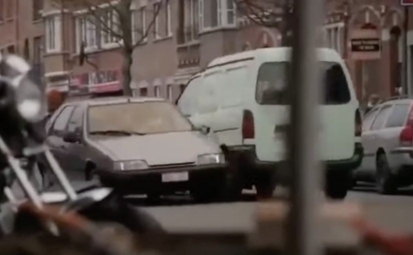
On an ordinary market day in a small, tranquil French town, an old lady was seen getting out of her parking space. In the process she knocked almost everything in her way before crashing into a line of market stalls. With the reveal being that it was staged to make the point.

How the “bad driver” setup delivers the message

The mechanism is staged reality in a real environment. By staged reality, AXA controls the trigger and the reveal, while the setting and bystander reactions stay real.

AXA uses a familiar public setting and a believable trigger. A driver leaving a parking space. Then it escalates into visible damage that bystanders can immediately judge as “this is what we do not want on the road.” The trick creates attention first, then makes space for the reveal and the point. Because the incident unfolds in public, the fairness judgment forms before anyone asks for an explanation.

In European insurance categories, public-safety messages land faster when consequences are visible and socially agreed, not only described.

Why it lands in the moment

It works because it activates two instincts at once. Concern and fairness. Nobody wants to see people hurt or property damaged, and once people witness reckless behavior, the idea of everyone else paying for it feels wrong.

Extractable takeaway: If you can make the cost of a behavior feel public and unfair in under ten seconds, you do not need to over-explain the risk.

The business intent behind the stunt

The intent is to turn an abstract insurance argument into a shared social judgment.

The real question is whether your message can become a shared verdict before people have time to tune out.

Bad driving creates costs. The campaign pushes viewers and bystanders toward the same conclusion. Pricing and consequences should reflect behavior. By making that conclusion feel obvious, AXA strengthens its positioning around responsibility and risk.

Steal this structure for risk awareness activations

  • Start with a situation everyone understands. A simple parking maneuver needs no context.
  • Make the consequence visible. People react to outcomes they can see, not statistics they cannot.
  • Use escalation to earn attention. Build from normal to shocking so the message arrives when focus is highest.
  • Let the audience reach the conclusion. The most persuasive line is the one people say to themselves first.

A few fast answers before you act

What was AXA’s “Crazy Driver” trying to change?

It aims to reduce risky driving by confronting people with an exaggerated version of everyday bad driving, making “normal” shortcuts feel unacceptable in the moment.

What is the core mechanic?

Stage a believable incident in a real public setting, then escalate visible consequences fast so bystanders form an immediate social judgment before the reveal.

What is the emotional sequence the stunt triggers?

Concern first, then fairness. Once people witness reckless behavior, the idea that everyone else pays for it starts to feel wrong, which makes the message stick.

What business intent does this serve for an insurer?

It turns an insurance argument into a shared conclusion. Risky behavior creates costs, and consequences should reflect behavior. The stunt makes that conclusion feel obvious.

What should brands steal from this approach?

Make the behavior the content. Start with a situation everyone understands, show consequences people can see, and let the audience reach the conclusion themselves.

What is the key risk with prank-style public activations?

If it feels unsafe, humiliating, or too punitive, attention can flip into distrust. The line is whether the reveal resolves tension quickly and respectfully.

AXA: Mobile Service Home i-Mercial

In 2010, AXA was the first insurance company in the market to launch an iPhone application for car insurance. In 2011, AXA took this one step further and developed an iPhone application for fire insurance.

“Mobile Service Home” is described as a first for the Belgian insurance market, so the product was launched with a method designed to feel just as inventive. AXA and ad agency Duval Guillaume Antwerp. Modem developed what they called an i-Mercial, a television spot for viewers to step into.

How the i-Mercial works

The mechanism is a second-screen bridge: the TV spot includes an on-screen code, and the viewer uses an iPhone to scan it. That scan unlocks an extended layer of the story on the phone, so you move from watching the house on TV to exploring what happened inside it on your own screen. Because the scan happens while the spot is still running, the viewer stays in the narrative and experiences the service logic instead of just hearing about it.

In European insurance markets, this kind of second-screen interactivity turns a passive TV spot into a hands-on service demonstration.

The real question is whether the second-screen bridge proves the service promise in the moment, not whether the format feels novel.

Why it lands

It makes “mobile service” tangible. If the promise is speed and guidance in stressful moments, an interactive format is a better proof than a claim.

Extractable takeaway: Interactive advertising works when the phone is used as a second screen to continue the story and demonstrate the service. The TV spot creates the prompt. The mobile interaction delivers the proof.

  • It gives the viewer control. The audience is not asked to remember a URL later. The action happens in the moment, and the phone becomes the interface for continuing the narrative.
  • It turns a CTA into an experience. Scanning is not a bolt-on gimmick. It is the creative idea, because it lets the viewer literally step into the ad.

Second-screen launch moves

  • Design the interaction to be immediate. If the action cannot happen in seconds, most viewers will drop.
  • Make the “next layer” worth it. The mobile extension should add narrative, clarity, or utility, not just extra footage.
  • Ensure the format matches the product. A mobile service is best launched through a mobile-driven interaction.

A few fast answers before you act

What is an “i-Mercial” in this case?

A TV commercial designed to continue on an iPhone, so the viewer can interact with the ad rather than only watch it.

How does the viewer “step into” the TV spot?

By scanning an on-screen code with an iPhone during the broadcast, which unlocks an extended experience on the phone.

Why is this a smart launch method for an insurance app?

Because it demonstrates mobile-guided service behavior immediately, instead of asking viewers to imagine how the app helps.

What is the main risk with this format?

Link rot. If the scan destination or app flow is no longer maintained, the core mechanic breaks and the campaign loses its point.

What is the most transferable lesson?

When you want people to believe a mobile service, make the first brand interaction mobile, interactive, and simple enough to complete in the moment.

AXA: iPhone App for Car Accidents

AXA is Belgium’s first insurance company to launch an iPhone app. Their free application helps and guides you through some basic steps when you have a car accident.

To launch this new app Duval Guillaume Antwerp / Modem from Belgium created an innovative print ad that required your iPhone to complete the message.

Why the print idea is a smart match

The product promise is practical. Help me when I am stressed and do not know what to do next. The launch mirrors that by making the iPhone essential to “finishing” the ad, so the viewer experiences the role of the phone immediately. Because the viewer has to use their own device to complete the message, the concept is remembered as help in the moment, not a feature claim. In European insurance marketing, the first interaction needs to make crisis guidance feel tangible.

Extractable takeaway: If your product is built for high-stress moments, design the launch so people experience the first step, not a promise about steps.

  • Device as the missing piece. The iPhone is not just where the app lives. It is how the message becomes complete.
  • Low barrier to understanding. You do one simple action and the concept clicks.
  • Print-to-mobile bridge. The campaign uses print to trigger a mobile behavior, instead of treating print as a dead end.

What to reuse from this approach

The real question is whether your launch makes someone feel guided before they have to believe you.

If the utility of your app is “guidance in a critical moment”, your launch should demonstrate guidance, not describe it. By “guidance”, I mean a few clear, step-by-step prompts that reduce decision load when people are stressed. A small, tangible interaction can do that faster than any list of features.

  • Start with one action. Give people a single, low-friction step that mirrors the moment your app is built for.
  • Make the device essential. Let the phone complete the story so the product role is experienced, not inferred.
  • Bridge media into behavior. Use the channel to trigger the next step, not just to carry copy.

A few fast answers before you act

What does the AXA Belgium iPhone app do?

It helps guide drivers through basic steps after a car accident, providing practical assistance when they need it most.

Who created the print launch ad?

Duval Guillaume Antwerp / Modem (Belgium) created the print execution to launch the app.

What made the print launch ad innovative?

The print execution required the viewer’s iPhone to complete the message, turning the phone into an active part of the ad rather than a separate channel.

Why is this a strong launch mechanic for an insurance app?

It demonstrates the phone’s role as a helper in-the-moment, which aligns directly with the app’s accident-assistance promise.

What is the transferable pattern?

Design a simple physical or media trigger that forces a first interaction with the device. Then let that interaction explain the product in seconds.