Carlsberg: Probably the Best Ad in the World

Carlsberg: Probably the Best Ad in the World

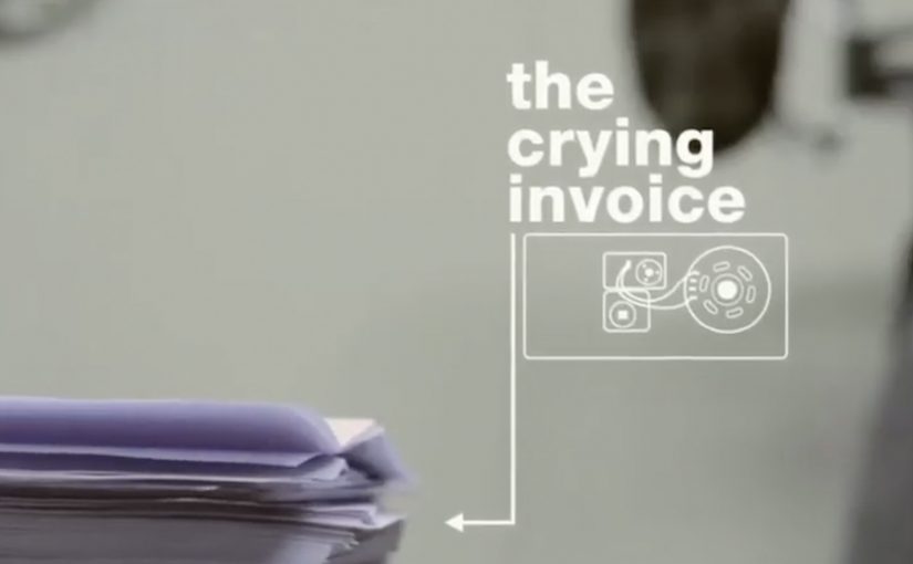
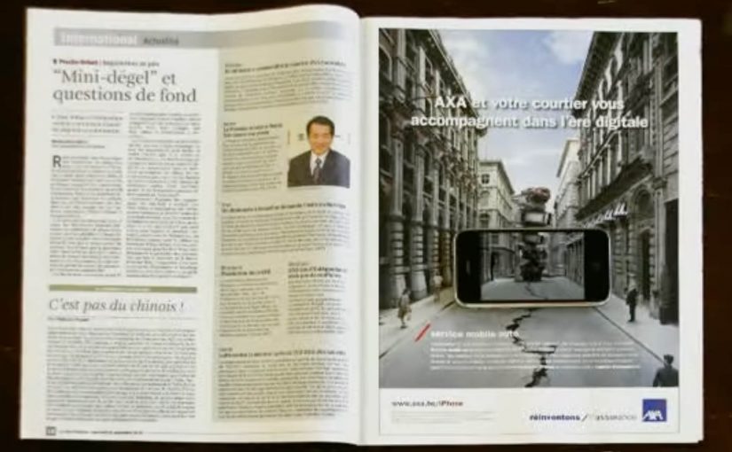
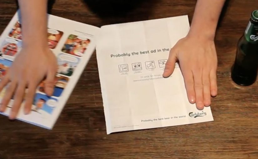
You can debate the effectiveness of magazine advertising all day long, but this Carlsberg ad from Belgian agency Duval Guillaume is undeniably useful. The advertisement reportedly appeared in Men’s magazine Menzo. Follow its instructions and you can use the flimsy piece of paper to open a bottle of Carlsberg.

How the idea is built

The mechanic is the message: the page is not just media. It is a tool. The ad teaches you how to tear and fold it into a working opener, which turns “try the product” into a physical action inside the magazine.

In print-led FMCG marketing, the fastest way to earn attention is to make the medium do something the viewer can immediately test.

The real question is whether your medium can deliver proof, not promises.

Why it lands

It turns a claim into proof. There is no argument to win and no feature list to remember. You either open the bottle, or you do not.

Extractable takeaway: Interactive print works when the action is the demonstration. Here, “interactive print” means the paper itself triggers a physical action, not just reading or looking. If the audience can do the product benefit with their hands in under a minute, the ad becomes memorable because it turns attention into a small personal “win”.

It forces participation. The reader cannot stay passive. The ad only completes itself when someone follows the instructions.

It earns a second look. Utility creates curiosity. People keep it, show it, and try it, which is the opposite of how most print gets treated.

Try it out yourself by downloading the advertisement from: www.probablythebestadintheworld.be.

But does it make this “probably the best ad in the world”? Not if you consider the likely inspiration below. The video shows someone using a piece of paper to open a bottle of Carlsberg.

Steal this: make the page a tool

  • Make the medium carry the benefit. If the product is about a moment. Build an execution that creates that moment.
  • Keep the instruction set frictionless. Fewer steps. Clear folds. Obvious success condition.
  • Design for sharing in the real world. The best print innovations get passed around physically before they get shared digitally.

A few fast answers before you act

What makes this print ad “interactive”?

It is not just read. It is folded into a functional bottle opener, so the reader completes the ad by doing something.

Why is a bottle-opener mechanic effective for beer?

It links the ad directly to the consumption moment. The ad becomes part of opening the product, not just talking about it.

Does utility automatically make a print ad effective?

It improves attention and memorability, but effectiveness still depends on distribution and whether people actually try it.

What is the biggest risk with “useful” print ideas?

If the build is fiddly or fails, the novelty collapses. The interaction must work reliably with minimal effort.

What is the most transferable lesson for advertisers?

When possible, replace messaging with demonstration. If the audience can experience the benefit through a simple action, persuasion gets easier.

IKKI.be: The Crying Invoice

IKKI.be: The Crying Invoice

USG People, one of the world’s biggest outsourcing companies, launched ikki.be. A portal for freelancers in search of new projects. The mission was to build awareness among freelancers and get them to sign up.

What they learned is simple. One of a freelancer’s biggest concerns is getting paid on time. Which they usually do not. So instead of another feature-led pitch, they created a physical reminder that lets freelancers “recall” the accounts department of late payment, with a little smile. Here, “recall” means prompting the payer to act by making the delay impossible to ignore.

An invoice that complains for you

The execution is the product truth turned into a prop. A mailed invoice that starts to cry when the envelope is opened. Case write-ups describe the trigger as a simple sensor reacting when the invoice is exposed, so the sound becomes unavoidable in the moment the payment decision is made. That matters because the trigger turns a forgettable invoice into an unavoidable emotional cue at the exact moment payment is being processed.

In European B2B lead generation for freelance marketplaces, the fastest attention often comes from solving a cash-flow anxiety rather than talking about platform features.

Why it lands

It lands because it reframes a painful, familiar workflow into a moment of social pressure that feels playful rather than aggressive. The invoice does the awkward part, and the person opening it becomes the one who has to explain why it is “crying”. That flips the emotional burden away from the freelancer chasing and onto the payer delaying.

Extractable takeaway: If your audience shares a recurring frustration, build a small object or mechanic that creates a socially visible cue at the exact decision point, then let that cue do the persuasion instead of your copy.

What the business intent really is

This is awareness built on relevance. It ties ikki.be to a pain point that every freelancer recognizes immediately, and it makes the brand memorable through a single, repeatable story people will retell. This is the right kind of B2B awareness work because it earns memorability by dramatizing a real freelancer pain instead of dressing up a feature list. The real question is how to make your brand useful at the moment the pain is felt, not just visible before it happens.

What to borrow from this payment-pressure idea

  • Start from a shared anxiety. Build the message around what keeps your audience up, not what your roadmap shipped.
  • Move the moment to where decisions happen. Here, the reminder appears at envelope-open time, not in a banner.
  • Use humor as a pressure valve. Playful discomfort can be more effective than aggressive escalation.
  • Make it explainable in one line. “It cries when you open it” is instant word of mouth.

A few fast answers before you act

What is “The Crying Invoice”?

A physical invoice that audibly cries when opened, designed to nudge late payers and spark conversation around paying freelancers on time.

Why does this work better than a standard awareness ad?

Because it appears inside a real payment workflow and turns a private delay into a socially noticeable moment, without needing confrontation.

What problem is the campaign solving for ikki.be?

It makes the portal relevant by anchoring it to the most common freelancer concern. Getting paid on time.

What is the main risk with this approach?

If the gimmick feels mean-spirited or humiliating rather than playful, it can trigger backlash and reduce goodwill.

How can another B2B platform copy the pattern?

Identify the shared operational pain, then create a lightweight intervention that shows up at the decision point and makes the issue easy to talk about.

AXA: iPhone App for Car Accidents

AXA: iPhone App for Car Accidents

AXA is Belgium’s first insurance company to launch an iPhone app. Their free application helps and guides you through some basic steps when you have a car accident.

To launch this new app Duval Guillaume Antwerp / Modem from Belgium created an innovative print ad that required your iPhone to complete the message.

Why the print idea is a smart match

The product promise is practical. Help me when I am stressed and do not know what to do next. The launch mirrors that by making the iPhone essential to “finishing” the ad, so the viewer experiences the role of the phone immediately. Because the viewer has to use their own device to complete the message, the concept is remembered as help in the moment, not a feature claim. In European insurance marketing, the first interaction needs to make crisis guidance feel tangible.

Extractable takeaway: If your product is built for high-stress moments, design the launch so people experience the first step, not a promise about steps.

  • Device as the missing piece. The iPhone is not just where the app lives. It is how the message becomes complete.
  • Low barrier to understanding. You do one simple action and the concept clicks.
  • Print-to-mobile bridge. The campaign uses print to trigger a mobile behavior, instead of treating print as a dead end.

What to reuse from this approach

The real question is whether your launch makes someone feel guided before they have to believe you.

If the utility of your app is “guidance in a critical moment”, your launch should demonstrate guidance, not describe it. By “guidance”, I mean a few clear, step-by-step prompts that reduce decision load when people are stressed. A small, tangible interaction can do that faster than any list of features.

  • Start with one action. Give people a single, low-friction step that mirrors the moment your app is built for.
  • Make the device essential. Let the phone complete the story so the product role is experienced, not inferred.
  • Bridge media into behavior. Use the channel to trigger the next step, not just to carry copy.

A few fast answers before you act

What does the AXA Belgium iPhone app do?

It helps guide drivers through basic steps after a car accident, providing practical assistance when they need it most.

Who created the print launch ad?

Duval Guillaume Antwerp / Modem (Belgium) created the print execution to launch the app.

What made the print launch ad innovative?

The print execution required the viewer’s iPhone to complete the message, turning the phone into an active part of the ad rather than a separate channel.

Why is this a strong launch mechanic for an insurance app?

It demonstrates the phone’s role as a helper in-the-moment, which aligns directly with the app’s accident-assistance promise.

What is the transferable pattern?

Design a simple physical or media trigger that forces a first interaction with the device. Then let that interaction explain the product in seconds.