To promote a million-seat fare sale, Scandinavian Airlines (SAS) and Crispin Porter + Bogusky Stockholm ran a Facebook competition where fans could “grab” a free trip. The ask was visual and dead simple, and it turned participation into the media.
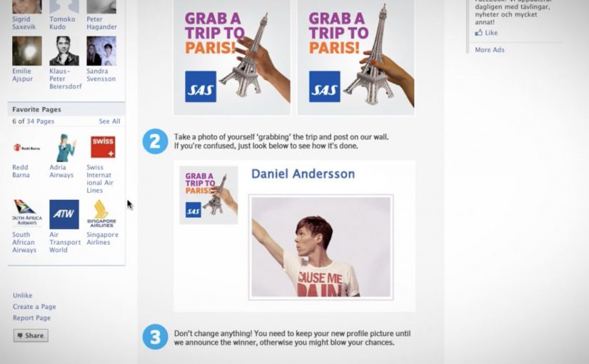
Fans changed their profile picture into a custom “Up For Grabs” image, then posted a matching photo on the SAS Facebook wall where they physically “grabbed” the trip. Every entry looked like an ad, and every ad looked like a friend.
The mechanic that turns fans into distribution
The campaign’s mechanism was a two-step loop. First, replace your profile image with a branded frame that signals you are “in”. Second, publish a playful photo on the brand wall that demonstrates the concept, grabbing the prize. That wall then becomes a live gallery of social proof, with each new post re-selling the fare sale in a more human way than a banner ever could.
In airline marketing, promotions that convert participation into shareable images can outperform price-only fare announcements.
Why it lands
It turns an abstract offer into a physical gesture. “Grab a trip” becomes something you can perform, photograph, and show. The profile-picture switch is a light commitment that broadcasts intent, and the wall post is a public performance that invites imitation. The momentum comes from visibility, because the more entries you see, the more “normal” it feels to join.
Extractable takeaway: When you need scale fast, design one participation artifact that doubles as an ad unit, and make the action easy enough that people will copy it without instructions.
What the shutdown reveals about the strategy
The campaign was reportedly against Facebook promotion terms, and it was shut down. That ending is part of the story, because it highlights the tightrope of social-first promotions. The creative is built on a behavior Facebook historically restricts for contest entry, asking people to publish specific content as a condition of participation, even if the idea is clever and the buzz is real.
The real question is whether the participation mechanic can spread the offer without depending on a platform behavior that can be switched off overnight.
The stronger strategic read is that the creative idea is right, but the distribution mechanic is too dependent on borrowed platform rules.
What to steal for your own launch
- Make the entry format the message. If the entry itself demonstrates the offer, you get free repetition of the proposition.
- Use a low-friction first step. Profile-picture frames and templates work because they are fast and socially legible.
- Design a single visual trope. “Grabbing” is a trope anyone can reproduce, and that consistency creates a recognizable feed.
- Build compliance in from day one. If the mechanic depends on prohibited platform behaviors, plan a compliant alternative before launch.
A few fast answers before you act
What is the core idea of Up for Grabs?
A Facebook contest where fans change their profile picture to a branded frame and post a “grabbing the trip” photo on the SAS wall to compete for a free flight.
Why does the profile-picture step matter?
It turns participation into persistent visibility. The frame signals “I am in”, and it spreads through everyday browsing without requiring an additional media buy.
What made the campaign travel beyond the SAS page?
Each entry was both participation and promotion. When fans changed their profile picture and posted a matching photo, the fare sale moved into personal networks instead of staying inside brand media.
Why was it shut down?
It was reportedly closed for violating Facebook promotion rules by conditioning entry on specific platform actions, such as posting photos on the wall.
How do you keep the upside without the platform risk?
Keep the visual template and the “grab” trope, but move the submission mechanic to a compliant entry flow, then allow optional sharing that is not required to participate.