McDonald’s: Pick N’ Play Billboard Game

McDonald’s: Pick N’ Play Billboard Game

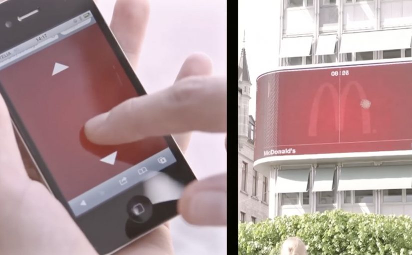
You are walking through central Stockholm and a McDonald’s billboard does something unusual. It invites you to play a quick Pong-style challenge on the screen, using your own phone as the controller.

DDB Stockholm has created another interactive outdoor campaign for McDonald’s Sweden called Pick N’ Play. Passers-by use their mobile phones as controllers to play for a chosen McDonald’s treat. If they last for more than 30 seconds, they score a coupon that earns them free fast food at a nearby McDonald’s.

Reportedly, the interaction avoids an app download and instead uses a simple mobile web flow, with proximity checks (via phone location) so only people physically near the screen can play.

Why this one pulls a crowd

The mechanic is instantly legible. Most people recognize Pong in a split second, which lowers hesitation and increases participation. The billboard also creates a public spectacle, which adds social proof and makes stopping feel normal, not awkward.

Extractable takeaway: This is rewarded interactivity, meaning the payoff is gated behind sustained attention instead of a tap. In outdoor, that simple “earn it” rule turns a public glance into a deliberate, measurable action.

What McDonald’s is really buying

The prize is not the point. The real value is a measurable bridge from street attention to store visit. A time-based win condition filters for people who are actually willing to pause, focus, and then act, which makes the coupon a higher-signal trigger than a generic discount blast.

The real question is whether your DOOH idea can turn a public moment into a private, trackable action without adding friction.

In global consumer brands and retail environments, interactive digital out-of-home earns its keep when it connects a public moment of attention to a private, trackable action on a personal device.

Steal these moves for your next DOOH game

  • Use a mechanic people already know. Familiar rules beat clever rules in outdoor contexts.
  • Make the phone the interface. It turns a billboard into a controllable experience and a trackable session.
  • Reward endurance, not clicks. Time-in-game is a simple proxy for real attention.
  • Close the loop fast. A coupon that can be redeemed nearby turns novelty into footfall.

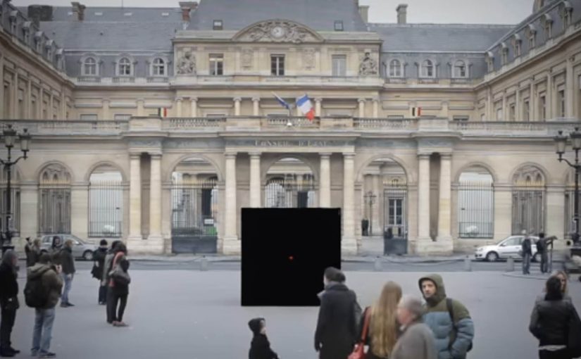
Last year they had challenged pedestrians to take pictures of McDonald’s food to get it for free.


A few fast answers before you act

What makes an interactive billboard work in practice?

An interactive billboard works when the invite is understood in seconds and the first action feels effortless on a phone.

Do you need an app to control a billboard with a phone?

No. Campaigns like this are often built as mobile web experiences so participation is immediate and friction stays low.

How do you stop people from playing remotely?

By verifying proximity. A common approach is using phone location to confirm the player is physically near the screen before the session starts.

Why use a 30-second target?

It is long enough to prove engagement, short enough to feel achievable, and simple enough to explain with one line of copy.

What is the business upside versus a normal coupon?

You get a higher-intent audience. The coupon is earned through attention and action, which tends to correlate with stronger redemption and store visitation.

The Escape Service: Press the red button

The Escape Service: Press the red button

DDB Paris creates a new service for the French rail booking site Voyages-sncf.com. “The Escape Service” lets people escape to any destination they want by simply pushing a magical red button.

Together with the French collective Pleix, they design three celebrations that emerge from a 3×3 meter black box that unfolds like a giant jack-in-the-box. In Paris, the cube lures passers-by in, asks where they want to go, then bursts into a destination-themed surprise and hands out a mock ticket for the chosen trip.

The film also ends by inviting viewers to press the button themselves and experience a first-person view version of the Escape Service. That first-person view version is a POV cut where the camera takes your place at the button.

A black box that behaves like a travel shortcut

The mechanism is deliberately minimal. There is one obvious choice, press the red button. The payoff is oversized, because the box transforms into a celebration that makes “go anywhere” feel real without explaining routes, prices, or schedules.

In European rail and travel marketing, turning an abstract promise like “escape” into a public, physical moment helps people imagine the journey instantly.

Why the red button is the real interface

The button turns travel intent into an action you can perform in one second. That matters because it removes hesitation. You do not need to “plan” to participate. You only need curiosity, and the street does the rest.

Extractable takeaway: When your promise is intangible, make the first step a one-second action that people can try without planning, then let the payoff do the explaining.

What the campaign is really proving for Voyages-sncf.com

This is not about a single destination. It is about choice and immediacy. The idea says: if you can decide on the spot, you can book on the spot. The mock ticket detail pushes the story from spectacle into something you can take away and show.

The real question is whether your service promise can be compressed into one action people will try without needing more information.

This kind of one-action interface is worth copying when you need to turn curiosity into intent fast.

Moves to borrow from the red-button mechanic

  • Reduce the interaction to one decision. One button is better than a menu when you need street participation.
  • Make the reward visible to bystanders. If spectators can understand the payoff, the crowd recruits the next person.
  • Personalize the outcome fast. A destination choice and a ticket-like takeaway make the moment feel “mine”.
  • Bridge offline to online without forcing it. A first-person online version extends reach without changing the story.

A few fast answers before you act

What is “The Escape Service” for Voyages-sncf.com?

It is a public pop-up experience where a black box invites people to press a red button, choose a destination, and trigger a surprise celebration that dramatizes the idea of escaping by train.

Why use a red button and a box?

Because it is self-explanatory. A single button removes friction and creates a clear before-and-after moment that people remember and film.

What makes this more than a stunt?

The mechanic maps cleanly to the service promise: pick a destination and go. The mock ticket detail turns the experience into a personal travel intent, not only entertainment.

How does this support online booking?

It makes “decide and book” feel effortless. The film’s first-person online extension reinforces that the same impulse can continue digitally.

What is the transferable lesson for service marketing?

When your product is intangible, build a physical interface that compresses the benefit into one action and one memorable payoff.

Superette: Short Shorts

Superette: Short Shorts

In the inner city, someone stands up from a bus-stop bench and notices a message pressed into their thigh. It reads like a sale reminder, and it travels with them for the next hour.

That is the execution DDB Auckland creates for Superette’s short shorts sale. Indented plates are fitted across bus stops, mall seats, and park benches in the fashion district, so when people sit down, the message is imprinted on the bare skin exposed by the trend. The result, as described, is branded seating plus a moving wave of free media: thousands of temporary imprints that last up to an hour, and show up most visibly on exactly the style-setters the retailer wants.

Superette’s short shorts sale campaign.

How the imprint works

This is body imprint advertising: a physical surface transfers a readable message onto skin through pressure, like a temporary stamp without ink. The media buy is the furniture people already use. The “placement” is the moment the audience sits down.

In fashion retail, the fastest way to make a promotion feel native is to attach it to the lived behavior and the exposed product context, not a separate media channel.

Why it lands in the street

The idea carries its own proof. The imprint is not a claim you read; it is a thing that happens to you, and that makes it unusually hard to ignore or forget. It also creates a social moment. People compare marks, laugh, take photos, and inadvertently become distribution. The targeting is embedded in the location strategy: benches in inner-city and fashion-district zones bias the audience toward the “hippest young cats” already dressed for visibility.

Extractable takeaway: When your offer is simple and time-bound, design a mechanic where the audience physically carries the message for a short period, then place that mechanic where the right crowd naturally gathers.

What Superette is really buying

Not just awareness. The campaign buys cultural permission. It signals that the sale belongs to a specific scene and that the brand understands how that scene moves, sits, and shows skin. The imprint is a cheap, repeatable proof-point of “this is for you” without ever saying it directly.

The real question is whether the sale message can travel through the scene as social proof instead of behaving like an ad bolted onto it.

What retail teams can steal from this

  • Turn existing infrastructure into media. Find the surfaces your audience already uses, then engineer the message into the touchpoint.
  • Make the ad portable. If people carry the message with them, your reach compounds without extra placements.
  • Target by behavior, not demographics. Location and context can do the filtering when the creative is inseparable from the setting.
  • Keep the message legible and short. Physical imprint media rewards minimal copy and a single, clear action.

A few fast answers before you act

What is “body imprint advertising” in this campaign?

A message is created as a temporary impression on skin by sitting on seats fitted with indented plates. No ink is needed. Pressure creates the readable mark.

Why does putting the ad on benches make sense for a shorts sale?

The trend exposes bare thighs, so the sale message can live on the same body area the product is designed to reveal. The medium and the product context reinforce each other.

What makes this feel like “free media” after the placement?

Once a person stands up, the imprint travels with them for a while. Every subsequent encounter becomes an additional impression without buying another seat or poster.

What is the main risk with this approach?

If the imprint feels intrusive or uncomfortable, the novelty can flip into backlash. The mechanic depends on perceived playfulness, not coercion.

When should a brand use a tactic like this?

When the message is ultra-short, the audience is location-clustered, and the idea can be experienced instantly in a way that people will talk about and show others.