Fantastic Delites: Delite-O-Matic

Fantastic Delites: Delite-O-Matic

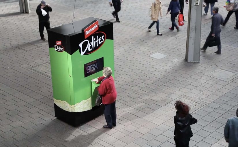
In this latest example, ad agency Clemenger BBDO Adelaide set out to see how far people will go for a free pack of Fantastic Delites.

So a machine dubbed the “Delite-O-Matic” was created that gave people a free pack of Fantastic Delites by means of pushing a button hundreds of times or performing challenges. It was then put out on the streets to prove that because Fantastic Delites taste so good, people would go to incredible lengths to get them.

Sampling that people choose to earn

Interactive vending machines are a great way to get consumer participation and engagement on the ground. There are tons of examples out there, of which some have been covered here.

The mechanic that makes it watchable

The mechanism is effort-based reward. The machine sets an instruction, the participant complies, and the prize is dispensed only after the effort is visible. The escalating “work” becomes the entertainment, and the entertainment becomes the message.

In FMCG sampling and retail activations, interactive vending machines are a repeatable way to exchange effort for product trial.

That structure works because visible effort gives the crowd a simple story to follow before the product appears.

Why it lands

This works because it turns sampling into a story people can instantly judge. The point is not only “free snack”. The real question is what kind of visible effort makes a simple product feel worth watching and worth wanting. Each extra button press or challenge makes the product feel more desirable, and the crowd becomes a built-in audience.

Extractable takeaway: When you make the cost of entry visible, you turn a giveaway into a social moment. That moment carries the brand further than a silent handout ever could.

What to steal from Delite-O-Matic

  • Make the exchange legible: people should understand the rule in one glance, and the effort should be obvious on camera.
  • Escalate, then release: tension comes from “will they do it”. Satisfaction comes from the dispense moment.
  • Keep the prize simple: the product is the hero. The machine is the stage.
  • Design for bystanders: the best sampling stunts recruit a crowd even before the first pack comes out.
  • Let participation become proof: the more people comply, the stronger the implicit claim becomes.

A few fast answers before you act

What is the Delite-O-Matic?

It is an interactive vending machine activation that dispenses a free pack of Fantastic Delites after people complete button-mashing or challenge-style tasks.

Why use effort instead of a simple giveaway?

Effort creates a story. It increases attention, pulls in bystanders, and makes the reward moment feel earned, which boosts recall and sharing.

What’s the key behavioral trick?

Visible commitment. When people publicly invest effort, the product feels more “worth it”, and the scene becomes entertainment for everyone around.

Where does this work outside snacks?

Anywhere trial is the goal and the product is easy to dispense or unlock. Beauty samples, quick-service food, entertainment promos, and event activations.

What’s the main risk?

If the tasks feel humiliating or unfair, the tone can flip. The sweet spot is playful challenge with a clear, quick payoff.

eBay: Give-A-Toy Store

eBay: Give-A-Toy Store

One of the things that all people do during the holidays, besides real shopping, is window shopping. Storefront window displays therefore have a stronger significance during the holiday season. Keeping that in mind, eBay has developed a way to make this experience move from passive to interactive and engaging.

Give-A-Toy Store is a 3D Christmas window installation with QR code tagged toys, built to evoke the passer-by’s giving side. Scanning the QR codes inside the eBay app allows passers-by to donate that toy on the spot, with the window lighting up and rewarding them for the donation.

The window installation is currently available at Toys for Tots in New York (at 35th and Broadway) and San Francisco (at 117 Post St).

Additionally customers can also customize their own toys on eBay’s Facebook page. For each toy created, eBay will donate $1 (up to $50,000).

From window shopping to “giving on the sidewalk”

This is a simple flip. The window is no longer just display media. It becomes a donation interface. You look, you scan, you give. Then you get instant feedback in the physical world.

How the mechanism does the heavy lifting

The mechanic is intentionally friction-light. Toys are visually presented as scannable choices. The QR tag is the call-to-action. The eBay app is the checkout. The window lighting up is the reward loop, confirming that something happened and making the act feel social even if you are alone.

In high-traffic retail corridors, a good interactive storefront turns waiting and wandering into measurable intent, without asking people to step inside.

Why it lands in a holiday crowd

It works because it respects the window-shopping mindset. People are already browsing. They are already comparing. This just adds a small, clear next step that feels aligned with the season. The visual “thank you” in the window also matters. It makes the donation feel immediate and real, not abstract and back-end.

Extractable takeaway: If you can make the environment visibly react to a mobile action, you create trust and momentum. The moment becomes self-explanatory, and bystanders learn the behavior just by watching.

What the brand is really building

The real question is whether a holiday storefront can turn passing attention into a mobile action that feels immediate enough to complete on the sidewalk.

This is not only about donations. It is a product demo for mobile commerce in disguise. It shows that scanning can be a legitimate buying action, that the phone can complete a transaction in seconds, and that the brand can connect physical retail ritual with digital conversion.

What this teaches about interactive storefronts

  • Make the first action obvious. If scanning is the behavior, the codes must look like the product tag.
  • Design a physical confirmation. Light, motion, or animation reduces doubt and makes the act feel rewarding.
  • Keep the choice set tight. Fewer, clearer options beat a cluttered scene when people are walking past.
  • Match the moment. Holiday giving is a natural fit for “instant donate” mechanics.
  • Make it watchable. When others can see the window respond, you get free teaching and free social proof.

A few fast answers before you act

What is the core idea behind Give-A-Toy Store?

Turn a holiday window into a scannable donation experience, so giving happens in the same moment as browsing.

Why does the window lighting up matter?

It provides immediate confirmation and reward. That reduces hesitation, makes the interaction feel real, and invites others nearby to notice and copy the behavior.

What makes this different from a normal QR campaign poster?

The display is the product experience. The scene feels like a store window first, and the QR code is integrated as a natural “price tag” action rather than a separate ad instruction.

What is the biggest execution risk?

Friction. If scanning is unreliable, the app flow is slow, or the codes are hard to spot at walking distance, people will not complete the action.

How would you adapt this if you do not have an app?

Keep the structure. Use a fast mobile entry point, and pair it with a visible physical confirmation so people know their action worked.

Prigat: Smile Stations

Prigat: Smile Stations

Publicis Israel and e-dologic are back with a new campaign for Prigat, a leading company in the Israeli fruit juice market.

This time they use innovative digital billboards called “Smile Stations” to send real-time messages at various train stations. The aim is to get passers-by to smile, and “like” the moment.

The mechanic: turn a Facebook message into a station moment

It starts on the Prigat Facebook Page. People send messages that are pushed to screens at train stations. Commuters walking by can approach the screen and press a physical “Like” button.

That button press triggers a simple payoff. The billboard captures the moment, then broadcasts the video back to the person who sent the message. Users who generate the most smiles win a prize.

In busy public transit environments, interactive out-of-home works best when the action is obvious, the feedback is immediate, and the reward is shareable.

Why it lands: it makes public emotion measurable

Most out-of-home asks for attention. Smile Stations asks for a reaction, then turns that reaction into proof you can send back to the originator.

Extractable takeaway: If you want participation at scale, close the loop. Let a remote user trigger a real-world moment, let a passer-by respond with one physical action, then send that response back as a personal artifact the originator can keep and share.

Reported figures put this at over 10,000 messages sent to station screens, with thousands of people responding by hitting the Like button.

What the brand gets from this

The real question is whether a public display can turn a remote social prompt into a personal moment worth sharing.

This is stronger than passive digital out-of-home because the physical Like button reduces effort and the returned video turns a fleeting reaction into a personal memory both sides can own.

The campaign does not just generate impressions. It creates a two-sided interaction where both parties feel like they caused something to happen. That is a stronger memory structure than “I saw an ad”, especially in a context as repetitive as commuting.

What to steal for your own social-plus-out-of-home activation

  • Design a one-step physical interaction: one big button beats a complicated interface in public space.
  • Make the response visible: the passer-by should understand instantly that their action “counts”.
  • Return a personal artifact: sending the video back is what turns participation into sharing.
  • Gamify without friction: “most smiles wins” is a clean mechanic with no explanation overhead.
  • Pick locations with dwell time: stations work because people pause, look up, and wait.

A few fast answers before you act

What is a “Smile Station”?

It is an interactive digital billboard at a train station that displays user-submitted messages and invites passers-by to respond by smiling and pressing a physical Like button.

What makes this different from a normal digital billboard?

It is two-way. Remote users trigger messages, commuters respond physically, and the response is captured and sent back as video, creating a closed feedback loop.

Why include a physical Like button?

Because it removes friction. A single, tangible action is faster and more intuitive than asking people to pull out a phone, scan, or type.

How do you measure success for an activation like this?

Message volume, unique senders, Like-button presses, response rate per message, video shares by originators, and dwell time around the screen locations.

What is the main execution risk?

Latency and unclear feedback. If the system feels slow or people are unsure what their button press did, participation drops quickly in a commuter setting.